Component API Design: Naming Conventions That Scale
Consistent naming for props like variant, type, and kind keeps a design...
Tag
Tokens are the boring plumbing that makes a design system hold together, and we love the boring plumbing. Articles here trace the whole path: naming your color and spacing primitives, structuring semantic aliases, syncing Figma variables to code, and shipping JSON through Style Dictionary so designers and engineers stop arguing about hex values. We get into modes, theming, and the naming conventions that survive a rebrand. This is for design system leads and front-end folks who want one source of truth instead of a spreadsheet nobody trusts. Get the token layer right and everything above it gets calmer.
Articles, guides and tutorials tagged Design Tokens (19 in total), newest first.
Component API Design: Naming Conventions That Scale
Consistent naming for props like variant, type, and kind keeps a design...
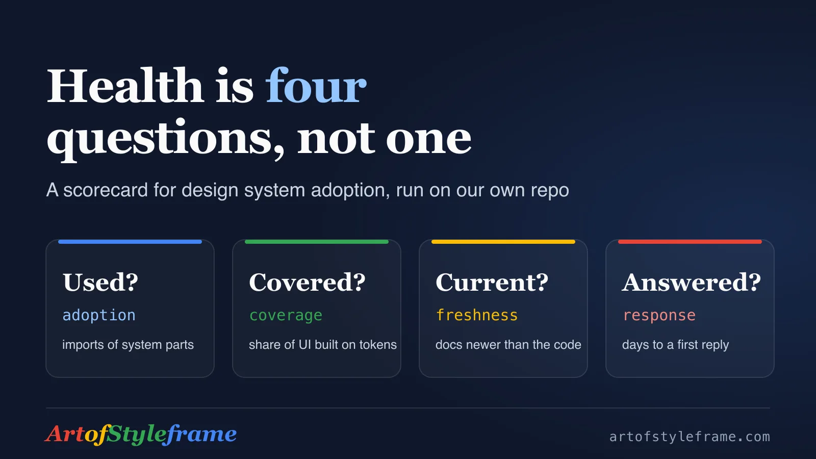
Design System Health Metrics: A Scorecard You Can Run
Usage is not coverage, and a detach is not a verdict. A...
Audit Your UI Against Its Design Tokens With Claude Code
Install the aosf-design Claude Code plugin, audit built UI against its tokens...
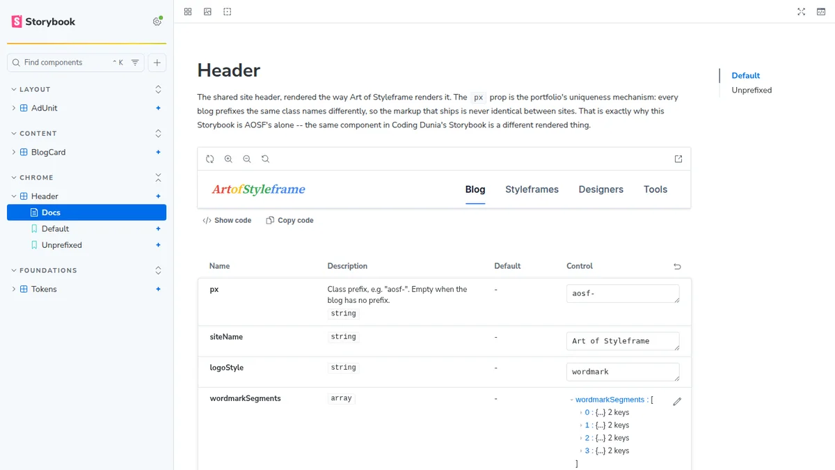
Claude Design From Storybook: Make the Repo the Source
Claude Design can build a design system from your repo. How a...
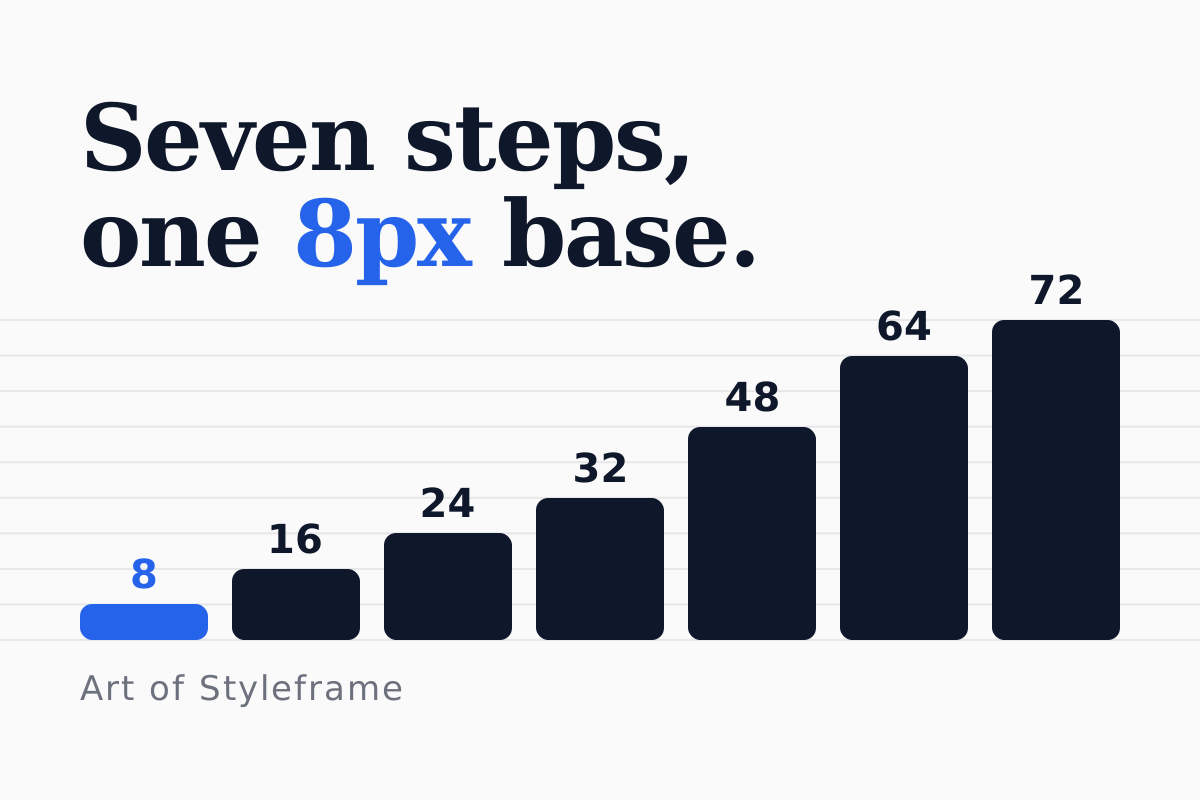
An 8pt Spacing Scale for Long-Form Article Layouts
Seven spacing steps from one 8px base cover a whole article page:...
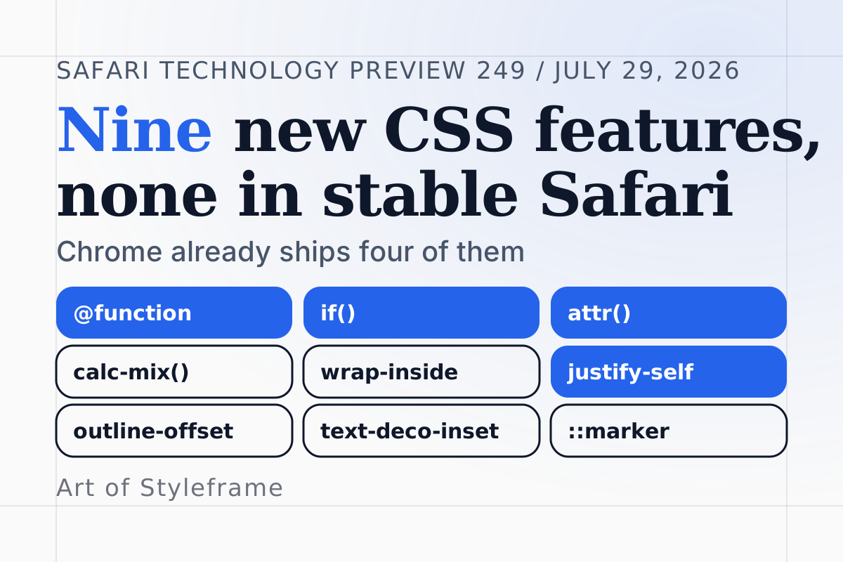
Safari Technology Preview 249: Nine New CSS Features
Safari Technology Preview 249 lists nine new CSS features, from @function and...
Design System Color Contrast: Baking WCAG Into Tokens
Design system color contrast at the token level: a DTCG token file...
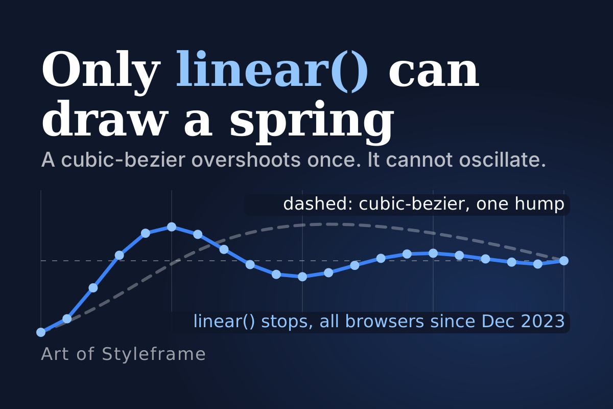
Easing Curves: The Shape, Not the Word, in Motion UI
What a cubic-bezier can and cannot draw, why linear() exists, what Material...
Design System Governance: Versioning and Changelogs
A practical guide to semantic versioning for design systems: breaking token changes,...
Dark Mode Dashboard Design: 4 Rules, Palette and Contrast
Dark mode dashboard done right: a lifted #0f172a canvas, surface elevation, a...
Type Scale Systems: A Modular Approach for Products
A modular type scale, built on a ratio like 1.25 Major Third,...
Multi-Brand Theming: One Design System, Many Brands
Run several brands off one component library with layered design tokens and...
Design Tokens: Style Dictionary and Figma, Explained
How Style Dictionary turns Figma design tokens into CSS, iOS, and Android...
Figma Variables vs Design Tokens: What Goes Where Now
Figma variables and design tokens explained: what each term means, where they...
Figma Components: Variants, Auto Layout, and Slots
Master figma components with variants, auto layout, and the slots pattern. Learn...
The Designer to Developer Handoff Playbook in Figma
A practical guide to the designer to developer handoff: Figma Dev Mode,...
Design Tokens From Figma to CSS and Tailwind in Code
Design tokens move from Figma variables to CSS and Tailwind. Token tiers,...
Visual Hierarchy in UI Design: What It Is + 7 Principles
What visual hierarchy is, and how size, contrast, color, spacing, and alignment...
How to Build a Design System in Figma Step by Step
How to build a design system in Figma with tokens, components, and...