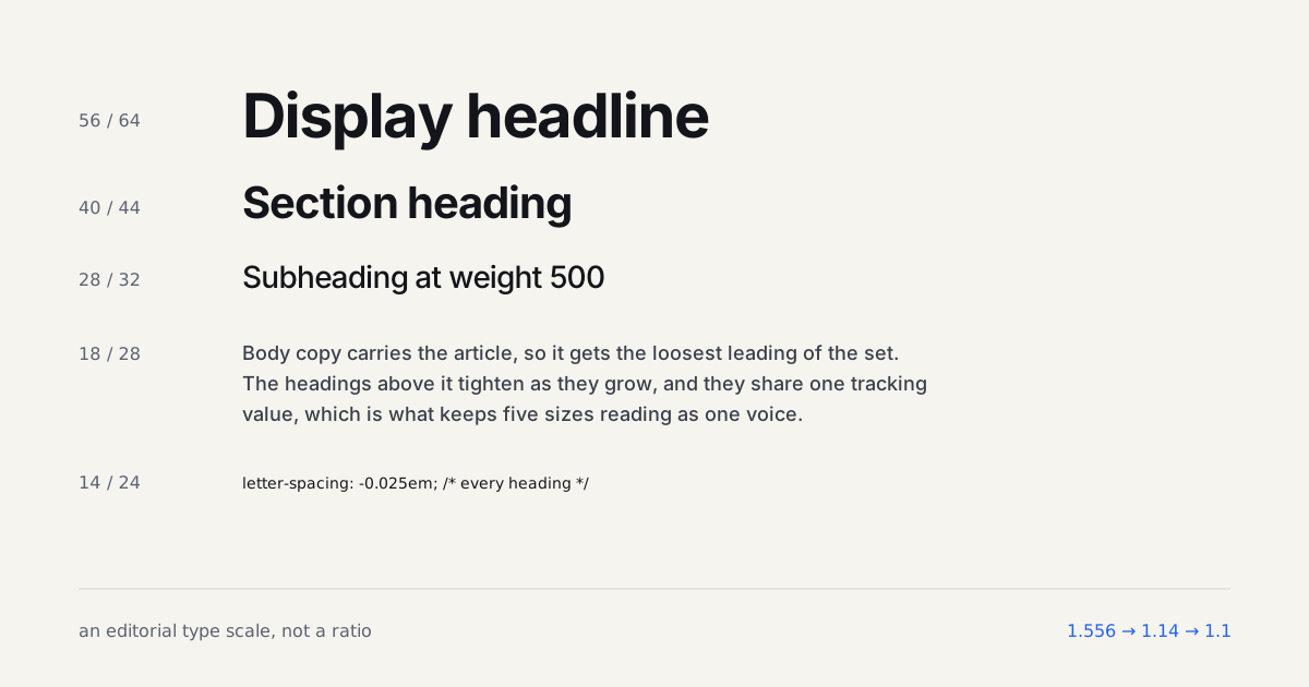
Editorial Type Scale: Why Blog Typography Skips the Ratio
A measured blog type scale (18/28 body, 40/44 h2, 56/64 h1) with...
Category · 10
Type does more heavy lifting than any other design decision. These guides cover pairing, scale, readability, and the web-specific constraints, font loading, performance, and fallbacks, that decide whether your carefully chosen typeface ever reaches the reader.
Type is the part of a layout people feel before they read a word. These guides get specific: pairing a display face with a workhorse body, fixing the optical sizes most teams ignore, and cutting page weight with variable fonts instead of loading six static weights. We cover web typography for performance and for craft, with measured numbers (a variable font can replace a 200KB stack) rather than vibes. Examples link to the foundries and specimens worth studying.
Good type on the web means solving two problems at once: it has to look considered and it has to load fast, and the two goals fight each other more than people admit. We dig into font-display strategies, subsetting to cut a 40-glyph range down to what a page actually uses, and the real difference between shipping a variable font and shipping a fallback stack that only pretends to match it.
Pairing gets real attention too, not just "here's a nice combination" but the actual reasoning: x-height matching, contrast between a display face and its body partner, and where a third face earns its place instead of just adding weight to the page. We also track how type systems hold up across languages and scripts, since a pairing that works cleanly in English can fall apart the moment diacritics or a non-Latin script enter the layout.
Editorial coverage of typography for motion designers, art directors, and UI designers working with modern interface design. You'll find in-depth articles and step-by-step tutorials here. Each piece below was written by a working designer, peer-reviewed for accuracy, and links out to the primary source: the designer's portfolio, the original release notes, or the relevant studio site. We do not run sponsored articles or take payment for placement.
Newest articles appear first. Browse the 10 pieces below, or open the main archive for a full chronology across all categories. The designers index covers attributed work, and the styleframes gallery surfaces individual frames pulled from longer reels.
Editorial Type Scale: Why Blog Typography Skips the Ratio
A measured blog type scale (18/28 body, 40/44 h2, 56/64 h1) with...
Accessible Typography: Dyslexia-Friendly Fonts That Work
Real dyslexia-friendly fonts, spacing rules, and layout patterns for accessible typography that...
Kinetic Typography for the Web: Where Motion Meets Type
A practical guide to kinetic typography for the web, covering CSS animation...
Typography for Dark Mode: Weight and Optical Sizing
Why the same font weight looks different on a dark background, and...
CSS clamp() for Fluid Typography: No Breakpoints Needed
How to replace media query breakpoints with CSS clamp() for fluid type:...
Font Loading Performance: Avoiding FOUT/FOIT in Product UI
Unoptimized web fonts cause FOUT and FOIT that hurt LCP and CLS...
Ideal Line Length in CSS: 65ch, Measure and Rhythm
How long should a line of text be? 50-75 characters, 65ch in...
Type Scale Systems: A Modular Approach for Products
A modular type scale, built on a ratio like 1.25 Major Third,...
Variable Fonts in UI: One File vs Static Weights, Tested
Variable fonts run on 41.3% of mobile sites. When one file beats...
Web Typography and Font Pairing: A Designer's Guide
Practical font pairing and web typography guide, variable fonts cut page load...