A dark theme can look flawless in the Figma file and slightly wrong in production. Same font, same weight value, same hex codes checked against a contrast checker. It just looks heavier than it should, almost bold where regular was specified. The problem isn't a bug. It's how light text behaves on a dark background, full stop.
That's the part most teams miss when they add dark mode as an afterthought: swapping background and text colors isn't a typography-neutral operation. The same weight, size, and spacing values that read correctly in light mode will not automatically read correctly once you invert them.
TL;DR: Light text on dark backgrounds visually appears heavier due to an optical effect called irradiation, a Medium 500 weight can read like Semibold 600. Increasing font weight by one step and line-height by 10-20% is the standard 2026 fix, alongside avoiding pure white on pure black (Mark Boulton, 2026).
Why Does Light Text Look Heavier on Dark Backgrounds?
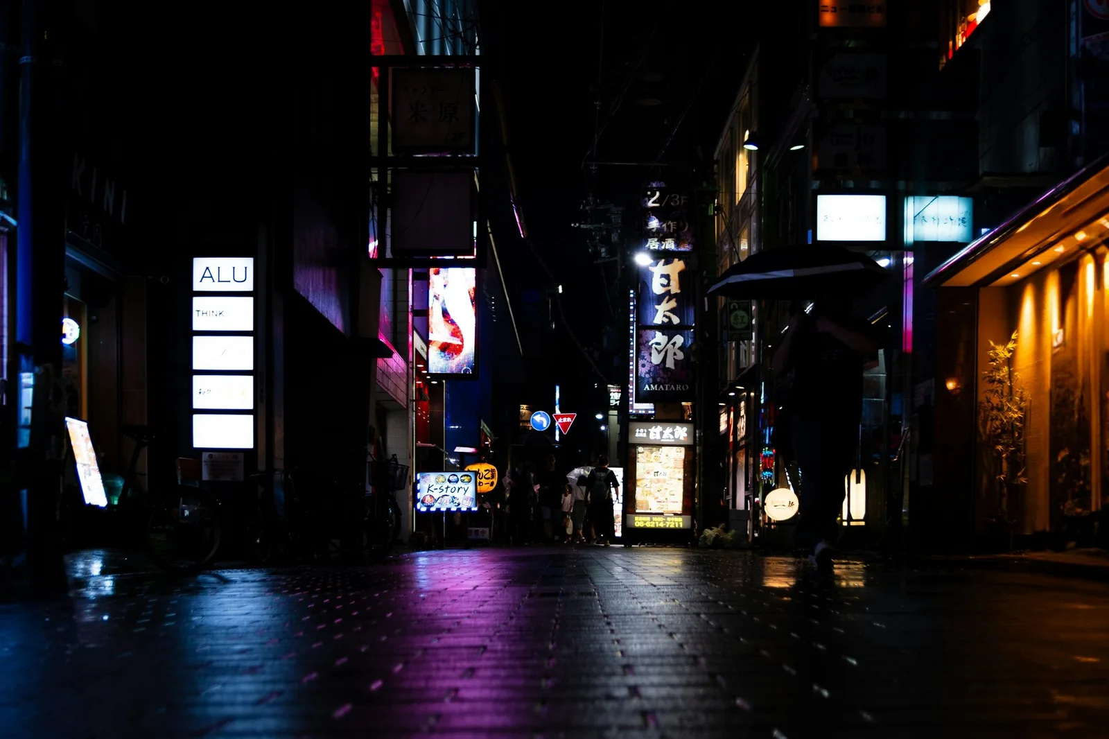
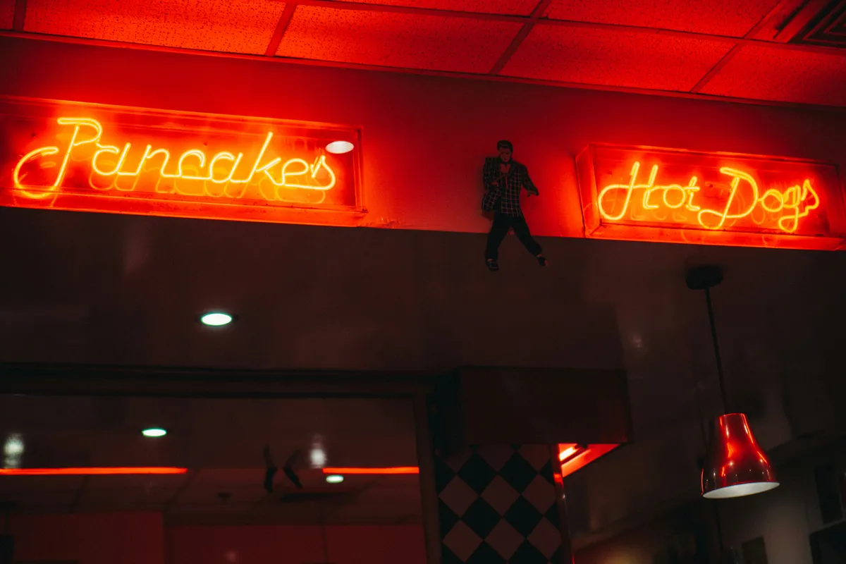
It's a real optical phenomenon, not a rendering bug, called irradiation. Bright shapes on a dark field appear to expand slightly beyond their actual edges, an effect photographers and typographers have documented for decades, long before dark mode UI existed. Your eye perceives the white letterforms as bleeding a little into the surrounding black.
Practically, this means a heading set at font-weight 600 in light mode can look noticeably heavier, sometimes closer to 700, once you flip to a dark background at the same pixel size. Designers who don't account for this end up with dark themes that feel clumsy or over-bold compared to their light counterparts, even though the numeric weight value never changed.
A font weight that looks balanced in light mode does not automatically look balanced in dark mode, and treating them as interchangeable is the most common dark UI mistake.
| Property | Light mode | Dark mode adjustment |
|---|---|---|
| Heading weight | e.g. 700 | Drop one step, e.g. 600 |
| Text color | Pure white acceptable | Off-white (#E8E8E8-#EDEDED), not pure white |
| Background | Pure black acceptable | Dark gray (#121212-#1A1A1A), not pure black |
| Line-height | Baseline value | 10-20% higher |
How Should You Adjust Font Weight for Dark Themes?
Don't share one weight token across both themes. Set up separate CSS custom properties, --font-weight-heading-light: 700 and --font-weight-heading-dark: 600, and let your theme switcher pick the right one. That sounds like duplicated work, but the alternative is a dark theme that consistently reads slightly bolder than intended across every single heading on the site.
:root[data-theme="light"] {
  --font-weight-heading: 700;
  --font-weight-body: 400;
}
:root[data-theme="dark"] {
  --font-weight-heading: 600;
  --font-weight-body: 400;
}
h1, h2, h3 { font-weight: var(--font-weight-heading); }
Body text needs less adjustment than headings as a rule, because the irradiation effect is more visible at larger sizes and heavier weights. A 400-weight body paragraph rarely needs a dark-mode-specific override. It's your 600 and 700-weight headings that drift.

What Is Optical Sizing and Why Does It Matter Here?
Optical sizing is a variable font axis (opsz) that reshapes a typeface's proportions, stroke contrast, x-height, spacing, based on the point size it'll render at, rather than just scaling one fixed shape up or down. High-contrast display faces (thin strokes paired with thick ones) are the ones that suffer most on dark backgrounds; those thin strokes can look like they're flickering or dissolving against black, an effect that gets worse the smaller the text gets.
Fraunces and Recursive both ship with a usable opsz axis you can dial toward a heavier setting specifically for dark mode headings, without touching the numeric font-weight value at all:
h1 {
  font-variation-settings: "opsz" 72, "SOFT" 30;
}
If your chosen typeface doesn't include an optical sizing axis, the practical substitute is simple, bump the font-weight token by one increment for dark mode, as covered above. It's not as elegant as a purpose-built optical axis, but it solves the same visual problem for teams working with static font families.
How Should Contrast Ratios Differ From Light Mode?
Higher contrast is not automatically better, which surprises people the first time they hear it. Pure white (#FFFFFF) text on pure black (#000000) technically maximizes your contrast ratio, but extreme polarity like this can tire the eyes and make long stretches of reading harder than a softer pairing would. It's genuinely more tiring to read for long stretches.
Use an off-white body color, something in the #E8E8E8 to #EDEDED range, against a dark gray rather than true black, somewhere around #121212 to #1A1A1A. You'll still clear WCAG AA's 4.5:1 contrast requirement comfortably, and the reading experience improves over a long session. WCAG 3.0's newer APCA model actually scores perceptual contrast more precisely than the old ratio-based check, factoring in font size and weight alongside polarity, worth tracking as it moves toward wider adoption (Inkbot Design, 2026).
What Are the WCAG Contrast Standards for Dark Mode Text?
The comfort argument above sits on top of a hard floor: the WCAG numbers your dark theme has to clear before comfort even enters the conversation. Dark mode doesn't get a special exemption. The same ratios apply whether text is dark-on-light or light-on-dark, because a contrast checker measures the pair, not the direction.
Here's the set to check every dark theme against:
| Content | WCAG 2.2 AA | WCAG 2.2 AAA |
|---|---|---|
| Body text (under 24px, or under 18.66px bold) | 4.5:1 | 7:1 |
| Large text (24px+, or 18.66px+ bold) | 3:1 | 4.5:1 |
| UI components and graphics (borders, icons, focus rings) | 3:1 | not defined |
That last row is the one teams forget. A 1px hairline border or an icon-only button that reads fine in light mode can slip under 3:1 once it sits on #121212, and it fails success criterion 1.4.11 (non-text contrast) even when every paragraph passes. A dark theme can clear every text check and still fail audit on the disabled-state form borders. Embarrassing, and entirely avoidable.
APCA, the perceptual model arriving with WCAG 3, scores this differently. Instead of one ratio it returns an Lc value, and the rough working targets are Lc 75 for body text, Lc 60 for large text, and Lc 45 for non-text elements. APCA rewards exactly the off-white-on-dark-gray pairing the section above argues for, where the old ratio math is blind to polarity and treats #FFFFFF on #000000 as a perfect score. It's still a draft though. Ship against WCAG 2.2 AA today, treat APCA as the direction things are heading, and don't let a checker's green tick talk you out of reading the actual text on the actual background.
Does the Type Scale Itself Need to Change?
The scale mostly holds. The bottom of it doesn't, and that's where dark mode quietly hurts.
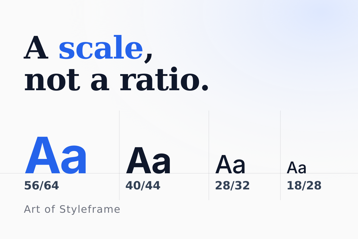
Halation, the bloom that makes light text spread into a dark background, is proportional to the stroke, not to the point size. So the same effect that adds a pleasant softness to a 32px heading turns a 12px caption into a smudge. On a light background that caption was merely small. On a dark one it's small and blurry, and the reader's eye does the extra work without knowing why.
Three adjustments handle it, in the order worth trying them.
| Problem | Fix | Cost |
|---|---|---|
| Captions and labels smudge | raise the smallest step, 12px to 13 or 14px | one token, no layout change |
| Small text looks bolder than intended | drop one weight step below 14px | needs a variable font to do well |
| The whole ramp feels tight | widen the ratio slightly, 1.200 to 1.250 | reflows everything, do it early or never |
Start with the first one. Raising the floor of the scale is a single token change, and it fixes most of the complaint. Widening the ratio is the expensive move, because every step above it shifts and your layouts move with them; if you're going to do it, do it before the system has consumers, not after.
Worth building the ramp properly rather than picking sizes by eye. Our type scale calculator generates the steps from a base size and ratio, and a sensible starting point for dark surfaces is a 16px base at 1.250, with the smallest step pinned at 14px rather than whatever the ratio produces below the base. The scale is a guide, and the bottom step is where you're allowed to overrule it.
One thing not to do: keep two separate scales, one for light and one for dark. Teams that try it hit the maintenance cost quickly, because every new component then needs two sets of decisions and the two scales drift apart. One scale, with the floor raised for both modes, loses you almost nothing in light mode and saves you from maintaining a fork. The same logic applies to spacing, and our spacing scale generator builds that ramp the same way: one system, tuned for the harder case.
Does Line Height Need to Change Too?
Yes, modestly. Bump your line-height by roughly 10-20% for dark mode body text compared to light mode. A paragraph sitting comfortably at 1.5 line-height in light mode often wants 1.6 to 1.65 in dark mode. The irradiation effect makes lines of text feel like they're crowding each other even when the actual pixel spacing hasn't moved a single unit.
Store this as its own token rather than burying it in a one-off override class. If you're building out a broader dark theme beyond typography, our dark mode UI design guide covers the color system and component-level decisions that pair with these type adjustments.
How Do You Wire Dark Mode Typography Into a Theme System?
Everything above ends up as tokens, and the interesting question is which mechanism switches each one. Typography values come in two kinds, and CSS handles them differently.
Colors are the easy kind. The light-dark() function takes two colors and returns the first in a light scheme and the second in a dark one. MDN lists it as Baseline since May 2024, and it needs color-scheme: light dark on the root before it does anything. Numbers are the other kind, and light-dark() can't help: it accepts colors and images, not a font weight or a line height. Those need an override block, either a prefers-color-scheme media query or an attribute on the root.
:root {
  color-scheme: light dark;
  --text-body: light-dark(#1f2937, #e8e8e8);
  --surface: light-dark(#ffffff, #121212);
  --font-weight-heading: 700;
  --line-height-body: 1.5;
}

@media (prefers-color-scheme: dark) {
  :root {
    --font-weight-heading: 600;
    --line-height-body: 1.65;
  }
}
If your product has a manual theme toggle, key the numbers off the attribute and set color-scheme from the same attribute. Otherwise a reader who forces light mode on a dark operating system gets light colors with dark-mode leading, which looks like a bug nobody can reproduce on their own machine.
Name tokens by role, not by value: --text-body, --text-muted, --text-heading. Components read the role and never mention a hex code, which is the same layering a token pipeline gives you, and our guide to modes and brands in Style Dictionary shows how those per-theme files get generated. Then test each role, not each theme. Body text rarely fails. The muted role does, because the common #6b7280 grey clears 4.5:1 on white at 4.83 and lands at 3.88 on #121212, which is exactly the pair the checker above opens on.
One last shortcut to leave alone. -webkit-font-smoothing: antialiased makes light text on a dark background look lighter, and it's tempting as a one-line fix. MDN marks it non-standard and says it only works on macOS, so it does nothing for Windows, Android or Linux readers. Weight and leading tokens work everywhere.
How Do You Test Dark Mode Legibility Before It Ships?
Run three passes on every text role: a numeric contrast check, an automated scan with the dark scheme emulated, and a read-through at the smallest size. Each one catches something the other two miss, and skipping the third is how a theme that "passes" still smudges.
Pass one is the numbers. Check each role against the surface it actually sits on, not just the page background: body, muted, disabled, borders and the focus ring. The thresholds are the ones in the table above, 4.5:1 for body text and 3:1 for large text and non-text elements. The contrast checker embedded earlier on this page takes a pair and gives the ratio. The muted role is where themes fail first, as the 3.88:1 on #121212 earlier shows.
Pass two is a scan. An automated checker measures the colors the page renders, so it has to render the dark theme. In Playwright that's one line before the scan:
await page.emulateMedia({ colorScheme: "dark" });
const results = await new AxeBuilder({ page }).withTags(["wcag2aa"]).analyze();
The scan reads the default rendered state, so hover, focus and disabled styles still need a manual look. A green result means the text it saw passed. It doesn't mean the theme is readable.
Pass three is a person. Switch the theme in Chrome DevTools (Rendering panel, emulate prefers-color-scheme), turn the screen brightness down, and read three paragraphs plus the smallest caption at real size. Does the caption stay crisp? Does the heading feel heavier than the body should allow? A pair can clear 4.5:1 and still smudge at 12px, which is the reason the floor of the scale is worth raising rather than trusting the ratio.
Keep the results with the theme. A dark theme that was tested once is a theme that regresses at the next palette tweak, so run the scan wherever the rest of your accessibility checks already run.
Getting dark mode typography right is mostly a discipline of not assuming light-mode values transfer cleanly. They don't, not for weight, not for contrast, not for line-height. Test every type decision against the actual dark background you shipped, not the one you assumed would behave the same as light mode inverted.
Check a pair before you argue about it
It opens on a lighter grey, #9ca3af, over #121212, which scores 7.38:1. Now type #6b7280 into the text field. That grey is a fine secondary text color on white, where it scores 4.83:1, and it drops to 3.88:1 on the dark surface. Slide the text color lighter until the body-text badge flips, then try the off-white from the section above against the same background and read how much room it leaves.