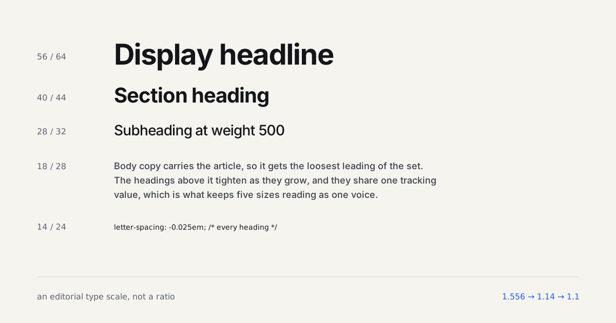
A client once sent me a dashboard screenshot with a single complaint: "it looks like a wall of numbers." Nothing was technically wrong. Every metric was labeled, every table aligned to a grid, every chart had a legend. It just had zero typographic hierarchy, so nothing told the eye where to land first.
That's the core challenge of dashboard typography. You're not writing a headline and a paragraph. You're managing forty numbers competing for the same half-second of attention.
TL;DR: Dashboard typography needs tabular numerals for column alignment, a tight type scale (roughly 12-20px), and weight-based hierarchy since size alone runs out of room fast. Nielsen Norman Group's dashboard research emphasizes that users scan dashboards to make quick, time-sensitive decisions, not to read line by line (Nielsen Norman Group, 2026).

Why Do Data-Dense Dashboards Need a Different Type Scale?
Editorial typography optimizes for sustained reading. Dashboard typography optimizes for scanning under time pressure, a user glancing at a monitoring screen needs to catch an anomaly in seconds, not absorb a paragraph. That changes almost every typographic decision: line length rules go out the window because most dashboard text sits in short table cells, not flowing paragraphs, and the type scale needs far more granularity at the small end than a marketing site ever would.
A blog's type scale might jump from 16px body to 32px H1 in three or four steps. A dashboard often needs six or seven steps crammed between 11px and 24px, because captions, secondary labels, table values, card labels, and section headers all need to sit distinctly apart from each other in a much tighter range.
What Are Tabular Numerals and Why Do They Matter Here?
Most typefaces ship with proportional numerals by default, a 1 narrower than an 8, which is fine in a sentence and genuinely bad in a table. Turn on tabular numerals with font-variant-numeric: tabular-nums and every digit gets identical width, so a column of dollar figures or percentages lines up without a single pixel of manual nudging (MDN Web Docs, 2025).
.metric-value {
  font-variant-numeric: tabular-nums;
  font-feature-settings: "tnum" 1;
}
I add this rule to every dashboard project on day one now. It used to be something I'd notice missing during a late-stage QA pass, misaligned numbers in a table that otherwise looked finished, and fixing it early costs one line of CSS instead of a review cycle. The same declaration is what stops a counting figure from changing width on every frame, which the animated stats cards piece covers.
A dashboard's job is to answer a question in under three seconds. Typography either helps that happen or it's just decoration on top of a spreadsheet.
How Small Can Dashboard Text Go Before It Breaks?
12px is the practical floor for anything a user needs to read reliably, and I push back hard when a design pushes secondary labels to 10px or 11px to fit more on screen. Dashboards rarely need body text above 14px, the density is the point, but shrinking past 12px trades a layout problem for an accessibility one. If a screen genuinely can't fit everything at a readable size, that's an information architecture problem, not a typography problem: collapse a rarely-checked metric behind a toggle instead of shrinking every label to compensate.
What Type Scale Actually Works for Dashboard Hierarchy?
Here's a scale I've used across several data-heavy client projects, tuned for a tight vertical range:
| Level | Size | Weight | Use |
|---|---|---|---|
| Caption | 11px | 400 | Timestamps, helper text |
| Label | 12px | 500 | Table headers, card labels |
| Value | 14px | 400 | Standard metric values |
| Value emphasis | 16px | 600 | Key metric on a card |
| Section header | 18px | 600 | Panel and widget titles |
| Hero metric | 24px | 700 | The one number the page exists to show |
Weight carries more of the hierarchy load than size here, because size alone runs out of visual room once you're packing dozens of values onto one screen. These same density constraints show up across dashboard layout patterns generally, and typography is the layer that either reinforces or undermines the grid decisions made there.

How Does This Differ Between a Dashboard and an Admin Panel?
Dashboards prioritize glanceable metrics; admin panels prioritize dense, editable data grids where users spend longer, more deliberate sessions. Admin UI typically needs slightly larger row heights and a marginally looser scale than a monitoring dashboard, because users are reading and editing many fields per session rather than glancing at one number. Our SaaS admin panel layout guide covers the layout side of that distinction in more depth, including how table density and typography interact once inline editing enters the picture. Push the glance further, to a tablet on a wall read from two meters away, and the rules in designing for wall-mounted tablets take over.
Getting typography right on a dashboard rarely feels exciting. Nobody screenshots a tabular-nums fix for their portfolio. But it's the difference between a dashboard someone trusts at a glance and one they have to double-check every time.
Build this grid yourself
Type density and grid density are the same decision made twice. Build the layout below at the density you actually have, then put the metric sizes from this article into it: 24px values in a tile that spans three columns read as confident, and the identical 24px in a tile spanning one reads as a mistake.