I've designed nine dashboards over the past five years. The first three were bad. Not ugly-bad, functionally bad. Users couldn't find the data they needed, navigation confused them, and I kept hearing the same feedback: "Where do I go to see X?" This covers modern approaches and patterns, emphasizing web apps and SaaS products.
Dashboards fail when designers treat them as data murals instead of tools. A dashboard isn't a report. It's a cockpit. Every element needs to earn its pixel space by helping someone make a decision or take an action.
TL;DR: The strongest dashboard pattern in 2026 combines sidebar navigation (240-280px), a card-based metric strip (4-6 KPIs), and a flexible content grid using CSS Grid with
auto-fill. Prioritize information density over whitespace, dashboard users are power users who want data, not breathing room.

Why Do Most Custom Dashboards Feel Worse Than SaaS Tools?
Because SaaS products like Linear, Stripe, and Grafana have iterated on their dashboards through thousands of user sessions. They've stripped away decoration and optimized for task completion. Custom dashboards usually get designed once, by someone who hasn't watched real users click through them under pressure.
The gap comes down to three things: navigation predictability, information density, and load state handling. Strong visual hierarchy ties all three together. Miss any of these and you'll build a dashboard that looks great in Figma and frustrates everyone in production.
What Navigation Pattern Works Best for Dashboards?
Sidebar. Full stop. And I'll defend that opinion because I've tried the alternatives.
Top navigation works for marketing sites with 5-7 pages. Dashboards have 15-40 sections. A horizontal nav either truncates into a hamburger menu (defeating the purpose) or creates a second tier of tabs. Both options add clicks and hide features.
The sidebar pattern used by Linear, Vercel, and Notion works because:
- It's always visible, users never wonder "how do I get back to X"
- It accommodates nested sections cleanly (collapsible groups)
- It leaves the full viewport width for content
- It collapses to a 64px icon rail on smaller screens
Sidebar implementation specs
I use these measurements on every project:
- Expanded width: 256px (16rem), fits most labels without truncation
- Collapsed width: 64px (4rem), icon + tooltip on hover
- Section headers: 12px uppercase, #6B7280, 24px top margin
- Nav items: 36px height, 12px horizontal padding, 8px border-radius
- Active state: background fill at 8% primary color opacity, left 3px border accent
- Transition: 200ms ease-in-out width change, no content reflow
That 36px item height is intentional. It's smaller than the 44px mobile touch target because dashboard sidebars are a desktop pattern. Mouse users are precise enough for 36px. Bump it to 44px if you're supporting tablet.

How Should You Structure the Metric Strip?
The top 80-120px of a dashboard's content area is prime real estate. Don't waste it on a welcome message. Put your 4-6 most actionable KPIs there.
Stripe's dashboard does this well, four cards showing total revenue, charges, payouts, and disputes. Each card has a number, a trend indicator (up/down arrow with percentage), and a sparkline. That's it. No labels like "Total Revenue for the Current Period", just "Revenue" with a number and a trend.
What makes a good metric card:
- One primary number, large, 28-32px, high contrast
- One comparison, vs last period, target, or benchmark (14px, secondary color)
- One visual, sparkline, mini bar, or trend arrow. Not all three
- Card size: 200-280px wide in a CSS Grid row with
auto-fill, minmax(200px, 1fr)
Here's my unpopular take: most metric cards show too much context. If I need to explain what "MRR" means to a dashboard user, that user shouldn't be on this dashboard. Keep labels short. Provide a tooltip for the confused newcomer rather than cluttering every card with explanatory text.
What Content Grid Pattern Handles Mixed Content?
Below the metric strip, dashboards need to display tables, charts, lists, and detail panels. CSS Grid with named areas is the cleanest approach for layouts that shift between viewport widths.
I've standardized on a 12-column grid with 24px gutters for dashboard content. It maps well to common layouts:
- Full-width table:
grid-column: 1 / -1 - Chart beside a data table:
grid-column: span 7+span 5 - Three equal cards:
grid-column: span 4each - Sidebar detail panel:
grid-column: span 4pinned right, contentspan 8left
Why not Flexbox? Flexbox works for single rows but fights you when cards need to align vertically across rows. Grid's auto-rows with minmax(200px, auto) keeps everything aligned without JavaScript calculations. If you're choosing between Grid and Flexbox for your own layouts, our CSS layout patterns breakdown covers the tradeoffs in detail.
Container queries (supported in all major browsers since February 2023) finally let dashboard cards adapt to their container width instead of the viewport. A chart card at 600px shows the full legend. At 300px, it hides it. This matters when users resize panels or use dashboards on different monitors.
How Do You Handle Empty and Loading States?
Skeleton screens. Not spinners. Stripe, Linear, and Notion all use content-shaped placeholders that pulse with a shimmer animation, a smart use of motion to communicate state changes. Keep that loading shimmer visually distinct from any AI-processing indicator; the designing for Apple Intelligence guide explains why Apple reserves its shimmer outline strictly for active AI work rather than generic loading states. For designers who also create motion content outside dashboards, the motion design for social media guide covers how the same timing and attention principles apply to short-form video. This technique reduces perceived load time by 20-30% compared to spinner-only approaches, according to research from the Lukew archive and confirmed by Google's Web Vitals team.
Here's what I've learned the hard way: you need three states for every dashboard component:
- Loading: skeleton placeholder matching the component's layout
- Empty: illustration + single sentence + CTA ("No invoices yet. Create your first invoice.")
- Error: red/amber banner with retry button, not a full-page error screen
I once shipped a dashboard where error states showed a generic "Something went wrong" modal that blocked the entire page. One flaky API endpoint made the whole dashboard unusable for 45 minutes. Component-level error boundaries would have isolated the failure to one card while the rest kept working.
For teams implementing these patterns in React, the React Server Components with TypeScript guide on Coding Dunia covers how to structure dashboard data fetching at the component level - each card streams in independently, error boundaries scope cleanly to the card, and loading states are easier to model. It pairs directly with the three-state design pattern above.

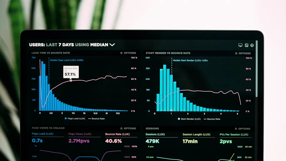
Should You Build Custom Charts or Use a Library?
Use a library. Specifically, use one that respects your token system. Building custom SVG charts sounds fun until you're debugging a tooltip z-index issue at 11pm on a Friday.
My current stack for dashboard charts:
- Recharts for React projects, declarative API, good default styling, 40KB gzipped
- Chart.js 4 for lightweight needs, canvas-based, 65KB gzipped, handles 10K+ data points
- Apache ECharts for complex dashboards, heavier (400KB+) but handles geographic data, 3D, and massive datasets
One thing every chart library gets wrong: default colors. The built-in palettes usually fail WCAG contrast requirements on white backgrounds. Always override chart colors with your design system's semantic palette. I test every chart combination against Sim Daltonism to verify deuteranopia and protanopia accessibility. If you're still building that palette from scratch, this color palette generator with contrast checks compares Coolors, Adobe Color, and Realtime Colors specifically for UI use.
What Makes Dashboard Tables Actually Usable?
Tables are the workhorses of dashboards. And most of them are terrible. Here's what separates a functional data table from a decorative one:
- Fixed header on scroll, position: sticky, z-index: 10, background: solid (no transparency)
- Row height: 48-52px for comfortable scanning, 36-40px for dense data views
- Column alignment: left-align text, right-align numbers, center-align status badges
- Sort indicators: visible on the active column, subtle arrows on other sortable columns
- Pagination vs infinite scroll: use pagination for data people reference ("page 3, row 7"). Use infinite scroll for feeds nobody bookmarks
I've shipped tables with both TanStack Table (React) and AG Grid. TanStack gives you full control but requires more setup. AG Grid works out of the box for enterprise-grade features like column pinning, row grouping, and Excel export. Pick based on how much customization your design needs. If your team is migrating data fetching off REST hooks, the TanStack Query + TypeScript guide on Coding Dunia covers the server-state side that pairs naturally with TanStack Table.
Responsive tables on dashboards? Don't overthink it. Most dashboard users are on 1366px+ screens. A horizontal scroll with a fixed first column handles the rare tablet user. Don't stack table rows into cards unless mobile is a primary use case.