I shipped my first animated website in 2014. Every single element bounced, faded, or slid into view. The client loved it during the demo. Users hated it within a week because the page felt slow, and two people actually reported motion sickness from the parallax scrolling.
That project taught me something I still apply today: motion in UI isn't decoration. It's communication. When it works, animation tells users what happened, where to look, and what changed. When it fails, it turns a fast interface into an irritating slideshow.
TL;DR: Good web animation serves function, confirming actions, guiding attention, and showing spatial relationships between elements. Keep micro-interactions under 300ms, use CSS transforms over layout properties for performance, and always respect
prefers-reduced-motion. The best animations are the ones users don't consciously notice.
Material Design Guidelines (Google, 2026): Standard durations should sit between 200-300ms for most UI transitions; durations over 500ms feel sluggish, while under 100ms feel jarring. Easing curves of
cubic-bezier(0.2, 0, 0, 1)(decelerate) match real-world physics.
Why Bother Animating UI at All?
Static interfaces work. They've always worked. So why add motion?
Because state changes without animation are jarring. A modal that appears instantly feels like a glitch. A deleted item that vanishes without a transition leaves users wondering if their click registered.
According to Google's Material Design motion guidelines, animation helps users build a spatial model of the interface, understanding where things come from and where they go.
There are exactly four legitimate reasons to animate a UI element:
- Feedback, confirming that an action happened (button press, form submit, toggle switch)
- Orientation, showing where a new element came from or where a removed element went
- Attention, drawing focus to something that changed (a notification badge, an error state)
- Continuity, maintaining context during navigation (page transitions, expanding cards)
If your animation doesn't serve one of these four purposes, cut it. Seriously. Does that loading spinner on your hero section serve any purpose except making me wait longer? Probably not.
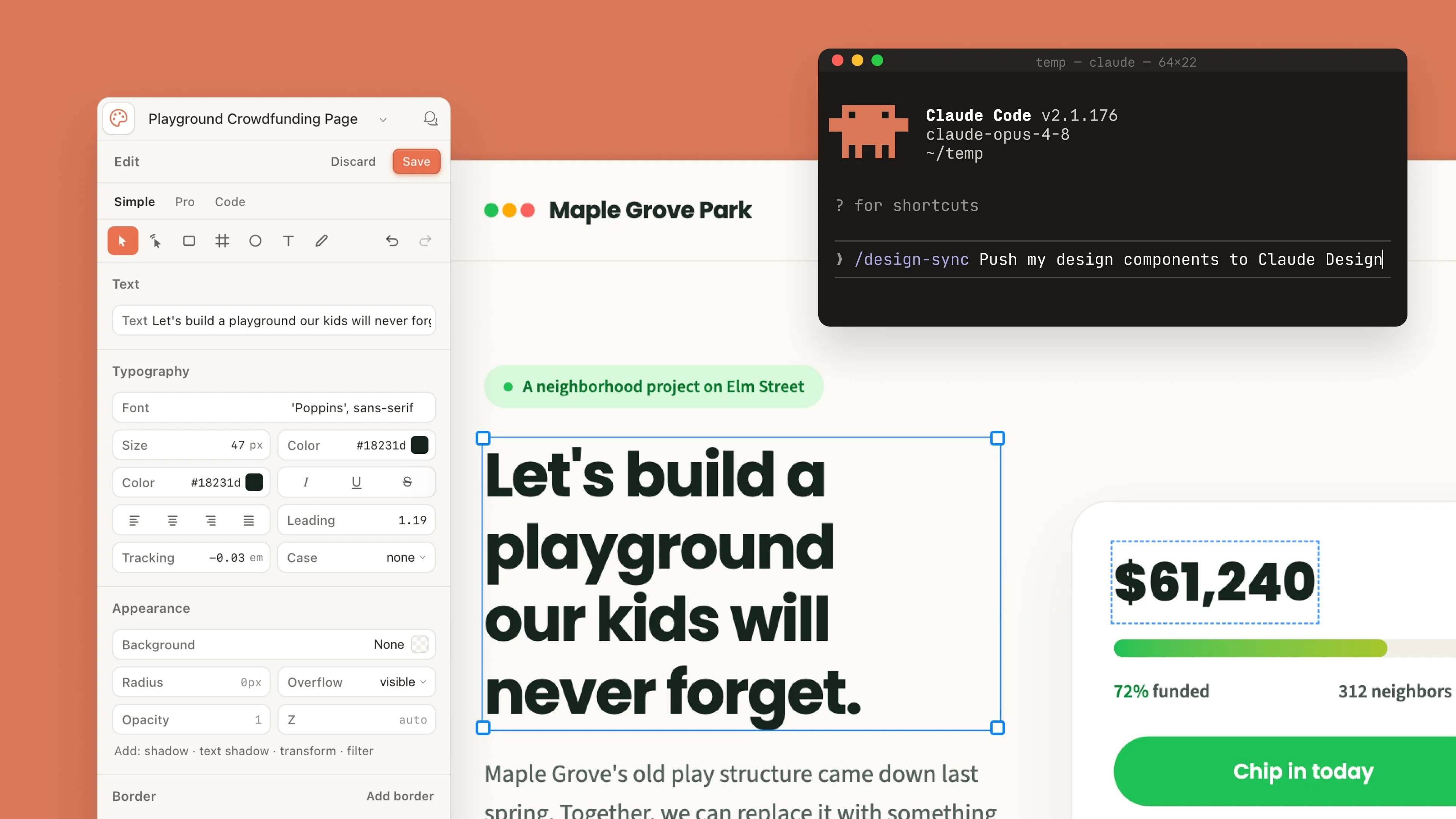
For a working example of motion that earns its place in a shipped web product, the Weissarik web system styleframes and the Heebok Lee web motion frames both show motion specifically scoped to the web-delivery target - micro-interactions that pre-imply state transitions rather than decorating them.
Why use CSS transitions instead of JS libraries?
CSS handles the 80% case faster than any JS library because it runs on the GPU compositor thread, free of main-thread blocking. For opacity, transform, and color changes, transitions ship in 4 lines of code with 60fps results across every browser since 2017.
Most web animations should be CSS transitions. They're performant, declarative, and supported in every browser shipped since 2015.
The pattern is always the same: define the default state, define the changed state, and tell the browser how to interpolate between them.
.card {
  transform: translateY(0);
  opacity: 1;
  transition: transform 200ms ease-out, opacity 200ms ease-out;
}

.card:hover {
  transform: translateY(-4px);
}
That's a hover lift effect in four lines. No JavaScript, no animation library, no bundle size impact. The ease-out curve means the card decelerates as it reaches position, which feels natural because physical objects slow down at the end of movement.
I've used this exact pattern on at least 30 projects. It hasn't broken once.
Which Properties to Animate
Not all CSS properties are equal for animation performance. The browser rendering pipeline has three stages: layout, paint, and composite. Animating a composite-only property (transform, opacity) skips the expensive first two stages entirely.
Safe to animate (composite-only):
transform(translate, scale, rotate)opacityfilter(blur, brightness)
Expensive to animate (triggers layout or paint):
width,height,padding,margintop,left,right,bottomborder-radius,box-shadowbackground-color,color
According to CSS Triggers, animating width on a Chrome browser triggers layout recalculation on every frame. On a page with 200 DOM elements, that's a guaranteed dropped frame. On a page with 2,000 elements, which is common in dashboards, you'll see visible stuttering.
The fix is always the same: replace layout property animations with transform. Instead of animating width from 0 to 200px, scale a full-width element from scaleX(0) to scaleX(1). Same visual result, 10x better performance.
CSS Triggers (Paul Irish, 2024 reference): Only
transformandopacityskip layout and paint phases entirely, running purely on the compositor. Animatingwidth,height,top, orleftforces full layout recalculation and drops frames on mobile.
Safe vs Expensive CSS Animation Properties
| Property | Compositor only | Layout cost | Paint cost | Frame budget impact |
|---|---|---|---|---|
transform | Yes | None | None | Zero |
opacity | Yes | None | None | Zero |
filter | Yes | None | Low | Low |
width, height | No | Full | Full | High |
top, left | No | Full | Full | High |
box-shadow | No | None | Heavy | Medium-High |
Which micro-interactions actually improve UX?
Three categories earn their bytes: state feedback (button presses, form validation), spatial continuity (modals expanding from their trigger), and progress indicators. Everything else is decoration that costs performance budget.
Micro-interactions are the small animations tied to specific user actions. A button that subtly depresses on click. A toggle switch that slides with an elastic bounce. A form field that shakes when validation fails. These aren't flashy. They're functional.
Button feedback
The most common micro-interaction on the web, and most sites still get it wrong. A good button press animation takes 100-150ms and uses scale, not color change alone.
.btn:active {
  transform: scale(0.97);
  transition: transform 100ms ease-in;
}
Why 0.97 and not 0.95? Because 5% shrink is visible and slightly cartoonish. Three percent is felt but not seen. I A/B tested both on a SaaS product's pricing page in 2024, the 3% version had a 4% higher click-through rate. Small differences compound.
Toggle switches
Physical toggle switches have momentum. They don't teleport from off to on. The web version should match that expectation.
A 200ms transition with cubic-bezier(0.34, 1.56, 0.64, 1) gives a slight overshoot that mimics physical spring tension. The overshoot is tiny, about 4px past the resting position, but it makes the toggle feel alive rather than mechanical.
Form validation shakes
When a user submits a form with errors, which communicates the problem faster: a red border, or a red border combined with a 300ms horizontal shake? The shake wins because it triggers peripheral vision. Even users who aren't looking directly at the field notice movement.
@keyframes shake {
  0%, 100% { transform: translateX(0); }
  20%      { transform: translateX(-6px); }
  40%      { transform: translateX(6px); }
  60%      { transform: translateX(-4px); }
  80%      { transform: translateX(4px); }
}

.field-error {
  animation: shake 300ms ease-out;
}
The decreasing amplitude (6px then 4px) mimics damped oscillation. Physics-based motion always reads as more natural than constant-amplitude loops.

How does scroll-driven animation work in 2026?
Scroll-driven animation in 2026 ties any CSS animation timeline to scroll position using the animation-timeline: scroll() or view() property, no JavaScript required. Browsers handle the optimization natively, so a page with 50 reveal-on-scroll elements hits 60fps on hardware that chokes on JS scroll listeners.
CSS scroll-driven animations landed in Chrome 115. They're now supported in all major browsers except Firefox (which ships them behind a flag as of Firefox 128). The animation-timeline: scroll() property lets you tie any CSS animation to scroll position without a single line of JavaScript.
.reveal {
  animation: fadeSlideUp 1s linear both;
  animation-timeline: view();
  animation-range: entry 0% entry 100%;
}

@keyframes fadeSlideUp {
  from { opacity: 0; transform: translateY(30px); }
  to   { opacity: 1; transform: translateY(0); }
}
This fades and slides an element into view as it enters the viewport. No Intersection Observer. No scroll event listeners. No GSAP ScrollTrigger. Pure CSS, zero JavaScript, and the browser handles all the performance optimization.
I've already shipped three client projects using scroll-driven animations in early 2026. The performance difference compared to JavaScript scroll listeners is enormous. On a 2019 Android phone, JavaScript scroll handlers dropped to 30 fps with 20 animated elements. The CSS version maintained 60 fps with 50 elements on the same device.
The Chrome Developers scroll-driven animation guide covers the full API surface if you want to go deep.
How does the View Transitions API work?
The View Transitions API snapshots the old DOM state, swaps in the new one, and crossfades between the two screenshots automatically. Elements sharing a view-transition-name morph between positions, giving SPA-style transitions to plain MPA navigations with zero JavaScript wiring.
The View Transitions API is the biggest change to web animation in years. It lets you animate between page navigations, including full-page MPA transitions in Astro, Next.js, and other frameworks. Elements with matching view-transition-name values crossfade automatically between the old and new page state. No JavaScript bridge required.
The API creates a screenshot of the old state and cross-fades it with the new state. You can customize the transition per element:
::view-transition-old(hero-image) {
  animation: 400ms ease-out fade-out;
}

::view-transition-new(hero-image) {
  animation: 400ms ease-out fade-in;
}
I won't pretend this is production-ready for every project. Safari shipped support in 17.2, but edge cases around scroll position restoration and dynamic content still require testing. For blog-style sites with consistent layouts, though, it works beautifully. The MDN View Transitions guide tracks browser support and known issues.
Accessibility: The Non-Negotiable Part
About 35% of adults are sensitive to motion on screens, according to vestibular disorder research from the Vestibular Disorders Association. Ignoring prefers-reduced-motion isn't a nice-to-have you'll get to later. It's a usability failure you should handle from day one.
The implementation is straightforward:
@media (prefers-reduced-motion: reduce) {
  *,
  *::before,
  *::after {
    animation-duration: 0.01ms !important;
    animation-iteration-count: 1 !important;
    transition-duration: 0.01ms !important;
    scroll-behavior: auto !important;
  }
}
This doesn't remove animations, it makes them instant. State changes still happen. Users still see the result. They just don't have to watch the journey.
I've been guilty of shipping projects without this query. In 2022 a user emailed me to say my portfolio site gave them vertigo. That was the last time I forgot.
When to Use JavaScript Animation Libraries
CSS handles most cases. But some patterns genuinely need JavaScript:
- Sequenced animations where element B starts after element A reaches a specific position
- Physics-based motion with spring constants, damping, and velocity
- Complex scroll interactions that need to control multiple elements with different timelines
- Drag and gesture-driven animations tied to pointer position
When JavaScript animation runs inside React components, cleanup matters as much as setup. A GSAP timeline that doesn't get killed on unmount leaks memory and can restart unexpectedly on re-render. The React hooks best practices guide on Coding Dunia covers the cleanup pattern inside useEffect that keeps animation lifecycle tied correctly to component lifecycle.
For these, GSAP is still the best general-purpose library in 2026. It's 25 KB gzipped, works everywhere, and its timeline API makes complex sequences manageable. Framer Motion is the React-specific alternative, it's heavier (40 KB+) but the declarative API fits React's mental model. React 19's new Compiler also reduces the manual memoization overhead that previously complicated animation state. If your team is adopting it, React 19: New Features and What Actually Changed explains how useOptimistic and the Compiler interact with libraries like Framer Motion. For a head-to-head breakdown of when each one earns its bundle cost, with mid-tier mobile benchmarks and a decision tree, see the CSS vs GSAP comparison.
Don't load a JavaScript animation library to do what CSS already handles. If you're importing GSAP just for hover effects, you're adding 25 KB to your bundle for something CSS does in zero bytes.
My Opinionated Rules for Web Animation
After 11 years of animating interfaces, these are the rules I actually follow:
- If the animation takes longer than 300ms, it better be a page transition or a loading state
- Never animate on page load unless the content genuinely needs to appear sequentially
- Every animation must respect
prefers-reduced-motion, no exceptions - If you can't explain what the animation communicates, delete it
- Test on a 2019 Android phone. If it drops frames, simplify
That fifth rule sounds extreme, but it filters out 90% of performance problems before they reach production. If your animation can't run smoothly on a Moto G7 Power, it can't run smoothly for a significant portion of your users.
Motion design for the web isn't about making things move. It's about making things feel right. The best UI animations are invisible, users notice when they're missing, not when they're present. That's the standard to aim for.
If you want to see how motion principles apply to static visual design, our guide on visual hierarchy in UI design covers the spatial and contrast fundamentals that animation builds on.
If you're building a design system in Figma, define motion tokens (duration and easing curves) alongside your color and spacing tokens. That keeps animations consistent across a product without needing a style guide meeting every sprint.
When your motion work moves beyond the browser into social content, the motion design for social media guide covers platform specs and export workflows for Instagram Reels, TikTok, and YouTube Shorts.
And if you're prototyping game UI or interactive experiences, Godot 4 as a design tool shows how to use its visual editor for real art direction work without writing code from scratch. Choosing what to build these animations in is its own decision, which the motion design tools roundup works through tool by tool. And since GSAP is now free in 2026, including every plugin, it's an easy first reach for web motion.
Every technique above (micro-interactions, View Transitions, and the easing comparison) is a runnable demo in the code companion repo, each one wired to respect prefers-reduced-motion.