TL;DR: Godot 4.7 gives visual designers a free game engine with real art direction tools: a theme editor that behaves like a token system, Control nodes with anchors instead of breakpoints, MSDF font rendering, and a visual shader graph. AI coding tools bridge the gap between design specs and working GDScript, turning styleframes into playable prototypes.
Why should designers care about Godot?
Most game engines feel like they're built for engineers. Unity buries UI behind component hierarchies. Unreal expects you to tolerate Blueprint spaghetti or learn C++. Godot is different, and the difference starts with what it costs you to open it.
Godot ships under the MIT license with no royalties, no subscription, and no per-seat fee (Godot Engine). Compare that to the alternatives on a designer's actual budget line.
| Tool | License | Cost | Royalty model |
|---|---|---|---|
| Godot 4.7 | MIT open-source | Free | None, ever |
| Unity Pro | Proprietary | $210 per seat per month, annual plan | Runtime Fee cancelled September 2024, seat-based again |
| Unreal Engine 5 | Proprietary | Free to start | 5 percent revenue share on games |
| Figma | Proprietary SaaS | $16 per full seat per month | Not applicable, it's a design tool |
That Unity row is worth reading carefully, because the internet still hasn't caught up with it. The per-install Runtime Fee that caused the 2023 uproar was cancelled outright on 12 September 2024, and Unity went back to seat-based pricing. If somebody is still recommending Godot to you purely on Unity's install fee, they're arguing about a policy that no longer exists.
The real draw isn't the price anyway. It's the node-based scene system that mirrors how we already think about visual hierarchy and layout composition. Every UI element is a node. Nodes nest inside other nodes. Properties cascade downward. Sound familiar? I've spent eight months using Godot for game UI prototyping, and it's reshaped my entire design process.
Which Godot version should you build on in 2026?
Start on Godot 4.7, stable since 18 June 2026 and at 4.7.2 since 16 August. The reason this needs saying: a large share of the Godot tutorials you'll find were written for 4.3, which is now two years and four minor releases behind.
| Version | Released | Where it stands |
|---|---|---|
| 4.3 | 15 Aug 2024 | What most written tutorials still target |
| 4.4 | 3 Mar 2025 | |
| 4.5 | 15 Sep 2025 | |
| 4.6 | 26 Jan 2026 | Still fine for UI work |
| 4.7 | 18 Jun 2026 | Current stable, 4.7.2 as of 16 Aug 2026 |
Release dates from Godot's published release history. The drift between 4.3 and 4.7 hits designers hardest in exactly the two panels we live in: the theme editor and the visual shader graph. Menus moved, node names changed, defaults shifted. Concepts carry over cleanly. Click paths mostly don't. So read the old tutorial for the reasoning and keep the current docs open for the buttons.
If you're mid-project on 4.5 or 4.6, stay there and finish. Upgrading a live project between minor versions costs more attention than it returns, and nothing in the UI toolchain since 4.5 is worth breaking a milestone for.
How does Godot's Theme Editor work for UI designers?
A Theme resource is a design token system that lives inside the engine. Define colors, fonts, font sizes, margins, and StyleBox resources in one file, and every Control node in the project inherits them, exactly the way component tokens work in Figma.
A StyleBox is Godot's box model. Set background color, corner_radius (their term for border radius), border width, content margins, and shadow. Create one StyleBoxFlat resource, assign it to your theme, and every Button, Panel, and LineEdit picks it up instantly. Change it once, and every screen updates.
Why does that matter more than it sounds? Because you can swap entire visual identities by switching theme files. Dark mode is a different theme. A high-contrast accessibility mode is another. I've built prototypes carrying three complete visual directions and let stakeholders toggle between them mid-session, clicking real buttons. Static mockups lie about how 16px of padding feels at 60 fps.
One naming trap worth clearing up, because it eats hours: your game's Theme resource and the Godot editor's own theme are unrelated things. The Theme resource ships inside your build and styles what players see. The editor theme lives under Editor > Editor Settings > Interface > Theme and only skins the application on your machine. When a tutorial's screenshots look nothing like your window, that's usually somebody's custom editor theme, not a version difference.
Which Control nodes and layout containers should designers learn first?
Learn VBoxContainer, HBoxContainer, GridContainer, and MarginContainer. Those four cover roughly 80 percent of UI compositions, and the anchor system handles responsive scaling without media queries or breakpoint hacks.
Godot's Control nodes map directly onto concepts from web motion and layout. VBoxContainer stacks children vertically. HBoxContainer goes horizontal. GridContainer works like CSS Grid with fixed columns. MarginContainer adds padding around its children. The full container hierarchy and inheritance rules live in the official Godot UI tutorials, worth bookmarking the moment you start.
Anchors do the scaling. Set a panel's anchors to full_rect and it stretches with the viewport. Pin a health bar to the top-left with preset anchors and it stays put whether you're running at 1920x1080 or 2560x1440. I've tested this across five resolution targets, including the Steam Deck's 1280x800, without a single layout break once the anchors were right.
How do you get crisp text at every size with MSDF fonts?
Import your .ttf or .otf, tick "Multichannel Signed Distance Field" in the import dock, set the MSDF pixel range to 8, and one font file renders sharply from 14px body copy to 72px splash headers. No separate size variants, no re-import when a headline grows.
MSDF stores glyph outlines as a distance field rather than a bitmap, so the GPU reconstructs sharp edges at any scale. The practical payoff for a designer is that your type scale stops being a technical negotiation. You pick sizes because the hierarchy needs them, not because someone baked an atlas at three fixed sizes.
Two things I learned the hard way. A pixel range of 8 is a good default, but very thin display faces want more, and heavy slabs are fine with less. And MSDF is worth turning off for genuine pixel fonts, where you actually want the hard bitmap edges and nearest-neighbour filtering that distance fields are designed to smooth away.
If you've spent hours on font pairing decisions, you'll appreciate previewing combinations at real render quality with no export step. My go-to game UI pairing: Inter for interface text (free, nine weights plus italics, drawn for screens at small sizes) and Space Grotesk for titles. Don't use more than two typefaces. Three is chaos.
Why use Visual Shaders for game UI effects?
Visual Shaders let you build animated backgrounds, gradients, dissolves, and glow effects by connecting nodes on a graph. The engine compiles that graph to GPU code, and it runs at full hardware speed in your prototype. No GLSL required.
Drag a color uniform here, connect a noise texture there, multiply them, and you've got a procedural fire effect. For UI work the useful outputs are animated backgrounds, gradient overlays, dissolve transitions between screens, and glow on focus states. I prototyped a set of menu transitions that would have taken a shader programmer days, and built them in one afternoon by rewiring node connections.
Because the shader runs on the GPU, your prototype performs exactly like the final game. That matters when someone asks whether it'll really look like this in the build. It already does.
One strong opinion: Godot's 2D rendering pipeline produces cleaner results than Unity's for pixel art and flat UI styles. Pixel snapping works, sprite filtering doesn't smear edges, and you're not fighting the engine for crisp visuals. Not everyone agrees, and I've shipped in both engines, but the difference is visible.
For a sense of where in-game art direction lands when a team chases cinematic quality, the Batman: Arkham Knight frames and the Destiny opening cinematic stills are both useful reference points. Both shipped at AAA scale with the mood-and-color discipline you can reproduce inside Godot's 2D pipeline given the right shader work.
Which AI tools fit a Godot art workflow?
Claude Code is the strongest fit right now for turning plain-language design specs into GDScript. Roughly 70 percent of what it produces runs without edits, which still beats learning GDScript from zero or queuing behind a developer's pull request.
Describe the thing you drew. "Panel node, 600x200 pixels, centered, RichTextLabel using Inter 16px, TextureButton anchored bottom-right with 12px margin." You get code to paste into Godot. Does it work every time? No. The failures are usually API drift, a method that moved between minor versions, which is another reason to know which version you're on.
The workflow I've settled on: build static layouts by hand in the visual editor, then hand off interaction logic, hover states, transitions, and animation triggers. You stay in design-brain mode. The AI handles syntax.
How do you set up your first Godot art direction project?
Download Godot 4.7, create a project, set the viewport to 1920x1080 with canvas_items stretch mode, then build a Theme resource before you place a single element. That order matters: theme first, layout second, content third.
Godot arrives as a single executable. No installer, no account, no license activation. Create a project, then set your viewport under Project > Project Settings > Display > Window and change the stretch mode to canvas_items so UI scales proportionally instead of pixel-doubling.
Create the Theme resource next. Define the palette before anything else exists on screen: background, surface, primary, secondary, text, accent. Add your font imports with MSDF enabled. Set base sizes, 14px body, 18px subheading, 24px heading, 32px display. Those aren't universal rules, they're the starting points I keep returning to across projects.
Then build the first screen with Control nodes. PanelContainer for the main surface, VBoxContainer for content flow, HBoxContainer for navigation rows. Apply the theme and everything inherits your art direction automatically.
Animation timing rules for game UI
Game UI animation runs on different rules from web UI. Players are in an active mental state, focused and reacting, and they're impatient with anything that slows the feedback loop. A 400ms modal that feels considered on a SaaS dashboard feels broken between combat rounds.
Entrance animations: 150-200ms max. Opening a pause menu or inventory panel should feel instant.
Feedback animations: 80-120ms. Button presses, item pickups, health changes. These need to be faster than web hover states, because the input-to-feedback gap is what players read as responsiveness.
Transition animations: 200-250ms between screens. Longer is fine during loading, where a pause is expected. Not during active play.
Idle and ambient animations: 1-3 second loops for HUD breathing effects, background patterns, status indicators. They add life without interrupting flow.
Godot's Tween node handles all of it. Use TRANS_QUART or TRANS_CUBIC easing rather than LINEAR for most UI moves, since linear motion reads as mechanical. I bind every UI animation to a single Autoload singleton so the timing constants live in one file instead of scattered across scenes.
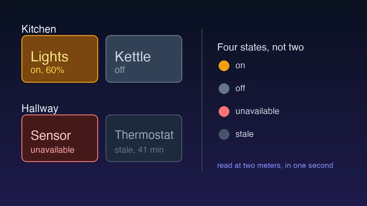
One more thing: mute your speakers and test. Your UI should communicate state through motion and color alone before any sound design lands on top. If it looks broken in silence, it is broken.
A styleframe is a promise. A playable build is proof.
Export to HTML5 and run the prototype in a browser. Show it to people. A styleframe is a promise, a playable build is proof, and that difference matters more than any annotation ever will.