An 8pt Spacing Scale for Long-Form Article Layouts
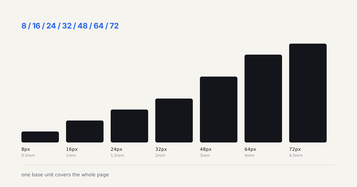
Seven spacing steps from one 8px base cover a whole article page:...
Category · 21
Modern CSS gave us grid, flexbox, container queries, and far fewer excuses for a broken layout. This section breaks down layout patterns that actually ship, when to reach for each one, and how to keep a design responsive without drowning in media queries.
Grid or flexbox? Container queries or breakpoints? The answer is usually both, and the interesting part is knowing when. This category collects layout patterns that hold up on a real phone, not just a design canvas: subgrid for editorial pages, intrinsic sizing that survives long German words, and the dashboard structures that don't collapse at 320px. Every pattern ships with the CSS, the trade-off, and a note on browser support so you can use it Monday.
Most layout advice online assumes a clean, evenly-spaced design comp, and then falls apart the moment real content, a long headline, an unexpectedly tall image, a translated string, shows up. We write from the other direction: start with the messy content case and build a layout that survives it. That means real coverage of container queries versus media queries and when each one actually solves the problem better, intrinsic and fluid sizing with clamp() instead of a pile of breakpoints, and CSS Grid patterns like subgrid and named lines that keep editorial or dashboard layouts aligned without a wrapper div for every alignment tweak.
We also cover the parts that get skipped in most layout tutorials: what happens at 320px on an older Android phone, how a layout behaves with the OS text-size setting cranked up, and where flexbox is still the simpler, more honest tool even when grid feels like the fashionable choice.
Editorial coverage of web layouts for motion designers, art directors, and UI designers working with modern interface design. You'll find in-depth articles and step-by-step tutorials here. Each piece below was written by a working designer, peer-reviewed for accuracy, and links out to the primary source: the designer's portfolio, the original release notes, or the relevant studio site. We do not run sponsored articles or take payment for placement.
Newest articles appear first. Browse the 21 pieces below, or open the main archive for a full chronology across all categories. The designers index covers attributed work, and the styleframes gallery surfaces individual frames pulled from longer reels.
An 8pt Spacing Scale for Long-Form Article Layouts
Seven spacing steps from one 8px base cover a whole article page:...
Card-Based UI Layouts: Grids, Masonry, and Feed Patterns
Card-based UI layouts explained: when grids, masonry, or feed patterns fit your...
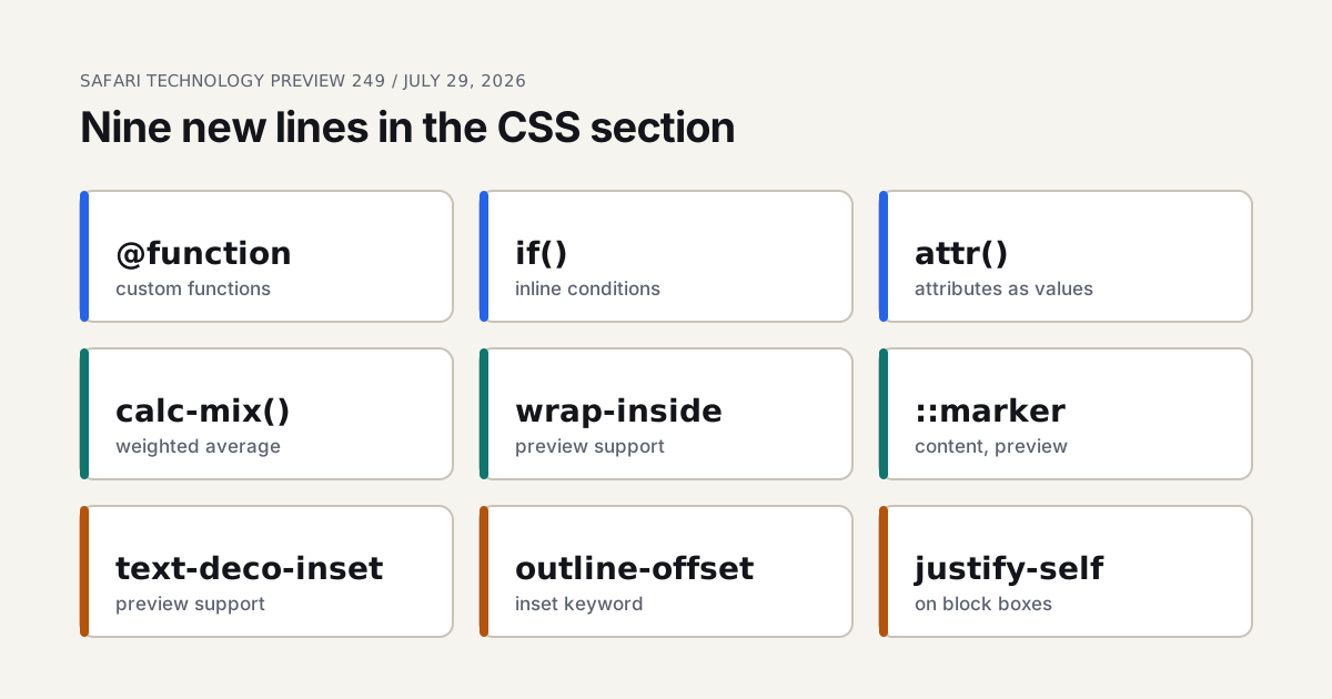
Safari Technology Preview 249: Nine New CSS Features
Safari Technology Preview 249 lists nine new CSS features, from @function and...
Safari 27 Stable Shipped 83 Features, Not the Beta's 58
Safari 27 stable shipped 83 features against the beta's 58. Scroll anchoring,...
Responsive Breakpoints Strategy: Beyond Mobile-First
Container queries beat fixed breakpoints for real component design. Here is a...
Safari 27 Beta: 58 Features and the Six That Matter
Safari 27 beta shipped 58 features. Customizable select, transform-aware anchoring and the...
Admin Panel Layouts: Advanced SaaS Dashboard Patterns
Advanced admin panel UI patterns for data-heavy SaaS tools: dense data tables,...
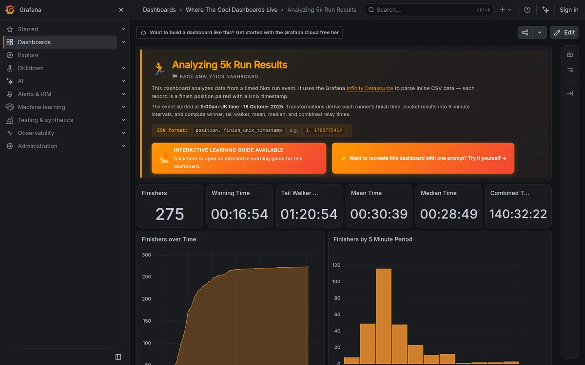
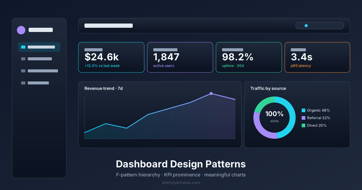
Modern Dashboard Design: 5 Real Examples You Can Open
Five modern dashboards you can open right now without a login: Plausible,...
Safari 26.6 Is A Bug Fix Release Designers Should Read
Safari 26.6 shipped one WebAssembly tweak and eight bug fixes. Three are...
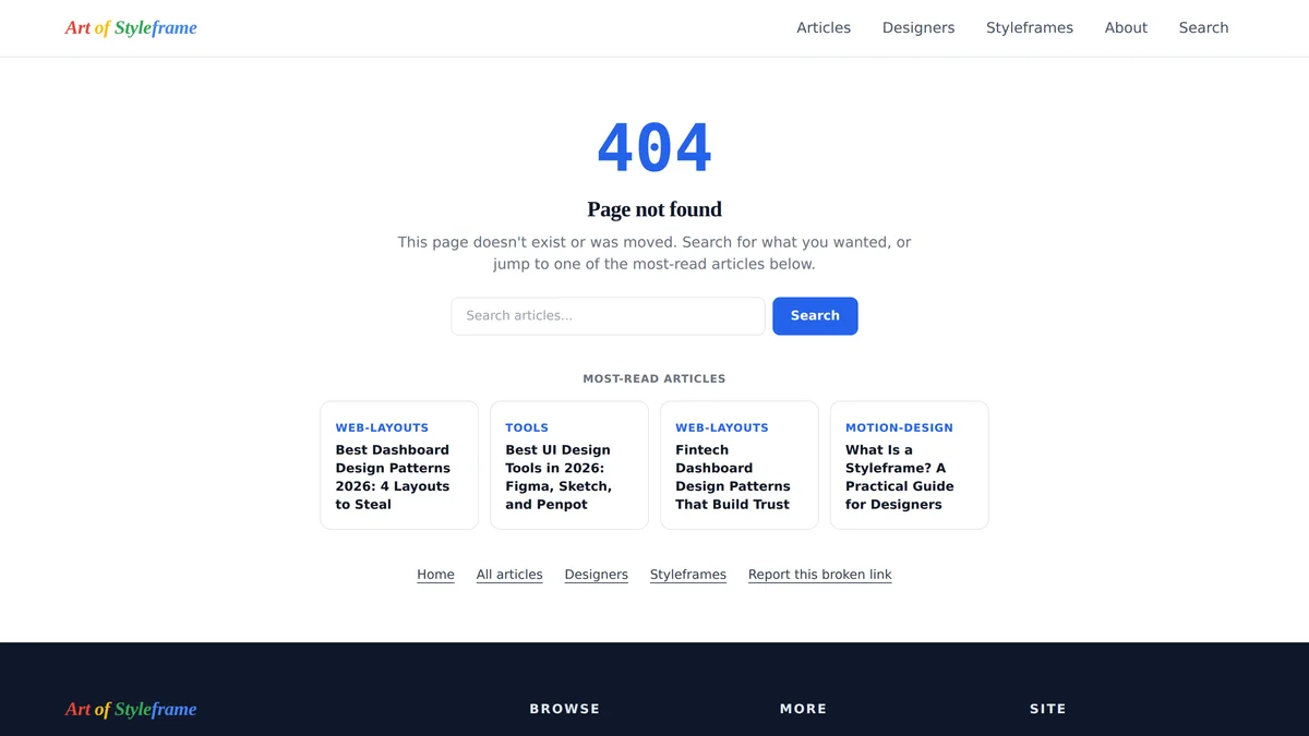
Empty States and Error Pages: Designing the Edge Cases
How to design empty states, 404 pages, and error screens as first-class...
Common SaaS Landing Page Layout Patterns That Convert
A reference breakdown of the hero, social proof, and pricing teaser blocks...
Pricing Page Layouts That Actually Convert in 2026
Top-quartile SaaS pricing pages convert at 6.5-12% versus a 2.8% average, and...
Dashboard Dark Mode: Patterns That Survive Real Use
Dashboard dark mode patterns that survive real use: chart color tokens, shadow-free...
Dashboard Data Density Patterns: How Much Is Too Much
Dashboard data density patterns: comfortable vs compact row modes, when dense tables...
Fintech Dashboard Design Patterns That Build Trust
Fintech dashboard design patterns: gain/loss color coding, numeric precision, staleness indicators, and...
Mobile Navigation Patterns: Tab Bars, Drawers, Gestures
A visible tab bar beats a hidden hamburger menu for primary navigation...
E-commerce UI Patterns: Product Pages That Convert
Sticky add-to-cart bars can lift conversion, yet mobile still converts below desktop...
Dashboard Design Patterns by Industry: A Practical Roundup
Dashboard design patterns compared across healthcare, logistics, POS, and HR software, with...
Dashboard Charts: How to Pick the Right Chart Type
Dashboard chart selection: line versus bar versus sparkline, real chart-library tradeoffs, and...
Modern Dashboard UI: 2026 Design Trends and Layouts
The 2026 dashboard patterns Linear, Stripe and Vercel all ship: a 256px...
CSS Layout Patterns in 2026: Grid, Flexbox, or Bento?
CSS Grid vs Flexbox vs Bento layouts compared. When to use each,...