A client once showed me a dashboard with fourteen different chart types spread across one screen, line charts, radar charts, a gauge, two pie charts, and something that resembled a heat map only if you squinted. Nobody on the team could tell me what the radar chart was supposed to communicate. It looked impressive in the pitch deck and told users nothing.
Chart selection isn't a design preference, it's a translation problem: turning a specific question into the visual format that answers it fastest. This guide covers the decisions that actually matter, when each chart type earns its place, and the color and sizing rules that keep a chart honest. For the broader layout decisions that surround these charts, see our dashboard design patterns for web apps guide. For finished layouts these charts actually sit inside, the modern dashboard design examples are the reference. When you get to the grid those charts sit on, the dashboard grid generator hands you the column and gutter values instead of making you guess them.
TL;DR: Match the chart to the question, not the other way around. Line charts for trends over time, bar charts for category comparison, sparklines for compact trend indicators next to a number, and skip pie charts past three or four slices. Never let color alone carry the meaning.
What Question Is Each Chart Type Actually Answering?
Every chart on a dashboard should trace back to one specific question a user is trying to answer. Nielsen Norman Group's data visualization research is blunt about this: charts chosen for visual variety rather than communication clarity consistently underperform simpler formats in comprehension tests (Nielsen Norman Group, 2024).
| Chart type | Best question it answers | Avoid when |
|---|---|---|
| Line chart | How has this changed over time? | Comparing unrelated categories |
| Bar chart | How do these categories compare right now? | More than 8-10 categories |
| Sparkline | Is this trending up or down at a glance? | Precise values matter |
| Stacked bar | How does a total break into parts, over time? | More than 4-5 segments |
| Scatter plot | Is there a relationship between two variables? | Non-technical audiences |
| Pie chart | What's the simple split between 2-3 things? | More than 4-5 slices |
Why Do Sparklines Punch Above Their Size?
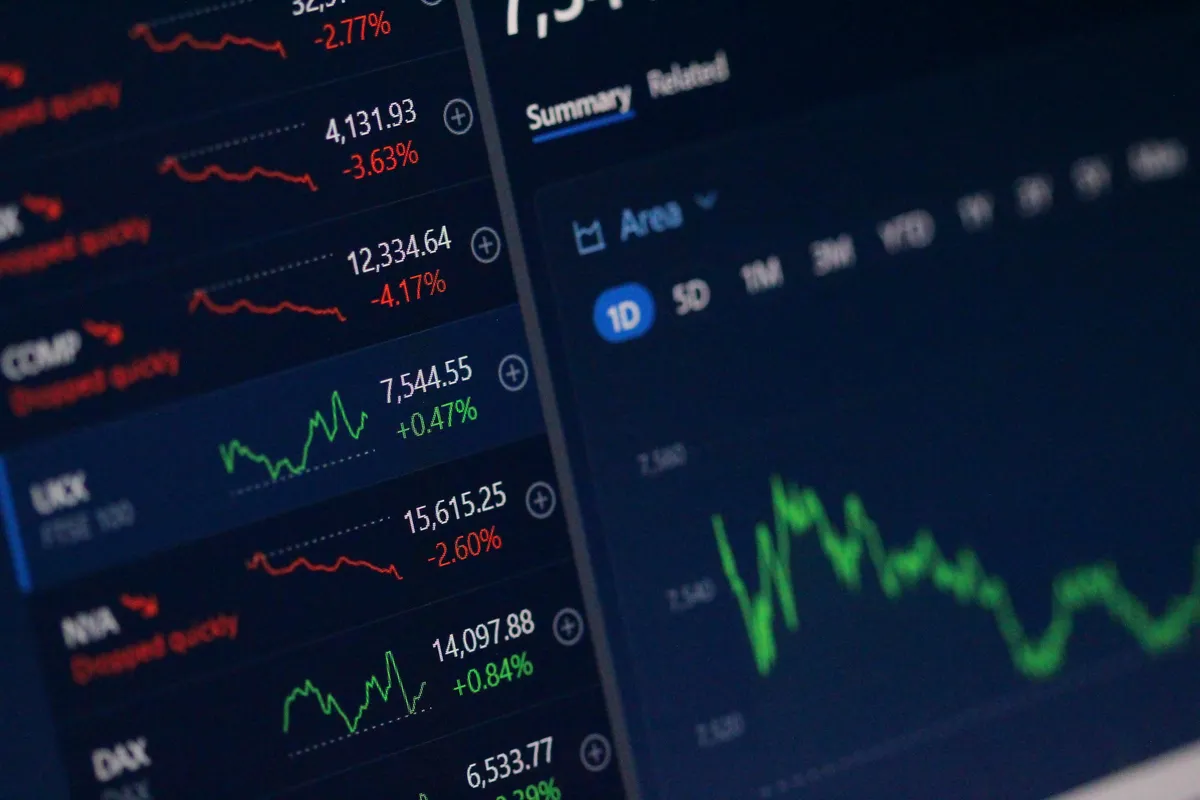
Because they answer the fastest question a dashboard user asks: is this good or bad, and is it getting better or worse? A sparkline next to a metric card number does that in under a second, without forcing the eye to leave the card and hunt for a separate chart section.
I pair every KPI card that supports it with a sparkline, revenue, active users, error rate, and I keep them deliberately tiny, no axis labels, no gridlines, just the shape of the trend and maybe one highlighted endpoint dot. The moment a sparkline needs a legend to be understood, it's failed its one job.
A sparkline's job is showing direction, not precision. The moment it needs a legend, something's gone wrong.

How Should Color Work Across Dashboard Charts?
Consistently, and never as the only signal. Pick one color per metric and use it everywhere that metric appears, revenue is always the same blue whether it's on a line chart, a bar, or a metric card, so users build pattern recognition across the whole dashboard instead of relearning a color key on every screen.
Building that one-color-per-metric set is easier from a fixed palette than from ad hoc picks. I start in the color palette generator and assign metrics to the swatches it produces.
Roughly 8% of men have some form of red-green color vision deficiency, which is exactly the split most dashboards lean on for gain/loss or good/bad signals (W3C WCAG 2.2, 2023). Pair every color-coded chart element with a redundant signal, an icon, a pattern fill, or explicit text, so the chart still communicates correctly in grayscale. I run every dashboard chart palette through a colorblindness simulator before shipping, and I've caught real failures that way: charts where two adjacent bars were functionally identical to a colorblind viewer.

When Does a Chart Library Beat Hand-Rolled SVG?
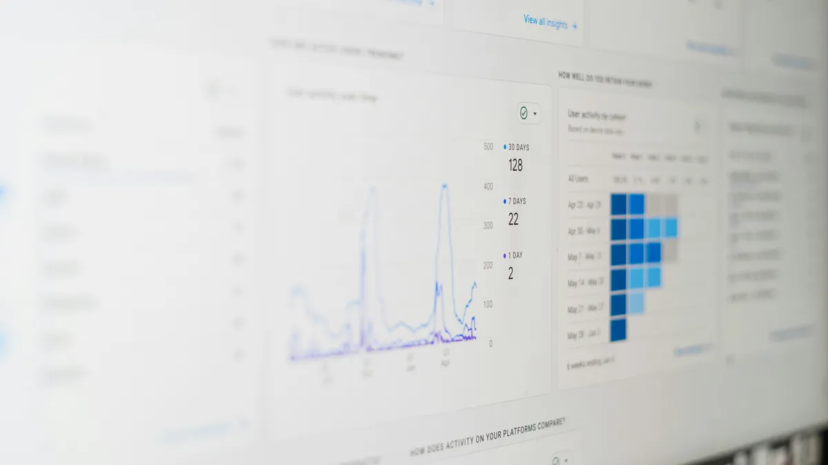
The moment users need to interact with the data rather than just glance at it. Hover tooltips, zoomable time ranges, toggleable series, and touch-friendly interaction targets are all solved problems in mature libraries like Recharts and Chart.js, and reimplementing them means rebuilding accessibility and edge-case handling that a library already spent years refining.
For static charts, a sparkline that never changes state, a simple comparison bar, hand-rolled SVG wins on load weight and gives full control over exact pixel rendering. I default to hand-rolled for anything under about five data points with no interaction, and reach for a library the moment a user needs to do something with the chart beyond looking at it.
I switched a client's dashboard from a heavyweight charting library to hand-rolled SVG for six static sparklines last year, and page weight dropped by roughly 140KB, enough to shave a noticeable chunk off first load on a slow connection. Nobody hovering over a sparkline that never had a tooltip in the first place ever noticed the difference. That's the tell I look for now: if a chart's interaction model has been unused for months, it's not earning the library dependency it's costing the page.
Where Does Good Chart Selection Break Down?
At the edges, mostly. The rules above hold until your data misbehaves, and then they need judgment. Take a line chart with gaps. A monitoring dashboard I worked on plotted API response time every 5 minutes, and whenever the collector died for half an hour, the library helpfully drew a straight line across the gap. That line was a lie. It implied smooth latency during a window where we had no idea what happened. We switched to a dashed segment with a small "no data" marker, and the on-call engineers stopped chasing phantom recoveries.
Scale mismatch is the second trap. Plotting revenue at 4.2 million alongside refunds at 3,100 on one axis flattens the smaller series into the baseline. A dual axis feels like the fix and usually isn't, because two axes let a chart imply any correlation you want just by choosing the ranges. I split them into two stacked charts sharing an x-axis instead. Uglier, honest, and nobody misreads it.
Then there's the small-sample problem. A bar chart of conversion rate by traffic source looks authoritative even when one bar represents 9 visitors and another represents 40,000. If a category's sample is under roughly 100, I either show the raw count next to the percentage or drop the category into an "other" bucket. Percentages without denominators are how dashboards launder noise into strategy. My blunt opinion after years of this: a chart that hides its sample size is worse than no chart, because it hands someone false confidence they'll act on in a meeting.
Would swapping your busiest chart for a plainer format actually lose information, or just lose spectacle? If it's the second one, make the swap. The best dashboard chart is the one a user reads correctly in the two seconds they actually spend looking at it.