Last spring a client asked me to turn their entire blog archive into a card grid because a competitor's site "felt more modern." Three hundred posts, every one crammed into an identical 340px box. The archive page took forever to feel navigable, and half the cards fought for attention with the exact same visual weight as the other half.
That's the trap with cards. They're the pattern everyone reaches for, and almost nobody stops to ask whether the content actually wants to be a card.
TL;DR: Cards work best when content chunks are genuinely comparable in shape, not just similar in topic. Masonry suits uneven, image-heavy content. Uniform grids suit scannable items of similar length. Nielsen Norman Group's research found list view often beats card view for direct comparison tasks, even when cards look nicer (Nielsen Norman Group, 2026).
When Is a Card Actually the Right Container?
A card earns its spot when three things are true at once: the item has a visual anchor (a photo, an icon, a thumbnail), a short label that stands alone without extra context, and roughly the same importance as its neighbors. Product tiles qualify. So do blog previews, recipe cards, and team bios.
Cards fall apart when items vary wildly in length. Cram a two-sentence summary and a four-paragraph excerpt into cards of identical height and you get one of two bad outcomes: aggressive truncation that hides the useful part, or empty white space that makes the short card look broken. I've shipped both mistakes. Neither is fixable with more CSS, it's a content-model problem wearing a layout costume.
What's the Real Difference Between Masonry and a Uniform Grid?
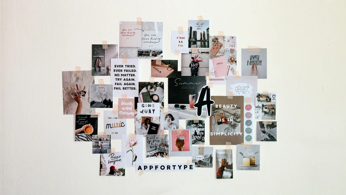
Uniform grids force every card into the same height. Masonry lets each column stack items at their natural height, so a tall product photo sits next to a short one without a gap. The tradeoff is scanning speed: masonry's ragged bottom edge is great for visual browsing, Pinterest boards, photography portfolios, mood collections, but genuinely worse for comparison tasks where users expect items to line up.
I built a masonry gallery for a styleframe portfolio site last year specifically because the source images had wildly different aspect ratios, some 16:9, some near-square. Forcing them into a uniform grid would have meant cropping every image, and cropping was not an option the client would accept. Masonry solved a real content constraint there. It would have been the wrong call for their pricing page three clicks later, where every plan needed to feel equally weighted.
Whichever you pick, keep the gutters and the internal card padding on one scale rather than eyeballing each value. The spacing scale generator spits out that ladder in a few seconds.
A card layout is a promise that every item deserves equal attention. Break that promise and the grid feels broken even when the CSS is flawless.
How Should a Feed Pattern Handle Mixed Content?
Feeds, the single-column, infinite-scroll pattern you know from social apps, solve a different problem: chronological or algorithmic ordering where width doesn't need to vary. A feed card can still have a photo, a headline, and metadata, but it reads top to bottom instead of left to right and down.
The mistake I see most: teams build a feed for content that isn't actually sequential. A resource library where every item is equally relevant regardless of publish date doesn't want a feed, it wants a filterable grid. Ask whether "newest first" is genuinely the right default sort before defaulting to a feed just because it's familiar.

What Goes Wrong When Everything Becomes a Card?
Two failure modes, over and over. First, the "everything is equally important" trap: a homepage with 20 identical cards gives users zero hierarchy cues, so they bounce because nothing tells them where to start. Second, the crawlability trap: rendering the whole card set client-side with no server-rendered fallback means search engines never see the links inside those cards at all. Real anchor tags, not div click handlers, and a server-rendered first page fix that second one outright.
Is your card grid actually earning its layout, or did you pick it because it's what everyone else does? That question alone has saved me from a few bad rebuilds.
How Do You Choose Between Grid, Masonry, and Feed?
Start from the content, not the aesthetic. Comparable items of similar shape: uniform grid. Genuinely uneven visual content: masonry. Chronological or ranked single-stream content: feed. The underlying CSS for all three usually comes from the same Grid and Flexbox primitives covered in our CSS Grid and Flexbox guide, the pattern decision sits one layer above the code.
Whichever you land on, size the cards against the container they sit in rather than the window: a card grid in a sidebar and the same grid full-bleed want different column counts at the same viewport width, which is the whole argument in our responsive breakpoints strategy.
One thing I'd push back on: don't let a client's competitor audit dictate this decision. "Their site uses cards" isn't a content requirement, and I've had to say that out loud in more meetings than I'd like to admit.
| Pattern | Best for | Weakness |
|---|---|---|
| Uniform grid | Comparable items of similar shape: product tiles, pricing cards | Forces cropping or awkward truncation on uneven content |
| Masonry | Genuinely uneven visual content: photography, mood boards, Pinterest-style galleries | Ragged edges hurt comparison tasks |
| Feed | Chronological or ranked single-stream content | Wrong choice when items aren't actually sequential |