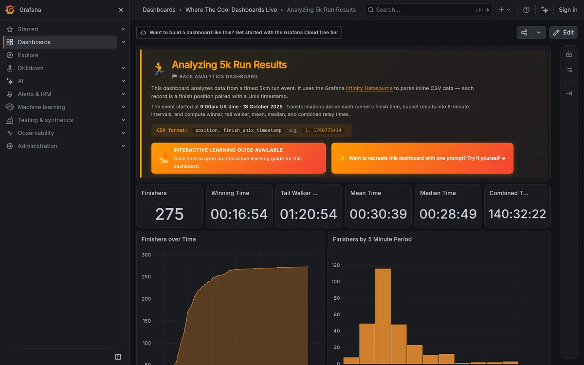
I built a dashboard card component in 2024 with the standard three breakpoints, mobile, tablet, desktop. Then a client dropped that exact card into a narrow sidebar widget, and it broke instantly. Text overflowed, the icon overlapped the label, the whole thing looked like a bug report screenshot. The viewport was desktop-sized. The card just wasn't.
That's the blind spot in fixed breakpoint thinking: it assumes a component's context matches the browser window. It rarely does anymore, not with dashboards, CMS blocks, and widgets that get dropped into wildly different layouts on the same page.
TL;DR: Fixed viewport breakpoints can't account for a component's actual rendered width. Container queries fix that: 41% of developers have used them at least once, up from awareness of 81% in 2024 to 86% in 2025 (State of CSS 2025), and browser support has been baseline since 2023.

Why Do Fixed Breakpoints Keep Breaking on Real Projects?
Because a fixed breakpoint asks the wrong question. It asks "how wide is the browser window?" when the question that actually matters is "how wide is this specific component right now?" A card in a full-width hero section and the same card in a 280px sidebar live at completely different effective widths, on the exact same device, in the exact same browser session. Mobile-first design solved the small-screen-up ordering problem years ago. It never solved the reusable-component problem, because that problem didn't really exist until component libraries and CMS-driven layouts became the default way teams build.
I used to work around this with JavaScript resize observers, manually toggling classes based on an element's getBoundingClientRect() width. It worked. It was also fragile, added a layout thrash risk, and meant every component carried its own bespoke measurement logic. Nobody wants to maintain that at scale.
What Do Container Queries Actually Fix?
Container queries let a component respond to the width of its containing element instead of the viewport. You mark a wrapper with container-type: inline-size, name it if you want to target it specifically, then write @container rules that fire based on that container's rendered width.
.card-wrapper {
  container-type: inline-size;
  container-name: card;
}

@container card (min-width: 320px) {
  .card {
    display: grid;
    grid-template-columns: 96px 1fr;
  }
}

@container card (max-width: 319px) {
  .card {
    display: flex;
    flex-direction: column;
  }
}
Drop that same .card into a sidebar, a modal, or a full grid column, and it adapts on its own. No JavaScript, no per-page overrides, one rule that travels with the component wherever it gets used.
| Media queries | Container queries | |
|---|---|---|
| Responds to | Browser viewport | Containing element's width |
| Owns | Page-level layout shape, sidebar presence | Component-level adaptation |
| Best for | Overall structure | Reusable components (cards, nav items, form rows) |
Should You Rewrite Your Whole Breakpoint System Right Now?
No, and I'd push back hard on anyone telling you to. Media queries still do the job at the page level, layout shape, navigation pattern (the mobile navigation patterns guide covers the tab-bar versus drawer call), whether a sidebar exists at all. Rip those out and replace them with container queries and you've just made your codebase harder to reason about for no real gain. The right split is boring: page-level structural decisions stay in media queries, component-level adaptation moves to container queries. Most teams I've consulted for get the best results by migrating their three or four most-reused components first, cards, navigation items, form rows, and leaving everything else alone until there's a real reason to touch it.
How Do You Actually Plan a Breakpoint Strategy for a New Project?
Start at the page level with four viewport breakpoints, not eleven. Mobile at 375px, tablet at 768px, desktop at 1280px, and an optional wide catch above 1920px if your audience actually has ultra-wide monitors, check your analytics before you assume they do. That's the outer frame. Then, for anything that gets reused, a card, a stat block, or the tiers of a pricing page layout, wrap it in a container and let it manage its own internal layout with @container rules.
If you're building the numeric side of this, our free spacing scale generator produces a consistent token set for gaps and padding that holds up across both breakpoint types, so your container-query components and your page-level layout share the same rhythm instead of drifting apart. Container query length units (cqi, cqb) let font sizes and padding scale with the container too, which pairs naturally with the fluid typography clamp() approach most modern sites already use for page-level type. To see the resulting clamp() curve before you commit numbers, the clamp preview tool plots min, preferred and max across every viewport width.
Fixed breakpoints aren't dead, they're just no longer the whole strategy. Treat the viewport and the component as two separate, related problems, and stop trying to solve both with one set of numbers.