A familiar stylesheet has six separate media queries, each one nudging the hero H1 down by a few pixels for a slightly different breakpoint, and then a seventh for an oddball 834px iPad viewport nobody remembers testing. Replacing that stack with clamp() is the right move, but it's easy to set the minimum too aggressively. On an actual iPhone SE the body copy can shrink to something close to 13px and read like a legal disclaimer.
TL;DR: CSS clamp() replaces a breakpoint stack with one formula: minimum, preferred (viewport-relative), maximum. Global browser support sits at 94.2 percent (Can I Use, 2026), but an aggressive minimum can fail WCAG 1.4.4 text-resize checks well before you hit desktop widths.

How Does the clamp() Three-Argument Syntax Actually Work?
clamp() takes exactly three arguments, in order: a minimum, a preferred value, and a maximum. The browser picks whichever of the three keeps the result inside the min/max bounds.
h1 {
  font-size: clamp(1.75rem, 1.333rem + 1.667vw, 3rem);
}
Read that as: never go below 1.75rem (28px), never go above 3rem (48px), and between those two limits, scale using the middle expression. The middle argument is where the actual fluidity lives, it mixes a fixed rem value with a viewport-relative vw value, so the size grows as the browser window widens and shrinks as it narrows. Below the minimum viewport, you get the minimum. Above the maximum viewport, you get the maximum. In between, it's linear.
How Do You Compute the vw Coefficient for the Slope Formula?
This is the part most tutorials wave their hands at, so here's the actual math. Say you want body text to scale from 28px at a 400px viewport up to 48px at a 1600px viewport.
slope = (maxSize - minSize) / (maxViewport - minViewport)
slope = (48 - 28) / (1600 - 400) = 20 / 1200 = 0.016667
That slope is pixels of font size per pixel of viewport width. Multiply by 100 to convert it into a vw coefficient: 1.667vw. Next you need the y-intercept, the rem value the formula would produce at a viewport of zero:
yIntercept = minSize - (slope * minViewport)
yIntercept = 28 - (0.016667 * 400) = 28 - 6.667 = 21.333px = 1.333rem
Put those two numbers together and you get the exact expression from the code block above: clamp(1.75rem, 1.333rem + 1.667vw, 3rem). Check the math at both ends: at a 400px viewport, 1.333rem (21.33px) plus 1.667vw of 400px (6.67px) equals 28px, matching the minimum exactly. At 1600px, 21.33px plus 1.667vw of 1600px (26.67px) equals 48px, matching the maximum. That's the whole trick, it's just linear interpolation dressed up in CSS syntax.
| Viewport | Formula result | Matches |
|---|---|---|
| 400px (minimum) | 1.333rem + 1.667vw of 400px = 28px | Minimum bound |
| 1600px (maximum) | 1.333rem + 1.667vw of 1600px = 48px | Maximum bound |

What Happens When Your Minimum Size Is Too Aggressive?
This is a mistake many teams make. A clamp() minimum that looks fine in a design tool at desktop width can be genuinely unreadable once it actually renders on a 375px phone in someone's hand. Below 14px, even a well-built typeface starts failing for readers with mild low vision, and 16px is where most accessibility guidance draws the practical floor for anything meant to be read at length. Size is only half of it, though. Fluid type changes how many characters fit on a line at every viewport width, so a clamp() curve that behaves at both ends can still drift outside a usable line length in product UI somewhere in the middle.
There's a second, sneakier failure mode buried in the spec itself. Because clamp() with a vw component doesn't respond to browser zoom the way a plain rem value does, an aggressive max-to-min ratio can leave large text stuck at a size that never reaches 200 percent when a user zooms in, which is exactly the threshold WCAG Success Criterion 1.4.4 requires. The guidance from Smashing Magazine's accessibility review of fluid type puts a hard number on it: keep your maximum at or below 2.5 times your minimum, or the resize math stops adding up at certain viewport widths (Smashing Magazine, 2023).
A clamp() minimum that looks fine on your 27-inch monitor can be flat-out unreadable on the phone in someone's actual hand.

Is Browser Support Good Enough to Ship This Today?
Yes. CSS math functions, min(), max(), and clamp(), sit at roughly 94.2 percent global support as of this year's Can I Use data. Every evergreen browser has supported clamp() since 2020, and the gap is almost entirely older browsers your analytics likely show under half a percent of traffic. A fallback font-size declaration above clamp() is no longer worth writing. Is there a real reason left to avoid shipping this? I don't think there is.
Why Is clamp() Better Than a Framework-Specific Solution?
Because it isn't a framework feature at all, it's plain CSS, defined in the CSS Values and Units spec, and it works the exact same way whether you're hand-rolling a stylesheet, running Tailwind, or maintaining a component library in whatever framework replaces the current one in three years. No JavaScript resize listener, no ResizeObserver polyfill, no client-side hydration step to get the right font size on first paint. You write the declaration once and the browser's layout engine does the rest, on every device, before your JS bundle finishes parsing.
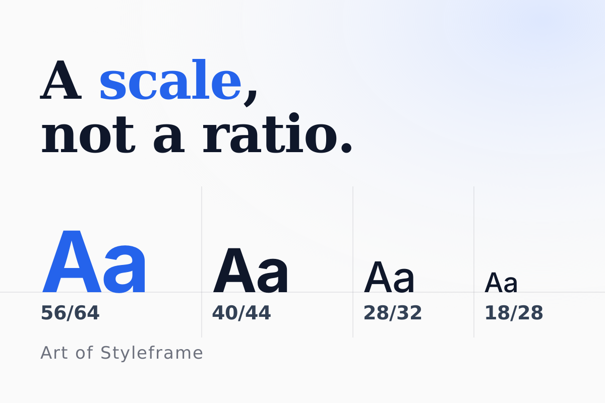
That's a genuinely underrated property. A media-query-only approach forces you to pick a number of "T-shirt size" breakpoints and hope your content fits neatly between them; clamp() has no such assumption. If you also use a modular type scale to generate your base sizes, apply clamp() to every step, not just headings. Our type scale calculator gives you the min and max values for each step, which is exactly what the two ends of a clamp() need, and the clamp() preview turns those two ends into the finished declaration. Body copy stuck at a fixed 16px while headings scale fluidly is its own kind of visual mismatch, and it's one I still catch in design reviews more often than you'd expect.
Run the numbers yourself
The arithmetic above is easy to follow and easy to get wrong by a decimal place. Put your own sizes in below and the tool hands you the finished declaration, then drag the viewport slider to see where the curve flattens. It also checks the two limits this article cites, the 16px floor and the 2.5x ratio, while you type.