I redesigned a client's blog template that read beautifully on mobile and felt exhausting on a desktop monitor. Same font, same size, same line-height. The only difference was that the desktop version let paragraphs stretch to the full 1400px container width. Capping it at 65 characters fixed the entire complaint without touching a single other style.
Line length is one of those variables that's invisible when it's right and exhausting when it's wrong, and most teams only ever notice the exhausting version.
TL;DR: Cap body text at 50-75 characters per line (66 is the cited sweet spot), pair it with 1.4-1.6 line-height, and base vertical spacing on multiples of that line-height.
max-width: 65chgets desktop body text into the right range with one CSS rule.


Where Does the 50-75 Character Rule Actually Come From?
Print typography, not screens. Robert Bringhurst's research into measure (the typographic term for line length) established the 50-75 character range decades before responsive web design existed, and eye-tracking studies since have supported the same range for on-screen reading (UXPin, 2026). 66 characters gets cited most often as the sweet spot within that range.
The mechanism is about the eye's return sweep, the movement back to the start of the next line. Lines under roughly 45 characters break reading rhythm with too many sweeps per idea; lines over 80 make each sweep less accurate, so readers occasionally lose their place. Novice readers do best around 45 characters per line; experienced readers can comfortably handle up to 80.
| Measure | What happens | Where it belongs |
|---|---|---|
| Under 45ch | Too many return sweeps; rhythm breaks up mid-idea | Narrow mobile columns, where it's unavoidable |
| 45-50ch | Comfortable for novice and younger readers | Education and accessibility-first reading |
| 65-66ch | The most-cited sweet spot | Your default for body copy |
| Up to 80ch | Fine for experienced readers, sweeps get less accurate | Documentation and long-form technical writing |
| Over 80ch | Readers start losing their place on the return | Nowhere for paragraphs; fine for short microcopy |
How Do You Actually Implement This in CSS?
One rule gets you most of the way there:
.post-body p {
  max-width: 65ch;
}
The ch unit is based on the width of the "0" character in the current font, so it scales automatically with font size and even shifts slightly between typefaces, unlike a fixed pixel width that would need separate tuning per font. On mobile, where the viewport itself is narrow, this rule mostly becomes a no-op since the natural container width already sits under 50 characters for most phone screens.
A blog post that reads fine on your phone can become a wall of text on your monitor if nothing caps the line width.
Baymard Institute's research on this same question lands in the same range and adds a practical note: e-commerce product descriptions and UI microcopy get a pass on strict measure discipline since they're usually short enough that line length barely matters (Baymard Institute, 2026). Save the discipline for actual paragraphs, not button labels.
What's the Relationship Between Line Length and Line-Height?
They interact. Longer lines need slightly more line-height because there's more horizontal distance for the eye to track back across on the return sweep. A line at the shorter end of the range, around 50 characters, reads fine at 1.4 line-height. Push toward 75 characters and 1.5-1.6 keeps the paragraph from feeling cramped.

I default to 1.6 for long-form article body text and drop to 1.4-1.5 for dense UI copy, table cells, form labels, anywhere vertical space is genuinely scarce and the text runs shorter anyway. For the fuller picture on pairing this with a type scale and responsive sizing, our web typography and font pairing guide covers the scale side of the same system.

What Is Vertical Rhythm, and Why Isn't Line-Height Enough?
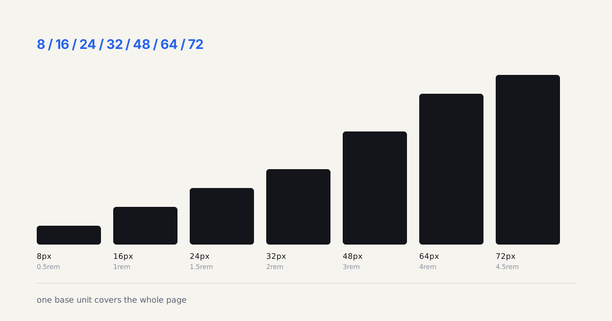
Vertical rhythm is the spacing between blocks, paragraph margins, heading margins, list item spacing, following the same baseline unit as your line-height, instead of whatever margin happened to look right at the time. If body line-height at 16px works out to roughly 25.6px per line, paragraph spacing that's also a multiple of that number (25.6px, 51.2px) keeps the page's vertical spacing feeling deliberate.
If you'd rather not do that arithmetic by hand, the spacing scale generator will derive the whole set of margin steps from a single baseline unit.
Skip this and you get interfaces that feel subtly off even when line length and line-height are each individually correct, the spacing between text blocks doesn't share a rhythm with the spacing inside them, and readers notice the inconsistency without being able to name it. Get the line length right first; the vertical rhythm follows from the same baseline math once you've picked it.
What Does a Correct Measure Look Like on a Real Page?
Here's one I measured rather than reasoned about. A production developer blog runs its article column at 628px with body text at 18px on a 28px line. That is 8 of 12 grid columns inside a 1280px container, minus 44px of padding on the left and 64px on the right, and it works out to 65 to 68 characters per line in a geometric sans. Nobody typed 65ch into that stylesheet. The grid produced it.
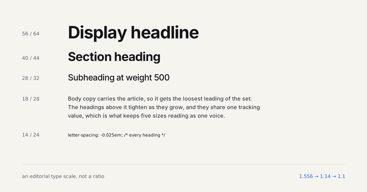
Two things about that page are worth copying. The line height is 1.556, not the 1.6 I default to, and it reads perfectly well because the measure sits at the short end of the range; a 75-character line at the same size would want the extra tenth. And the paragraph gap is 24px, which is not a multiple of the 28px line. The page doesn't fake a baseline grid. It picks one spacing unit for gaps and one for leading, and lets them be different numbers.
On a 390px phone the same column drops to 342px and about 38 characters per line, with the body size unchanged at 18px. That's below the 45-character floor in the table above, and it's fine, because a phone is held closer and read in shorter bursts. The rule that holds is the body size, not the character count.
Where Does the 65ch Rule Stop Working?
More often than the rule's fans admit. The ch unit measures the width of the zero glyph, and zero is not an average character. In a font with narrow figures and wide lowercase, 65ch can land at 78 actual characters of running text. Inter is reasonably well behaved here. A condensed grotesk is not, and I've measured the same 65ch container producing anywhere from 58 to 80 real characters depending on the typeface. Set the rule, then count characters in an actual paragraph once. If you're over 75, drop to 60ch and move on.
Language breaks it harder. German compound nouns and Finnish inflection push average word length up sharply, so a measure tuned for English leaves ragged holes when the same component renders a translation. If your product ships in more than three languages, test the longest one, not the shortest.
The rule also has no business inside a data table. Table cells, form labels, button text, badge copy, breadcrumb trails, none of these are paragraphs, and capping them at 65ch does nothing except occasionally wrap a label that should have stayed on one line. Measure discipline is for continuous reading. Everything else needs different rules entirely.
Vertical rhythm has its own edge case worth naming. The moment an image, a code block, or an embedded chart lands mid-article, the baseline grid breaks, because that element's height is whatever the content says it is rather than a multiple of 25.6px. Purists chase this with wrapper padding math. I've stopped. Reset the rhythm after the block instead of trying to preserve an unbroken grid through it, since readers perceive the spacing consistency within a run of paragraphs and genuinely do not notice a half-line offset across a figure. That's an opinion some typographers will hate, and I'll defend it: perfect grids cost hours and buy almost nothing on the web.
A quick way to audit an existing page: open DevTools, select a paragraph, and check its computed line-height in pixels. Then check the margin-bottom on that same paragraph and on the nearest heading above it. If neither margin is a clean multiple of the line-height, that's your drift, and it's usually the result of three different developers eyeballing spacing over a few years rather than one deliberate decision. Fixing it is almost always a global CSS variable swap, not a redesign, which is exactly why it's worth doing before you touch anything else on the page.
Build the scale while you read
Measure and leading are downstream of size, which is why this argument keeps circling back to the scale. Set your base below and watch the steps move together. A 56px headline at a body line height reads as separate sentences, and the fastest way to believe that is to generate the size and try it.