I spent a morning this month measuring the CSS of a developer blog I keep coming back to, the kind that looks like nothing happened and reads like everything did. Computed styles at 1440, 1024 and 390 pixels, every heading, every paragraph, every code chip. I expected to find a modular ratio underneath. There wasn't one.
What I found instead was five sizes, one tracking value and a line height that gets tighter the bigger the text gets. That's an editorial type scale, and it's a different animal from the ratio-driven scale most design systems ship.
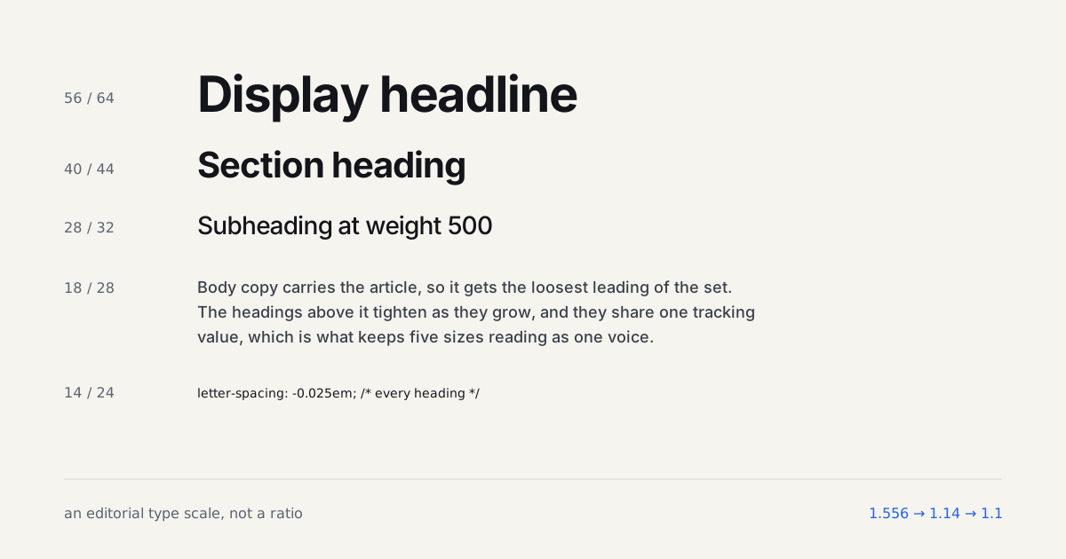
TL;DR: Long-form pages don't follow a ratio. The measured scale is 18/28 body, 28/32 subheading at weight 500, 40/44 heading, 56/64 display, with -0.025em tracking on every heading level and leading that drops from 1.556 to 1.1 as size climbs. Build the shape, not the numbers.
What Does the Measured Scale Actually Look Like?
Here's the whole thing, in pixels, as the browser rendered it on a desktop viewport.
| Role | Size / line height | Ratio to body | Weight | Tracking |
|---|---|---|---|---|
| Display (h1) | 56 / 64 | 3.1x | 700 | -0.025em |
| Heading (h2) | 40 / 44 | 2.2x | 700 | -0.025em |
| Subheading (h3) | 28 / 32 | 1.55x | 500 | -0.025em |
| Body | 18 / 28 | 1x | 500 | 0 |
| UI and captions | 16 / 24 | 0.89x | 500 | 0 |
| Code | 14 / 24 | 0.78x | 500 | 0 |
Look at the jumps. Body to subheading is 1.56x. Subheading to heading is 1.43x. Heading to display is 1.4x. Those aren't the same number, and they aren't meant to be. A modular scale would have forced them equal, and equal is precisely what a reading page doesn't want.
Why not? Because the reader's attention isn't evenly distributed. You live inside the body text. You glance at an h3. An h2 has to stop you, because it marks the moment the argument changes direction. So the step into h2 territory carries more weight than a ratio would grant it, and the step from h2 to h1 can relax, since a page only has one h1 and nothing competes with it.
On mobile the top two sizes drop: 48/52 for the h1 and 32/36 for the h2. Body stays at 18. That last part surprised me more than anything else in the measurement. Most sites shrink body copy on phones. This one held it, and the paragraphs on a 342px column still land at roughly 38 characters per line, which is short but nowhere near the point where reading rhythm falls apart.
Why Does Leading Tighten as Size Grows?
The line heights run 1.556, 1.14, 1.1, 1.14 from body upward. That's the opposite of what a single global line-height: 1.5 would do, and it's the single change that separates an amateur heading from a set one.
Butterick's guidance puts line spacing at 120 to 145 percent of the point size for body text (Practical Typography, 2026). At 18px on a screen you want the top of that range or a touch beyond it, which is where 28px sits. But apply 1.556 to a 56px headline and you get 87px lines. Two lines of that headline read as two separate statements with a gulf between them.
Big text needs less air because the eye isn't tracking across a long line and sweeping back. It's taking in a shape. A 40px heading at 44px leading is a shape. At 60px leading it's a list.
A headline at body line height doesn't read as a headline. It reads as two sentences that forgot to become a paragraph.
I've broken this rule myself, on a marketing page in 2024 where the design system had one --line-height token and nobody wanted to add a second. The hero looked fine in Figma at one line and fell apart the moment a long product name wrapped. We added --lh-tight the following sprint. It should've been there from day one.
Why One Tracking Value on Every Heading?
Every heading level in the measured scale carries letter-spacing: -0.025em. At 56px that's -1.4px. At 40px it's -1px. At 28px it's -0.7px. One declaration, three optically correct results, because em scales with the font size it's applied to.
This is the part that made me stop and re-check the numbers, since the usual advice is to hand-tune tracking per size. And you would, if you were setting pixel values. But a proportional value already is the hand-tuning. The bigger the glyphs, the more absolute space you remove, which is exactly what large sans-serif text wants: at display sizes the default sidebearings start to look loose, so you pull them in (Practical Typography, 2026).
Where does it stop working? Two places. Below about 20px, negative tracking begins to close the counters on letters like e and a, and legibility drops faster than density improves. That's why body text in the measured scale sits at zero. And all-caps labels want the opposite treatment, positive tracking around 0.04 to 0.08em, because capitals have no ascenders and descenders to create rhythm and need the gaps instead.
There's an accessibility angle too. WCAG 1.4.12 requires that content survive a user override of letter spacing to 0.12em without loss (W3C WAI, 2026). Negative tracking on headings is fine under that rule as long as the layout doesn't break when someone widens it, which in practice means no fixed-width heading containers and no white-space: nowrap on anything longer than two words.
Which Three Fonts Carry a Scale Like This?
The measured site runs three families, and the roles are more interesting than the names.
A geometric sans for body, in a variable cut. The specific font was Satoshi, which ships as a variable font with a weight axis from 300 to 900 and is free through Fontshare (Fontshare, 2026). Body copy sits at weight 500 rather than 400, which reads a hair darker on light backgrounds and holds up better on mid-range Android screens. Inter and Manrope would do the same job. The point isn't the brand, it's that the body face has to stay quiet at 18px for 2,000 words.
A grotesk display face for headings. Here the site used Rational Display, a commercial family with tight spacing and a slightly squarer skeleton than the body face. The contrast between the two is subtle, which is deliberate: the headings are the same genre as the body, just a firmer voice. If you want a free stand-in, Cabinet Grotesk or General Sans get close. Our font pairing guide goes deeper on why same-genre pairs age better than serif-plus-sans contrast on technical sites.
A monospace at weight 500 for code. IBM Plex Mono, at 14px over 24px, in both the inline chips and the code blocks. The 500 weight matters here for the same reason it does in body: mono fonts at 400 tend to look thin against a dark code panel. JetBrains Mono at 500 is the free alternative I'd reach for first.
Three families sounds like a lot. In practice the mono only appears in code, and the display face only above 28px, so at any moment the reader sees two. The heavier constraint is loading: three families with variable axes is 200 to 300KB of woff2 before subsetting, which is why font loading strategy becomes a first-class concern rather than an afterthought on a site like this.
How Does the Scale Behave in Dark Mode and at Small Sizes?
Honestly, I didn't measure a dark theme on this site because it doesn't have one. But the scale's shape tells you what would happen. Weight 500 body on a dark background reads heavier than it does on light, so the dark mode typography move would be to drop body to 450 and leave the headings alone. The variable font makes that a one-line change, which is one more argument for shipping variable fonts in the first place.
At the small end, the 14px code size is the floor. Nothing on the page went below it. The captions and metadata sat at 16, not 14, and the category labels at 14 in a bold weight. That's a discipline most blogs lose within a year, as somebody adds an 11px badge here and a 12px timestamp there.
Want a quick test for your own site? Open the inspector on a published post, select every element with text, and sort by computed font size. If you count more than six distinct values, the scale has leaked. Two of those extras will be a caption and a tag label that somebody set by eye. On the site I measured the list was exactly six long, and I checked three different articles to be sure it wasn't luck.
Where Does This Scale Go Wrong?
It's built for one column of prose with occasional code. Try to reuse it in a data-dense admin screen and the 18px body eats your row height while the 40px h2 has nowhere to live. That's the domain where a ratio-driven scale genuinely wins, and I'd rather have two small scales than one big compromise.
It also assumes a measure of around 630 to 660 pixels, which is where 18px lands at 65 to 68 characters per line. Stretch the column to 900px and the 28px leading is no longer enough; you'd need 30 or 32 to keep the return sweep comfortable. The line-length math and the scale are one system, and moving either one alone breaks it.
The last failure is the one I'd argue about with a design system team: the temptation to encode all of this as a ratio anyway, because tokens generated from a formula feel more rigorous. They aren't. A scale is a set of decisions about how a page is read. Five hand-placed numbers that came from looking at a real article are more rigorous than nine generated ones nobody has read at. If the token pipeline needs a formula, feed it the five numbers as constants and let it generate the rem conversions. That keeps the tooling happy without letting it make the typographic decision.
How Do You Build Your Own Version?
Start from the body, not the headline. Pick 17 or 18px and a leading of 1.5 to 1.6, then set a paragraph in your actual body font at your actual measure and read it. Adjust until you'd happily read 2,000 words of it.
Then place the h2. Not by multiplying, by asking what size stops a reader who is skimming. On most sans-serifs that's between 2.1x and 2.3x the body size, with leading around 1.1. Set two headings, one short and one that wraps, and check the wrapped one still reads as a unit.
The h3 goes between them, and this is where weight does more than size. A 28px heading at weight 500 is visibly subordinate to a 40px heading at 700 without needing to shrink further. Dropping the weight is what lets the h3 stay large enough to be found.
Finally the h1, once, at the top, as big as your measure allows without wrapping past three lines on a phone. Then one --tracking token for all three heading levels, and you're done. Fluid sizing with clamp() can smooth the steps between breakpoints later; our clamp() guide covers the arithmetic. But the two fixed sets, desktop and mobile, are the honest starting point, because you can read them.
Is this more work than typing a ratio into a calculator? Yes, by about an hour. Over the life of a publication that hour buys you a page that people finish.
Build the scale while you read
Generate the ratio scale first, then compare it with the hand-tuned sizes in the table above. Set the base to 18 and the ratio to 1.414, and watch the h2 land at 36px and the h1 at 51px: close, but the leading and the tracking that make the measured scale work are exactly the two things a ratio cannot give you.