I swapped a client's four static font weights for one variable font file back in early 2025, expecting a modest win. The page's font payload dropped from around 280KB to 94KB. Nobody on the team believed me until I showed the network panel twice.
That's the promise of variable fonts: one file, every weight, smaller total download. But "smaller" isn't automatic, and I've also seen teams ship a bloated variable font that's heavier than the two static weights it replaced. The difference comes down to how many weights you actually use, not how impressive the technology sounds in a conference talk.
TL;DR: Variable fonts now run on 41.3% of mobile sites, up from about 34% in 2024 (HTTP Archive Web Almanac, 2025). They win on payload once you need three or more weights from the same family; below that, static files can still be smaller and simpler.

What Is a Variable Font, Exactly?
A variable font packs an entire design space, weight, width, sometimes slant or optical size, into a single font file instead of shipping a separate file per style. Instead of Inter-Regular.woff2, Inter-Medium.woff2, and Inter-Bold.woff2 as three downloads, you load Inter-Variable.woff2 once and dial in any weight between 100 and 900 with plain CSS.
Adoption has climbed fast. The HTTP Archive's 2025 Web Almanac found variable fonts on 39.4% of desktop sites and 41.3% of mobile sites, up from roughly 33-34% a year earlier (HTTP Archive, 2025). That's real, mainstream traction, not an early-adopter curiosity anymore.
When Does a Variable Font Actually Save You Requests?
Here's the honest answer: once you're using three or more weights of the same typeface. Two static weight files (say, 400 and 700) at roughly 90KB combined can beat a full-range variable font that ships every weight from thin to black when you'll only ever use two of them.
Run the numbers for your actual usage:
| Weights you use | Better choice | Why |
|---|---|---|
| 1-2 | Static files | Often smaller; don't switch just because variable fonts are trendy |
| 3-4 | Variable font | Usually wins, and four requests drop to one |
| 5 or more (or weight plus italics) | Variable font | Wins decisively on both payload and request count |
A variable font you'll never fully use is just a heavier static font with extra steps.
I ran this comparison on a client's marketing site last quarter: four static weights totaled 312KB across four requests; the equivalent variable font, subsetted to Latin only, came in at 118KB in one request. That's the over-engineering line moving in your favor, not against it, once you cross three weights.
What's the Real Setup, Beyond the Marketing Pitch?
The CSS side is simple once the font file is right:
@font-face {
  font-family: "Inter Variable";
  src: url("/fonts/inter-variable.woff2") format("woff2") tech(variations);
  font-weight: 100 900;
  font-display: swap;
}

h1 { font-weight: 700; }
body { font-weight: 400; }
That font-display: swap line is doing more than it looks. It trades a flash of unstyled text for a flash of invisible text, and the FOUT-versus-FOIT tradeoff is worth understanding before you copy it blindly.
The part teams skip is subsetting. A full variable font file with every language's glyphs can be huge. Strip it down to the character sets you actually serve, usually Latin plus whatever locale you ship, using a tool like fonttools or Google Fonts' ?subset=latin parameter. Skipping this step is the single most common reason a "we switched to variable fonts and it got slower" complaint turns out to be true.

Is It Ever Over-Engineering?
Yes. If your product uses exactly two weights and never will, a variable font adds a build step, a slightly larger single file than you strictly need, and a font-loading edge case (weight interpolation flicker during load) that a static file doesn't have. I turned down a variable font migration for a client's marketing microsite last year for precisely this reason: two weights, one page, done. The migration would have cost a day of engineering time to save roughly 4KB.
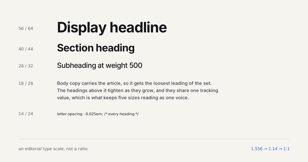
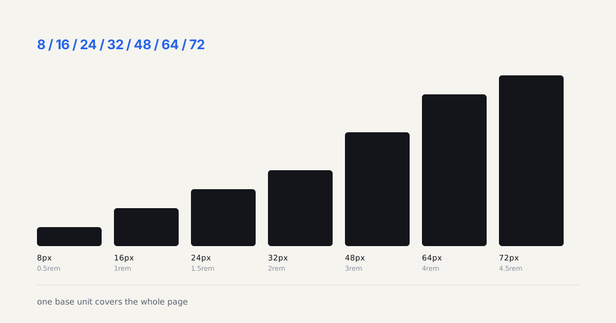
The decision isn't about the font technology being good or bad. It's about matching the tool to how many weights your actual design system uses. Check your type scale before touching @font-face, because the number of steps in that scale is what decides the answer. Storing the result as design tokens keeps the decision in one place instead of scattered across component CSS.
For the CSS side of pairing a variable font with a second typeface, our font pairing guide covers the one-axis-of-contrast rule that keeps two fonts from clashing.
A weight axis is only worth shipping if the extra weights buy you real hierarchy, and knowing when they do is a typography question, not a CSS one. If you want the reasoning behind measure, leading and weight rather than the @font-face mechanics, one book still covers it better than any blog post.
What Should You Actually Do This Week?
Open your project's network tab and count how many distinct font weight files are downloading right now. Three or more from the same family? Migrate to variable. Two or fewer? Leave it alone; you're not the audience for this migration yet, and that's a perfectly fine place to be.
If you do migrate, budget half a day, not a sprint. Swap the @font-face declaration, subset to the languages you serve, set explicit font-weight values on every heading and body rule, and add font-display: swap. Run Lighthouse before and after. On the three migrations I've done this year, the before-and-after Largest Contentful Paint numbers moved enough to justify the afternoon every single time, and the client always asks why we didn't do it sooner.
Where the Migration Goes Wrong
Three failure modes cover almost everything I've had to debug. The first is a self-hosted variable font served without the tech(variations) format hint and without a static fallback, which in a couple of older WebView builds meant the @font-face rule was skipped entirely and the page silently rendered in the system stack. Nobody noticed for six days because it only affected an in-app browser.
The second is the numeric weight trap. Static setups often rely on font-weight: bold resolving to the 700 file. With a variable font, bold maps to 700 on the axis fine, but semibold labels written as font-weight: 600 in one component and 500 in another suddenly render as genuinely different weights rather than snapping to the same nearest static file. The design used to hide the inconsistency. The variable font exposes it. That's a design system problem surfacing, not a font bug, though it always gets reported as one.
The third is subsetting a font down to Latin and then shipping a product where users type accented names into their own profile. Strip to latin and latin-ext together, not latin alone, unless you genuinely control every string on the page.
A Number Worth Checking Yourself
Here's a contestable position: most teams should cap the weight axis rather than ship the full 100-900 range. Subsetting the axis with fonttools to something like 400-700 cut one of my builds from 118KB to 71KB, a 40 percent drop, because the interpolation data for weights nobody uses still ships in the file. Almost nobody does this, and I think that's a mistake. It costs one extra flag in the same subsetting command you're already running.
Ship the variable font when you need three or more weights from one family. Stick with static files when you don't. Everything else is a performance budget conversation, not a religious one.