Design tokens are the named variables that store your design decisions, and roughly 70% of design system teams now manage them inside Figma Variables (Figma - Variables). A token isn't a color. It's a decision about a color, stored once and reused everywhere. Get this right and a rebrand takes an afternoon. Get it wrong and it takes a sprint.
I've rebuilt token pipelines for three different teams. The tooling changed each time. The core problem never did: keeping one truth in sync across a design file and a code repo.

What Are Design Tokens, Really?
Design tokens are name-value pairs that encode visual decisions, and the W3C standardized their JSON format in October 2025 (W3C Design Tokens Community Group Format). Instead of writing #3B82F6 in fifty places, you write it once as blue-500 and reference the name everywhere. Change the name's value, and every reference updates.
Why does that matter so much? Because raw values scatter. A hex code buried in a Figma fill and a hardcoded margin in a stylesheet have no relationship. A token creates that relationship. It's the difference between a spreadsheet of copied numbers and a single formula everyone points at.
Tokens travel further than color, too. Spacing, radius, typography, shadows, breakpoints, motion durations, all of it.
What Are the Three Token Tiers?
Most mature systems use a three-tier structure, and the split between raw and semantic tokens is the single biggest predictor of whether a rebrand stays cheap. The tiers are:
- Primitive tokens hold raw values. blue-500 is #3B82F6. No meaning, just the palette.
- Semantic tokens attach intent by referencing a primitive. color-action references blue-500. This is where theming lives.
- Component tokens scope a value to one part. button-primary-bg references color-action.
Why the Semantic Tier Earns Its Keep
Skip the semantic layer and you glue components directly to raw values. That feels faster on day one. Then dark mode arrives, and you discover every button reads blue-500 with no way to swap it per theme. The semantic tier is the swap point. Redefine color-action once, and buttons, links, and focus rings all follow. That indirection is the whole trick.

How Do Figma Variables Map to Tokens?
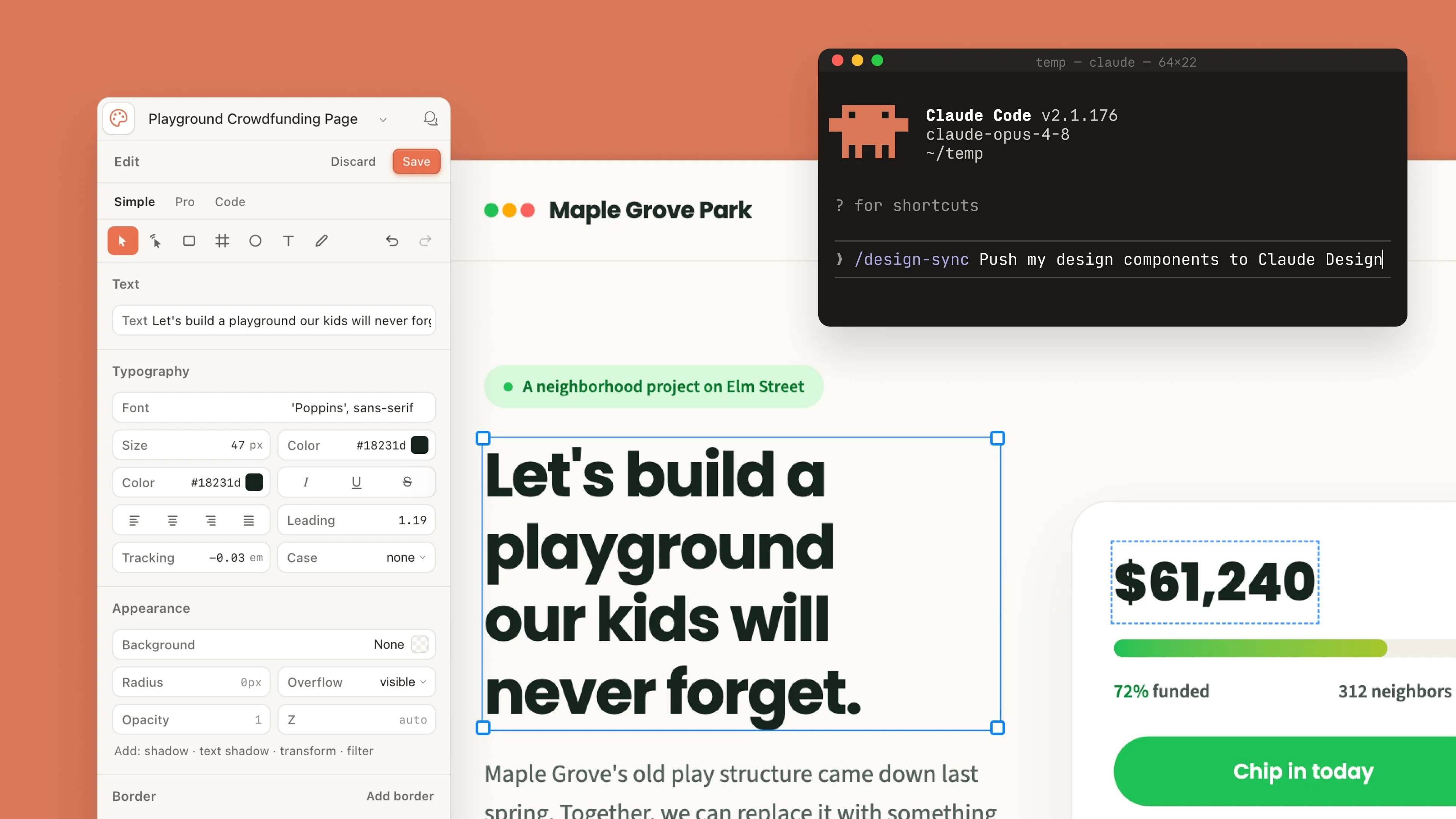
Figma Variables map almost directly onto the token model, supporting four types (color, number, string, boolean) plus aliasing, which is the feature that makes tiering possible. Aliasing lets one variable point at another. So color-action can reference blue-500 inside Figma itself, mirroring your semantic-to-primitive chain before a single line of code exists.
Group your variables into collections. I keep primitives in one collection and semantics in another, then use modes for light and dark. Modes are Figma's answer to theming. One collection, multiple mode columns, and a component switches its whole palette by switching mode. Have you ever tried theming without them? It's miserable.
Name variables with slashes: color/action/background. Figma renders slashes as folders, and the path survives export.
How Do You Export Tokens With Tokens Studio?
Tokens Studio exports Figma variables into W3C-shaped JSON and syncs it to a Git repo, which is what turns a design file into a code source of truth. The plugin reads your collections, writes structured JSON where each token carries a $value and $type, and commits it. From there your build never touches Figma again.
The workflow I run looks like this:
- Designers edit variables in Figma, pull them into Tokens Studio.
- The plugin pushes updated JSON to a tokens branch on GitHub.
- A pull request opens, the token diff is reviewable in plain text.
- On merge, CI regenerates CSS and Tailwind output.
That plain-text diff is underrated. Seeing color-danger change from red-600 to red-700 in a code review beats squinting at two Figma screenshots.
How Do Tokens Sync to CSS and Tailwind?
A transform tool converts token JSON into CSS custom properties and a Tailwind config, and Style Dictionary v4 handles both targets from one source. CSS custom properties land on the :root selector: --color-action-background: #3B82F6. Tailwind consumes the same values inside its theme block, giving you utility classes like bg-action.
Keep names identical across both worlds. color/action/background in Figma becomes --color-action-background in CSS and action-background in Tailwind. When names match one-to-one, a mismatch is obvious during review instead of invisible until production. Automate the generation in CI so nobody retypes values by hand. The moment a human copies a token manually, drift starts. Let the machine translate. My honest opinion? Manual sync is technical debt you take on knowingly, and it always costs more than the tooling would have.
Keeping Design and Code in Sync
One source of truth plus automated transforms is the only sync strategy that survives a real team, since manual handoff drifts within weeks. Decide where tokens are born (Figma, usually), push to Git on every change, regenerate outputs in CI. No exceptions for small edits, because small edits are exactly where drift sneaks in.
Review the JSON diffs like code. Match names one-to-one. Run the token build on every relevant pull request. Do those three things and your Figma file and your stylesheet stop being two guesses about the same design. They become one decision, expressed twice, by a machine that never forgets to copy a value.
Tokens only pay off when they attach to well-built Figma components. Once both are in place, package them for engineering with the designer to developer handoff playbook. If you're standing the whole system up from zero, the step-by-step design system guide covers the architecture around your tokens. And before you name a single color token, a UI color palette generator with live WCAG contrast gets the primitives right from the start. If you want tokens native to the design tool instead of bolted on, the Penpot review covers the first editor to ship them built-in.
The full pipeline (tokens.json to CSS variables to a Tailwind config, with a working demo) lives in the code companion repo if you'd rather read the code than the prose.