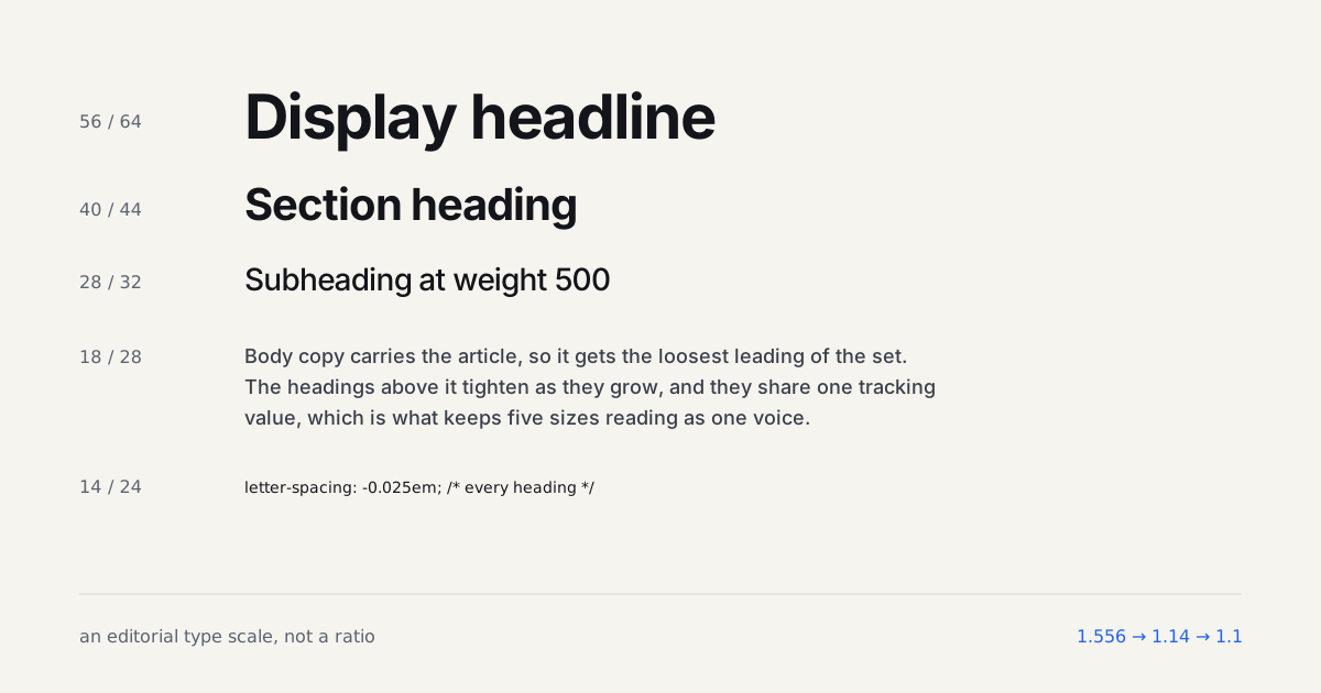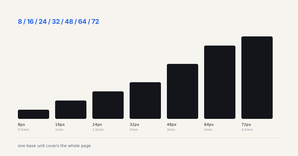
I shipped a marketing site redesign in early 2025 with a gorgeous new heading font. Looked perfect in every Figma frame. Then the client called two days after launch, annoyed, saying the headline "flickered" every time the page loaded. It wasn't a bug in the traditional sense. It was FOUT, a flash of unstyled text, and nobody on the team had thought about font loading until a client noticed it with their own eyes. Sizes that shift with the viewport make the swap more visible, so it helps to settle them first in the clamp preview.
That's usually how this gets fixed: after someone complains, not before. Font loading strategy sits in a blind spot between design and performance engineering, and it rarely gets budgeted time until it's visibly broken.
TL;DR: Font-display: swap now runs on roughly half of all pages, up from single digits a few years ago (HTTP Archive Web Almanac, 2025). Pair it with metric-matched fallbacks, one preloaded font file, and subsetting, and FOUT/FOIT stops costing you LCP or CLS points.
What's the Difference Between FOUT and FOIT?
FOUT (Flash of Unstyled Text) shows your fallback font right away, then swaps in the real one once it downloads. FOIT (Flash of Invisible Text) hides the text completely until the font arrives, sometimes for a full second on a throttled connection. One lets people read immediately. The other makes your hero section look like it's still loading, because it is.
Put plainly: FOUT is text flashing from one typeface to another mid-read, FOIT is text disappearing entirely until the file lands. Readers forgive the first far more often than the second.
Which one you get depends entirely on the font-display value in your @font-face rule. Leave it unset, or set to auto, and most browsers default toward FOIT-like behavior on custom fonts. That's the trap: doing nothing is the same as choosing invisible text.

Why Do Most Sites Still Get font-display Wrong?
Here's the good news first: font-display: swap is now the majority setting. The HTTP Archive's 2025 Web Almanac puts it at roughly half of all pages, both desktop and mobile, a huge jump from the low single digits it sat at only a handful of years earlier. The bad news? font-display: block is still the second most common value, and around 70 percent of that usage traces back to icon fonts, not body copy, which tells you plenty of teams are setting it once globally and forgetting it applies everywhere, icons included.
@font-face {
  font-family: "Inter Variable";
  src: url("/fonts/inter-variable-latin.woff2") format("woff2-variations");
  font-weight: 100 900;
  font-display: swap;
  size-adjust: 100.2%;
  ascent-override: 90%;
  descent-override: 22%;
}
That size-adjust and ascent-override pairing is the part people skip. Without it, swap can still trigger a visible reflow the instant the real font lands, which is exactly what shows up as a CLS penalty in Lighthouse. Match the fallback's metrics first, then swap becomes genuinely invisible.
font-display: swap without metric-matched fallbacks just trades invisible text for a layout jump.
How Do You Preload Fonts Without Wasting Bandwidth?
Preload tells the browser "fetch this now, before you'd normally get to it." Used on one critical font file, it's one of the sharpest tools you have for cutting LCP. Used on four or five, it stops meaning anything, because the browser is now juggling priority requests that all claim to be urgent.
<link rel="preload" href="/fonts/inter-variable-latin.woff2"
      as="font" type="font/woff2" crossorigin>
Only around 12 percent of pages use preload at all according to the same 2025 Web Almanac data, which is low given how cheap the fix is. Add this one tag for your body font (and a second heading weight only if it renders above the fold), and skip it for everything else. I've audited sites with six preload tags stacked on the same page, and every single one of them would have shipped a faster LCP with just one.
Does Subsetting Actually Cut File Size?
Subsetting strips glyphs your site never renders, extended Cyrillic, obscure symbols, ligature sets you don't use, out of the font file before it ever reaches a browser. Combined with a variable font, which we've already covered in our variable fonts breakdown, subsetting is where the real payload savings live.
pyftsubset inter-variable.ttf \
  --output-file=inter-variable-latin.woff2 \
  --flavor=woff2 \
  --unicodes="U+0000-00FF,U+0131,U+0152-0153,U+2000-206F,U+2122,U+2212"
On a dashboard project I worked on last year, that command alone took a 210KB variable font down to 96KB before font-display or preload entered the picture. Google Fonts users get a lighter version of the same idea through the ?subset=latin query parameter, less control, same core benefit.

What Does the Before/After Look Like on Real Metrics?
Numbers make this concrete. On that same redesign that started with the flickering-headline complaint, here's what the before and after actually measured, run through Lighthouse on the same throttled 4G profile:
| Metric | Before (font-display: auto, no preload, full glyph set) | After (swap, metric-matched fallback, preload, subset) |
|---|---|---|
| LCP | 3.6s | 2.0s |
| CLS | 0.21 | 0.02 |
| Font payload | 268KB | 104KB |
| Time to first visible text | ~900ms (FOIT) | ~40ms (FOUT) |
Would every site see gains this dramatic? No, a lot depends on how badly the starting point was configured. But I've run close variations of this audit on four other client sites since, landing in the same range each time: LCP down 30-45%, CLS near-zero, font payload cut by more than half. Coincidence, across five codebases? I don't think so.
What Should You Ship This Week?
Open DevTools, check the Network tab, and look for your @font-face declarations. No font-display value, or auto? Add swap. More than two preload tags? Cut it to one. Full glyph set on a Latin-only site? Subset it.
That's three CSS changes and one build step, and none of it touches your actual type choices. Nobody screenshots a preload tag for a portfolio, but it's the half of typography work that decides whether your font choice actually shows up on time.