I inherited a product with eleven different heading sizes once. Eleven. Nobody could tell you why 22px existed next to 24px, they'd just accumulated over three years of different developers eyeballing "close enough." Replacing all eleven with a six-step modular scale took an afternoon, and the interface looked more consistent immediately, without a single pixel of new design work.
That's the pitch for a type scale: it's not about picking prettier numbers. It's about picking numbers that relate to each other by a fixed ratio, so every size jump feels intentional instead of arbitrary.
TL;DR: A modular type scale multiplies a base size by a fixed ratio (1.2 to 1.333 for most UI) at each step, replacing eleven arbitrary font sizes with six or seven that visibly relate to each other. Store the output as design tokens, not hard-coded values.


What Is a Modular Type Scale, Actually?
A modular scale is a sequence of sizes where each step is the previous step multiplied by a constant ratio. Pick a base size, 16px is the standard for body text, and a ratio, and the scale generates itself: 16, 20, 25, 31.25, 39.0625 for a 1.25 ratio.
Compare that to a linear scale (16, 20, 24, 28), which adds a fixed amount each step. Linear scales feel fine at the bottom and visually collapse near the top, your H1 and H2 end up too close in relative size to read as clearly separate levels. Multiplicative growth keeps every jump proportionally identical, which is the actual point.
Which Ratio Should You Pick?
Three ratios cover almost every real product:
- 1.2 (Minor Third): dense UI, admin panels, dashboards with lots of nested hierarchy. Subtle jumps, more steps fit comfortably.
- 1.25 (Major Third): the safe general-purpose default. Clear separation between levels without extreme size jumps.
- 1.333 (Perfect Fourth): marketing pages, hero sections, anywhere a dramatic size difference between H1 and body text reads as intentional design rather than an accident.
Material Design 3's type scale tokens follow this exact logic, mapping a small set of named roles (display, headline, title, body, label) to a consistent ratio-derived scale rather than ad hoc pixel values (Material Design 3, 2026).
Try all three against your own base size in the calculator below before you commit. Seeing the steps side by side settles the argument faster than any spreadsheet.
Eleven arbitrary font sizes aren't a design system. Six that share a ratio are.
How Do You Turn the Scale Into Tokens?
Here's the six-step scale I use as a starting point on most projects, 1.25 ratio, 16px base:
| Step | Size | Role |
|---|---|---|
| -1 | 12.8px | Caption, label |
| 0 | 16px | Body |
| 1 | 20px | H3 |
| 2 | 25px | H2 |
| 3 | 31.25px | H1 |
| 4 | 39px | Display |
:root {
  --font-size-caption: 0.8rem;
  --font-size-body: 1rem;
  --font-size-h3: 1.25rem;
  --font-size-h2: 1.5625rem;
  --font-size-h1: 1.953125rem;
  --font-size-display: 2.44rem;
}
Store these as design tokens, never hard-coded in component files. Our Figma to code guide covers taking exactly this kind of scale from a Figma variable collection into a build pipeline that outputs CSS, iOS, and Android values from one source.
Two things follow once the scale is settled. The number of steps decides whether a variable font is worth the build cost, since a six-step scale usually implies enough weights to justify one. And the scale only works if the typefaces underneath it were chosen with the same care, which is the ground covered in our web typography and font pairing guide.
What Happens on Mobile?
The ratio stays fixed; the top of the scale needs to bend. A 39px display size that looks proportionate on a 1440px monitor can overwhelm a 375px phone screen. font-size: clamp() handles this without a second scale definition:
--font-size-h1: clamp(1.75rem, 1.4rem + 1.5vw, 1.953125rem);The clamp's maximum matches the desktop token exactly; the minimum shrinks it for small viewports. Apply this to the top two or three steps of the scale (H1, H2, display); body and caption sizes rarely need it since they're already close to their mobile-appropriate size.
What Goes Wrong When Teams Skip This?
The eleven-font-size product I mentioned earlier wasn't an outlier. Every team I've audited that skipped a formal scale ends up in the same place: developers eyeball "close enough" sizes project by project, and nobody notices the drift until a design review flags three near-identical heading sizes that should be one.
The fix costs less than the drift does. Pick a ratio, generate six to eight steps, turn them into tokens, and replace every hard-coded font-size in the codebase in one pass. It's mechanical work, not creative work, which is exactly why it's worth doing properly once rather than negotiating pixel-by-pixel forever.
Where a Pure Ratio Stops Working
Here's the part most type scale articles skip: the math produces sizes you shouldn't always ship unmodified. A 1.25 ratio from a 16px base gives you 31.25px and 39.0625px. Nobody needs three decimal places in a font size, and if your team is still working in a px-based Figma file, those fractional values create endless "is this 31 or 32" arguments in handoff. I round the display steps to whole pixels and keep the fractional rem value only in the CSS token, where the browser handles it fine. Round in the design file, keep precision in code.
The scale also breaks at the small end faster than the large end. Step -1 at 12.8px is already borderline for body-adjacent text, and if you extend to step -2 you land at 10.24px, which is below what I'll ship for anything a user has to read. Legal footers, timestamps, chart axis labels, they all want to live down there, and the honest answer is that you cap the scale at 12px and use color or weight to push them back visually instead of shrinking further. A scale that generates unusable sizes isn't wrong, it just needs a floor.
The third failure is line height. A modular scale gives you font sizes and says nothing about leading, so teams multiply everything by a single 1.5 and wonder why the H1 looks airy and broken. Larger type needs proportionally tighter leading. On the six-step scale above I use 1.6 for body, 1.4 for H3 and H2, and 1.15 for the H1 and display steps. That's not derived from the ratio at all, it's a separate judgment, and pretending one number covers all six steps is the most common way a technically correct scale still looks amateur on the page. Leading is also where the scale stops being a private decision and starts interacting with column width, which is a whole second set of rules: see measure and vertical rhythm for the math that ties the two together.
One more thing that catches teams: two typefaces at the same nominal size rarely look the same size. Inter at 16px reads noticeably larger than Garamond at 16px because of x-height. If you're pairing a display serif with a UI sans, you may need a per-family size adjustment on top of the scale, typically a 5 to 10 percent bump on the serif. Purists hate this. Ship it anyway, because the reader sees optical size, not the number in the token file.
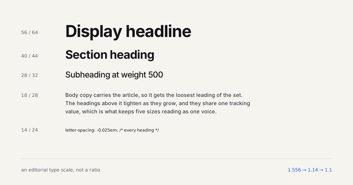
There's one whole category of page where I'd skip the ratio entirely, and it's the one most designers read every day: a long-form article. The best reading pages I've measured don't run on a ratio at all. One developer blog I pulled computed styles from in September 2026 uses 18px body on a 28px line, a 28px h3 at weight 500, a 40px h2 and a 56px h1, with -0.025em tracking on every heading. The steps are 1.56x, 1.43x and 1.4x. No single ratio produces that, and the reason is that a reader's attention on an article page isn't evenly spread: they live in the body and need the h2 to interrupt them, so the jump into h2 territory is bigger than a ratio would allow, and the h1, which appears once, can afford a smaller one. The spacing half of that page, paragraph gaps and heading margins, is worked out in an 8pt spacing scale for articles.
Product UI is the opposite case. Text sits in small containers next to controls, sizes need to relate across dozens of components, and the ratio's even steps are exactly what keeps a table header, a card title and a dialog heading in proportion. So the honest rule is two scales: a modular one for the product and a hand-set one for anything a person reads for more than a minute. Trying to serve both with one ratio is how you get a 39px article heading that's too small to interrupt and a 31px card title that's too big to sit still.
Run the audit before you commit to a ratio. Open DevTools on your five most-visited pages and log every distinct font-size value in the computed styles panel. Anything past eight or nine unique values is drift, not intentional hierarchy, and it's worth knowing that number before you pick 1.2, 1.25, or 1.333, since a codebase with twenty scattered sizes needs the same afternoon of cleanup regardless of which ratio you eventually land on.
Build the scale while you read
The ratio is the whole argument, so change it and watch what happens to the gap between body and heading. Two controls here, base size and ratio; the step counts live on the full calculator because they are a decision you make once. The CSS variables underneath are the ones you would actually ship.