Open the inspector on a page you think is well spaced and read the computed margins out loud. On most sites you'll hear a story: 13px, then 22px, then 1.35em that turns out to be 21.6px, then 30px, then 27px for no reason anybody remembers. I did this on a developer blog last week and heard a different story. Every number was a multiple of eight.
Not roughly. Every single one.
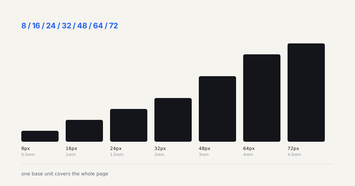
TL;DR: A long-form article page runs on seven spacing values from one 8px base: 8, 16, 24, 32, 48, 64, 72. Paragraphs are 24 apart, an h2 gets 72 above and 48 below, an h3 gets 48 and 24, list items 8, cards 24, the container is 1280 wide with 32px gutters on a 12-column grid. Ship them as rem tokens and stop deciding spacing on every component.
What Did the Measured Page Actually Use?
I recorded the gap between every pair of adjacent blocks in two articles on the site, one a 2,400-word tutorial with code, the other a 1,600-word essay with none. Then I sorted the gaps and counted.
| Where the gap sits | Measured | Token | Times seen |
|---|---|---|---|
| Between list items | 8px | --space-1 | 8 |
| Under a heading inside a card | 16px | --space-2 | 9 |
| Between paragraphs | 24px | --space-3 | 30 |
| Under an h3, above a list | 24px | --space-3 | 10 |
| Container gutter, section padding on phones | 32px, 24px | --space-4, --space-3 | 6 |
| Above an h3, below an h2 | 48px | --space-6 | 22 |
| Section padding, footer padding | 64px | --space-8 | 4 |
| Above an h2 (24 paragraph margin plus 48) | 72px | --space-9 | 10 |
Two things jump out of that table. First, the paragraph gap does most of the work. Thirty of the ninety-odd measurements were the same 24px, which is what makes a long page feel calm: the reader learns one distance in the first screen and never has to relearn it. Second, the biggest gap on the page, 72px above an h2, isn't its own token in the sense of a single declaration. It's the paragraph's 24px bottom margin plus the heading's 48px top margin, and because both are multiples of eight the sum is too. That's the whole trick of a base unit: the arithmetic stays inside the scale even when two margins meet.
Does anything break the pattern? One value: 40px of padding under the navigation bar before the article header starts. That's step 5, and it appeared exactly once. I'd have set it to 48 and moved on, but I can see the argument for a slightly tighter lead-in above the biggest text on the page.
Why Does 8 Beat Every Other Base?
Because 8 divides the things you already can't change.
The type scale on a reading page puts body text at 18px on a 28px line. The h2 sits at 40 over 44, the h3 at 28 over 32. Three of those four line heights are multiples of 8, and 44 is a multiple of 4. A 1280px container with 32px gutters and a 24px column gap gives twelve columns of 79.33px, which isn't pretty, but the gutters and gaps are. A 16:9 card image at 282px wide is 158.6px tall, and the card's 16px padding around it is a step.
Material's original spacing guidance built everything on 8dp for exactly this reason, with 4dp reserved for icon and type alignment inside components (Material Design, 2026). Apple's layout guidance doesn't name a number but its standard margins and the 44pt touch target both sit comfortably on a 4-point rhythm (Apple Human Interface Guidelines, 2026). Ten, the base that looks neatest on a whiteboard, produces 30px line heights that fight an 18px body and 50px margins that fall between the two heading sizes.
A spacing scale isn't a set of nice numbers. It's the set of numbers that already divide your type, your grid and your touch targets.
How Do the Seven Steps Map Onto an Article?
Here's the mapping as CSS, using the same token names the generator below emits so you can paste straight from one to the other.
:root {
  --space-1: 0.5rem;  /*  8px  list items, chip padding */
  --space-2: 1rem;    /* 16px  card padding, label to content */
  --space-3: 1.5rem;  /* 24px  paragraph gap, h3 bottom, card gap */
  --space-4: 2rem;    /* 32px  gutter, h2 bottom, code block margin */
  --space-6: 3rem;    /* 48px  h3 top, section break inside a chapter */
  --space-8: 4rem;    /* 64px  section padding, footer padding */
  --space-9: 4.5rem;  /* 72px  h2 top (as 24 + 48) */
}

.post p        { margin-block: var(--space-3); }
.post li + li  { margin-top: var(--space-1); }
.post h2       { margin: var(--space-9) 0 var(--space-4); }
.post h3       { margin: var(--space-6) 0 var(--space-3); }
.post pre      { margin-block: var(--space-4); padding: var(--space-3); }
.post figure   { margin-block: var(--space-6); }
Two decisions in there are worth defending. The h2 gets more space above than below, 72 against 32, because a heading belongs to the text that follows it, not the text before. Equal margins make a heading float between two sections and the eye can't tell which one it titles. And the h3 gets half the h2's lead-in, 48 against 72, which is what makes it read as a subdivision rather than a new chapter. If you flatten those two to the same value, which I've watched teams do in the name of simplicity, the page loses its outline.
The list-item gap of 8px is the one people fight me on. It looks tight in isolation. In a real list it's right, because list items are one thought each and the 8px says "these belong together" while the 24px above and below the list says "and this group is separate from the paragraphs." Bump items to 16px and a five-item list stretches to the height of two paragraphs and stops reading as a unit. Our line-length and rhythm guide covers the adjacent question of how those margins relate to the body line height, which on this page they do by construction: 24px is not a multiple of 28, and the page doesn't pretend otherwise.
How Does the Page Frame Use the Same Scale?
The article isn't the only thing on the page. Around it sits a header, a navigation bar, a card grid on the index and a footer, and every one of them runs on the same seven numbers.
The container. 1280px maximum width, 32px of padding on each side, a 12-column grid with a 24px gap. Twelve columns because the article page splits into 4 for the table of contents and 8 for the prose, and the index into 4 cards of 3 columns each. On a 1024px viewport the same padding gives 3 cards; at 390px, one, with the gutter down to 24px.
The prose column. Eight of the twelve columns come to 736px, and inside that the text column takes 44px of padding on the left and 64px on the right, landing at 628px. Why asymmetric? Because the table of contents sits to the left and the eye needs less separation from a related panel than from empty space. 628px at 18px is about 67 characters per line, right where the measure research says it should be. That number wasn't picked. It fell out of the grid.
Cards. 2px border, 12px radius, 16px padding, 24px gap between cards, and 24px between the card's image and its title. The featured card doubles to 32px padding, which is one step up, not a special value.
Header and footer. A 72px navigation bar, which is step 9, holding 16px links. The footer has 64px of padding top and bottom, column headings with 32px below them and links 8px apart. Nothing in the frame introduces a number the article didn't already use.
I've built the opposite kind of page more than once: article on one scale, marketing chrome on another, and a designer's Figma file on a third. It always shows. Not as a specific defect anyone can point at, but as a page that feels assembled from parts. One base unit for everything is how the parts stop showing.
Where Does an 8pt Scale Stop Working?
Three places, and pretending otherwise is how teams end up with a fourteen-token scale.
Inside components. A 2px border, a 3px pull-quote rail, a 4px inline-code radius, a 6px badge corner. These aren't spacing, they're detail, and forcing them onto the 8 grid makes them clumsy. Material's answer was the 4dp sub-grid for exactly this, and I'd go further: borders and radii are a separate, tiny scale of 1, 2, 3, 4, 6, 12 that has nothing to do with layout distance.
At the top end. The step from 64 to 72 is 12.5 percent and your eye can barely register it, which is why the measured page uses 72 only as a sum and 64 only as section padding. Above that, a linear scale gets silly: 80, 88, 96 are indistinguishable at page level. If you need hero-sized breathing room, jump to 96 or 128 as hand-picked values and stop calling them steps.
Between blocks that aren't text. When an image, a code block or an embedded demo lands mid-article, the rhythm around it wants 32 or 48, not the paragraph's 24, because a visual element needs more separation from prose than prose needs from prose. The measured page gave code blocks 32px and figures 48px. Both are steps, but they're different steps from the paragraph gap, and a rule that says "everything in the article is 24 apart" would have been wrong.
How Do You Audit a Page Against the Scale?
The inspector is enough, but the workflow matters. Select the first paragraph of an article, read its computed margin-top and margin-bottom, then walk down the DOM with the arrow keys and read the same two values on every block-level element until the footer. Write them down in one column. It takes about six minutes for a 2,000-word article and you'll have the entire spacing vocabulary of the template.
Then run the list through three questions. Which values are multiples of your base? Which ones are sums of two multiples, like the 72 above an h2? And which ones are neither? The third group is the leak, and it usually has a history: a margin someone nudged to make a screenshot look right, a Tailwind class picked because it was close, a 1.35em that nobody converted after the font size changed.
What surprised me on the measured page was the second group. Eleven of the distinct values I recorded were sums, not steps, which means the stylesheet itself probably has fewer than ten spacing declarations. A page that reads as generously spaced is running on a very short list.
If you'd rather not do it by hand, a bookmarklet that walks every element, reads getComputedStyle for the four margins and paddings, and counts distinct pixel values will give you the same histogram in a second. Sort it descending. The top five rows should account for roughly 80 percent of the count; on the measured page they accounted for 84.
How Do You Migrate an Existing Page?
Don't redesign. Measure first, the way I did above, and count how many distinct values you have. Most article templates I've audited carry between eleven and sixteen. Then map each one to its nearest step and look at the page. In my experience nine out of ten mappings are invisible, and the one that isn't is usually a heading margin that was wrong before too.
Put the seven values in a tokens file that nothing else writes to. Replace hard-coded margins in the article stylesheet first, since that's where the reader spends their time, then the card grid, then the chrome. Grep for px in the layout CSS when you're done; anything left that isn't a border or a radius is a leak.
Should the tokens also drive Tailwind or your Figma variables? Yes, and with the same names. The moment a spec says space-3 instead of 24px, the number stops being a decision and becomes a reference, which is the entire point. The design tokens workflow covers wiring that up; the spacing scale is just one of the collections it carries.
One base unit, seven steps, and a page that a reader never has to consciously parse. That's a cheap trade for an afternoon with the inspector.
Build the scale the page runs on
The table above is nine multiples of one number. Type that number into the base field below and the generator hands back the same list as CSS custom properties, in px and rem side by side. Then change the base to 10 and watch how many of the measured values stop existing: that is the argument for 8 in one edit.