A SaaS client asked me to help "fix their pricing," assuming the numbers were wrong. The prices were fine, competitive even. Their page showed five tiers with nearly identical feature lists, no visual hierarchy, no badge on any tier. We cut it to three tiers, added a "Most Popular" badge on the middle one, and conversion went from 1.2% to 3.1%. Same prices, same product, structurally different page.
That's the pattern across nearly every pricing page audit I've done: the number is rarely the problem. If the tier cards refuse to line up, the dashboard grid generator gives you a column set that survives three tiers and four. The layout deciding how easy that number is to evaluate usually is.
TL;DR: Top-quartile SaaS pricing pages convert at 6.5-12% versus a 2.8% average (SHNO, 2026), and the gap is almost entirely page structure. Three tiers, a highlighted middle option, and a monthly-first toggle account for most of that difference.

Why Do Three Tiers Outperform Five?
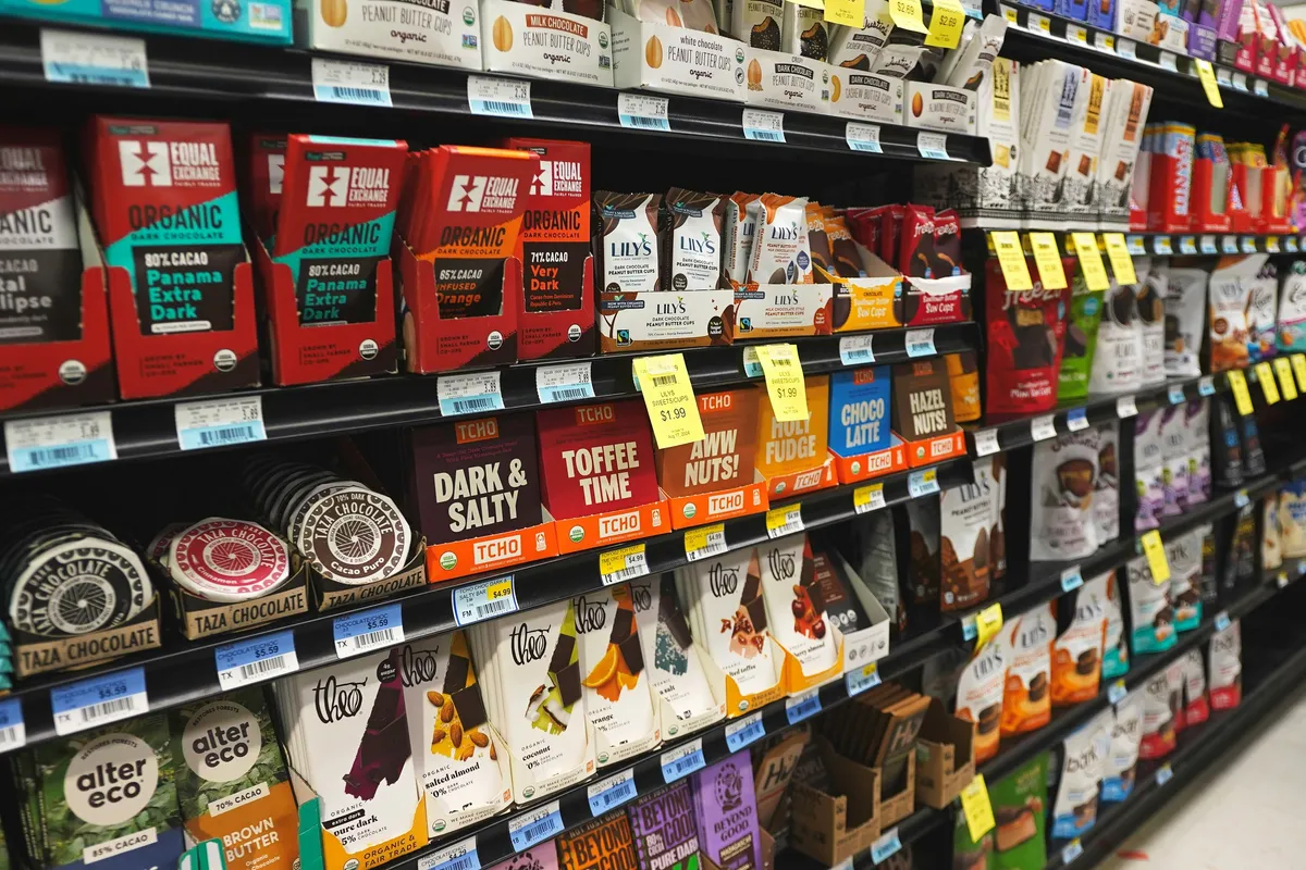
Three tiers cover distinct segments (solo, team, enterprise) while keeping the page scannable in under ten seconds. Five tiers with overlapping features force a visitor to actually read and compare, which is exactly the extra cognitive work that kills self-serve conversion.
The team I mentioned above cut from five tiers to three, simplified an overlapping feature list, and added a single "Most Popular" badge. Conversion moved from 1.2% to 3.1%, a 158% lift, without changing a single price (Digital Applied, 2026). The tier count and the badge did the heavy lifting.
Does the Middle Tier Really Win by Default?
Yes, and the number is bigger than most people expect: customers anchor to the middle option roughly 65% of the time when shown three tiers (SHNO, 2026). This is the Goldilocks effect, the middle choice reads as the safe pick between "too basic" and "too much," and most visitors gravitate there without needing to be convinced.
That's exactly why your actual target price belongs on the middle tier, highlighted visually, a badge, a slightly taller card, a different border color. You're not manipulating the choice. You're making the option most visitors were already inclined toward easier to commit to without second-guessing.
A pricing page with five nearly-identical tiers isn't giving customers choice. It's giving them homework.
| Metric | Value |
|---|---|
| Average SaaS pricing page conversion | 2.8% |
| Top-quartile conversion | 6.5-12% |
| Middle-tier anchoring rate (3 tiers shown) | ~65% |
| Lift from cutting 5 tiers to 3 + badge | 158% (1.2% to 3.1%) |
What Belongs Above the Fold on a Pricing Page?
The three tier cards, their prices, and a clear CTA on each, full stop. Feature comparison tables, FAQs, and testimonials all belong further down. Visitors evaluating a purchase decision want the number and what it buys before anything else; burying the price under a wall of feature bullets adds friction that a scannable card layout avoids entirely.
The rest of the page follows the same logic as any SaaS layout, which I walk through in landing page layout patterns.
Monthly or Annual Pricing First?
Monthly, by default, with a visible annual-discount toggle. A first-time visitor is evaluating, not ready to commit to twelve months; defaulting to annual pricing and hiding the monthly option reads as pressure, not value.
Label the toggle clearly, "Save 20% billed annually" rather than a bare percentage, and let price-sensitive visitors self-select into the better deal. Mobile matters here too: mobile traffic accounts for 58% of SaaS pricing page visits in 2026, so the toggle and tier cards both need to work as a single-column stack, not a squeezed-down desktop layout.
How Much of This Is Actually About the Prices?
Less than most teams assume. The average SaaS pricing page converts around 2.8%, while the top quartile reaches 6.5-12% on the same pricing-psychology data cited above, and that gap comes almost entirely from structure: tier count, anchoring layout, comparison clarity, CTA testing, not from charging different amounts. Two products at identical price points can convert at wildly different rates based purely on whether the page makes the decision easy or effortful.
For the checkout flow that follows a pricing decision, our e-commerce UI patterns guide covers the same anchoring and above-the-fold principles applied to product pages instead of subscription tiers.
Fix tier count, the middle-tier highlight, and the billing toggle before touching a single number on the page. That's where the actual conversion gap lives.
One more habit worth building: screenshot your pricing page every quarter and file it next to the conversion numbers from that period. Pricing pages drift. A marketer adds a badge, legal adds a disclaimer, someone A/B tests a banner and forgets to remove it, and eighteen months later the clean three-card layout has grown six competing calls to action that nobody remembers approving. The screenshot archive makes that drift visible in a way the live page never does, because you scroll the history and watch the clutter accumulate. Teams that run this ritual catch layout rot early, usually within one quarter, and the fix at that stage is deleting one element rather than commissioning another redesign.
Before you ship the redesign, run one more check: read the feature comparison table out loud to someone outside your team. If they hesitate on a row, that row's wording is the problem, not their attention span. I've watched a single confusing checkmark row ("Advanced reporting" with no definition of what "advanced" means) send a test user straight to a support chat instead of clicking buy. Clarity on that one row moved more conversion than the redesign's color palette ever did, and nobody on the internal team had noticed it was ambiguous until an outsider read it cold.