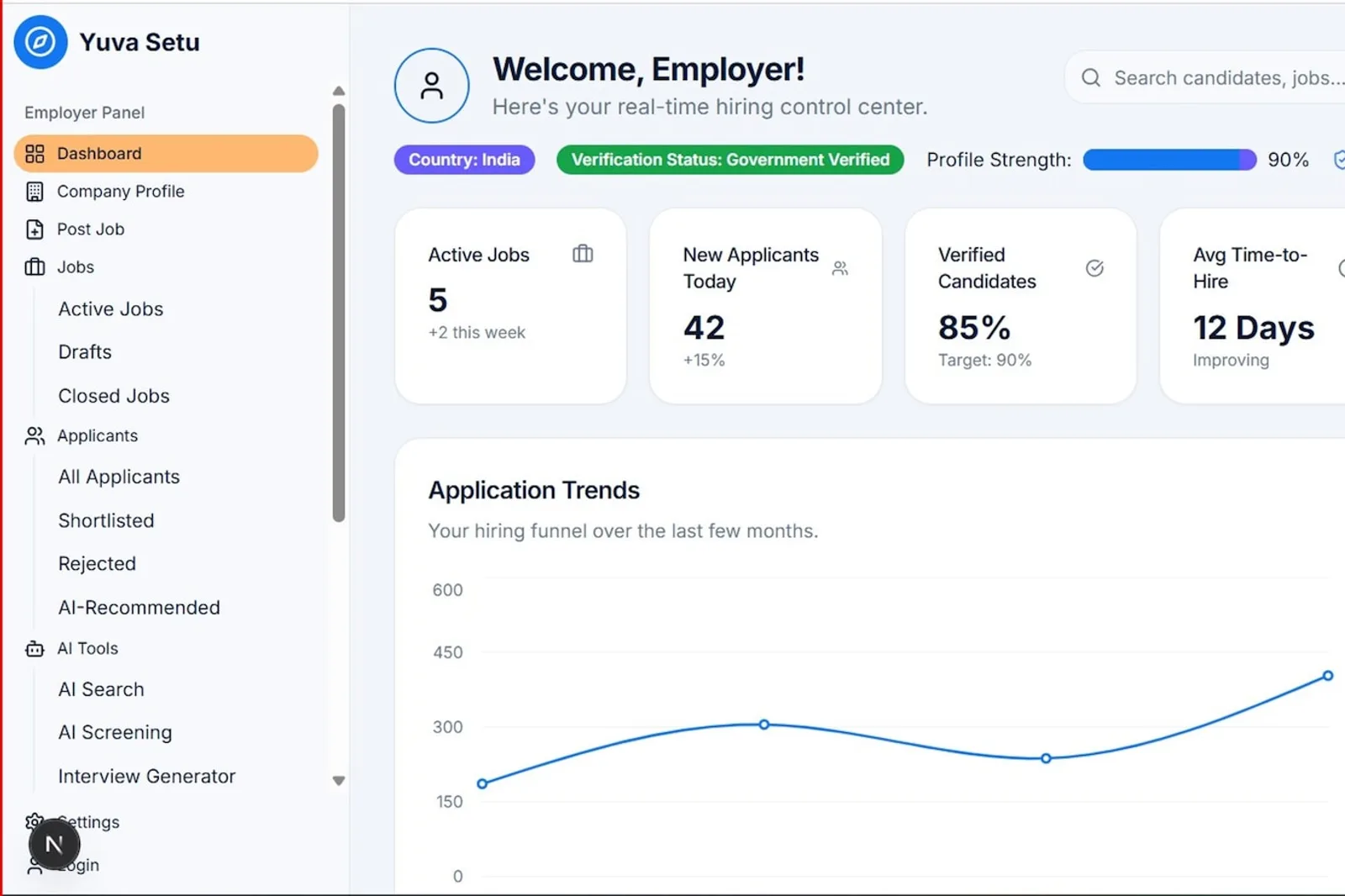
A founder sent me his landing page last month, asking why it converted at 1.9% while his closest competitor sat above 4%. Same price, same feature set, nearly the same product. I opened both pages side by side and the problem wasn't the copy at all. It was the order of the blocks: his hero opened with two sentences of positioning language, his social proof sat below the fold at position six, and the pricing teaser didn't show up until a visitor had scrolled past three separate feature grids.
TL;DR: A 2026 audit of over 2,000 landing pages found single-stat hero sections converting 18% better than generic-image heroes, while named-customer social proof lifted conversion 22% (Digital Applied, 2026). Block order, not copy polish, explains most of that gap.

What Actually Belongs in the Hero Section?
A SaaS hero needs exactly three things: one sentence that states the outcome, one stat or claim that backs it up, and one button. That's it. Everything else, the secondary nav links, the animated product tour, the second CTA sitting next to the first, is something a first-time visitor has to process before they understand what you sell.
The data backs this up more sharply than I expected. Hero sections built around a single defensible stat outperformed generic image heroes by 18%, while heroes using stock photography of smiling people in an office underperformed by 11% (Digital Applied, 2026). Why? A number is a claim you can evaluate in half a second. A stock photo of people in a meeting tells a visitor nothing about your product.

Is your headline actually specific, or could a competitor swap in their name and ship it unchanged? That's the test I run on every hero I review. "The platform teams trust" passes no test at all. "Cut deploy time from 40 minutes to 4" is a claim a reader can hold you to, which is exactly why it works harder.
Where Should Social Proof Actually Sit?
Right after the hero, not three scrolls down. The same study found named-customer social proof, phrasing like "used by 8 of the Fortune 50" rather than a bare logo strip, delivered the single biggest lift of any block tested at 22%, with single testimonials that include a photo and a name adding another 14% (Flint, 2026).
I've watched teams treat social proof as decoration, something to fill the gap between the hero and the feature grid. That's backwards. A cold visitor has zero reason to trust your claims yet, and proof that someone else already vetted you is what earns the next thirty seconds of attention. Skip it, or bury it, and you're asking for trust you haven't paid for.
What Does a Pricing Teaser Section Need to Include?
Three simplified tier cards, a starting price on each, and one differentiating line per tier, nothing more. The teaser's whole job is answering "is this roughly in my budget," fast, not replicating the full comparison table from your dedicated pricing page.
On a project last year, a client insisted on dropping the full feature-comparison table into the landing page teaser because "more information is always better." It wasn't. Scroll depth past the teaser dropped once the table went in, because a visitor who'd clicked from an ad wasn't ready for forty comparison rows yet. We cut it back to three cards and a single link reading "see full pricing details," and scroll-through improved within a week. If you want the deeper anchoring mechanics, our pricing page layout guide covers what belongs on that dedicated page once someone clicks through.
How Many CTAs Does the Page Actually Need?
One, repeated at most two or three times, not one CTA per section fighting for attention. Pages using a single, consistent CTA converted better than pages offering three or more competing buttons, and a sticky bottom CTA alone added an 11% lift on its own, per the same 2026 pass through 2,000 pages (Digital Applied, 2026). Multi-CTA heroes with three-plus buttons actually lost 8%, decision paralysis in action.
Here's my genuinely debatable take: most SaaS landing pages would convert better with fewer buttons than their own designers are comfortable shipping. A "Start Free Trial," a "Book a Demo," and a "See Pricing" button crammed into one hero isn't giving a visitor options. It's making them stop and think about which button applies to them, and that pause is exactly where you lose people.
What Layout Mistakes Show Up Most Often?
Three keep repeating across the pages I've audited. First, burying social proof below a feature grid nobody asked for yet. Second, a pricing teaser that tries to be the full pricing page, dragging cold traffic through detail they haven't earned the need for. Third, competing CTAs that split attention instead of guiding it toward one action.

None of these mistakes are about bad copywriting or ugly design. They're about sequence: what block comes first, what comes second, and how much a visitor has to process before reaching the button you actually want them to click. Fix the order before you touch a single word.
| Block | Position | Conversion lift when done right |
|---|---|---|
| Hero with single-stat claim | 1st | 18% over generic-image heroes |
| Named-customer social proof | 2nd | 22% |
| Single testimonial with photo and name | Alongside social proof | 14% |
| Sticky bottom CTA | Persistent | 11% |
The footer is the section teams treat as a dumping ground, which is why it earned its own piece: footer design patterns.