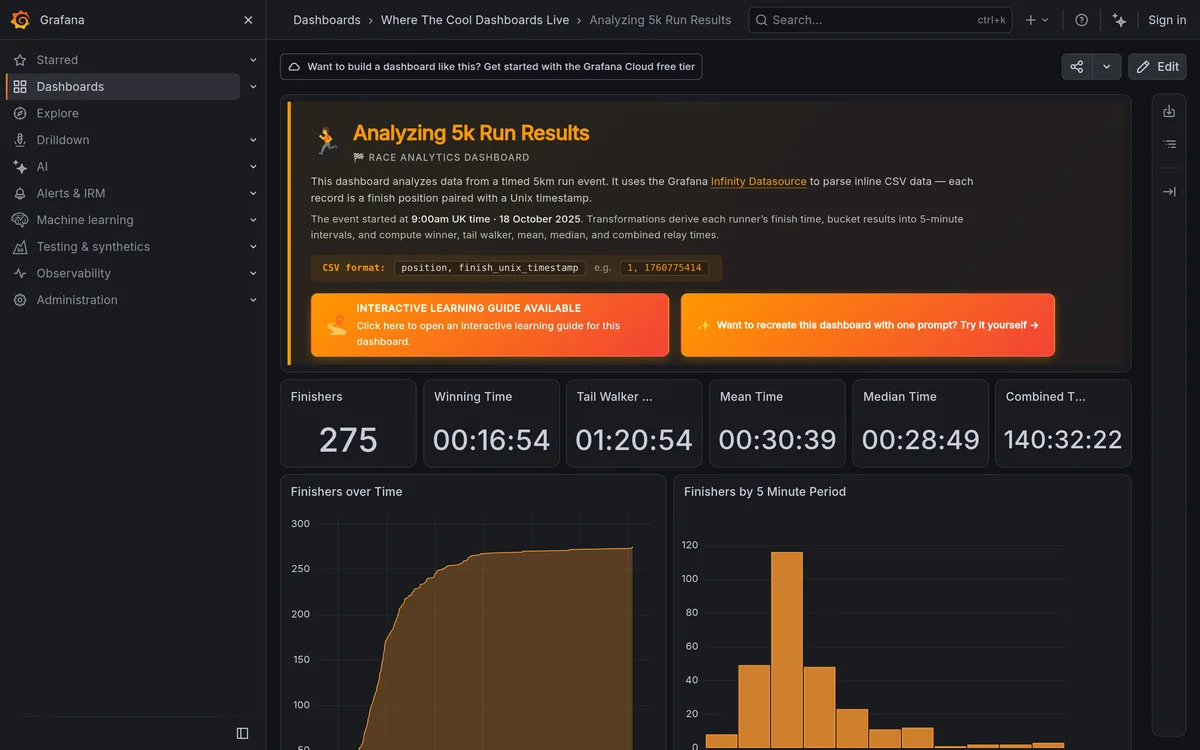
A support ops lead once told me her team processed roughly 400 refund requests a day through an admin panel I'd inherited from another agency. Every single bulk approval required clicking a checkbox, scrolling to the bottom, clicking approve, and waiting for a full page reload before she could do the next batch. Multiply that friction by 400, every day, for a team of six people. That's the kind of cost a beautiful-looking dashboard mockup never reveals.
Admin panels are a different design problem than the dashboards most teams practice on. A dashboard is read once and glanced at. An admin panel is worked in, for hours, by people whose job depends on moving through records fast. Speed and density beat polish here, every time.
TL;DR: Admin panels need a contextual bulk-action bar that appears the moment a row is selected, persistent selection across pagination, and default column sets under 8 per view. Nielsen Norman Group's data table research frames these as the baseline requirements for any table handling real operational work, not nice-to-haves.
What Makes Admin Panels Harder Than Regular Dashboards?
Volume and repetition. A marketing dashboard shows four KPI cards someone checks once in the morning. The SaaS landing page that sold the product gets a visitor for ninety seconds; an admin panel shows a table of a thousand rows that someone filters, sorts, edits, and bulk-acts on for hours at a stretch, every day, as their actual job. If you extended our earlier dashboard design patterns guide, the sidebar-plus-cards shell still applies here, but the content area needs a completely different set of interaction patterns once real operational density enters the picture.
The failure mode I see constantly: teams take a dashboard template built for glancing at metrics and try to force a 2,000-row user management table into it. It looks fine with ten seeded rows in a demo. It falls apart the moment someone needs to filter, multi-select, and bulk-edit against the real dataset.
| Dashboard | Admin panel | |
|---|---|---|
| Job | Summarize | Manage |
| Typical session | Glanced at once a day | Worked in for hours |
| Content | Four to six KPI cards | Tables of hundreds or thousands of records |
| Design priority | Polish, five-second read | Speed and density for a real work session |
How Should Bulk Actions Actually Work?
The moment a user checks even one row, a contextual action bar should appear, floating above or replacing the default column header row, showing the count selected and the available actions (approve, delete, export, reassign). This is the pattern Nielsen Norman Group's bulk action research consistently recommends, and it's the one that survives contact with real usage.
Be explicit about scope. A "select all" checkbox in the header selects only the visible page, that's honest and expected. If you additionally offer "select all 4,200 matching records," say so with a visible banner, because approving 4,200 refunds is a fundamentally different action than approving the 20 visible on screen, and a user who doesn't realize the difference can do real damage.

Selection state also needs to survive pagination. I've tested admin panels where selecting rows on page one and paging forward silently clears the selection, users lose trust in bulk actions within their first session and revert to one-by-one clicking, defeating the entire feature.
What's the Right Filter and Search Pattern for Dense Tables?
Put the filter bar directly above the table, always visible, never hidden behind a collapsed accordion that requires a click to even see what filters exist. Show active filters as removable chips, so a user glancing at the screen instantly understands why the table currently shows 40 rows instead of 4,000.
- Search: a single text input that searches across the most common fields (name, email, ID), not a dropdown forcing a field choice first
- Quick filters: status, date range, and owner as one-click toggle buttons, not buried in a modal
- Advanced filters: a secondary panel for less common combinations, collapsed by default
- Saved views: let power users save a specific filter combination as a named view, this is the single feature support and ops teams ask for most once they've used the table for a month
Does every admin panel need saved views on day one? No, but plan the data model to support them early, retrofitting saved filter state after launch is a bigger lift than building it in from the start.

How Many Columns Should a Data Table Show?
Six to eight by default, with everything else behind a column visibility toggle. I've reviewed tables that grew to 22 visible columns because nobody wanted to remove anything, and the result was a horizontal scroll nightmare that made the table nearly unusable on a standard 1440px laptop screen.
Persist column choices per user, not per session, someone shouldn't have to reconfigure their view every time they log back in. Different roles looking at the same underlying table often want genuinely different default columns, a billing admin cares about payment status and plan tier, a support agent cares about last login and open tickets. Don't force one universal default across every role using the table.


What About Permissions and Role-Based Views?
Hide actions the user can't perform, don't just disable them with a grayed-out button and no explanation. A grayed-out delete button with no tooltip reads as broken UI, not as a permission boundary. If a user genuinely can't take an action, either remove it from view entirely or show a clear, specific reason on hover ("Requires admin role to delete").
Admin panels reward restraint more than any other UI category I work in. Every extra column, every extra action in a row's dropdown, every extra filter option adds real cognitive load for someone using this tool eight hours a day. Cut anything that isn't earning its place, and the panel that looks slightly sparse in a design review will feel considerably faster in actual daily use.