TL;DR: Open all five and judge for yourself. Plausible shows the cleanest KPI strip, Umami adds change indicators to it, Grafana handles density better than anything else, GoatCounter proves you can ship a dashboard with no metric cards at all, and Matomo demonstrates what happens when every widget carries equal weight. None of them need a login.
Every article about modern dashboard design shows you screenshots of Linear, Stripe and Vercel. Here's the problem with that: you can't open any of them. They're behind a login, so you cannot check whether the writer described them accurately, and neither can I.
So this page does the opposite. Every dashboard below is published to anonymous visitors on purpose. Click the link, look at the thing, and disagree with me if I got it wrong. That's a lower bar for me and a much higher one for the claims.
If you want the underlying spec rather than the examples, the dashboard design patterns guide covers the 256px sidebar, the metric strip and the 12-column grid in detail. This page is the field trip.
Plausible: the KPI strip, done with restraint
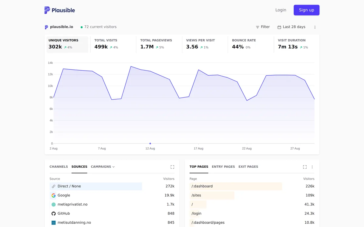
Plausible publishes its own live traffic, which is a confident thing to do. The layout is six metrics in a row, one chart, then two list panels side by side. That's the entire page.
What makes it work is what's missing. No sidebar. No filters cluttering the top. The date range and the filter control sit right-aligned on one line and stay out of the way until you want them. When your product does one thing, a sidebar is furniture nobody asked for.
The one I'd argue with: six metrics is one too many. Unique visitors and total visits sit next to each other and most people cannot tell you the difference without hovering the tooltip. Two adjacent numbers that need a tooltip to distinguish are one number and a footnote.
Umami: the same strip, plus direction
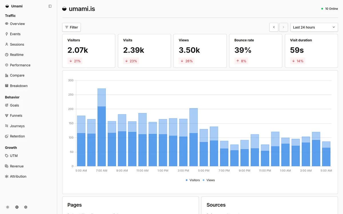
Umami runs five cards instead of six, and every card carries a percentage change with an arrow. That single addition does more for the page than any styling choice on it. A number alone tells you the state. A number with a delta tells you whether to care.
Note the colour discipline: the changes render red when they're down, including the bounce rate that went up eight percent. Rising bounce rate is bad, so red is correct there even though the arrow points up. That's a small thing that a surprising number of dashboards get backwards by tying the colour to the arrow direction instead of to the meaning.
The sidebar is grouped into Traffic, Behavior and Growth. Three groups of five or six items each is about the ceiling before people stop reading the labels and start hunting by position.

Grafana: density that stays readable
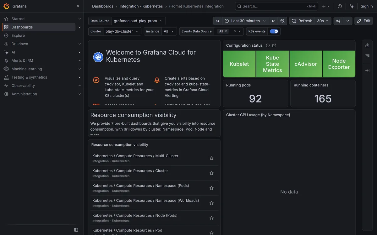
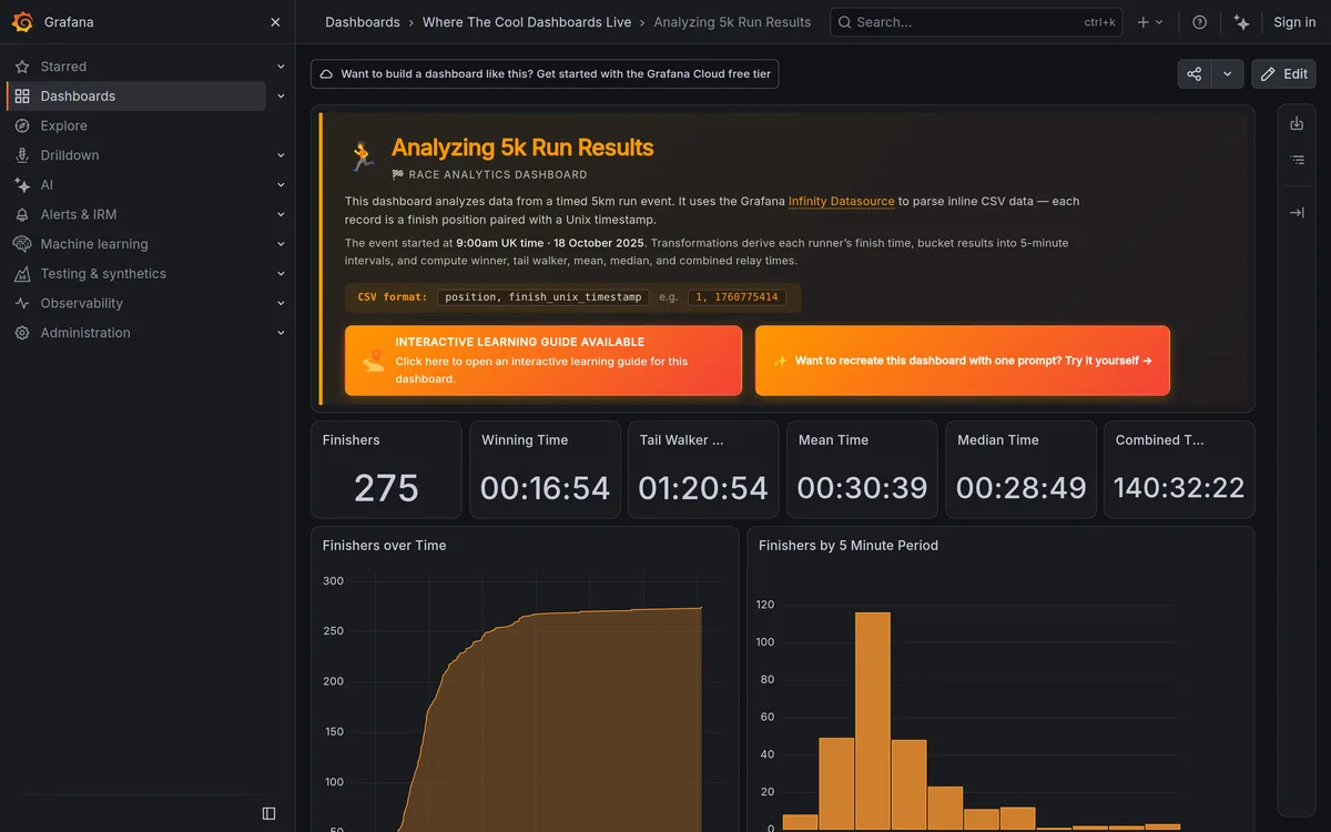
This is the densest layout of the five and still the easiest to scan, which is the whole trick. Two numbers are enormous: 92 running pods, 165 running containers. Four status tiles sit above them in solid green. Everything else is smaller and quieter.
Look at what the size difference is doing. Nobody has to decide what matters on this screen, because the type scale already decided. Most custom dashboards set every metric at the same size and then wonder why the page feels flat.
The honest detail I'd point at: there's a panel reading "No data". It hasn't been hidden, and it hasn't been dressed up. A monitoring tool that quietly hides an empty panel is lying to you about coverage, and this is one of the few products that treats an empty state as information rather than as an embarrassment.
Also worth stealing: the filter bar is a distinct strip between the breadcrumb and the panels, so cluster and instance selectors never get confused with the data itself.
Matomo: what a widget grid costs you
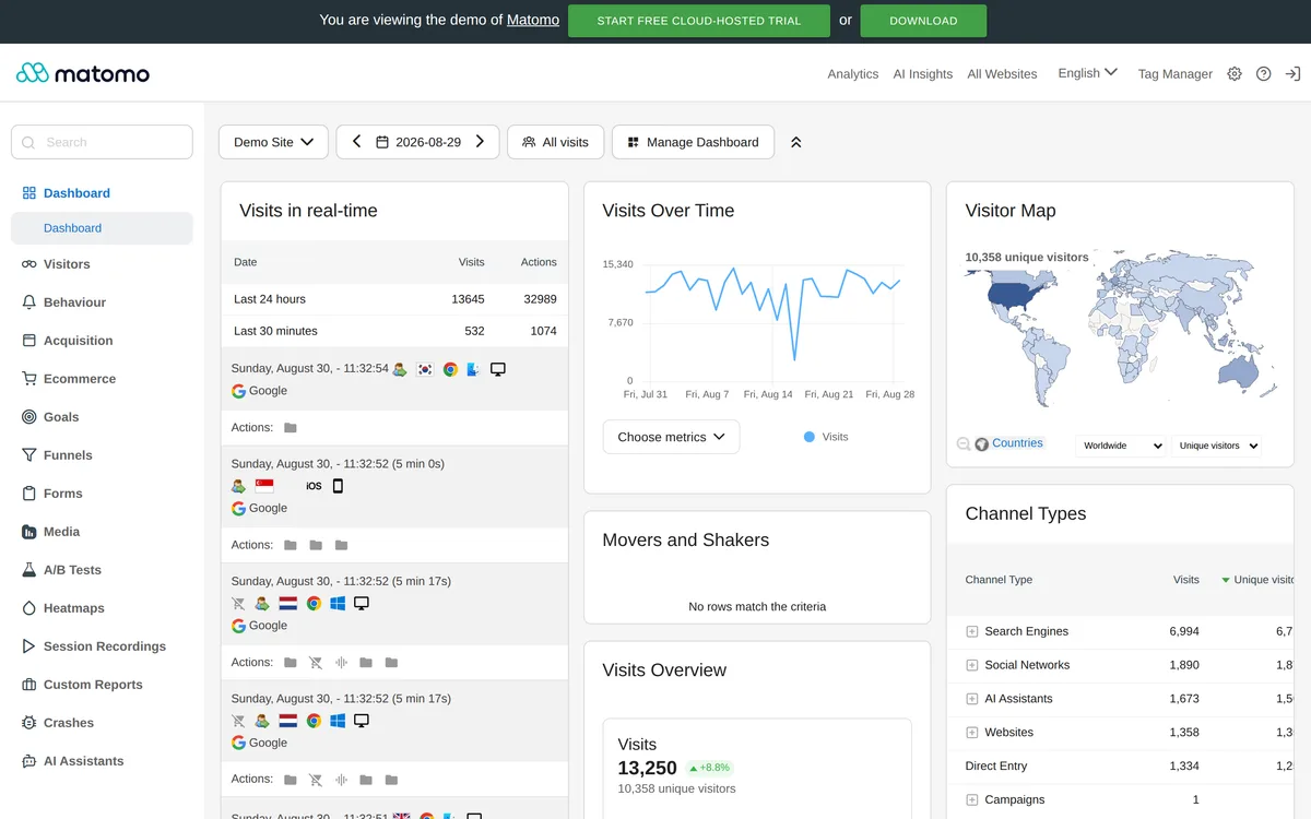
Matomo is the counter-example, and I mean that as a description rather than an insult. It's a genuinely powerful analytics product with a deep left navigation. But the dashboard itself is a widget grid, and a widget grid gives every box the same weight by construction.
Scan it and try to answer "how is the site doing?" in two seconds. You can't. A real-time visit log, a time-series chart, a world map and a channel table are all sitting at the same size with the same card treatment. The information is all there. The ranking isn't.
There's a second problem the screenshot catches: one widget reads "No rows match the criteria" and takes up as much room as the chart next to it. Empty widgets that hold full-size slots are the tax you pay for a user-arrangeable grid.
If you're building an arrangeable dashboard anyway, at least ship an opinionated default arrangement. Most people never rearrange anything.
GoatCounter: no metric cards at all
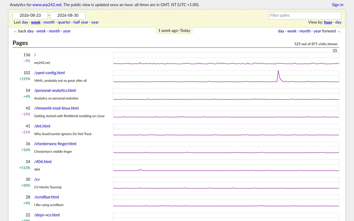
Here's the one that breaks the rules and gets away with it. No sidebar, no KPI cards, no hero chart. Just a date range, a filter box, and a list of pages where every row carries its own sparkline.
The layout is a single strong idea: the unit of interest is a page, so make the page the row and give each row its own trend line. Once you accept that, a summary chart at the top would be redundant.
Would I ship this for a product with five personas and a billing section? No. But it's a useful corrective, because the sidebar-plus-KPI-strip pattern gets applied reflexively to dashboards that have exactly one thing to show. If your dashboard answers one question, the honest layout might be a list.
Note the small honesty at the top right: "525 out of 871 visits shown". It tells you the view is truncated instead of quietly rounding.
What the five have in common
Strip away the styling and the same skeleton shows up in four of the five, GoatCounter excepted:
| Sidebar | KPI cards | Hero chart | Default theme | |
|---|---|---|---|---|
| Plausible | no | 6 | yes | light |
| Umami | yes, grouped | 5 with deltas | yes | light |
| Grafana | yes | 2 big + 4 tiles | no, panel grid | dark |
| Matomo | yes, deep | none | inside a widget | light |
| GoatCounter | no | none | per-row sparklines | light |
Two patterns fall out of that table. Products with one job skip the sidebar. Products people stare at for hours default to dark.
And the one thing every single one of them does, including Matomo: numbers are right-aligned or set in a tabular figure so the digits line up. It's the least glamorous item on this page and the one most custom dashboards miss.
Where to go next
Run the five-minute judging method from the patterns guide linked above on each of these before you copy anything, then build the layout with the dashboard grid generator and check your colours against the WCAG contrast checker. Grafana's dark theme in particular is easy to imitate badly, and low-contrast grey on near-black is the usual way it goes wrong.
These are live third-party dashboards. They change, sometimes daily, so if a screenshot here no longer matches what you see, the link is the source of truth and I'd rather you trust the link.