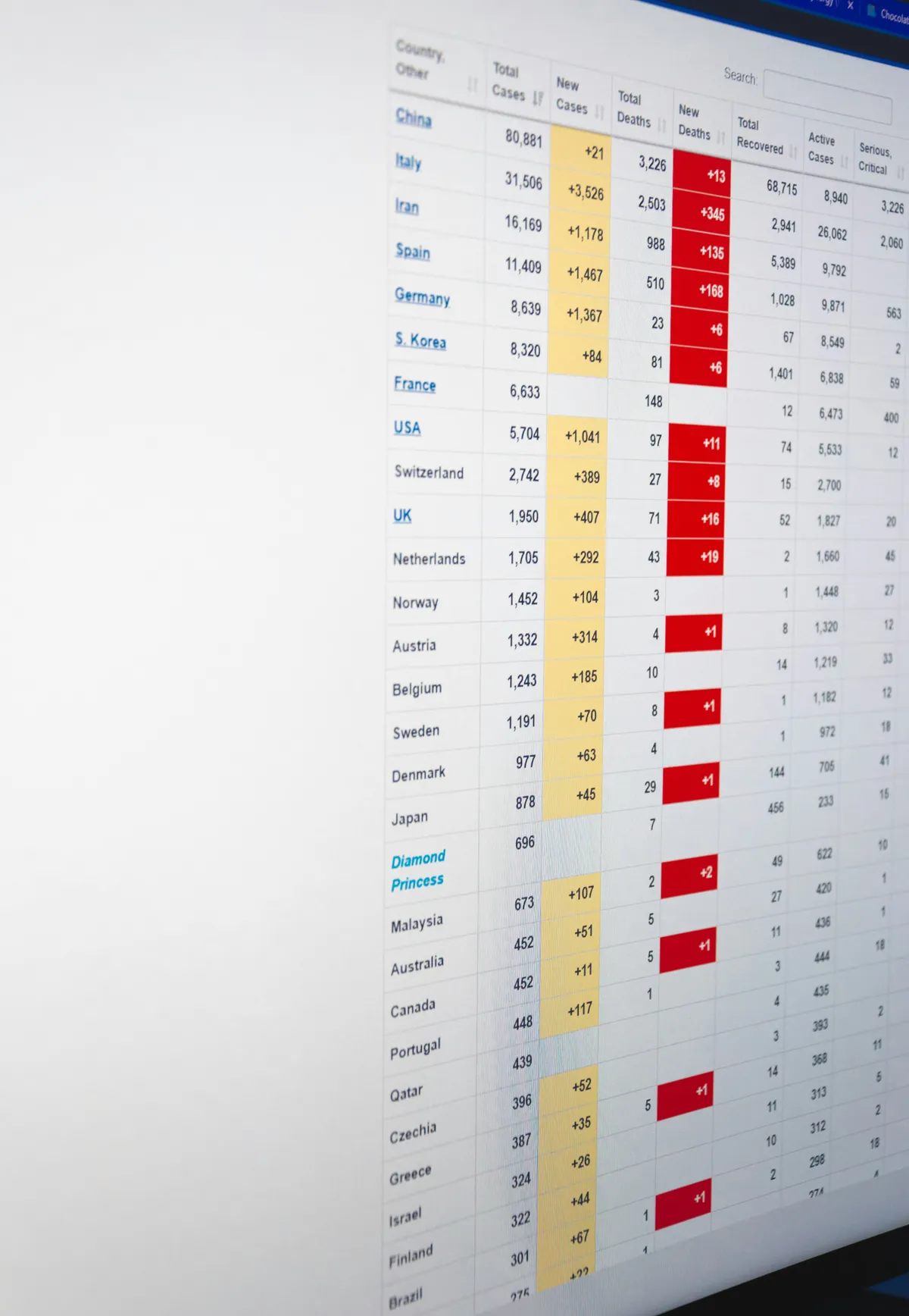
I once sat with a support team lead who'd been given a beautifully spacious dashboard, generous padding, five rows visible at a time, plenty of whitespace. She hated it. Her actual job was scanning two hundred tickets a shift, and every extra pixel of padding meant more scrolling, more lost context, more time. The dashboard had been designed to look calm in a demo. It had never been tested against how someone actually uses it for eight hours straight.
This guide extends our dashboard design patterns hub with the piece most density advice gets backwards: density isn't a style choice, it's a match between row height and how the person in front of the screen actually works.
TL;DR: Match table density to real usage, not to how calm the design looks. Offer a comfortable/compact toggle when your audience spans casual and power users, cap default visible columns around six to eight regardless of density, and never confuse tight row height with genuine clarity, both problems need solving separately.
Data density is the amount of information a dashboard shows per unit of screen space, set most concretely by row height and how many columns stay visible without scrolling. Comfortable runs about 50px a row. Compact runs about 30px and fits three times as many rows in the same space. The right density isn't a taste call you settle in a design review, it's a match to how long the person stares at the screen and how often they scan it.
What Does Data Density Actually Mean in Practice?
Row height and columns visible per screen, mostly. A comfortable table shows maybe five rows at 50-52px each with generous padding. A compact table shows fifteen rows in that same space at 28-32px. Neither wins by default, density is a tradeoff between scanability and information visibility, and the right answer depends entirely on who's looking at the screen.
That support lead needed compact. A executive checking a revenue dashboard once a week needed comfortable, five clean metrics, no scrolling, no cognitive load. Same underlying data, completely different right answer.
| Mode | Row height | Rows visible | Best for |
|---|---|---|---|
| Comfortable | 48-52px | ~5-6 | Occasional glances, executive summaries |
| Standard | 36-40px | ~8-10 | Mixed casual and regular use |
| Compact | 28-32px | ~14-16 | Daily power users, high scan volume |
A dashboard designed to look calm in a demo isn't the same as a dashboard built for how someone actually uses it for eight hours straight.
Should You Build a Density Toggle, or Just Pick One?
Build the toggle if your audience genuinely spans casual and power users. Google Sheets, Notion, and most serious admin tools ship one because their real user base splits that way, someone checking in twice a week and someone living in the tool daily need different defaults, and forcing one choice on both groups makes someone unhappy.
Persist the setting per user account, not per session. Nobody wants to reset their density preference every time they log back in. If your dashboard genuinely serves one narrow audience, say it's built exclusively for support agents processing tickets all day, skip the toggle and default straight to compact. Building a switch nobody needs is wasted engineering time better spent elsewhere.
How Do You Build a Density Toggle Without Breaking the Layout?
Deciding to ship a toggle is the easy part. Keeping it from breaking every other layout assumption is where teams get stuck, so here's the build that has held up for me.
Drive the row height from a single CSS custom property, not from a class on every cell. One --row-height variable on the table root, flipped between 30px and 50px by a data-density attribute, and every row reads from it. The toggle becomes one attribute change, and nothing downstream has to know which mode it's in.
Scale line-height with it, not just the height. A 30px row with a 22px line-height clips descenders, so tie line-height to the density too, roughly --row-height minus 8px. Padding follows the same rule: 6px vertical in compact, 14px in comfortable, both as tokens instead of magic numbers scattered through the CSS.
Keep the sticky header honest across modes. Use position: sticky; top: 0 with a solid background, then re-check the z-index after a density switch, because a shorter header row can expose data bleeding through a background that looked opaque at the taller height.
Then the part most guides skip: virtualization. Compact density exists to show more rows, and past a few thousand the browser chokes on rendering them all. A windowing library like TanStack Virtual or react-window paints only the visible slice, but it needs the row height up front, which is the exact number your toggle just changed. Feed the same --row-height into the virtualizer's size estimate, or the scroll position jumps every time someone flips the mode. Fixed row heights make this trivial. The moment you allow wrapped, variable-height rows, you're into dynamic measurement and the toggle gets a lot more expensive to support.
How Do You Keep a Dense Table From Feeling Like a Wall of Text?
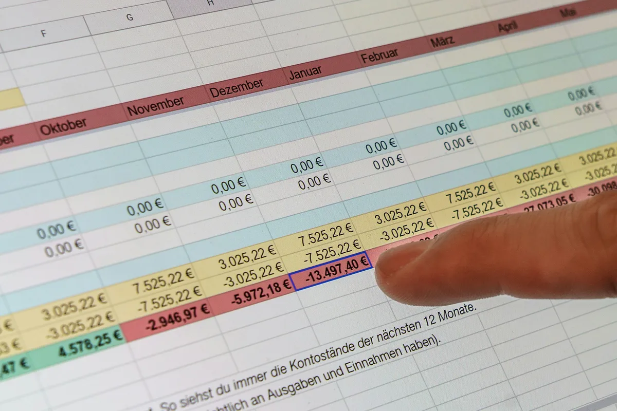
Alignment and column discipline, not just tighter spacing. A dense table with consistent left-aligned text, right-aligned numbers, and clear row dividers reads faster than a sparse table with sloppy alignment, even carrying more information per screen.

Cap default visible columns at six to eight, regardless of which density mode is active. Push anything beyond that behind a column visibility toggle. The real trap teams fall into: treating density purely as "shrink the row height" while still cramming in ten loosely-aligned columns. Rows at 28px with chaotic alignment feel worse than generous rows done cleanly, tight spacing alone doesn't buy you clarity. Solve alignment and column count as a separate problem from row height, or the compact mode just makes the mess smaller instead of fixing it.
Distance changes the math completely. A screen you read from two meters away, glanced at for a second on the way past, can't hold six columns of anything, and the smart home crowd hit this constraint years before SaaS teams started arguing about row heights. Their answer was fewer values, much larger, grouped by room instead of by data type. If you want to see how far that goes, this walkthrough of a wall-mounted Home Assistant dashboard lays out the layout compromises at that viewing distance. Worth borrowing from even if your dashboard lives on a laptop. The design side, with device states and room-first navigation, is in the smart home dashboard UI guide.
Does More Density Always Mean Faster Scanning for Power Users?
Only when the data at that density is actually being used, and that's a narrower case than most "power users want density" arguments assume. Edward Tufte's data-ink ratio principle applies directly here: every value on screen should inform a decision, not just demonstrate that the dashboard can hold a lot of numbers.
I've watched teams pack twenty metrics into a tight grid because a stakeholder assumed power users wanted maximum density, then pull usage analytics and find twelve of those metrics never got a single click in three months. That's not density earning its keep, that's clutter wearing a compact row height as a disguise. Before tightening any table, check what's actually being read against what someone assumes a power user wants. Nielsen Norman Group's research on data tables backs this up: the job of a table is supporting real tasks, scanning, filtering, comparing, sorting, not maximizing how much fits on screen.
Would cutting a metric change anyone's next action? If the honest answer is no, it doesn't earn a row in the dense view either.
How Many Rows Fit on a Real Screen?
Fewer than the table above suggests, and the gap is worth working out before you argue about pixels. That table assumes a panel roughly 450-500px tall. A full-height table on a 900px viewport, after a 72px filter bar and a 40px header, has 788px left for rows.
At 50px per row that's 15 records. At 40px it's 19, and at 30px it's 26. So going from comfortable to compact isn't a cosmetic tweak, it's 73% more records visible without scrolling. The same 788px at 28px would show 28, which is why I stop at 30px and let the type size, not the row, absorb the last bit of pressure: below 12px the text fails before the row does.
Run this sum with your own viewport before picking a default. If the support team works on 1080p monitors, the gain from compact is bigger. If they're on 768px-tall laptops, the browser might leave 600px of viewport, and at 50px rows that's 9 records. That could be the entire complaint.
Density and Touch Screens Pull in Opposite Directions
Compact rows and touch input want opposite things, and pretending otherwise is how a dense table becomes unusable on a phone. A 30px row is a fine mouse target and a poor thumb target, well under the 44px minimum both Apple and Google publish for touch. So the compact mode you built for power users at a desk actively fights the person who opens the same dashboard on a phone in a meeting.
I don't try to make one table serve both. Below the tablet breakpoint I force comfortable row height regardless of the saved preference, because the trackpad math that justified 30px doesn't survive a thumb. The toggle still exists on desktop. It just stops applying where it would hurt.
For genuinely wide tables, the honest mobile answer usually isn't a denser table at all. Freeze the first column, let the rest scroll sideways, and accept that a phone is a lookup device rather than a scanning one. When even that fails, drop the table on small screens and render each row as a card carrying the two or three fields that matter, the same reasoning the mobile navigation patterns guide uses: a layout that works one-handed is a different layout, not a shrunk one.
The mistake I see most is a single responsive table that keeps compact density all the way down to 375px, so the power user's advantage becomes everyone else's tap-the-wrong-row problem. Density is a desktop luxury. Don't ship it to a thumb.
Start From the Audience, Not the Row Height
If you take one number from this page, don't make it a row height. Make it the question underneath: how long does this person sit in front of the screen, and how many rows do they scan per session? A support lead clearing two hundred tickets a shift and an executive glancing at revenue on Monday are not the same user, and no single density serves both well.
So the working order is audience first, then a default density, then a toggle only if the audience genuinely splits, then virtualization once the row count crosses a few thousand. Reverse that order and you end up tuning pixels for a user you never actually described.
This page is one spoke of a larger set. The dashboard patterns hub linked above covers the sidebar, metric strip and grid the dense table sits inside; the chart-type guide handles the panels next to it; and the SaaS admin panel layouts writeup is where dense tables and role-based views collide most often.