A tablet on a wall is a strange design target. It never scrolls, nobody is sitting in front of it, and it stays on for eighteen months without being looked at properly once. Every habit from responsive web design either doesn't apply or actively hurts. So what replaces them?
This picks up where our smart home dashboard UI guide left off. That piece covered what to show and how to organise it. This one is about the physical layer, type scale, touch, and a screen that lives on a wall.
TL;DR: Design at 24px minimum body text and 40px+ for primary values, size touch targets at 60px rather than 44px, and never let the primary view scroll. Treat the dark theme as the default, dim on a schedule, and test everything on the actual panel mounted at actual height, because desk mockups lie about all of it.
The Two-Meter Type Scale
Signage designers have a rule that transfers almost perfectly: legible character height is roughly the viewing distance divided by 200. At two meters that's 10mm of physical character height, which on a typical 8-inch tablet at around 190 PPI lands near 28 to 30 device pixels for text you actually need to read.
That's for text that has to be read. The primary value on a card, the temperature, the room name, the one thing someone is checking from across the room, wants to be roughly double that. Here's the scale I work from:
| Role | Size at tablet DPI | Purpose |
|---|---|---|
| Primary value | 56 to 72px | Read from across the room without stopping |
| Card label | 32 to 40px | Read at a glance while approaching |
| Body and secondary | 24 to 28px | Read when standing at the panel |
| Timestamp, unit | 18 to 20px | Read deliberately, when you care |
Anything below 18px on a wall panel is decoration. If information genuinely doesn't matter enough to size it above that, it probably doesn't belong on the first screen.
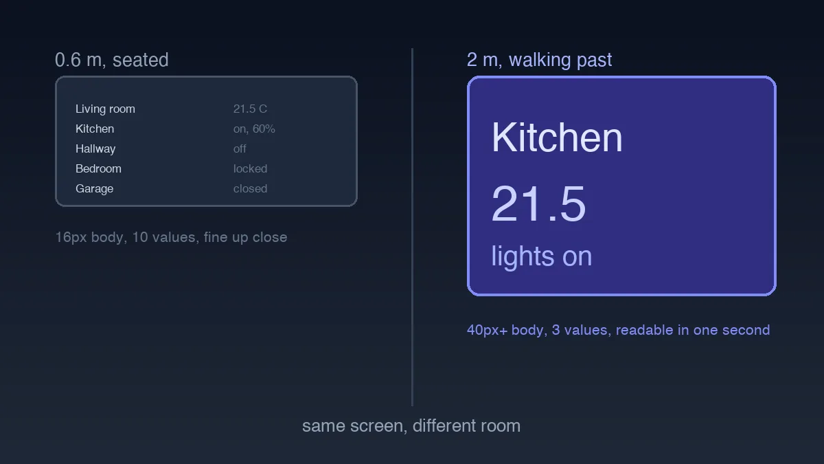
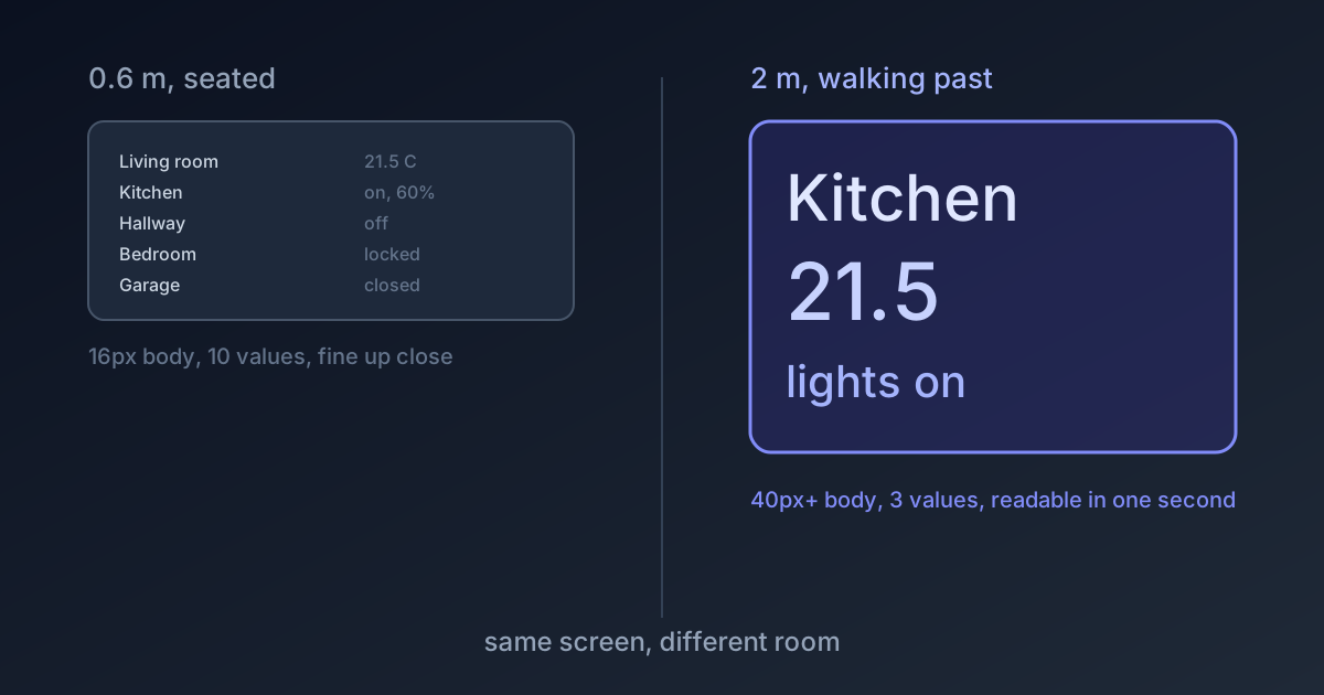
The mistake that undoes all of this is designing in a browser window on a laptop. A 24px label at 60cm looks enormous and feels wasteful, so it quietly gets reduced to 16px in review, and the panel ships unreadable. Mock it up on the actual device, mount it at the actual height, and walk past it. Everything about the type scale becomes obvious in ten seconds.
A 24px label looks wasteful in a laptop mockup, gets cut to 16px in review, and ships a panel nobody can read from the hallway.
Touch at Arm's Length
The 44px minimum touch target that every mobile guideline cites assumes a held device and a thumb with a short, controlled path. A wall panel gets an outstretched arm, often mid-stride, sometimes at an oblique angle, occasionally with a mug in the other hand. Accuracy drops.
Sixty pixels is my floor, and I'd rather have four large targets than nine correct ones. Spacing matters as much as size here: on a phone, a mis-tap opens the wrong page and you go back. On a wall panel, a mis-tap turns off the wrong light, which someone in another room then notices. The error cost is physical, so leave 16px or more of dead space between adjacent controls and accept that the screen holds less.
One thing worth designing explicitly: what happens between the tap and the device responding. A Zigbee light takes a few hundred milliseconds to confirm, sometimes longer, and a panel that shows nothing in that window gets tapped again. An immediate optimistic state change plus a subtle pending treatment solves it. Silence gets you double-taps and confused users, every time.
The No-Scroll Constraint
Here's the rule I'd defend hardest: the primary view does not scroll.
A wall panel earns its place by answering questions with zero interaction. Hidden content defeats that entirely, because content below the fold might as well not exist for someone walking past. If the layout doesn't fit, the answer is fewer things on it, not a scroll region.
That constraint is uncomfortable and it is the whole point. It forces an actual editorial decision about what the panel is for, and the answer is usually smaller than the first draft assumed. Six to nine elements, sized properly, is a full screen at this distance. The tenth thing goes to a second view, and the fifteenth thing probably goes nowhere.
Secondary views can scroll freely. By the time someone drills in, they've stopped walking and they're looking at the screen properly, which is a completely different interaction.
Living With an Always-On Screen
Design decisions that only surface after months of running:
Burn-in is real. A static layout at full brightness for a year and a half leaves ghosting, worst on OLED but visible on LCD backlights too. A subtle idle shift of a few pixels, a screensaver, or motion-triggered wake all solve it. Motion wake is the best of the three because it also fixes brightness at night.
Brightness needs a schedule. A hallway panel at full output is the brightest object in the house at 2am. Drop it after dark, either on a timer or an ambient sensor.
Dark is the primary theme. Not a preference, an operating condition. Design the dark version first and let the light variant be the derivative, which is backwards from how most design systems are built and correct for this device.
Test it in the actual room. Glare from a kitchen window kills contrast that tested fine on a desk. Viewing angle matters more than you'd expect, since a panel at chest height is looked at from above by anyone standing.
Building the Thing
The implementation side splits in two, and both halves are further along than most designers expect.
If you're assembling the panel from an existing home automation system rather than writing one, the hardware and mounting decisions shape the design as much as anything above: screen size, whether it charges cleanly through the wall, and whether it wakes on motion. Settle those before finalising a layout, because the device you can actually mount constrains both the aspect ratio and the safe area.
If you're building custom, the live-data side is its own project, and our walkthrough of a real-time React dashboard on the Home Assistant WebSocket covers the state layer that keeps those large numbers current without re-rendering the entire screen every second. On a panel this matters more than on a desktop, since tablet hardware in this price range has very little headroom.
Two meters and one second is the most aggressive editing constraint I've designed against. It removes everything that was on screen because it fit rather than because someone needed it, which turns out to be most of what ends up on a first draft. That's a lesson worth carrying back to the dashboards people actually sit in front of.