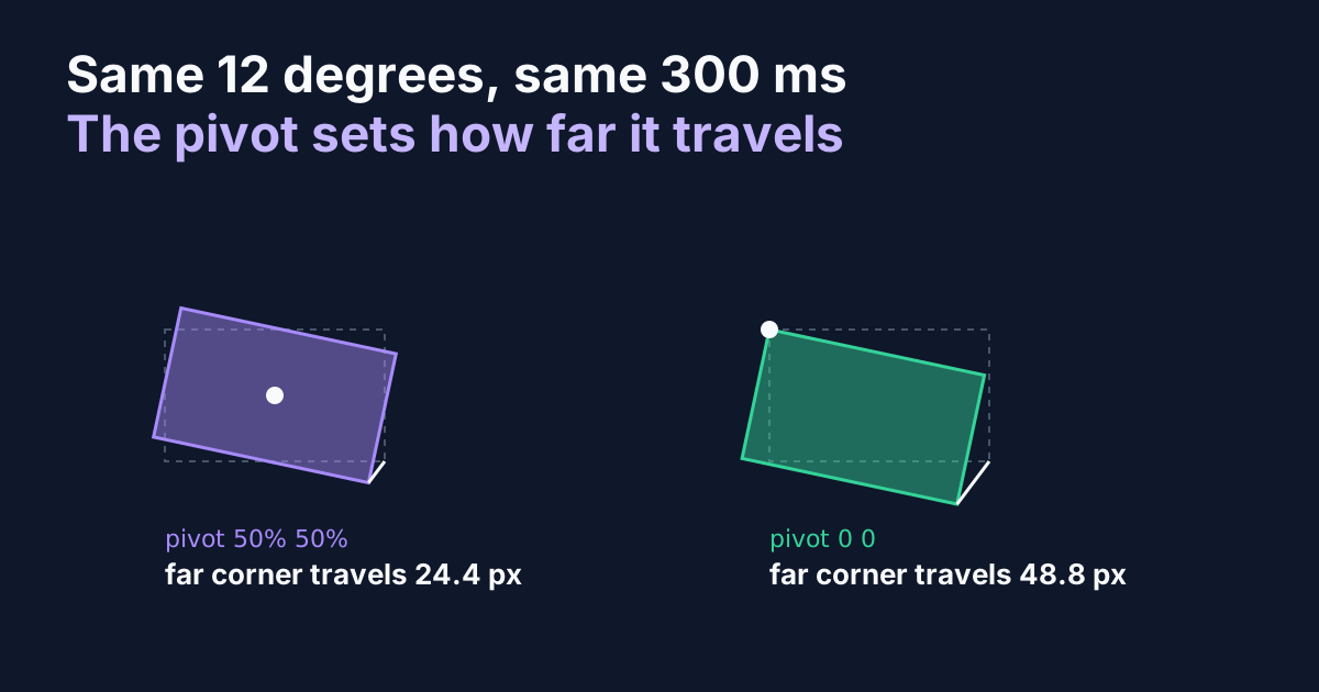
Two cards, one keyframe, one curve. The first rotates 12 degrees about its centre. The second rotates the same 12 degrees about its top-left corner. Which one moves more? Most people say they look about the same, and that's the trap, because the second one's far corner travels twice as far in exactly the same 300 milliseconds.
transform-origin gets treated as a positioning detail, something you set until the thing stops looking wrong. It's also half of the speed of your animation. I measured it, in a Chromium tab, with probe elements pinned to a box's four corners, and the numbers below come from those probes rather than from a formula I trusted.
TL;DR:
transform-originsets the pivot, and travel at any point is its distance from the pivot times the angle or scale change. A 12 degree rotation of a 200 by 120 box moved its farthest corner 24.4px about the centre and 48.8px about a corner, so the same duration and curve ran twice as fast. Move the pivot to match the pattern, then fix the travel with the angle, not the duration (MDN, 2026).
Where Does the Pivot Sit, and What Does It Control?
At 50% 50% unless you say otherwise: the middle of the element's box. Every rotate, scale and skew is applied relative to that point, so the point itself never moves and everything else swings or grows away from it. Run the preview above and watch the three dashed outlines. The card on the left pivots in the middle, the second on its top edge, the third in its top-left corner.
.card {
  --origin: 50% 50%;
  transform-origin: var(--origin);
  animation: swing 600ms cubic-bezier(0.16, 1, 0.3, 1) both;
}
.card--edge { --origin: 50% 0; }
.card--corner { --origin: 0 0; }

@keyframes swing { from { rotate: -12deg; opacity: 0; } }
Two details trip people up. First, the origin accepts keywords, percentages and lengths, and the lengths can sit outside the box: 50% -60px puts the pivot sixty pixels above the element, which is how you make something swing like a pendulum. Second, the individual rotate, scale and translate properties use the same origin as the transform shorthand. I set a 12 degree rotation both ways with the origin at 0 0 and compared all four corners: identical to a hundredth of a pixel. You don't need to switch to transform to get a custom pivot.
How Far Does a Corner Really Travel?
Further than you'd guess, and the arithmetic is short. A point's travel under a rotation is its distance from the pivot times the angle in radians. Under a scale it's its distance from the pivot times the scale change. Move the pivot, and the distances change.
I measured this with four dot elements pinned to the corners of a 200 by 120 box and read their positions before and after a 12 degree rotation. The scale test used a 240 by 160 box shrunk to 0.9.
pivot (transform-origin) | rotate 12deg, farthest corner | scale 0.9, farthest corner |
|---|---|---|
50% 50% (centre) | 24.4px | 14.4px |
50% 0 (top edge) | 32.7px | 20.0px |
0 0 (top-left corner) | 48.8px | 28.8px |
50% -60px (above the box) | 43.1px | not tested |
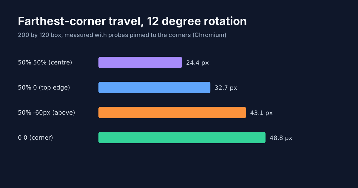
The centre row is the floor. No pivot inside the box gives a smaller maximum, because the centre is the point whose farthest neighbour is nearest. Every other pivot adds distance, and distance is speed.
That's why a corner pivot looks dramatic and a centre pivot looks polite. They aren't different effects, they're the same effect at two scales. The table also explains a failure you've probably seen: a card that's fine at 12 degrees from the middle and flings itself across the screen the day somebody moves the pivot to its hinge.
The pivot is half of an animation's speed: move it to a corner and the same duration and curve travel twice as far.
Why Does the Same Curve Feel Faster From a Corner?
Because speed at a point is travel times the curve's slope, divided by the duration. The duration didn't change. The curve didn't change. The travel doubled, so the speed did too.
The slope matters more than most people expect. A CSS timing curve has an average slope of 1 by definition, and a real curve spends some of its time well above that. I computed the peak slope for four common curves numerically, then multiplied by the travel from the table, for a 12 degree rotation over 300 ms.
| timing curve | peak slope | centre pivot, peak speed | corner pivot, peak speed |
|---|---|---|---|
cubic-bezier(0, 0, 0.58, 1) (ease-out) | 1.72 | 140 px/s | 280 px/s |
cubic-bezier(0.42, 0, 0.58, 1) (ease-in-out) | 1.72 | 140 px/s | 280 px/s |
cubic-bezier(0.25, 0.1, 0.25, 1) (ease) | 2.29 | 186 px/s | 372 px/s |
cubic-bezier(0.16, 1, 0.3, 1) (expo-out) | 6.25 | 508 px/s | 1,016 px/s |
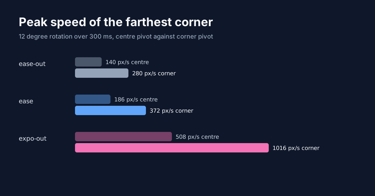
The last row is the one to remember. An expo-out curve starts at 6.25 times its average speed, because its first control point is (0.16, 1) and the opening slope is y / x. Put that curve on a corner pivot and the far corner leaves at about a thousand pixels a second. That's the snap people describe as "jumpy" without being able to say why.
So what do you fix? Not the duration. Lengthen it and the entrance gets slow before it stops being sharp. The travel is the thing that grew, and travel is angle times distance, so halve the angle:
.card--corner {
  --origin: 0 0;
  /* same 24px of far-corner travel as the centre pivot */
  --angle: -6deg;
}

@keyframes swing { from { rotate: var(--angle, -12deg); opacity: 0; } }
Six degrees about the corner matches the far-corner travel of twelve degrees about the centre. The curve you tuned stays as it was.
Does the Same Rule Hold for Scale-In Popovers?
It does, and this is the case you'll meet most often. A popover entering from scale(0.9) looks small, but the pivot decides where the missing ten percent comes from. On a 240 by 160 panel the farthest corner moved 14.4px about the centre and 28.8px about the top-left corner, measured the same way as above. The top edge sat between them at 20.0px.
.popover {
  transform-origin: var(--origin, 0 0);
  animation: pop 160ms cubic-bezier(0, 0, 0.58, 1) both;
}

@keyframes pop { from { scale: 0.9; opacity: 0; } }
If the trigger is a button in the panel's top-left corner, 0 0 is correct even though it doubles the travel, because the panel is visibly growing out of the button. What you can still control is how much it grows. A start of scale(0.95) from that corner travels about 14.4px, the same as 0.9 from the centre, and it reads as a shorter, calmer entrance without losing the sense of origin. Keep the pivot honest and tune the number instead.
Which Pivot Fits Which Pattern?
The rule I'd use: the pivot is where the thing is attached, or where it came from.
- Dropdowns, popovers, menus. The edge or corner nearest the trigger. A menu scaling from its middle looks like a balloon inflating in mid-air; scaled from the trigger's edge it looks released from it. The micro-interactions piece makes the same complaint about tooltips. Popover libraries tend to publish the correct origin as a variable, and Radix Primitives, for one, does it per component.
- Modals and dialogs. The centre, or the point that opened them if there is one. A centre scale from 0.96 is the default for a reason: it has the smallest travel.
- Hinged cards, flaps, drawers. The hinge edge. A card that swings open from
0 50%reads as a door; from the centre it reads as a wobble. - Progress bars and meters. The start edge, so the bar grows in the reading direction. The dashboard article on animated stats cards uses
transform-origin: leftwithscaleX()for exactly this. - Pendulums, tags, swinging signs. A length above the box, like
50% -60px. Measured above: 43.1px of travel for 12 degrees, close to a corner pivot, so keep the angle small.
Notice what's missing from that list: nothing animates the origin itself. Setting it once and animating the transform is the whole job. If the pivot slides during the motion, the element drifts, and no timing curve will hide that.
Why Does My SVG Shape Rotate Around the Wrong Point?
Because SVG elements default to a different box. For HTML elements, 50% 50% means the element's own box. For SVG shapes, the default transform-box is view-box, so the percentage resolves against the whole SVG viewport.
I tested it with a 100 by 60 rectangle at x=100, y=60 inside a 300 by 200 SVG. Rotated 45 degrees at 50% 50% with the default box, the rectangle ended up 7.1px to the right and 3.0px lower than the same rotation with transform-box: fill-box. It rotated around the middle of the picture, not the middle of the shape, so it drifted off its own position as it turned.
.shape {
  transform-box: fill-box;
  transform-origin: center;
}
If a rotating icon seems to orbit something instead of spinning, this is nearly always the reason, and it's the first thing I'd check before touching the keyframes.
What About Performance?
Less than you'd think, and not in the way articles usually say. transform-origin isn't a layout property, so changing it doesn't reflow anything, and a rotation or scale on transform, rotate or scale stays the same kind of operation wherever the pivot sits. I didn't benchmark frame times for this piece, and I don't think you need to: what moved in every measurement above was distance, and distance is something your eye pays for, not the GPU.
That distinction is the part worth taking away. When an animation looks wrong after you move the pivot, the instinct is to suspect the browser. The browser is doing the same work. What changed is how far your eye has to follow.
Summary
transform-origin sets the pivot, and the pivot sets the travel: distance from the pivot times the angle or scale change. Measured on a 200 by 120 box, a 12 degree rotation moved the farthest corner 24.4px about the centre and 48.8px about a corner, so the same 300 ms and the same curve ran at twice the speed. With an expo-out curve that's about 1,016 px/s at the start. Pick the pivot where the element is attached or where it came from, correct the travel with the angle rather than the duration, and give SVG shapes transform-box: fill-box before you debug anything else.