Stats cards are the most animated rectangles on the web, and most of that animation is a number counting up from zero because a template said so. Nobody asked for it. Nobody measured what it costs. A designer who searches for animated stats cards wants something specific: which effects are worth shipping, how to build them without a heavy dependency, and where to stop.
This guide does both halves. It builds a four-card set that runs in the preview under the next heading, reads the numbers off a real browser instead of guessing, and then argues about which parts you should delete. It extends the dashboard design patterns hub, which settles what belongs in a metric strip and says, deliberately, nothing about how that strip should move.
TL;DR: Animate a stats card once, on first load, for under a second, and animate only what changed on refresh. A registered CSS property (
@property) gives you a count-up with no JavaScript. Motion'sanimate()covers formatted numbers and live updates. Put every animation insideprefers-reduced-motion: no-preferenceso the default state is the final state, and announce the final value to screen readers once, never each tick.

What Does a Finished Animated Stats Card Set Look Like?
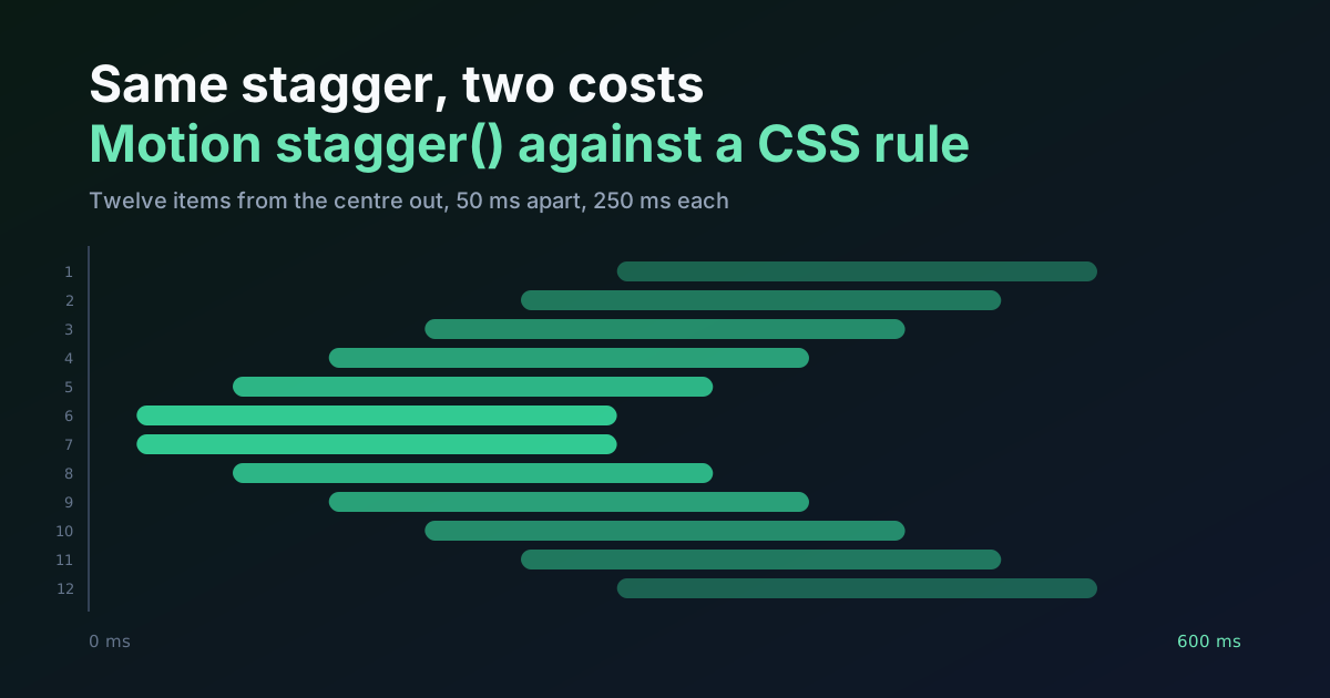
Four cards, four different effects, one timeline. The signups card counts up and then shows a delta chip. The conversion card fills a ring while its number counts alongside. Latency draws a sparkline and counts too. Storage grows a bar. Everything runs on five keyframe blocks (rise, count, draw, ring, fill) and a stagger of 50 ms per card, written as one custom property, --i, on each card.
I read the timeline off the browser instead of trusting my own easing curves. In Chromium 145, document.getAnimations() reports 13 running animations on load, and the last one ends at 850 ms. Under a second. Nothing loops. Nothing waits for a click.
Two things about the preview matter more than the effects. First, every final value already sits in the stylesheet and the markup. The keyframes only describe the journey, and they use from with no to, so the end state is whatever the element already is. Switch animations off, or hit a browser that ignores them, and you still get a correct dashboard. Second, the :not(:hover) on the wrapper is demo scaffolding. Move the pointer out of the grid and the animations restart, which is how you replay them here. Delete it in production, because replay on demand is exactly the habit the last third of this article argues against.
Count-Up in Pure CSS: One Registered Property
The trick is small enough to feel like cheating. Why can't a normal custom property count? Because to the browser it's just a string, so 0 can't tween into 842; it flips from one to the other partway through. Register it with a type and the browser knows it's an integer and interpolates it every frame. Then a CSS counter turns the integer into text.
@property --n {
  syntax: "<integer>";
  inherits: false;
  initial-value: 0;
}

.num { counter-reset: n var(--n); }
.num::after { content: counter(n) attr(data-unit); }

@keyframes count { from { --n: 0; } }
The markup carries the real number, style="--n:842", so the keyframe never repeats it. data-unit supplies the suffix: %, ms, nothing.
Browser support is the first question, and MDN's answer is Baseline 2024, newly available since July 2024. Newly. That word does real work, because the long tail of older browsers hasn't gone anywhere, so check your own analytics before you lean on it. The failure is gentle. I deleted the @property block from the preview's stylesheet and replayed the cards: the ring and the bar kept animating, and the numbers jumped from 0 to their final value early in the run. A late number, but never a wrong one. Registering a property is not limited to integers: an <angle> works the same way, which is how the Apple Intelligence glow ring in CSS keeps a conic gradient turning.
Four limits decide whether this is the right tool:
- It's integers only. No
12,480with a comma, no98.6. If your metric needs either, skip to the JavaScript version. - Counter text is generated content. It isn't part of the element's text in the DOM, so find-in-page and text selection won't see it, which is why the markup also holds a visually hidden copy of the real number (
.sr) for assistive tech. - Animating a custom property isn't one of the compositor-only cases. web.dev's animation guide tells you to restrict motion to
opacityandtransformif you want it off the main thread, and a count-up recalculates style on every frame. Four counters are unlikely to matter. A table with sixty animated cells would be a different bill, and the main-thread budget guide shows how to work out which one you're paying. - Proportional digits have different widths (a 1 is narrower than an 8), so a figure that's counting can change width on every frame. Add
font-variant-numeric: tabular-nums, which MDN lists as widely available since January 2020, and every digit takes the same space.
Drawing Sparklines, Rings and Bars Without Measuring Anything
Every one of these is "reveal a shape that already exists", which is why none of them needs JavaScript.
The pathLength trick
SVG's pathLength attribute tells the browser to pretend a shape is exactly that long. Set it to 1 on the sparkline and 100 on the ring, and stroke-dasharray and stroke-dashoffset stop depending on pixels. No getTotalLength() call, no re-measuring when the card resizes. MDN confirms it works on polyline and circle, among others.
.spark polyline { fill: none; stroke: #4f46e5; stroke-width: 2; stroke-linejoin: round; vector-effect: non-scaling-stroke; stroke-dasharray: 1 2; }
.ring .val { stroke: #4f46e5; stroke-linecap: round; stroke-dasharray: 100; stroke-dashoffset: calc(100 - var(--v)); }

@keyframes draw  { from { stroke-dashoffset: 1; } }
@keyframes ring  { from { stroke-dashoffset: 100; } }
On the ring, a value of 68 means an offset of 32, so the percentage you'd put in the markup is the percentage you see. The sparkline has one oddity I only caught in a mid-animation screenshot. With a plain stroke-dasharray: 1, a stray dot of stroke appeared at the far end of the line while it drew, because the dash and the gap are the same length and the pattern repeats. Making the gap longer (1 2) removed it. Check your own sparkline at the 40% mark, not only at the end.
Bars: scale, don't resize
Animating width makes the browser re-lay out the card on every frame. Animating transform: scaleX() doesn't. The bar's fill is full width, scaled down to its value from the left edge:
.bar i { display: block; height: 100%; background: #4f46e5; transform-origin: left; transform: scaleX(var(--v)); }

@keyframes fill  { from { transform: scaleX(0); } }
A scale distorts rounded ends as it runs. The track in the preview has overflow: hidden and a 4px radius, which hides it. If your fill needs a true pill cap, animate clip-path instead; I haven't ported this demo to it, so treat that as a lead rather than a result.
The Motion Gate: Default to the Final State
The block that makes all of it safe is the one that arrives last in the file:
@media (prefers-reduced-motion: no-preference) {
  .stats:not(:hover) .card { animation: rise 300ms cubic-bezier(.2, .7, .2, 1) both; animation-delay: calc(var(--i) * 50ms); }
  .stats:not(:hover) .num { animation: count 600ms cubic-bezier(.2, .7, .2, 1) both; animation-delay: calc(var(--i) * 50ms + 80ms); }
  .stats:not(:hover) .chip { animation: rise 300ms ease-out both; animation-delay: calc(var(--i) * 50ms + 450ms); }
  .stats:not(:hover) .spark polyline { animation: draw 600ms ease-out both; animation-delay: calc(var(--i) * 50ms + 120ms); }
  .stats:not(:hover) .ring .val { animation: ring 600ms cubic-bezier(.2, .7, .2, 1) both; animation-delay: calc(var(--i) * 50ms + 80ms); }
  .stats:not(:hover) .bar i { animation: fill 500ms cubic-bezier(.2, .7, .2, 1) both; animation-delay: calc(var(--i) * 50ms + 80ms); }
}

@keyframes rise  { from { opacity: 0; transform: translateY(8px); } }
The common reduced-motion pattern does it backwards: animate by default, then override with reduce and a near-zero duration. The micro-interactions guide explains why a blanket 0.01 ms override passes an audit and kills the signal the animation existed for. Why does the direction matter? Opting in turns that around. Reduced-motion users never start an animation at all, and I confirmed it: with reducedMotion: "reduce" emulated in Chromium, the page reports zero running animations and all four figures read 842, 68, 214 and 74 from the first frame.
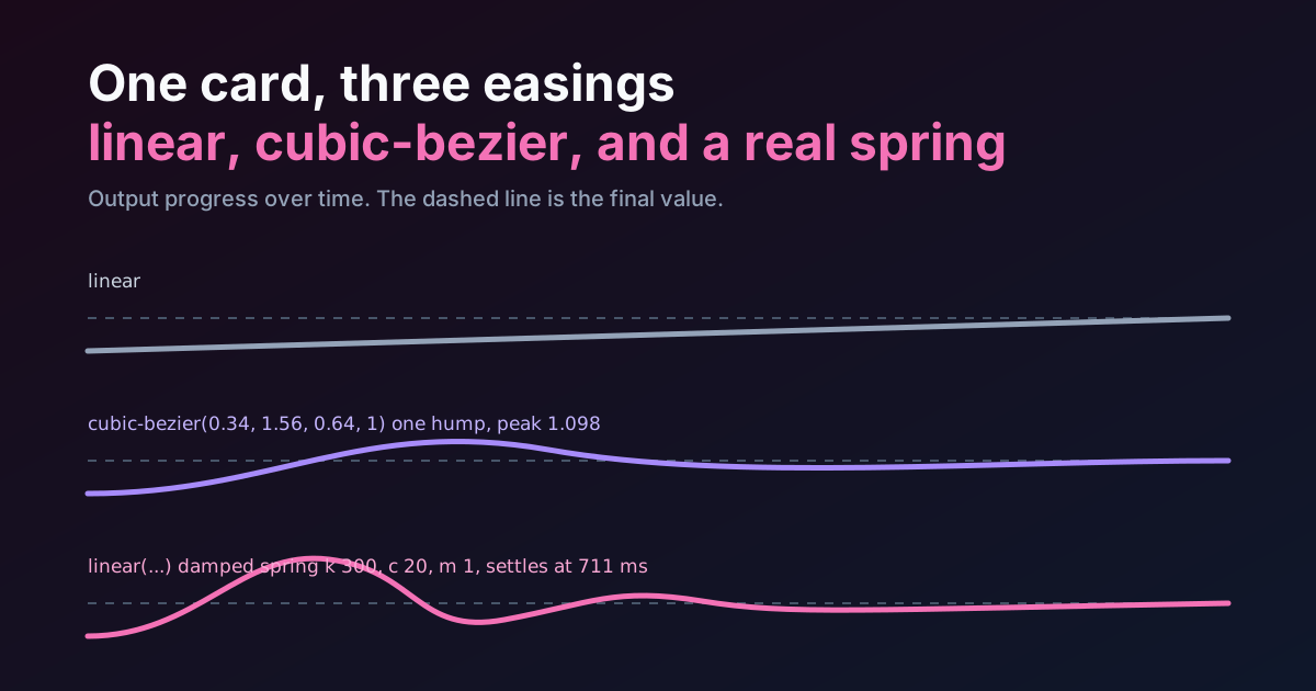
The cubic-bezier(.2, .7, .2, 1) curve is a long-tailed ease-out, so the count rushes and then settles; easing curves as shapes explains why that suits a number the eye is waiting on.
Count-Up in JavaScript: Commas, Decimals and Live Refreshes
The CSS version stops at integers and stops at first load. A real dashboard also needs 12,480, and it needs the number to move when new data lands. That's JavaScript's job, and the block below does both, plus the one thing I'd insist on: it fills the status region once, with the final value.
import { animate } from "motion";

const format = new Intl.NumberFormat("en-US");
const reduceMotion = matchMedia("(prefers-reduced-motion: reduce)");
const running = new WeakMap();

function setStat(card, next) {
  const num = card.querySelector(".num");
  const status = card.querySelector("[role=status]");
  const chip = card.querySelector(".chip");
  const from = Number(num.dataset.value ?? 0);

  running.get(num)?.stop();
  num.dataset.value = String(next);
  status.textContent = format.format(next);

  chip?.animate(
    [{ backgroundColor: "#fde68a" }, { backgroundColor: "transparent" }],
    { duration: 1200, easing: "ease-out" },
  );

  if (reduceMotion.matches || from === next) {
    num.textContent = format.format(next);
    return;
  }

  running.set(num, animate(from, next, {
    duration: 0.6,
    ease: [0.2, 0.7, 0.2, 1],
    onUpdate: (latest) => {
      num.textContent = format.format(Math.round(latest));
    },
  }));
}

const seen = new IntersectionObserver((entries, observer) => {
  for (const entry of entries) {
    if (entry.isIntersecting) {
      setStat(entry.target, Number(entry.target.dataset.final));
      observer.unobserve(entry.target);
    }
  }
}, { threshold: 0.6 });

document.querySelectorAll("[data-stat]").forEach((card) => {
  seen.observe(card);
});
The markup it expects is a [data-stat] card holding <span class="num" aria-hidden="true">0</span> and <span class="sr" role="status"></span>, with the target in data-final.
This exact block was run in Chromium 145 against Motion 13.5.0 from a CDN, with a second card parked 3,000px down the page. The first card counted to 12,480 and was reading 9,320 about 150 ms in. The second card stayed at 0 until I scrolled it into view, then read 573 and settled on 842. Its status region held only the final value the whole time. A second call to setStat while the first was still running stopped the old animation and finished cleanly on the new number. With reduced motion emulated, the numbers appeared instantly. One caveat: an interrupted count restarts from the previous target, not from the number currently on screen, so a mid-run refresh can jump by a few units.
Two API facts from Motion's documentation shaped the choices. Calling animate(from, to, { onUpdate }) on plain numbers needs the hybrid build, listed at about 18 kb, while the mini build at 2.3 kb only animates HTML and SVG styles through native browser APIs and can't take onUpdate. My opinion, and you can disagree: if a count-up is the only thing on the page that needs it, 18 kb is a lot of weight for one number. A thirty-line requestAnimationFrame loop does the same job.
There's also a middle route with no library. The Web Animations API can animate the registered property from the CSS section: el.animate({ "--n": [0, 842] }, { duration: 900, easing: "cubic-bezier(.2,.7,.2,1)", fill: "both" }). Sampled every 300 ms in my run it read 696, 821, 842. It ignores prefers-reduced-motion entirely, though, so the gate has to live in your script.
The highlight on the delta chip is deliberately outside the reduced-motion branch. A background that fades from amber to transparent doesn't move anything. MDN's guidance is to replace motion rather than remove the signal, and on a live dashboard the signal "this value just changed" is the part worth keeping.
A number that counts up on every filter change isn't telling you the data changed. It's telling you the dashboard wants to be admired.
When Does Animating a Metric Help, and When Does It Hurt?
Short version: it helps when the motion carries information the static page can't, and it hurts when it only carries personality.

| Pattern | Helps when | Hurts when | Runs on |
|---|---|---|---|
| Count-up | First load of a page people open rarely | A daily tool, or any filter that re-triggers it | Main thread |
| Delta flash | Live data, and you need the eye on what moved | Every card flashes at once | Paint, no layout |
| Sparkline draw-in | Direction of a trend matters on arrival | It redraws on every date-range change | Main thread (paint) |
| Ring or bar fill | Progress toward a target | A status checked hourly | Bar: compositor. Ring: main thread |
| Looping pulse | Almost never on a stat | Always, on a screen left open all day | Depends |
Where the motion earns its place
First load is the single best case. What does a person do in the first second on a dashboard? Look for the numbers. The page arrives, the eye hasn't picked a target yet, and a short staggered reveal tells it where the four important numbers are. After that moment the information is spent. On refresh, the useful animation is narrower still: mark the delta that changed and leave the rest alone, which is the pattern the JavaScript block uses. Skeleton to value is the third legitimate case. Swap the placeholder for the real figure, don't morph one into the other.
Where it costs more than it gives
Loops are the clearest failure, and there's a rule for it. WCAG 2.2 SC 2.2.2, Pause, Stop, Hide, is Level A. Moving content that starts automatically, lasts longer than five seconds and sits beside other content needs a way to pause or hide it. Auto-updating content has no five-second grace. A pulsing "live" badge on a dashboard that stays open all shift is precisely that content.
Re-animating on every filter change is the quieter failure. Each click makes the reader wait for a count they've already read. Nielsen Norman Group puts most UI animation in the 100 to 500 ms range and says that by 500 ms animations start to feel like a real drag. My own demo counts for 600 ms, which sits above that range, and I'd cut it to 300 or 400 for anything people open daily. Is a nicer count-up worth 200 ms of every morning? I wouldn't bet on it.
Screen readers are the third cost, and the easiest to pay by accident. MDN says polite suits updates that aren't critical and that a region changing rapidly should be set to off. A counter ticking at 60 frames a second inside a live region queues dozens of announcements. So the animated number stays aria-hidden, and a separate role="status" element gets the final value written once. WCAG 4.1.3 (Level AA) asks for exactly this kind of programmatic status message.
A Shipping Checklist
Run through these before a stats strip goes out, and cut anything that fails.
- The final value is in the markup, not only produced by the animation.
- Every animation sits inside
prefers-reduced-motion: no-preference, or the script checks the same query. - Nothing loops.
- Total time from first paint to settled is under a second; read it from
document.getAnimations()rather than adding up delays by hand. - A filter change doesn't restart anything. Only a data refresh does, and only for values that changed.
- Digits use
tabular-nums. - The hidden status text holds one value, written once.
If a stat needs illustrated motion beyond numbers, say a hero metric with a character or a morphing icon, that's a job for a dedicated runtime, and the comparison of motion design tools covers Rive, Lottie and the rest. For the chart that usually sits under these cards, choosing the right chart type decides whether the sparkline deserves to be there at all.
Where This Advice Stops Working
Operator dashboards, the kind a person watches for six hours to catch a spike, shouldn't animate entrances at all. The reader isn't orienting; they're scanning for change. There the only motion that survives is the delta flash, and even that needs a cap on how often it fires. The demo above is for the other kind of screen: the weekly business glance, the analytics home, the product overview someone opens to feel oriented. Which kind is yours? That answer decides how much of this you should keep, and the live CSS preview editor is a quick place to try deleting pieces until the card still makes its point.