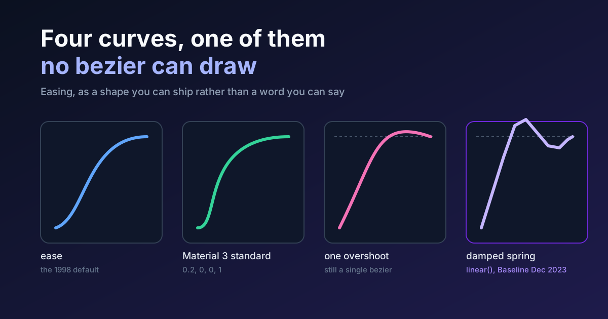
This blog has mentioned easing in 22 of its 90 posts and has never once written about it. That is a fair description of the discipline generally: easing is the thing everybody references and nobody specifies, and "add some nice easing" survives design review in a way that "add some nice colour" never would.
So how does a whole discipline keep deferring its own vocabulary? Here's the piece that should have come first. Not a gallery of curves to copy. A working account of what the shapes mean, which ones your tools can and cannot draw, what Google actually ships versus what its documentation describes, and the arithmetic behind the stagger that keeps making your list feel slow.
The Thing an Easing Curve Actually Plots
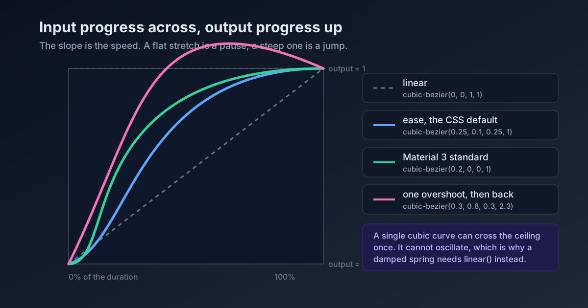
Input progress across. Output progress up.
Time runs left to right, 0 to 1, normalised to the duration. The curve's height at any horizontal position is how far through the value change you are at that moment. That is the whole definition, and reading it correctly changes what you see.
The slope is the speed. A flat stretch is a pause. A steep stretch is a jump. When somebody calls ease-out "slow", they have read the curve as a picture of velocity, and it is a picture of position: ease-out begins at its highest speed and decays. Its first frame is the fastest frame in the animation. Does that match the mental picture you had of it?
The CSS keywords are all cubic-bezier curves wearing names. MDN publishes the equivalences, and they are worth memorising because they turn four vague words into four sets of numbers you can compare.
| Keyword | cubic-bezier() equivalent |
|---|---|
linear | cubic-bezier(0, 0, 1, 1) |
ease | cubic-bezier(0.25, 0.1, 0.25, 1) |
ease-in | cubic-bezier(0.42, 0, 1, 1) |
ease-out | cubic-bezier(0, 0, 0.58, 1) |
ease-in-out | cubic-bezier(0.42, 0, 0.58, 1) |
Why ease Is the Wrong Default
Look at those numbers again. ease is cubic-bezier(0.25, 0.1, 0.25, 1): it accelerates gently, then decelerates into the finish. It is the default on every CSS transition that does not name a timing function, which means it is the most-shipped curve on the web by an enormous margin.
It is also nobody's considered choice. It's what you get when you don't choose, and a curve that's symmetric in feel is exactly wrong for the two most common jobs in a UI.
Things arriving should use ease-out. An element entering the screen is responding to something the user just did, so it should leave the gate at full speed and settle, because the perceived latency of the interaction is set by that first frame. Things leaving should use ease-in. An exit is not a response, it is a departure, and starting slow reads as the interface letting go rather than snatching the element away.
That is an opinion and plenty of designers will argue the other way on exits. What is not an opinion is that ease is the choice nobody made, on most of the transitions you have ever shipped. Would you let a default typeface ship on the same reasoning?
The Shape a Single Bezier Cannot Draw
Here is the technical boundary that decides a lot of motion work, and it is smaller than people assume.
cubic-bezier() takes four numbers, two control points. MDN is precise about the constraint: the x coordinates of both control points must sit in the range 0 through 1, while the y coordinates have no restriction at all. Put an x outside the range and the whole declaration is thrown away.
Unrestricted y is the interesting half. It means output progress can exceed 1, or dip below 0, so a curve can travel past its destination and come back. cubic-bezier(0.3, 0.8, 0.3, 2.3) overshoots; cubic-bezier(0.1, -0.6, 0.2, 0) undershoots first. That is your anticipation and your overshoot, both available in plain CSS, both underused.
What a single cubic bezier cannot do is oscillate. A damped spring crosses its resting value repeatedly, each crossing smaller than the last, and one cubic curve simply does not have that many turns in it. Every "springy" CSS transition written with cubic-bezier is a single overshoot pretending, and side by side against a real spring the difference is obvious in a way that's hard to unsee. So how many bounces do you think you've been shipping? One.
So for years the answer was JavaScript. It isn't any more.
linear() Is The Fix, And Its Name Is A Trap
The linear() easing function takes a list of progress stops and draws straight segments between them. Feed it two stops and you get a straight line. Feed it forty and you get any curve you like, including a damped spring, including a three-bounce ball, including a curve that holds still for a quarter of its duration and then moves.
/* the keyword: a straight line, and cubic-bezier(0, 0, 1, 1) */
transition-timing-function: linear;

/* the function: stops, with optional timing */
transition-timing-function: linear(0, 0.25, 1);
transition-timing-function: linear(0, 0.25 75%, 1);
transition-timing-function: linear(0, 0.5 25% 75%, 1);
MDN lists linear() as available across browsers since December 2023, so this is not a progressive enhancement argument any more. It is a thing you can use.
The trap is the name. The keyword linear and the function linear() mean opposite things in practice: one is the least interesting curve available, the other is the only one that can express the most interesting curves. Reviewers see linear( in a diff and reach for the comment box. Who names the most expressive function in a spec after the least expressive curve in it?
The real cost of linear() is legibility. A spring generated at reasonable fidelity is a string of dozens of numbers that no human will ever read or hand-tune, which means it belongs in a token, generated once and named:
:root {
  --ease-spring-soft: linear(
    0, 0.006, 0.025 2.8%, 0.101 6.1%, 0.539 18.9%, 0.721 25.3%, 0.849 31.5%,
    0.937 38.1%, 0.968 41.8%, 0.991 45.7%, 1.006 50.1%, 1.015 55%, 1.017 63.9%,
    1.001 82.9%, 1
  );
}
Name it, use the name, never paste the numbers into a component. A generated easing string in a component file is a magic number with sixty digits.
What Google Ships, Against What Google Documents
Material 3 is the most-copied motion spec in the industry, and most write-ups of it quote the prose. The values are more useful, and they sit in material-web's own token file:
| Token | Value |
|---|---|
easing-standard | cubic-bezier(0.2, 0, 0, 1) |
easing-standard-accelerate | cubic-bezier(0.3, 0, 1, 1) |
easing-standard-decelerate | cubic-bezier(0, 0, 0, 1) |
easing-emphasized | cubic-bezier(0.2, 0, 0, 1) |
easing-emphasized-accelerate | cubic-bezier(0.3, 0, 0.8, 0.15) |
easing-emphasized-decelerate | cubic-bezier(0.05, 0.7, 0.1, 1) |
easing-legacy | cubic-bezier(0.4, 0, 0.2, 1) |
Read the fourth row against the first. In that file, easing-emphasized and easing-standard carry identical numbers.
That is not a typo, it is the previous section showing up in production. The emphasized curve as Material describes it is a two-part shape, and a two-part shape is precisely what one cubic-bezier cannot hold. The web implementation flattens it to standard. If you've been reaching for "emphasized" in a web build expecting the motion from the Material videos, this is why you didn't get it, and linear() is how you would.
The durations travel with the curves, and this is the half that gets dropped:
| Band | Values |
|---|---|
| short1 to short4 | 50, 100, 150, 200 ms |
| medium1 to medium4 | 250, 300, 350, 400 ms |
| long1 to long4 | 450, 500, 550, 600 ms |
| extra-long1 to extra-long4 | 700, 800, 900, 1000 ms |
Sixteen steps, a 50 ms floor, a 1000 ms ceiling. My honest view is that duration does more of the work than curve choice, and that most motion that feels wrong is 200 ms of wrong duration rather than four wrong numbers. Swap ease for emphasized-decelerate on a 900 ms hover and it still feels like treacle.
Stagger Is Arithmetic, And People Do It Forwards
Stagger is the third technique in every motion tutorial and the one with an actual formula behind it. The last item in a staggered set finishes at:
total = (count - 1) * delay + durationTwenty cards, 100 ms apart, 300 ms each. That is 2.2 seconds before the grid is settled, on a list the user asked to see. Ten of those cards are below the fold, animating to nobody. Who is that second half of the sequence for?
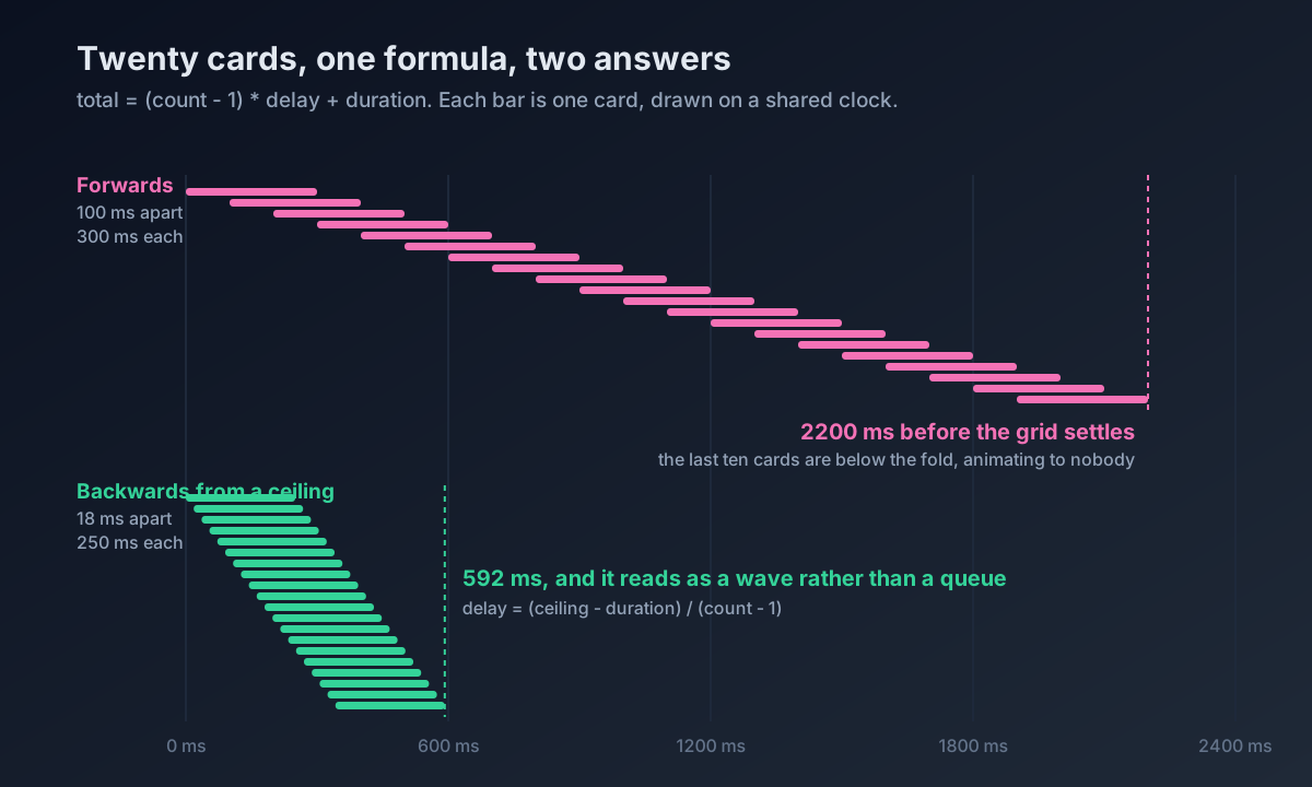
The fix is to run the formula backwards. Pick the ceiling first, and for a list somebody is waiting on I would put the ceiling under 600 ms. Then delay = (ceiling - duration) / (count - 1), which for twenty cards and a 250 ms duration lands at about 18 ms. That reads as a wave rather than a queue.
Two rules that follow from the same arithmetic. Cap the count: stagger the first eight items and let the rest arrive together, because nobody perceives item nineteen as part of a sequence anyway. And stagger the cheap property. Opacity and transform stagger for free; anything triggering layout turns your wave into a stutter, which is the subject of our piece on blocking the main thread.
The Curve You Are Obliged To Ship
prefers-reduced-motion is not an accessibility nicety bolted on at the end. It is a second design of the same transition, and it deserves the same attention as the first.
The common implementation is wrong in an interesting way:
/* Don't do this. */
@media (prefers-reduced-motion: reduce) {
  *, *::before, *::after {
    animation-duration: 0.01ms !important;
    transition-duration: 0.01ms !important;
  }
}
That nukes every transition, including the ones that carry meaning and cause nobody trouble. The request is to reduce motion, not to remove feedback. What triggers vestibular symptoms is large-scale movement, parallax, spin, zoom; a 150 ms opacity fade on a button state isn't the problem, and removing it makes the interface feel broken. Which of those two things did the user actually ask you to stop doing?
/* Keep the fade. Drop the travel. */
.panel {
  transition: opacity 200ms cubic-bezier(0, 0, 0.58, 1),
              transform 320ms cubic-bezier(0.05, 0.7, 0.1, 1);
}

@media (prefers-reduced-motion: reduce) {
  .panel {
    transition: opacity 200ms cubic-bezier(0, 0, 0.58, 1);
    transform: none;
  }
}
Same interaction, same legibility, no travel. It takes longer than the blanket override, and it's the difference between complying with the media query and answering it.
A Default Set Worth Stealing
If you'd rather stop choosing curves ad hoc, four tokens and three durations cover most of an interface:
:root {
  --ease-enter: cubic-bezier(0, 0, 0.58, 1);       /* ease-out: arrivals */
  --ease-exit: cubic-bezier(0.42, 0, 1, 1);        /* ease-in: departures */
  --ease-move: cubic-bezier(0.2, 0, 0, 1);         /* M3 standard: things already on screen */
  --ease-pop: cubic-bezier(0.3, 0.8, 0.3, 2.3);    /* one overshoot, used sparingly */

  --dur-fast: 150ms;   /* state changes the user caused */
  --dur-base: 250ms;   /* most things */
  --dur-slow: 400ms;   /* large surfaces, sheets, page-level */
}
Reach for linear() when, and only when, you genuinely need oscillation. Generate it, name it, and keep it out of component files. If you want the browser-support side of this story rather than the craft side, our Chrome 150 motion piece covers which release shipped what, and CSS versus GSAP covers when the platform stops being enough. For where any of this belongs in an interface at all, micro-interactions and when to animate is the argument that precedes the curve.
Summary
An easing curve plots input progress against output progress, so its slope is speed and its height is position, and misreading that is why ease-out gets called slow when its first frame is the fastest. The CSS keywords are four fixed cubic-beziers, and ease, the default on every unspecified transition, is the one nobody chose. A single cubic-bezier can overshoot, because its y coordinates are unrestricted while its x coordinates must stay in 0 to 1, but it cannot oscillate, which is why real springs need linear(), available across browsers since December 2023. Material 3's shipped web tokens make that limit visible: easing-emphasized and easing-standard are the same four numbers in material-web v0_192, because the emphasized shape does not fit in one curve. Duration does more work than curve choice, stagger totals run (count - 1) * delay + duration and should be designed from the ceiling down, and prefers-reduced-motion deserves a second designed transition rather than a blanket 0.01ms override.