Every easing comparison I've read shows three curves on a chart and asks you to imagine them. That's backwards. The chart is the derivative of the feeling, and nobody has ever felt a derivative.
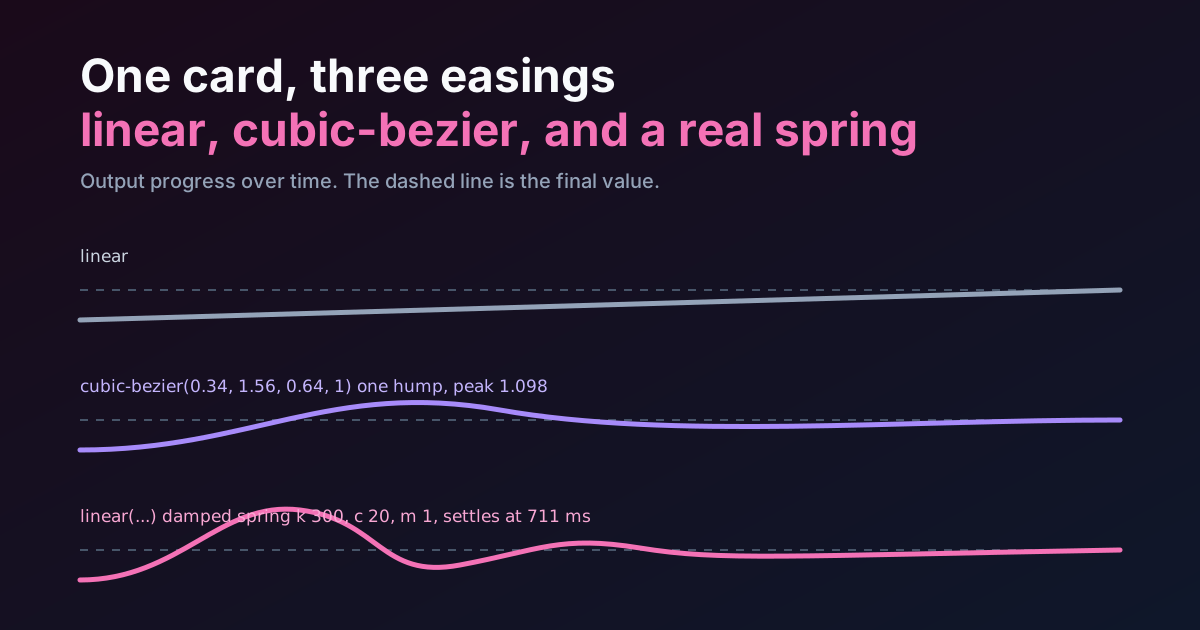
So this one runs. The preview under the first heading moves the same card with the same keyframes, three times: the linear keyword, the back-out cubic-bezier(0.34, 1.56, 0.64, 1) that half the internet uses for "bouncy", and a damped spring I generated from the actual equation of motion and sampled into linear(). Three timing functions, one widget, nothing else different. What separates them, then? What I won't do is tell you which one feels faster. I didn't measure anyone, and a perception claim without a measurement is a vibe with a percentage sign on it. What I can show is what each curve is capable of, in numbers you can check.
If you want the vocabulary first, the shapes, the keywords, what linear() is for, read the easing curves guide. This is the teardown that article's "a spring needs many turns" line was waiting for.
What the Three Curves Actually Do to the Same Card
Watch the three lanes for two cycles. Three things should be visible without any help from me.
The grey card never changes speed. That's the keyword linear, which is cubic-bezier(0, 0, 1, 1), and it's wrong for almost everything that isn't a progress bar or a scroll-linked effect. It looks mechanical because it is.
The purple card launches hard, flies past its stop, and eases back. Once. It settles from above and never dips under.
The pink card also flies past, comes back, undershoots, comes back again. Smaller each time. That's the spring. If you can't see the second crossing at this size, the numbers below will confirm it's there, and the hint under the preview shows the quickest way to break it.
Why cubic-bezier Overshoots Once and Then Gives Up
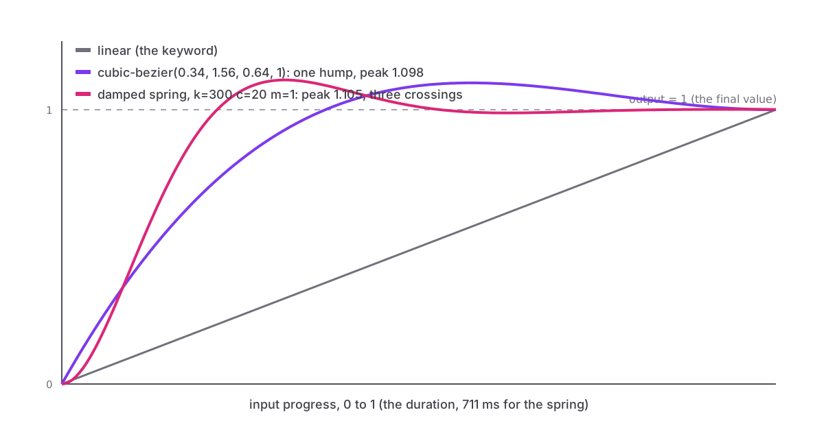
cubic-bezier() takes two control points. The spec restricts the x coordinate of each to 0 through 1 and leaves y free, which is the only reason overshoot exists in CSS at all. Push a y above 1 and the curve climbs past its destination.
But a cubic has a fixed amount of bend in it. One S, or one hump, and that's the whole budget.
I solved the back-out curve numerically rather than trust my memory of how it looks. cubic-bezier(0.34, 1.56, 0.64, 1) first reaches its final value at 37% of the duration, peaks at 1.098 times the travel at 57%, then descends to 1 and stays there. On a 180 px slide, that's a 17.6 px overshoot and a return. There is no second crossing because there can't be one: the curve would need to turn twice more, and a cubic has no more turns to give.
Is that bad? Not at all. One overshoot is a pop, and a pop is most of what UI motion wants. The problem is the word people attach to it. Call it "springy" and you've promised oscillation you can't deliver, and sooner or later a motion designer puts the real thing next to it in a review and asks why the web version looks like it ran out of money.
So where does a second bounce come from? Not from the curve. From a different kind of object.
A Spring Is a Differential Equation, Not a Curve
A damped spring isn't a shape you draw. It's a rule about forces: a restoring pull proportional to distance (stiffness, k), a drag proportional to speed (damping, c), acting on a mass (m). Solve that and the position over time comes out as a decaying cosine. Three numbers, and they're the ones every JavaScript spring library asks you for.
Two derived values tell you everything about how it'll look. The natural frequency is the square root of k over m. The damping ratio, usually written zeta, is c divided by twice the square root of k times m. Below 1 the spring oscillates. At 1 it's critically damped and just settles. Above 1 it's a slow approach with no overshoot at all.
For this article I picked k = 300, c = 20, m = 1. Not anyone's defaults, just a spring with visible bounce. That gives a damping ratio of 0.577 and a natural frequency of 17.3 radians per second, and when I ran it through a 30-line script, this is what fell out:
| Property | Value |
|---|---|
| Damping ratio | 0.577 (underdamped) |
| First crossing of the final value | 157 ms |
| Peak overshoot | 1.105 times the travel, at 222 ms |
| Crossings of the final value before rest | 3 |
| Settled to within 0.1% of travel | 711 ms |
The script is short enough to print, and it's the exact thing that produced the token in the preview:
const k = 300, c = 20, m = 1;
const w0 = Math.sqrt(k / m);
const zeta = c / (2 * Math.sqrt(k * m));
const wd = w0 * Math.sqrt(1 - zeta * zeta);

// position over time, normalised so 1 is the destination
const x = (t) => 1 - Math.exp(-zeta * w0 * t)
  * (Math.cos(wd * t) + (zeta * w0 / wd) * Math.sin(wd * t));

// settle: last moment the spring is more than 0.1% away from rest
let settle = 0;
for (let t = 0; t < 10; t += 0.001) {
  if (Math.abs(x(t) - 1) > 0.001) { settle = t; }
}

// sample it into linear() stops
const n = 32;
const stops = ["0"];
for (let i = 1; i < n; i++) {
  const p = i / n;
  stops.push(`${x(p * settle).toFixed(3)} ${(p * 100).toFixed(1)}%`);
}
stops.push("1");
console.log(`linear(${stops.join(", ")})`, `${Math.round(settle * 1000)}ms`);
Compare the two overshoots and the bezier doesn't even lose on height. 1.098 against 1.105 is nothing. What the bezier loses on is everything after the peak: it has one descent, the spring has three crossings, and the eye reads the third crossing as weight. That's the whole difference, and it's not a difference four numbers can express.
Every "springy" cubic-bezier on the web is one overshoot wearing a costume. If you want the second bounce, you need a different kind of object, not better numbers.
Sampling It Into linear(): How Many Stops Are Enough
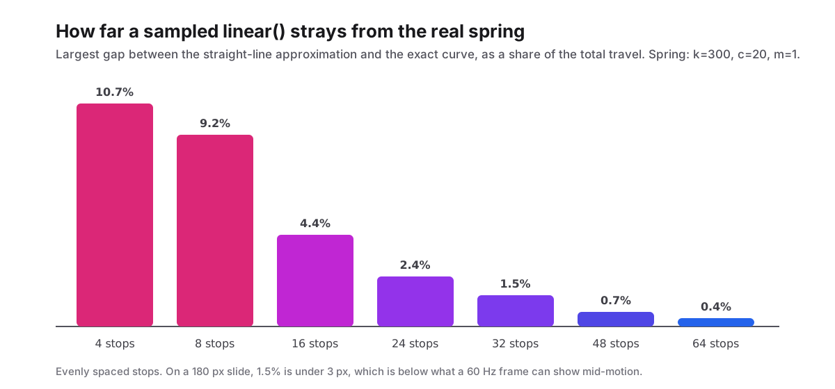
linear() draws straight segments between the stops you give it, so the question is how many stops a spring needs before the segments stop showing. I measured the largest gap between the sampled version and the exact curve at several counts, evenly spaced:
| Stops | Largest error (share of travel) | On a 180 px slide |
|---|---|---|
| 4 | 10.7% | 19 px |
| 8 | 9.2% | 17 px |
| 16 | 4.4% | 8 px |
| 24 | 2.4% | 4 px |
| 32 | 1.5% | 2.7 px |
| 48 | 0.7% | 1.3 px |
| 64 | 0.4% | 0.7 px |
So where's the knee? Between 16 and 32, and thirty-two is where I stopped. At 60 Hz the card is on screen for about 43 frames over 711 ms, so a 2.7 px worst case mid-motion is below what any single frame can resolve. Could you do better with fewer stops by putting them where the curve bends? Yes, and a good generator does exactly that. Evenly spaced is what I used because it's what the script above does and I'd rather you be able to reproduce the table than admire it.
Here is the token, as it appears in the preview:
:root {
  --ease-spring: linear(
    0, 0.063 3.1%, 0.215 6.3%, 0.404 9.4%, 0.597 12.5%, 0.767 15.6%,
    0.904 18.8%, 1.003 21.9%, 1.067 25%, 1.099 28.1%, 1.108 31.3%,
    1.102 34.4%, 1.085 37.5%, 1.065 40.6%, 1.044 43.8%, 1.025 46.9%,
    1.01 50%, 1 53.1%, 0.993 56.3%, 0.989 59.4%, 0.988 62.5%, 0.989 65.6%,
    0.991 68.8%, 0.993 71.9%, 0.995 75%, 0.997 78.1%, 0.999 81.3%,
    1 84.4%, 1.001 87.5%, 1.001 90.6%, 1.001 93.8%, 1.001 96.9%, 1
  );
  --dur-spring: 711ms;
}
Read the stops and you can see the physics in the digits. The value passes 1 between 18.8% and 21.9%, peaks at 31.3%, drops under 1 at 56.3%, bottoms at 62.5%, and creeps back over 1 at 87.5%. Three crossings, there in the string. Nobody will ever hand-edit that, which is the argument for keeping it in a token with a name and never in a component file.
The Duration Is Part of the Curve, and CSS Won't Tell You
This is the part that bites, and it's why the preview hint says what it says.
A JavaScript spring takes k, c and m and gives you a duration as an output. It runs until it settles. linear() is the opposite: it describes output against normalised input from 0 to 1, with no time in it anywhere. The duration is an input you supply separately, and the spring's physics only survive if that number equals the settle time the equation produced. For mine that's 711 ms.
What happens to the physics if you ignore that? Set animation-duration: 300ms on the same stops and the browser happily plays them. The card still crosses three times. But the whole dance now happens 2.4 times faster, which is the same as a spring with 2.4 squared, about 5.6 times, the stiffness. You designed one spring and shipped another, and no linter in the world will say a word.
So the duration isn't a separate decision. It's half the curve. Two consequences:
Ship them together. --ease-spring and --dur-spring are one token in two properties, and a component that uses the first without the second is wrong by construction. In a stagger, every item needs the same 711 ms whatever its delay, and if a 711 ms settle is too long for a list of twelve, the fix is a stiffer spring regenerated from the script, not a shorter duration on the old stops. The stagger ceiling arithmetic applies unchanged: the last item ends at delay times count minus one, plus 711.
And accept that the first 20% of a spring is slow. Why would a spring lag at the start? At 2% of the duration the spring has moved 2.75% of the way, where the back-out bezier is already at 8.95%. A spring starts from rest, because a real spring does, and that initial lag is the thing most people are reacting to when they say springs feel "heavy". If the interaction needs an instant first frame, a response to a tap, the bezier wins that frame outright. You can fake an initial velocity by starting the sample later in the curve, but then you're hand-tuning again.
Where a Spring Belongs, and Where the Bezier Wins
Here's where I land, and you're welcome to disagree.
Use the back-out bezier for one-shot arrivals nobody will interrupt. A toast, a tooltip, a pressed button, a checkmark. One overshoot, done in 250 ms, four reviewable numbers. The spring's third crossing is invisible at that size and duration, and 711 ms is too long to make a tooltip wait.
Use the linear() spring where the element is large enough and the motion long enough for the extra crossings to register, and where the thing arriving carries some weight in the interface. A sheet. A card settling into a grid. A panel that the user pulled open. Our micro-interactions piece argues the when; this is the how.
And know where CSS stops. A gesture-driven spring, one that gets flicked, caught, redirected mid-flight, needs its current velocity carried into the new target. CSS transitions don't do that: the spec's reversing behaviour shortens an interrupted transition, it doesn't preserve momentum, and a retargeted transition restarts the timing function from zero. That's the one case where GSAP or Motion is buying something the platform doesn't sell. The Framer Motion guide covers the API side.
What about linear the keyword, the grey card? Progress bars. Scroll-linked effects, where scroll is the clock and any easing is a lie about distance. Marquees. That's the list. On a card arriving in response to a tap it looks like a conveyor belt, and the preview shows you why in about a second.
The thing I'd most like you to take from this isn't which curve to pick. It's that two of the three are shapes and one is a model, and the model has a duration baked into it that CSS will silently let you throw away. Generate the stops, keep the milliseconds next to them, and the next time someone calls a bezier "springy" in a review, you'll have a card that proves otherwise.
Summary
The keyword linear moves at one speed and suits progress and scroll-linked motion only. cubic-bezier(0.34, 1.56, 0.64, 1) overshoots exactly once, peaking at 1.098 times the travel at 57% of the duration, and cannot cross its final value again because a cubic has one hump. A damped spring with k = 300, c = 20 and m = 1 has a damping ratio of 0.577, peaks at 1.105 at 222 ms, crosses its resting value three times and settles within 0.1% at 711 ms. Sampled into linear() with 32 evenly spaced stops it stays within 1.5% of the exact curve, under 3 px on a 180 px slide. Because linear() has no time in it, the 711 ms duration is half the curve and must ship in the same token; play the stops over 300 ms and you have a spring about 5.6 times stiffer than the one you designed. Use the bezier for short one-shot pops, the spring for larger surfaces with weight, and JavaScript when the motion has to carry velocity across an interruption, which CSS transitions don't.