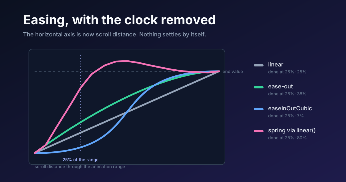
Every easing curve you've written was a statement about time. Fast at the start, slow at the end, over 300 milliseconds. Scroll-driven animation removes the milliseconds.
So what's left of the curve? Its shape survives, and the browser still applies it. But the horizontal axis now measures distance, and the thing counting that distance is a thumb, which keeps terrible time. I checked the MDN pages and the specification for each claim below, and the interesting part is how little of the old timing vocabulary survives the swap.
What Does an Easing Curve Do When Scroll Is the Clock?
It decides how fast the object moves compared with the scroll, nothing more.
Three things change the moment animation-timeline replaces the document timeline. First, duration stops meaning seconds. MDN's wording for animation-duration is that for scroll-driven animations, auto fills the entire timeline with the animation, and the specification puts it more mechanically: the remaining range is divided by the iteration count to find the used duration. Chrome's guide goes further and says you must set the duration to auto, or leave it out of the animation shorthand, where it defaults to auto anyway. Second, progress becomes a function of position, so it's perfectly reversible: scroll back and the animation rewinds along the same curve. Third, the easing function is the only timing control left that you wrote yourself.
Here are the declarations the preview above runs. Four dots, one scroll container, four curves.
.dot {
  animation: travel both;
  animation-timeline: scroll(nearest block);
}

.dot--linear { animation-timing-function: linear; }
.dot--out    { animation-timing-function: cubic-bezier(0, 0, 0.58, 1); }
.dot--cubic  { animation-timing-function: cubic-bezier(0.65, 0, 0.35, 1); }

@keyframes travel {
  from { transform: translateX(0); }
  to   { transform: translateX(220px); }
}
Scroll the box slowly. The dots separate, converge, and finish together, because every one of them has the same start and the same end and only the road between differs. The grey dot stays under your thumb. The blue one barely moves for the first quarter, then rushes.
Why does that matter more here than in a button hover? Because on a hover, the user watches the motion happen. On scroll, the user causes it, and a mismatch between hand and object is felt as lag or as slippage.
The Default Trap: ease Is Still Running
The initial value of animation-timing-function is ease, which MDN lists as cubic-bezier(0.25, 0.1, 0.25, 1). Nothing about a scroll timeline changes that. Write animation: reveal both; and animation-timeline: view(); and you've shipped an eased scroll animation without choosing one.
On a simple two-keyframe fade, that default is merely a little odd. Add a middle keyframe and it gets worse. MDN is precise about how keyframe easing works: a keyframe's easing function applies from the keyframe it's set on until the next keyframe that sets the same property. Every interval is eased on its own. So take a 0%, 50%, 100% animation and give it ease-in-out: the speed falls to zero at 50% progress, resumes, and falls to zero again at the end. The reader scrolls at constant speed and the object stops dead in the middle of the page. I'd rank it among the most common scroll-animation bugs, and it's invisible in a code review because the declaration looks innocent.
Two more shorthand facts, both from MDN's page on animation. The shorthand resets animation-timeline to auto if you don't include a timeline in it, and it resets animation-range-start and animation-range-end as well. The order rule follows directly: declare animation-timeline and animation-range after the shorthand, never before. A stylesheet that gets the order backwards doesn't throw an error. It just plays on the clock, for zero seconds, and ends in the final state.
.card {
  animation: reveal linear both;   /* shorthand first */
  animation-timeline: view();      /* then the timeline */
  animation-range: entry 0% entry 100%;
}
Speed Is the Number That Matters
An easing curve's slope is its speed, and on a scroll timeline speed has a physical meaning: motion per pixel scrolled. Linear is 1.0 everywhere. Any other curve spends some of its window below 1.0 and pays for it by running above.
I ran the four curves from the preview through a small solver for the cubic-bezier definition. The table is progress at one quarter of the window, and the highest speed the curve reaches.
| Curve | Done at 25% of the range | Peak speed |
|---|---|---|
linear | 25% | 1.0x |
ease-out | 38% | 1.7x |
ease-in-out | 13% | 1.7x |
cubic-bezier(0.65, 0, 0.35, 1) | 7% | 2.9x |
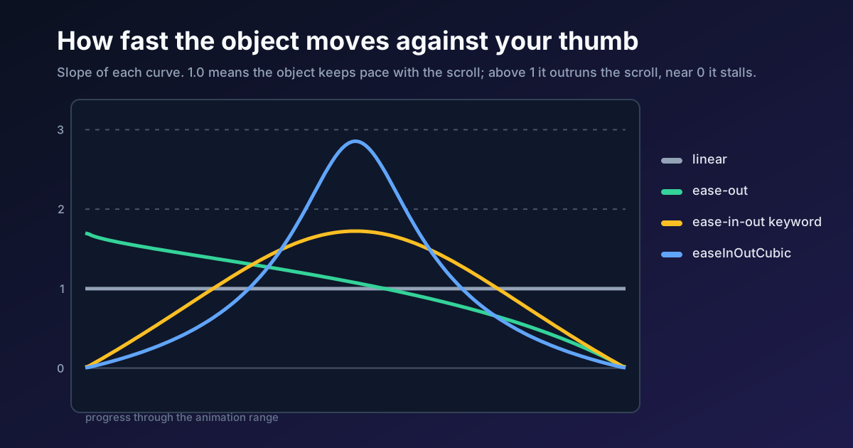
Put real distances on it. Say a card slides 40px as it enters. Linear moves it 0.1px for every pixel scrolled. The cubic curve moves it 0.29px per pixel at the midpoint of the window, so during a flick at 1000px per second the card adds roughly 290px per second of its own motion where linear would add 100. Does that feel like the card is attached to the page? It doesn't. It feels like the card has a mind of its own, and that's sometimes exactly what you want, so the decision is worth making on purpose.
Scroll-driven animation has no clock, so an easing curve stops being a feeling about time and becomes a decision about how far an object can outrun the reader's thumb.
My view is that the default should be linear, with easing as a deliberate exception. Reveals that should feel like they respond to you want ease-out: the first 25% of the window delivers 38% of the move, so the card is mostly arrived before the reader has finished deciding to look. Anything shaped like ease-in-out belongs on motion you want to feel autonomous, like a hero element that glides past while the text holds still. If you want the vocabulary for why those two curves read the way they do, the easing curves guide covers it from the shape side.
Range Is the Other Half of the Timing
Easing sets the curve. animation-range sets how many pixels the curve gets to use, and for a view timeline that number comes from the element's own geometry.
The specification defines the named ranges against the element's border box and the scrollport. cover runs from the moment the element's leading edge touches the end edge of the scrollport to the moment its trailing edge reaches the start edge. entry is the first part of that, ending when the element is fully inside. exit is the last part, starting when it begins to leave. contain is whatever is left in the middle.
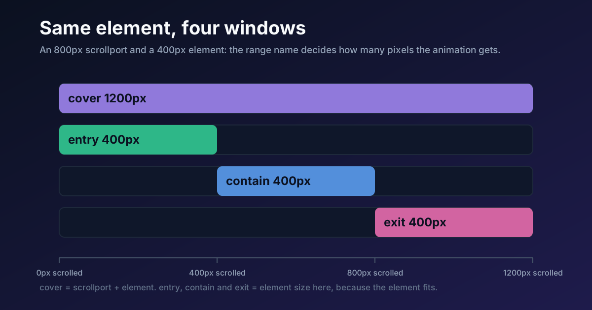
Take an 800px scrollport and a 400px element. Because the element fits, entry, contain and exit are 400px each, and cover is the whole 1200px. The same 40px slide is 0.1px per scrolled pixel over entry and 0.033px per pixel over cover. Same curve, same keyframes, and the second version moves a third as fast.
MDN's range syntax lets you mix those names, which is where pacing gets precise:
/* 400px: the element's entry, nothing else */
animation-range: entry 0% entry 100%;

/* 500px: entry plus the first quarter of contain */
animation-range: entry 0% contain 25%;

/* the full 1200px, for slow, atmospheric motion */
animation-range: cover;
Percentages are relative to the named range, and lengths are absolute offsets along the timeline. So entry 0% contain 25% is a window you can reason about in pixels. If you'd rather start with the syntax than the timing, the implementation side on Coding Dunia walks through building the progress bar and the fade-in. This piece assumes you've already got that working and want it to feel right.
One caveat. Those pixel counts assume the element is shorter than the scrollport. Make it taller and contain flips to mean the span where the element covers the whole port, and the maths changes. Check which case you're in before you promise a designer a pace.
Four Timing Patterns Worth Naming
Most scroll animations are one of four shapes. Naming them helps, because a handoff that says "fade in on scroll" specifies none of the numbers that matter.
Tracked. One curve across the whole timeline, linear, usually on scroll(). A reading progress bar is the standard case. The object is a gauge, so any easing would make the gauge lie.
Windowed. A short range on view(), with ease-out or linear. The reveal completes while the element is still entering and then stays put. The decision here is the window length, not the curve: 400px reads as snappy, 1200px reads as drifting.
Held. Enter, hold, leave, in one animation over cover. This is where keyframe-level easing earns its place, because the two ends want different curves and the middle wants none:
@supports (animation-timeline: view()) {
  .panel {
    animation: pass both;
    animation-timeline: view();
    animation-range: cover;
  }

  @keyframes pass {
    0%   { opacity: 0; transform: translateY(48px);
           animation-timing-function: cubic-bezier(0, 0, 0.58, 1); }
    30%  { opacity: 1; transform: translateY(0); }
    70%  { opacity: 1; transform: translateY(0);
           animation-timing-function: cubic-bezier(0.42, 0, 1, 1); }
    100% { opacity: 0; transform: translateY(-48px); }
  }
}
Arrivals ease out, departures ease in, and the 40% in between is a flat hold. Over a 1200px cover range that's 360px of arrival, 480px of stillness and 360px of departure. MDN confirms the keyframe-level override works the way the example uses it: the timing function on a keyframe governs the interval up to the next one, and a timing function on the last keyframe is never used.
Stepped. steps() instead of a curve, for things that should change state rather than glide: a label that ticks through four values, a sprite that flips frames. animation-timing-function: steps(4, jump-end) gives four discrete stops across the range, and nothing in between.
Why a Spring Doesn't Belong Here
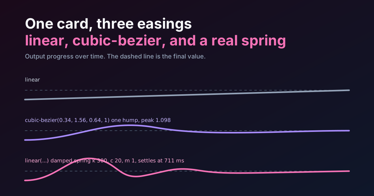
You can write a spring as linear() stops, and the fourth dot in the preview does. It overshoots to 1.125 at the halfway point of its range and settles at 1.
Scroll it, then stop partway through the overshoot. The dot sits there, past its target, indefinitely. A real spring settles because time passes. Here no time passes, only distance, so the "bounce" is just a curve that happens to go over its end value and come back, and it reverses perfectly when you scroll up. It can look springy while the finger is moving. It cannot feel like a spring, because the thing that makes a spring feel physical is that it keeps going after you stop touching it.
My advice is to keep overshoot out of scroll timelines unless the effect is decorative and you've watched it with the scroll stopped. If you want a real spring on a scroll-triggered element, trigger a time-based animation from a scroll position instead, which is a job for IntersectionObserver and not for this spec.
Shipping It: Support, Fallbacks and Reduced Motion
I checked MDN's browser compatibility data for animation-timeline on 5 October 2026. It lists Chrome 115 and Edge to match, Safari 26, and Firefox as preview only. MDN marks the feature as not Baseline. That makes the fallback the main design problem rather than an afterthought. Safari is also where the edges of the spec are still moving: Technology Preview 253 changed how named scroll timelines are matched, per the preview changelog digest, so if you declare a timeline in one component and consume it in another, test that pair in a preview build before you ship it.
Here's the trap, and it comes straight from the duration rules. A browser that doesn't know animation-timeline throws the declaration away, then plays your animation on the document timeline. MDN says auto duration is equivalent to 0s for time-based animations, so with both as the fill mode the animation jumps instantly to its last keyframe and stays. For a fade-in, that's harmless: the element ends up visible. For the held pattern above, whose last keyframe is opacity: 0, it's a disaster: the panel vanishes on every browser that can't run it. That is why the @supports (animation-timeline: view()) wrapper in that snippet isn't optional. Put anything whose final frame hides content behind it.
Reduced motion is a second layer, and the same logic as any other animation applies: the request is to reduce movement, not to remove feedback. Scroll-linked travel and parallax are exactly what vestibular sensitivity is about, so the sensible default is to wrap the whole block in @media (prefers-reduced-motion: no-preference). WCAG success criterion 2.3.3, Animation from Interactions, is a AAA criterion that asks for motion triggered by interaction to be disableable unless it's essential, and scroll-linked motion falls squarely inside it. A progress bar changing width is not travel; keep it. The same point holds for ordinary transitions, where a blanket 0.01ms override throws away feedback nobody asked to lose.
One performance note, and it's the reason to use this at all. Chrome's guide describes these animations as running off the main thread, which is true of transforms and opacity and stops being true the moment you animate something that triggers layout. Blocking the main thread covers why that line matters. And if you're comparing this against a JavaScript library for pinning or callbacks, CSS against GSAP draws the boundary. For the broader picture of when motion should exist at all, micro-interactions and when to animate comes first.
Support is the part of all this that goes stale fastest, so recheck the MDN table the week you ship.
Summary
On a scroll timeline, easing stops describing time and describes pace: how far the object moves per pixel the reader scrolls. animation-duration should stay auto, since MDN says it fills the whole timeline and the specification divides the remaining range by the iteration count. The default timing function is still ease, and it's applied per keyframe interval, so a three-keyframe animation with an eased curve stalls at 50% progress. linear is the right default for anything that tracks the hand. Easing is a deliberate exception: ease-out front-loads a reveal, and cubic-bezier(0.65, 0, 0.35, 1) peaks at about 2.9 times scroll speed in the middle of its window. animation-range sets how many pixels the curve gets, and for a 400px element in an 800px scrollport that's 400px for entry and 1200px for cover, a threefold difference in pace from one word. Declare animation-timeline and animation-range after the animation shorthand, wrap anything that ends hidden in @supports (animation-timeline: view()), and treat springs as decoration, because a spring needs time to settle and a scroll timeline has none.