Most UI advice treats interface design as a bag of tricks. Add a shadow here. Round that corner. Pick a trendy accent color. But the interfaces that hold up under real traffic aren't built from tricks. They're built from a small set of skills that compound.
I've spent years watching junior designers chase tool tutorials while their screens still fall apart under scrutiny. The screen looks fine in isolation. Then it ships, and users can't find the primary action, the data table becomes a wall of noise, and the engineer rebuilds half of it because the spec was ambiguous. Sound familiar?
This guide maps the four skills that actually carry modern UI work, and points you at the deeper piece for each one.
TL;DR: Modern UI design runs on four compounding skills: visual hierarchy, data-dense layout, developer handoff, and tool fluency. WebAIM's 2025 report found 94.8% of top home pages had WCAG failures, most rooted in weak hierarchy. Fix the craft underneath and the tools stop mattering.

What separates UI craft from decoration?
Users spend about 57% of their viewing time above the fold, and 74% of it inside the first two screenfuls (Nielsen Norman Group, ongoing eye-tracking research). That single fact reframes the job. You're not decorating a canvas. You're deciding what gets seen and in what order.
Visual hierarchy is the skill that governs this. Size, contrast, spacing, and position combine to tell the eye where to go. Get it right and an interface feels obvious. Get it wrong and no amount of polish rescues it.
Here's the part people miss: hierarchy is the base skill every other UI skill sits on. A dashboard fails when its numbers all shout equally. A handoff spec fails when the designer can't say which element is primary. Weak hierarchy shows up everywhere downstream.

For the full breakdown of size, contrast, spacing, and scan patterns, read the deep dive on visual hierarchy in UI design. It's the one skill I'd tell any designer to master first.
How do you design data-dense screens?
Dashboards break the rules that work for marketing pages. A landing page has one message. A dashboard has forty, and they all want attention. The craft here is density control: fitting real information into a scan-friendly layout without turning it into a spreadsheet.
The patterns that survive are boring on purpose. Card grids with a consistent baseline. A single primary metric per zone. Progressive disclosure that hides the fifth level of detail until it's asked for. Tools like Linear, Stripe, and Grafana get praised for restraint, not flourish.
A dashboard isn't a place to show everything you have. It's a place to show the one thing that matters, first.
When a screen has to carry weight, hierarchy and density become the same problem. That's why so many "cluttered dashboard" complaints are really hierarchy complaints wearing a costume. For layout systems that scale past a handful of widgets, see the guide to dashboard design patterns for web apps.
What makes a design survive developer handoff?
A design isn't finished when it looks right in Figma. It's finished when an engineer can build it without guessing. Ambiguity is where craft leaks out: undefined hover states, spacing that "looks about right," a mobile breakpoint nobody drew.
The fix is specification, not more pixels. Name your spacing scale. Define every interactive state, including the empty and error ones. Mark which values are tokens and which are one-offs. I once cut a build's back-and-forth roughly in half just by adding an explicit states table to each component, no new visuals, just fewer decisions left to chance.
Touch targets are a good tell. Apple's Human Interface Guidelines require a 44x44pt minimum (Apple), and a spec that ignores it forces the engineer to invent one. Every value you leave undefined becomes someone else's guess. The complete workflow lives in the guide to designer and developer handoff.
Which tools actually matter in 2026?
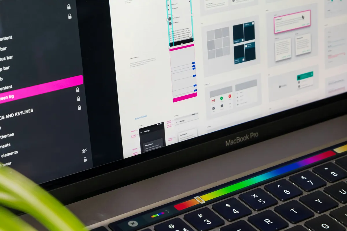
Less than the marketing wants you to believe. Figma, Penpot, and Sketch have converged on the same core: components, variants, auto-layout, and design tokens. The differences are real but small, and they mostly stop mattering once you know what you're doing.
WebAIM's 2025 audit found 94.8% of the top million home pages had detectable WCAG failures (WebAIM). Not one of those failures came from picking the wrong tool. They came from contrast choices, missing labels, and hierarchy that never got sorted. The tool didn't cause the problem, and a better tool wouldn't have fixed it.
So treat tool selection as the last decision, not the first. Pick one that fits your team's handoff and budget, then invest your real hours in the craft. For an honest side-by-side of what each option does well, read the best UI design tools compared. Want a fast way to test color contrast while you work? The palette tool below runs right here.
How do these four skills compound?
They stack. Hierarchy decides what gets seen. Density control keeps complex screens readable. Handoff discipline gets the design built as drawn. Tool fluency makes all of it faster. Miss one and the others count for less, a beautiful, well-specced screen still fails if its hierarchy is muddy.
Here's how the four skills map to the failure they prevent and the fastest way to shore each one up:
| Skill | What breaks when it's weak | First fix to try |
|---|---|---|
| Visual hierarchy | Users miss the primary action; everything shouts equally | Rank the elements, then raise contrast and size on the top one |
| Density control | Dashboards read as a wall of noise | One primary metric per zone, hide the fifth level of detail |
| Handoff discipline | Engineers guess, then rebuild half the screen | Add a states table and name the spacing scale |
| Tool fluency | Work is slower, but the screen isn't worse | Learn one tool's components and tokens, stop tool-hopping |
That's the case for treating UI as a craft instead of a checklist. Each skill makes the next one pay off more. A designer strong in all four ships interfaces that feel inevitable, the kind users move through without noticing the design at all.
Where should you start? Pick one live screen. Fix its hierarchy, tighten its handoff spec, and measure the difference. You'll feel the compounding faster than by reading another ten articles, this one included. If that live screen needs a dark theme too, the dark mode implementation guide covers the token and contrast work most teams skip.
Try our own free generator
Enough theory. We built our own color palette generator and use it on real client work, so go ahead and test it right here. Pick four colors, watch them land on a working interface, and read the live WCAG contrast before you commit to anything. Nothing leaves your browser.