Most dashboard design advice assumes a person sitting sixty centimeters from a monitor, giving the screen their attention for minutes at a time. A home control panel gets none of that. Someone walks past it, glances, taps once, and keeps walking. What survives that?
This extends our dashboard design patterns hub into a domain with constraints no SaaS product has: viewing distance measured in meters, sessions measured in seconds, and devices that can be in four states rather than two.
TL;DR: Design home control panels around a one-second glance from two meters away. Group by room rather than device type, treat unavailable and stale as first-class states with their own visual language, cap the primary view at six to nine large touch targets, and make the dark theme the primary design rather than an inversion.
Why Does Distance Change Everything?
Type size is the obvious consequence, but it isn't the interesting one. The real effect is on element count.
At sixty centimeters, a dense table with forty rows is legible and useful. At two meters, the same screen holds maybe eight elements before anything becomes work to read. That's not a scaling factor you apply at the end. It changes what the screen is for: an admin dashboard is a place to explore data, a wall panel is a place to perform one action you already decided on before you got there.
This is where the data density conversation inverts. Density is a virtue when someone is scanning and comparing. It is a defect when someone is glancing. Same principle, opposite conclusion, purely because of who is standing where.
The practical numbers I work to: minimum 24px body text at typical tablet DPI, 40px or more for the primary value on a card, and touch targets no smaller than 60 by 60 rather than the usual 44. That last one surprises people. A target sized for a thumb on a phone you're holding is not the same as a target for a hand reaching out mid-stride.
Four States, Not Two
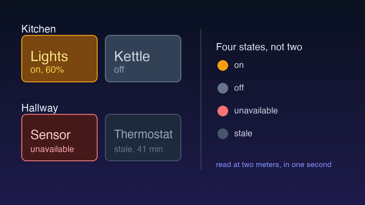
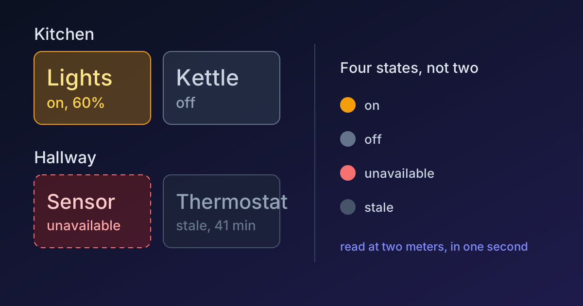
Here's the constraint that catches every designer coming from web products. A toggle in a SaaS app is on or off. A light in a house is on, off, unavailable, or stale, and those last two are not edge cases, they happen weekly in any real installation.
Unavailable means the panel has lost contact with the device. It cannot tell you whether the light is on. Showing it as off is a lie, and it's a lie the user will discover by tapping it and having nothing happen.
Stale means the last known value arrived a while ago. A temperature card reading 21.5 degrees is meaningless without knowing whether that came in ten seconds or forty minutes ago.
Give each state its own treatment, and never rely on colour alone, which WCAG requires anyway and which matters more here because the panel is often viewed at an angle in poor light:
| State | Visual treatment | Text |
|---|---|---|
| On | Filled card, accent colour, high contrast value | Value plus unit |
| Off | Muted fill, calm and unremarkable | "Off" |
| Unavailable | Dashed or hollow border, warning hue | "Unavailable" |
| Stale | Muted fill plus timestamp | "41 min ago" |
Off should look calm, not broken. It's the most common state in the house and a panel where half the cards look like errors at any given moment trains people to ignore errors.
Room-First Navigation
Backend data is organised by integration and device type, because that's how the system is built. Almost every first-draft home dashboard inherits that structure, and almost every one gets rearranged within a month of real use.
People navigate houses spatially. "The light in the hallway" is a location before it's a device class. A room-first layout matches the mental model exactly, and it has a second benefit that's easy to miss: rooms are naturally small. A room holds three to six devices, which lands almost exactly on the element budget the viewing distance imposes. Device-type grouping produces a screen with every light in the house on it, which is both too long and useless from two meters away.
Keep the device-type view, just make it secondary. "All lights off" is a genuine bulk action and it deserves a route. It's the wrong front door.
Designing for the One-Second Session
If you take one thing from this: the primary view should answer a question without any interaction at all.
Is the house locked? Is anything still on? Is the heating running? Someone walking past should get those answers from the layout itself, which means status lives above the fold at the largest type size on the screen, and controls sit underneath. Most home panels do this backwards, leading with a grid of buttons and burying the status they'd actually check.
Guests are the honest test, and it is the test I trust most, because I cannot run it on my own panel. Someone who has never seen it should be able to turn on a light in the room they're standing in, without a tour. If they hesitate, the navigation is organised for the person who built it. The designer is the one user who can never tell you whether the layout works.
The designer is the one user who can never tell you whether the layout works.
From Design to a Working Panel
Two directions from here, depending on which half of this you own.
If you want to build the panel as a custom app, the data layer is its own problem, and it's a genuinely interesting one, because entity states arrive as strings and every state can be unavailable at any moment. Our guide to typing Home Assistant data in TypeScript covers modelling exactly the four-state problem described above, at the type level, so the compiler forces you to design for the fault cases rather than discovering them in production.
The constraints here are unusual enough to be genuinely instructive even if you never design a home panel. Two meters and one second is a brutal editor. It cuts everything that was on the screen because it fit rather than because it earned its place, which is a habit worth taking back to the dashboards you do design.