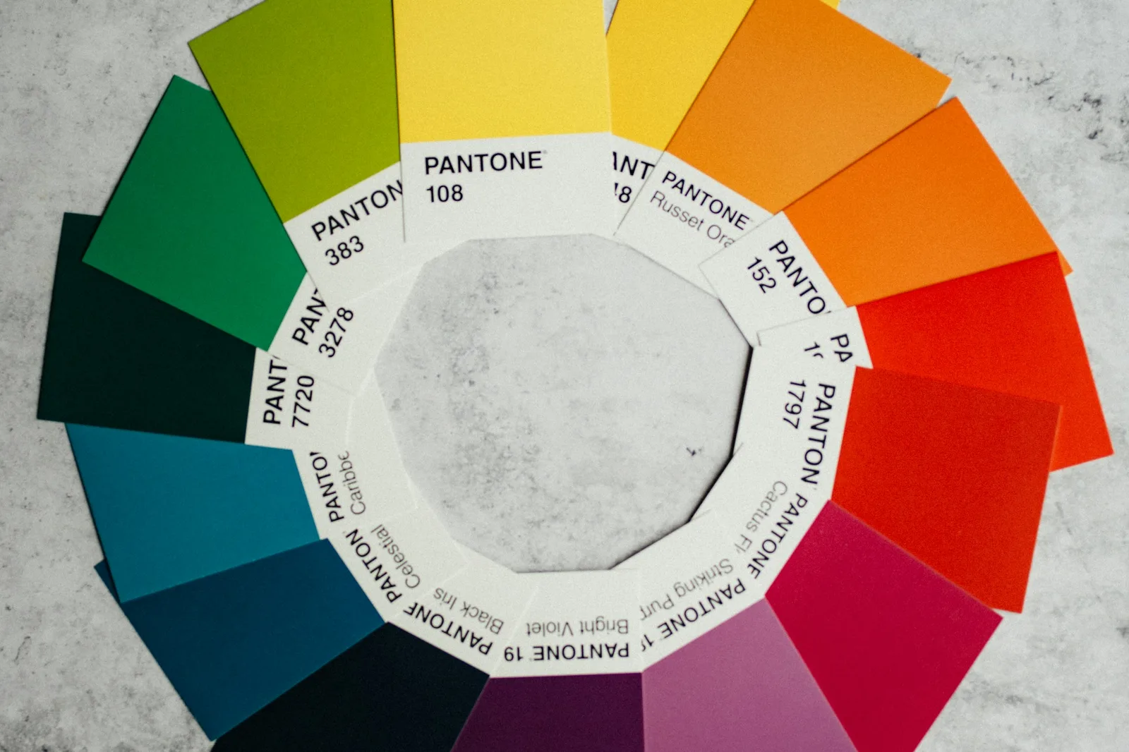
I once inherited a design system where every color combination technically had a documented hex value, and about a third of them failed contrast when I actually ran the numbers. Nobody had lied. Nobody had cut corners on purpose. The tokens just described colors, not relationships, so nothing stopped a designer from pairing a light gray label with an off-white card and calling it done.
That's the pattern I keep running into. Teams treat accessibility as a check you run at the end, a Lighthouse pass before launch, instead of a property the color system enforces from the start. Fixing it after the fact means re-touching every screen that used the failing pair. Fixing it at the token level means it can't happen again.
TL;DR: Low-contrast text still shows up on 83.9% of home pages, the single most common accessibility failure measured (WebAIM Million 2026). Bake validated contrast pairs into design tokens themselves, and that failure becomes structurally impossible instead of something you catch in a late audit.
Why Do Contrast Failures Keep Slipping Through, Even With a Design System?
Because most token systems store colors, not color relationships. A token named color.gray.400 tells you a hex value. It doesn't tell you where that gray is safe to use as text, or on what background it silently fails 4.5:1. Every designer and developer has to independently remember that constraint, or run a contrast checker manually, every single time. Multiply that across a fifty-screen product and a two-year timeline, and someone eventually forgets. It's not a discipline problem. It's a system that never encoded the rule in the first place.
I'll say the unpopular part out loud: most "accessible design systems" I've audited aren't actually accessible systems. They're regular design systems with an accessibility statement bolted onto the README. The tokens themselves carry zero enforcement.
The thresholds themselves are the easy part. They've been stable since WCAG 2.1, and they're what your tokens need to encode:
| Content | WCAG level | Minimum ratio | Success criterion |
|---|---|---|---|
| Body text under 18pt (or 14pt bold) | AA | 4.5:1 | 1.4.3 Contrast (Minimum) |
| Large text, 18pt+ or 14pt+ bold | AA | 3:1 | 1.4.3 Contrast (Minimum) |
| Body text under 18pt | AAA | 7:1 | 1.4.6 Contrast (Enhanced) |
| Large text, 18pt+ or 14pt+ bold | AAA | 4.5:1 | 1.4.6 Contrast (Enhanced) |
| UI components, focus rings, icons carrying meaning | AA | 3:1 | 1.4.11 Non-text Contrast |
| Disabled controls and pure decoration | n/a | No requirement | 1.4.3, 1.4.11 exceptions |
That last row is the one teams get wrong in both directions. Disabled controls are genuinely exempt, so chasing 4.5:1 on a greyed-out button is wasted effort. But a focus ring is not decoration, and it needs 3:1 against whatever sits behind it.
What Does an Accessibility Token Actually Look Like?
Structure it as a pairing, not a single value. Here's a simplified example from a token set I built for a fintech client:
{
  "color": {
    "text": {
      "onLight": { "value": "#1A1A1A", "contrastRatio": "16.1:1", "onBackground": "color.bg.light" },
      "onBrand": { "value": "#FFFFFF", "contrastRatio": "4.87:1", "onBackground": "color.brand.500" },
      "onWarning": { "value": "#1A1200", "contrastRatio": "8.2:1", "onBackground": "color.warning.300" }
    }
  }
}
Every text color token names the background it's validated against and stores the actual ratio it achieved. When a designer picks color.text.onBrand, they aren't choosing a hex value in isolation, they're choosing a relationship that's already been checked. Add a linting step that fails CI if any two paired tokens compute below 4.5:1, and the whole category of bug becomes nearly impossible to ship.
Most "accessible design systems" are just regular design systems with an accessibility statement bolted onto the README.
How Do You Retrofit This Into a System That Already Exists?
Start with an audit, not a rewrite. Pull every color pairing currently in production and run it through a contrast checker, our free WCAG contrast checker does this in bulk if you paste in hex pairs. You'll get a list of failures ranked by how often each pairing appears across your product. Fix the highest-frequency failures first, because that's where the retrofit buys the most coverage per hour spent.
Then, and this is the step most teams skip, don't just fix the failing pair. Add the passing replacement as a named token with its validated background baked in, so the next designer who needs "text on a warning banner" picks from a pre-validated list instead of eyeballing a new hex value that might fail again in six months.
Is This Worth the Engineering Time It Takes?
Honestly? Yes, and it's cheaper than you'd expect once you've done the audit once. The upfront cost is the token restructuring and the linting rule. The ongoing cost is close to zero, because the system now prevents the mistake instead of requiring a human to catch it every time. Compare that to the alternative: a Lighthouse accessibility score that quietly drops every quarter as new screens ship, followed by a panicked remediation sprint before a compliance deadline. I've run both processes on different projects. The token-first approach is boring in exactly the way good infrastructure should be boring.
There's also a people cost worth naming honestly. Every time a designer has to stop and manually check a contrast ratio, that's a small tax on their attention, paid over and over across hundreds of screens and years of a product's life. Bake the rule into the token and that tax disappears entirely, not reduced, gone. New hires inherit a system that quietly teaches the right habit instead of one that trusts everyone to remember a rule from an onboarding doc they read once. I've watched teams stop debating contrast in design reviews altogether once the tokens did that work for them, which freed up review time for decisions that actually needed a human judgment call. That shift alone changed how my last two clients ran their weekly design critique.
Contrast is one half of accessible type. The other half is choosing typefaces and spacing that don't fight your readers before contrast even enters the picture, which is exactly what our accessible typography guide covers next.