A common first attempt goes like this: install Storybook, write three stories, call it done. Six months later nobody on the team uses it, because those three stories cover a sliver of the actual component library. A design system's documentation is only as good as its coverage, and coverage is the part everyone underestimates.
Storybook itself is simple. Getting a team to actually populate and maintain it is the real project. This guide walks through the setup that sticks, from install to a CI pipeline that fails a pull request when a component ships without a story.
TL;DR: Storybook remains the default tool for component-level design system documentation in 2026. Design system adoption is climbing, 79% of teams now have a dedicated design system team, up from 72% in 2024 (zeroheight Design Systems Report, 2026), but 3 in 5 of those teams say they're understaffed.
How Do You Install Storybook Without Breaking Your Build?
Run the official initializer inside your existing project, npx storybook@latest init. It detects your framework (React, Vue, Astro's React integration, whatever you're on) and scaffolds a config that matches your existing bundler. Don't hand-roll the config from scratch, the initializer's defaults save you a genuine afternoon of Webpack or Vite debugging.
Once it's running, you'll have a .storybook/main.ts and a .storybook/preview.ts. The main file controls which files count as stories and which addons load. The preview file controls global decorators, things like theme providers or a router context that every story needs wrapped around it.
// .storybook/main.ts
const config = {
  stories: ["../src/**/*.stories.@(ts|tsx)"],
  addons: [
    "@storybook/addon-essentials",
    "@storybook/addon-a11y",
    "@storybook/addon-interactions",
  ],
  framework: { name: "@storybook/react-vite", options: {} },
};
export default config;
A design system's documentation is only as good as its coverage, and coverage is the part every team underestimates.
| Addon | What it does |
|---|---|
| Controls | Interactive prop testing |
| Docs | Auto-generated documentation pages |
| Accessibility | Flags a11y violations directly in the UI |
| Viewport (optional) | Tests responsive components |
| Interactions (optional) | Scripts user flows inside a story |
What Should Your First 10 Stories Actually Cover?
Start with your atoms, not your pages. Layout primitives count as atoms too, and the dashboard grid generator is where I settle the column and row values before any of them get a story. Button, Input, Badge, and Card cover more real usage than any page-level composite you could write a story for. Documenting a full dashboard layout as story number one is a common mistake; nobody references it because it isn't reusable at that granularity.
For each component, write a story per meaningful state, not per prop combination. A Button needs default, disabled, loading, and destructive variants. It doesn't need 40 stories covering every color times every size times every icon position, that's what the Controls addon is for, letting engineers toggle props live instead of you pre-baking every permutation.
How Do You Wire Autodocs Into Existing Components?
Add the tags: ['autodocs'] property to a story's meta export and Storybook generates a full documentation page from your existing stories, pulling prop tables straight from your TypeScript types.
// Button.stories.tsx
import type { Meta, StoryObj } from "@storybook/react";
import { Button } from "./Button";

const meta: Meta<typeof Button> = {
  title: "Atoms/Button",
  component: Button,
  tags: ["autodocs"],
};
export default meta;

export const Default: StoryObj<typeof Button> = { args: { children: "Save" } };
export const Loading: StoryObj<typeof Button> = { args: { children: "Save", loading: true } };
That's the entire lift for a documented, interactive page with a working prop table. No separate documentation file to maintain in parallel, which is exactly why teams stop maintaining docs in the first place, two sources of truth always drift apart.
If your component library spans an Astro-plus-React setup, the same pattern applies without much translation. A design system built for a Coding Dunia-style TypeScript stack (React components consumed from Astro islands) documents identically in Storybook, the framework adapter handles the wiring, your story files stay framework-agnostic in structure.
What Makes a Component Survive the Trip Into a Design System?
Here's where most setup guides stop and where the interesting part starts. If you ever want this component library read by something other than a browser, a design system tool, an agent, a static capture pipeline, then the way you author the component matters more than the way you configure Storybook.
I learned this the slow way, porting 23 components out of an Astro site and into a Claude Design system. Six rules came out of it, and every one of them cost me a broken render first.
Keep components pure and props-driven. No data fetching, no framework virtual modules, no reaching into a global config object. Our card used to pull an astro:content collection entry directly. That single import made it unbundlable, and the fix was a flat post prop with the eight fields the card actually reads.
Ship each component's CSS with the component. Utility classes don't travel. Our post template was styled with Tailwind, and outside the site build the breadcrumb rendered as a numbered list and the prose lost every bit of rhythm. A scoped <style> block inside the component fixed it in one commit. Design systems don't inherit your build pipeline.
Put tokens in one canonical file, and extract it from the built site. Not from the design doc, not from the redesign deck. We pulled ours out of the deployed page's :root block, 16 color variables and 3 font stacks. The aspirational palette in the design kit and the palette actually shipping had drifted by four values. Which one would you rather your design system learn?
// .storybook/preview.ts  (lives inside the blog, not in a shared package)
import '../.design-sync/tokens.css';
That's the same file the design-system bundle ships as its stylesheet entry. One source, two consumers, no drift possible.
Watch for framework syntax that looks portable and isn't. :global(...) is Astro. Drop it into a plain React <style> and it silently fails to parse, taking the rest of the block with it. Same class of bug: our components imported the design system by its package alias, which resolves in previews and nowhere else.
Let the wrapper own the interactivity. The hamburger toggle, the newsletter submit, the palette shuffle, all of that lives in vanilla script outside the component. The component renders static markup and hydrates zero times. Sounds like a limitation. It's the reason a headless capture of that component is honest instead of a screenshot of a half-mounted state.
Neutralise entrance animations before you capture anything. Our hero starts at opacity: 0 and animates in. The first static capture came back as an empty box, which is exactly what the CSS said to draw. Strip the entrance animation for the twin, or ship a picture of nothing.
Do Stories and Design System Previews Have to Be Separate Work?
No, and treating them as separate work is the mistake I'd most like to talk teams out of.
A story is a component plus a realistic set of props plus a name. A design-system preview card is a component plus a realistic set of props plus a name. Those are the same artifact wearing two labels. Our design-sync previews and our .stories.tsx files ended up sharing sample data through one alias:
// blogs/<site>/.storybook/main.ts
stories: ['../src/stories/**/*.stories.@(ts|tsx)'],
The Storybook lives inside the blog, next to the .design-sync folder it shares sample data with. One curated post object feeds the Storybook control panel, the autodocs page, and the design system's card. Write it once, review it once, and when the component's prop shape changes, exactly one file lies to you instead of three.
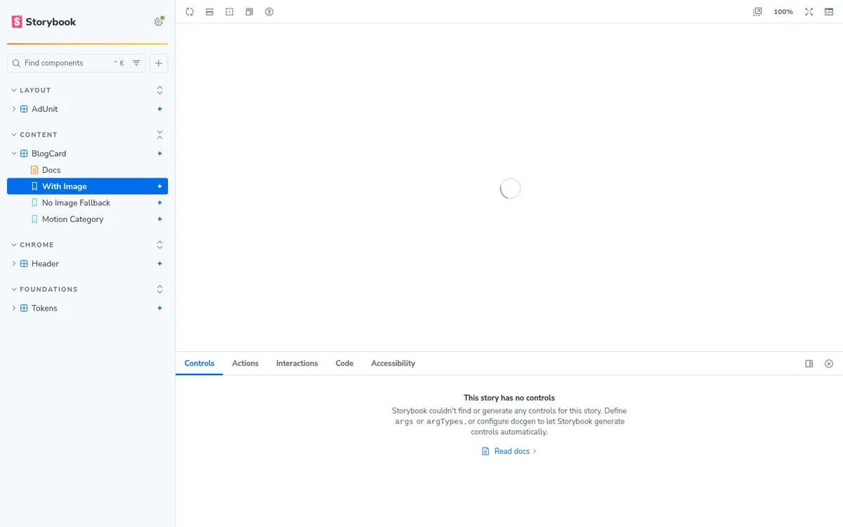
Sample data deserves one more rule: make it self-contained. Our card's cover image is a data-URI SVG, not a URL. A story that reaches the network renders differently on every run, and a design-system card built from an inconsistent capture is worse than no card at all.
Should a Monorepo Have One Storybook or One Per Site?
One per site, and I got this wrong first.
My instinct was a single shared Storybook in a packages/ folder, documenting every component the monorepo owns. It built fine. It was also lying. Our sites render the same shared header through different tokens and a different class prefix, so the "Header" in a shared Storybook is a header no visitor ever sees. Ours takes a px prop, and the markup that ships is aosf-site-header here and a different prefix on the next property.
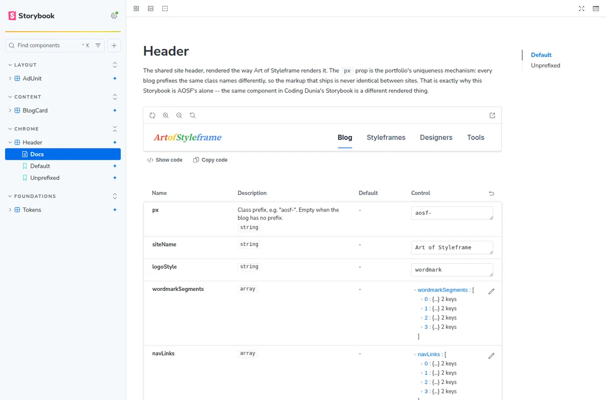
Splitting it per site fixed something I did not expect: the prop tables filled in. react-docgen-typescript documents only files inside the active TypeScript project. A shared Storybook sits in its own package, so every component in another workspace comes back undocumented, and the table quietly shrinks to whatever props happen to have args. Move the Storybook into the blog that owns the components and they are all in one project again.
The rule that falls out of it: put the Storybook where the components live. What remains outside, for us the six components in the shared package, needs argTypes written by hand, and that is a fair price for six.
How Do You Enforce Storybook Coverage in CI?
Add a lint rule or a small script that fails the build if a component file exists without a matching .stories.tsx file. A five-line Node script in a pre-merge GitHub Action does it: it globs src/components/**/*.tsx and src/components/**/*.stories.tsx, then diffs the two lists. Anything missing a story fails the check with a clear message.
This is the single change that makes Storybook coverage stick. Without an enforced gate, coverage decays within a quarter as deadlines pressure people to skip "just this one component." With the gate, writing the story becomes as automatic as writing the component itself. Once coverage holds, add a second gate that checks whether stories stay current, because a story older than its component is green and wrong.

Is It Worth Adding Accessibility Checks Inside Storybook?
Yes, and it's one of the highest-value additions on this list. The @storybook/addon-a11y addon runs an automated axe-core scan against every story and surfaces violations directly in the Storybook UI, contrast failures, missing labels, invalid ARIA attributes. Catching these at the component level, before a component ships into ten different pages, is far cheaper than catching them in a page-level audit later.
Sparkbox research found that adopting a documented design system accelerates development by roughly 47%, but only for teams that actually understand what's in it (Storybook, 2026). A component library nobody can find, browse, or trust to be current delivers none of that speed. Storybook's job isn't to look impressive in a demo, it's to be the place engineers check before they build something that already exists.
A well-documented Storybook instance is also the fastest way to close the gap our designer-developer handoff guide describes, engineers get a single source of truth instead of chasing design files. For teams still deciding how deep the hierarchy inside each component should go, our visual hierarchy in UI design principles piece covers the underlying rules worth documenting first.