Safari 27 Stable Shipped 80 Features, Not the Beta's 58
Safari 27 stable shipped 80 features against the beta's 58. Scroll anchoring,...
Tag
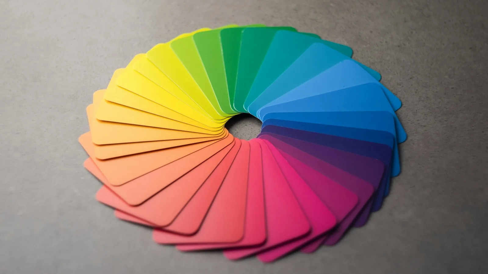
Palettes that have to work in two themes, at 4.5:1, on hardware you don't control. This tag treats color as a systems problem rather than a taste one. Contrast baked into tokens beats contrast checked at review, because the token survives the redesign and the review doesn't. Apple Intelligence brought glow and gradient back into product UI and there's a right and wrong way to borrow that. Dark mode is where most palettes fail first, so it gets attention here. The posts here run from the practical to the mechanical. One compares color palette generators on the things that matter in production, like whether they export OKLCH and whether they check contrast while you work. Another shows how to bake WCAG ratios into a token set, so a rebrand can't quietly break them. The dark mode guides cover the first real stress test a palette gets: surfaces that sit only a few lightness steps apart, body text that needs a different weight on black, and status colors that must read on both backgrounds. Why start with contrast? Because it's the one color decision you can settle with a number instead of an opinion. Read that piece first, and the rest of this tag will lean on it.
Articles, guides and tutorials tagged Color (9 in total), newest first.
Safari 27 Stable Shipped 80 Features, Not the Beta's 58
Safari 27 stable shipped 80 features against the beta's 58. Scroll anchoring,...
Design System Color Contrast: Baking WCAG Into Tokens
Design system color contrast at the token level: a DTCG token file...
Apple Intelligence Gradient in CSS: The Animated Glow
The conic-gradient and @property recipe behind the Apple Intelligence glow, with a...
Typography for Dark Mode: Weight and Optical Sizing
Why the same font weight looks different on a dark background, and...
Dark Mode Dashboard Design: 4 Rules, Palette and Contrast
Dark mode dashboard done right: a lifted #0f172a canvas, surface elevation, a...
How to Implement Dark Mode in UI Design the Right Way
Dark mode isn't a color swap. Here's how to implement it in...
Apple Intelligence UI: Colors, Glow and Design Patterns
The four Apple Intelligence colors in hex, how the shimmer glow signals...
UI Color Palette Generators: 4 Tools for Web and Apps
UI color palette generators compared: Coolors, Adobe Color, Realtime Colors and Huemint...
Visual Hierarchy in UI Design: What It Is + 7 Principles
What visual hierarchy is, and how size, contrast, color, spacing, and alignment...