A support team I worked with once told me their single most common ticket wasn't a bug report, it was "why is my balance different from what I expected." Nine times out of ten, the dashboard was technically correct. The number was just displayed in a way that invited a wrong assumption, stale data with no timestamp, a balance that didn't distinguish pending from cleared funds, a rounding choice that quietly dropped a few cents. Fintech dashboards get more scrutiny than any other dashboard type, because the numbers on screen represent someone's actual money.
This guide extends our dashboard design patterns hub with the patterns specific to financial data: precision, color conventions, staleness, and the audit trail most generic templates skip.
Fintech dashboard design is the practice of presenting money so a number survives a dispute, not just a glance. It carries the usual dashboard bones, a sidebar, a KPI strip, a chart, then adds the rules finance demands: asset-correct precision, gain and loss signals that never lean on color alone, a visible data-freshness timestamp, and a one-click path from any figure down to the transactions behind it.
TL;DR: Fintech dashboards need explicit data-freshness indicators, asset-appropriate decimal precision, gain/loss signals that never rely on color alone, and a visible path from every summary number down to its transaction-level detail.
Why Do Financial Dashboards Need Different Rules Than Everything Else?
Because the failure mode is different. A marketing dashboard that shows a metric wrong costs someone an awkward meeting. A fintech dashboard that shows a balance wrong costs trust, and sometimes it costs the company a support escalation with legal implications attached. I design every fintech screen assuming it will be screenshotted and disputed eventually.
That assumption changes real decisions. How many decimal places to show. Whether "pending" and "cleared" get distinct visual treatment. Whether a number that updates in real time needs a visible timestamp next to it. None of that shows up in a generic dashboard template, because generic templates optimize purely for glanceability. Other verticals bend the base rules in their own directions too, which the dashboard design patterns by industry roundup lays out side by side. Fintech needs glanceability plus a number that holds up under a dispute.
Generic dashboard templates optimize for glanceability. Fintech dashboards need glanceability plus defensibility.
What's the Right Way to Show Gains and Losses?
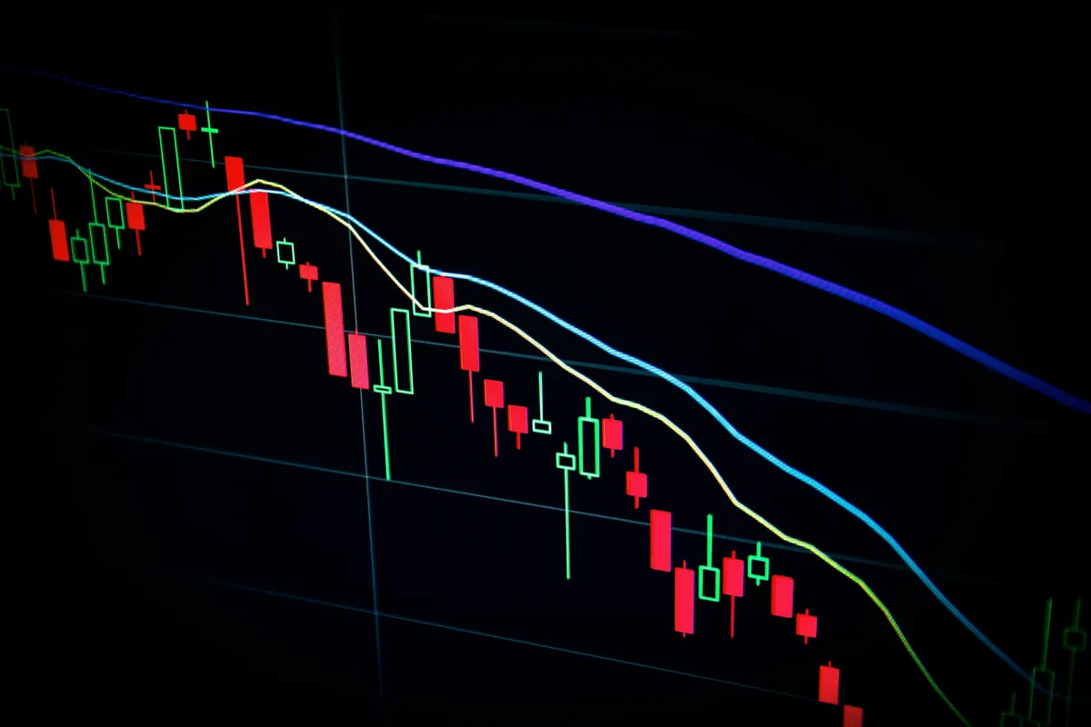
Green for gains, red for losses. It's the dominant Western convention (some East Asian markets reverse it), and fighting convention here costs more than it's worth. What actually matters is redundancy, not the color choice itself.
Never let color be the only signal. Pair every gain or loss indicator with an explicit sign, plus or minus, and an arrow icon where space allows.
| Signal type | Weak (color only) | Strong (redundant) |
|---|---|---|
| Text color | Green "$118.02" | Green "+$118.02 (uparrow)" |
| Card background | Red fill, no label | Red fill + "-0.86%" + down arrow |
| Chart line | Red line only | Red line + dashed reference at zero |
Check the red and green you picked against the card background too, not just against white. A WCAG contrast checker run takes seconds and catches the greens that vanish on a tinted surface.
Roughly 8% of men have some form of red-green color vision deficiency. A dashboard that relies on color alone to signal gain versus loss is functionally broken for a meaningful chunk of users, and it's an easy fix: run every screen through a deuteranopia simulator before launch. I've caught real failures this way, cards where the only signal was a background fill with no icon or sign at all.
How Many Decimal Places Should You Actually Show?
Match the asset class, not your grid system. Fiat currency gets two decimal places, always, because that's what every bank statement shows and anything else reads as a bug. Crypto and forex frequently need more, four to eight decimals depending on the pair, because meaningful price movement happens in that range.
I shipped a crypto dashboard once that rounded everything to two decimals as a default design-system rule. Every token trading under a dollar displayed as "$0.00" across the board, technically true, completely useless. Fixed it the same day, but it never should have shipped. The rule I use now: precision follows the asset, not the layout.
How Should You Format the Numbers Themselves?
Precision is only half the number problem. How the digits render decides whether a column of money is scannable or a guessing game.
Set every figure in tabular (monospaced) numerals. Proportional fonts give the digit 1 a narrower box than 8, so a column of right-aligned balances still fails to line up its decimal points and the eye can't compare magnitudes down the column. Most good UI fonts ship a font-variant-numeric: tabular-nums feature. Turn it on for anything financial and the columns snap into alignment for free.
Format with the locale, not by hand. Intl.NumberFormat gives you thousands separators, the correct decimal mark, and currency-symbol placement per region, and it handles the cases a manual formatter forgets: a French user expects "1 234,56 EUR", a US user "$1,234.56". Rolling your own with string concatenation is how you ship a dashboard that reads correctly in exactly one country.
Pick a negative-number convention and hold it. Accounting interfaces often use parentheses, "(1,204.00)", while trading interfaces use a minus sign and color. Either is defensible. Mixing them on one screen is not, because a parenthesis and a minus reading as the same thing is exactly the ambiguity a money screen can't afford.
Be careful with compact notation. "$1.2M" is fine on a chart axis or a summary tile where the exact figure isn't the point. It's never acceptable on the actual balance or a transaction row, because "$1.2M" hides whether someone holds 1,200,000 or 1,249,000, and on money that gap is the whole ballgame. Compact for context, full precision for anything a user might act on or dispute.
How Do You Show Users That Data Is Live, Not Stale?
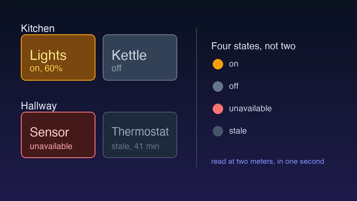
Explicitly, with a real timestamp. A pulsing green dot that says "live" looks nice in a demo, but it tells the user nothing useful when a feed actually breaks. Pair it with dynamic text: "Updated 3 seconds ago" or "Delayed 15 min," not a static badge.
Set a visible staleness threshold. I use 60 seconds for price feeds and longer windows for account balances, past that point the UI should flag the data as delayed rather than silently continuing to present it as current. A confident-looking balance that's quietly 20 minutes stale during a volatile market is exactly the kind of thing that turns into a support escalation, and it's preventable with one conditional and a label.
Would a user trust a number that never tells them how fresh it is? Most wouldn't, once they think about it, they just don't think about it until something goes wrong.
Should the Dashboard Hide the Transaction Detail to Stay Clean?
No, and this is the mistake I see most often. Dense financial data already competes for attention, so hiding the full transaction history feels like a reasonable way to keep the top-level view calm. It backfires the first time a user needs to answer "why does my balance say this" and the only path forward is a support ticket instead of a click.
My pattern: keep the summary view genuinely clean, four to six KPIs and one primary chart, same discipline as any dashboard should follow. But make every number on that view clickable through to its underlying detail. A balance links to the transactions that produced it. A gain percentage links to the trades behind it. That one-click path from summary to detail is what keeps a dense dashboard from needing a support team to explain itself. If your data tables need to get genuinely dense to support that drill-down, our dashboard data density guide covers how to keep dense tables scannable instead of overwhelming.
The best fintech dashboards don't win by looking impressive. They win by never making a user doubt a number, and that's a much higher bar than most dashboard advice accounts for.
The Trust Signals Most Templates Leave Out
A few details separate a fintech dashboard people trust from one that merely looks professional, and none of them are visual flourishes.
Distinguish pending from cleared, visibly. A balance that folds unsettled funds into the headline number without saying so is the single most common source of the "why is my balance different" ticket. Show cleared as the primary figure and pending as a labeled, secondary line, never silently summed into one number.
Never flash a zero. While a balance loads, a dashboard that renders "$0.00" for even 300 milliseconds tells the user, for a heartbeat, that their money is gone. Use a skeleton shaped like the number instead. A spinner is acceptable; a confident wrong figure is not, and on money a wrong figure is uniquely alarming.
Timestamp the reconciliation, not just the feed. "Balances as of 09:41" tells a user which snapshot they're reading, which matters the moment they compare your number against their bank's. A live price feed and an account balance often update on different clocks, so label them separately rather than implying one freshness for the whole screen.
Show the disclaimers the domain requires without burying them. "Not investment advice", deposit-insurance notes, or a "figures may be delayed" line belong near the data they qualify, not four clicks deep in a footer nobody opens. Regulated finance treats a missing disclaimer as a real problem, so design a home for it rather than bolting it on at review time.
None of these cost much to build. All of them are the difference between a number a user acts on and a number a user calls support about.
Where Fintech Fits in the Pattern Set
Start from the hub's baseline, then layer these financial rules on top: asset-correct precision, redundant gain and loss signals, explicit freshness, visible pending-versus-cleared, and a click from every figure to its detail. When you're choosing how to plot the money rather than list it, the chart-type guide covers which visualization actually fits a time series, a distribution, or a single balance. Get the numbers trustworthy first. The chart is decoration until they are.