A hospital ward dashboard and a Shopify sales dashboard have almost nothing in common except the word "dashboard." One tracks patient acuity in real time with lives on the line. The other tracks conversion rate for a marketing team checking in twice a day. Treating them as the same design problem is how a lot of vertical software ends up with beautiful, useless interfaces.
This roundup covers what actually changes when a dashboard serves a specific industry, and the patterns worth stealing regardless of which vertical you're building for. For the baseline layout and navigation patterns these verticals build on top of, start with our dashboard design patterns for web apps guide.
TL;DR: Generic dashboard templates optimize for shared metrics like revenue and growth. Specialized industries need their own status logic, healthcare needs acuity and bed state, logistics needs live location, retail needs stock urgency. The pattern that transfers everywhere is color-coded status you can read in under a second.
What Makes a Healthcare Dashboard Different?
Life-safety consequences change every design decision. A healthcare dashboard, a nurse station board, a bed management screen, an EHR summary panel, has to communicate patient acuity and status changes fast enough that a delayed glance doesn't matter clinically. That means high-contrast color coding for urgency (typically red/yellow/green with redundant text labels, never color alone), minimal cognitive load per screen, and a strict hierarchy where the most critical patients are never buried below the fold.

Nielsen Norman Group's dashboard research emphasizes designing for the actual decision a user makes in the moment, not the complete dataset available (Nielsen Norman Group, 2024), and healthcare is where that principle carries the highest stakes. A nurse scanning a ward board isn't analyzing trends, they're triaging attention in the next thirty seconds.

How Does a Logistics Dashboard Solve a Different Problem?
Location and time-to-arrival dominate everything else. A logistics or fleet-tracking dashboard replaces the line chart with a live map as the primary visual, because "where is it right now" beats "how has this trended" for nearly every logistics decision. Status badges (in-transit, delayed, delivered, at-risk) do the same job the healthcare dashboard's acuity color does, fast visual triage before anyone reads a single number.
The best logistics dashboards I've reviewed treat delay as the default alert state rather than an edge case, a shipment running two hours late is routine, not exceptional, so the UI needs a way to flag genuinely urgent delays without drowning them in routine ones. Threshold-based alerting, not blanket red-flagging, is what separates a usable ops dashboard from one operators learn to ignore.
A logistics dashboard's real question isn't "how has this trended," it's "where is it right now.
What Does a Point-of-Sale Dashboard Get Right That Others Miss?
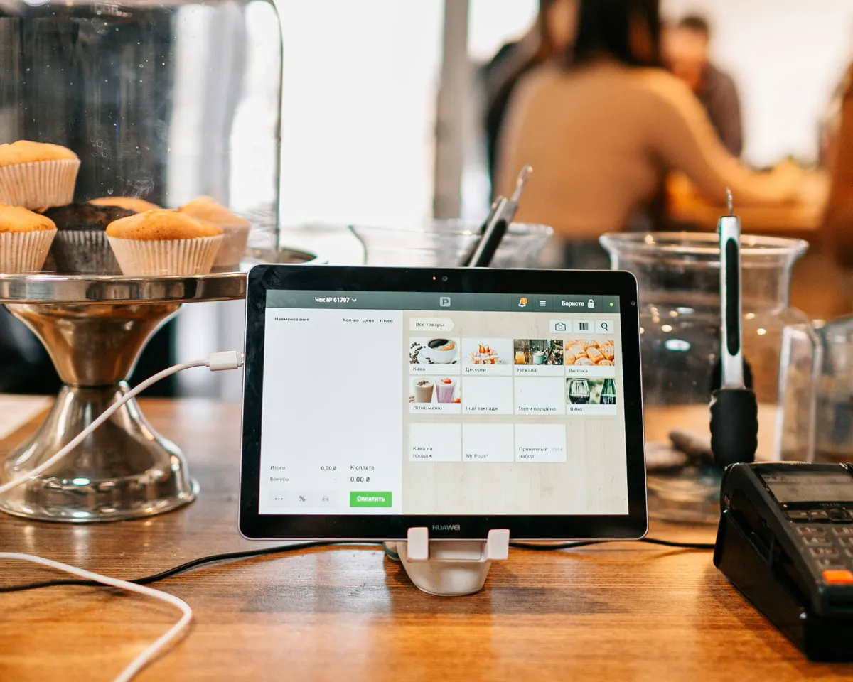
Speed under pressure, designed for someone standing at a counter with a line forming. POS dashboards, whether retail checkout or restaurant order management, compress information into the fewest taps possible and use large, high-contrast touch targets because the user is frequently moving fast with imperfect attention split between the screen and a customer.
Inventory urgency is the metric that matters most here, not historical sales trends. A "12 left" badge that shifts color as stock drops toward zero does more real work than a sales-over-time chart most POS staff never open during a shift.
How Do EdTech and HR Dashboards Differ From Each Other?
Both track people, but the emotional stakes flip the design entirely. An edtech dashboard, a teacher's gradebook view or a student progress tracker, needs to motivate rather than just report, progress bars and streak indicators do real pedagogical work by making incremental improvement visible. Shame-based framing (a stark "failing" red state) tends to backfire with student-facing views specifically.
HR dashboards, performance reviews, headcount, attrition risk, need the opposite instinct: restraint and privacy-conscious defaults. Attrition-risk scoring in particular deserves careful framing, a raw "flight risk: high" badge visible to the wrong audience creates real workplace harm, so access control and framing matter as much as the visual design itself.
I've watched a manager open an HR dashboard in a shared screen-share and accidentally expose a direct report's attrition score to the whole team. Nobody meant harm, the layout just didn't consider who else might be looking at that screen in the moment. That single incident changed how I approach role-based visibility on every people-facing dashboard since: sensitive scores get a permission check before a color, not after.
How Do the Five Verticals Compare Side by Side?
Each vertical answers a different first question, and that question decides the primary visual. Read the table as a design brief: whatever sits in the "first question" column is what belongs in the top-left of the screen, and everything else is one click away.
| Vertical | The first question | Primary visual | Refresh cadence | The failure mode |
|---|---|---|---|---|
| Healthcare | Who needs attention now? | Colour-coded status board | Near-real-time | Alert fatigue from non-urgent flags |
| Logistics | Where is it right now? | Live map | Near-real-time | Genuine delays buried in routine ones |
| Point of sale | What sold, and is anything out? | Ranked list plus stock count | Hourly to daily | Trend charts nobody acts on |
| EdTech | Who is falling behind? | Cohort progress, per learner | Daily to weekly | Averages that hide the individual |
| HR | What changed since last month? | Period-over-period comparison | Monthly | Real-time widgets on monthly data |
The refresh column is the one teams get wrong most often. I've watched an HR dashboard rebuilt with live-updating widgets because live felt modern, on data that changes once a payroll cycle. It cost three sprints and nobody looked at it more than they had before.
Is There One Pattern Worth Stealing Across Every Vertical?
Status at a glance, always. Whatever the industry, the dashboards that actually get used daily lean on the same core trick: color-coded state that a user reads in under a second, with the exact number one click away rather than forced into the first glance. A hospital bed board, a delivery map, a POS stock badge, a classroom progress bar, and a fintech balance screen are visually nothing alike, and every single one is solving "what needs my attention right now" before anything else. Strip away the vertical entirely and the shared shell is the same one I broke down in the modern dashboard examples roundup.
What Mistakes Show Up Across All of These Verticals?
Alert inflation is the big one, and I've never worked on a vertical dashboard that didn't drift toward it eventually. A team ships with three red states. A year later there are nineteen, because every stakeholder who asked "can we flag that too?" got a yes. On one warehouse ops screen I audited, 41 of the 60 visible rows were red during a normal Tuesday shift. Red had stopped meaning anything. We rebuilt it so that at most two rows could hold the top alert state at once, ranked by a severity score, and everything else demoted to a neutral badge. Supervisors started acting on alerts again within a week.
The second recurring mistake is designing for the demo rather than the shift. Demos happen on a 27-inch monitor in a quiet room. Real use happens on a 10-inch tablet mounted at chest height under fluorescent light, or on a laptop with a smudged screen at 2am. I now test every vertical dashboard at 50 percent brightness on the actual hardware before signing anything off, and roughly half the time a contrast pairing that passed the checker in Figma turns out to be unreadable in the room where it lives.
Third: burying the one number that drives the shift. Every vertical has one. Find it, then make it bigger than your instincts want.
Would your dashboard survive being glanced at for two seconds by someone standing, distracted, and slightly stressed? If the honest answer is no, that's the redesign brief, regardless of which industry it's built for.