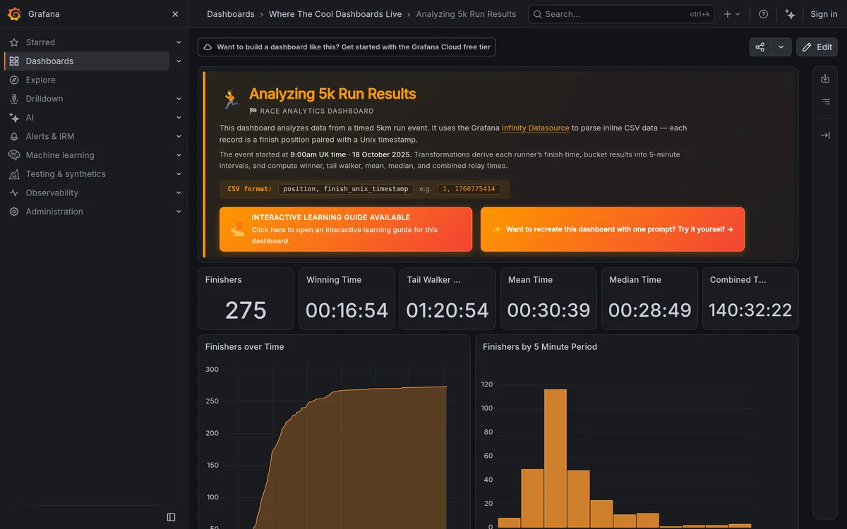
Modern Dashboard Design: 5 Real Examples You Can Open
Five modern dashboards you can open right now without a login: Plausible,...
Tag
Reusable solutions to problems users have seen a thousand times. Infinite scroll, wizards, empty states, progressive disclosure: this tag examines the patterns that quietly shape most interfaces, plus the anti-patterns that betray users' trust. We're not fans of copying a pattern just because a big app uses it, so expect some pushback on the sacred cows. Each piece asks when a pattern helps and when convention has calcified into laziness. For product designers who want a mental library of moves and the judgment to know which one fits.
Articles, guides and tutorials tagged UX Patterns (8 in total), newest first.
Modern Dashboard Design: 5 Real Examples You Can Open
Five modern dashboards you can open right now without a login: Plausible,...
Empty States and Error Pages: Designing the Edge Cases
How to design empty states, 404 pages, and error screens as first-class...
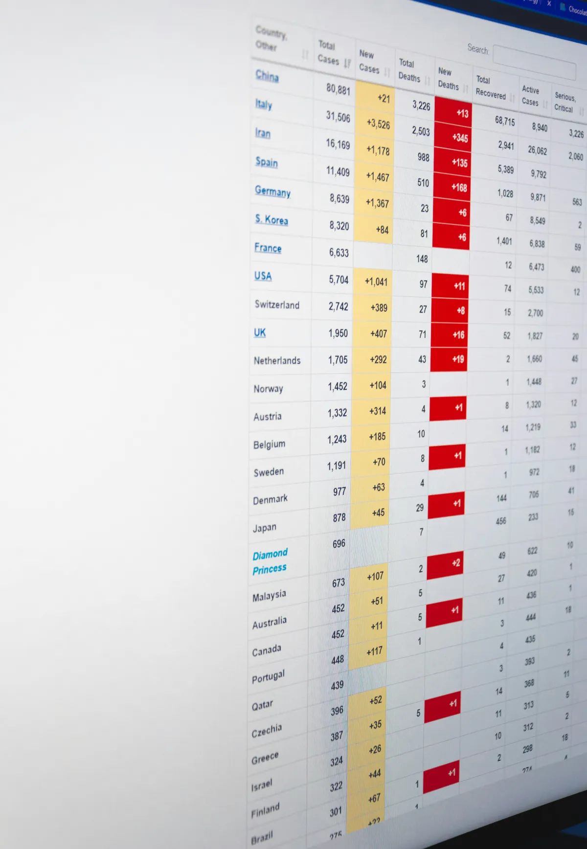
Dashboard Data Density Patterns: How Much Is Too Much
Dashboard data density patterns: comfortable vs compact row modes, when dense tables...
Fintech Dashboard Design Patterns That Build Trust
Fintech dashboard design patterns: gain/loss color coding, numeric precision, staleness indicators, and...
Mobile Navigation Patterns: Tab Bars, Drawers, Gestures
A visible tab bar beats a hidden hamburger menu for primary navigation...
Dashboard Design Patterns by Industry: A Practical Roundup
Dashboard design patterns compared across healthcare, logistics, POS, and HR software, with...
Motion Design for the Web: When and How to Apply It
Motion design for the web, practical CSS transitions, scroll-driven effects, micro-interactions, plus...
Modern Dashboard UI: 2026 Design Trends and Layouts
The 2026 dashboard patterns Linear, Stripe and Vercel all ship: a 256px...