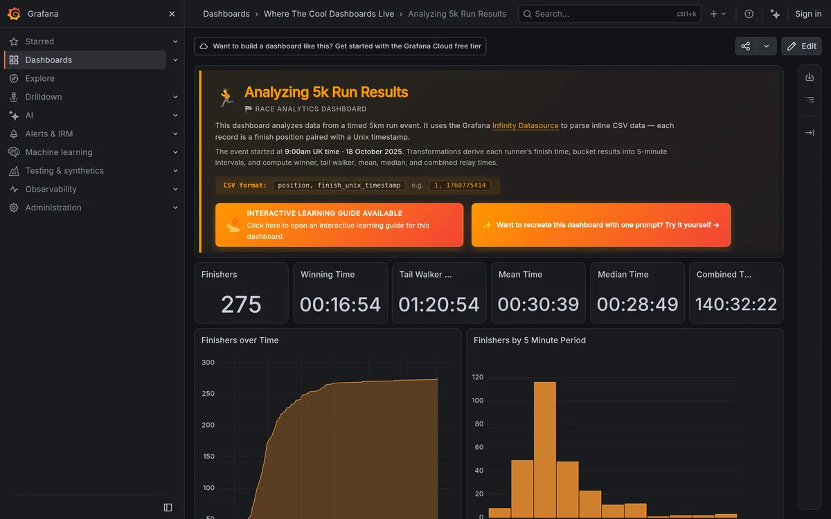
I once inherited a SaaS dashboard where the "no data yet" screen for brand-new accounts was a single gray box that said, literally, "No data." Nothing else. New users hit that screen on day one, during their first five minutes in the product, and a chunk of them never came back. Nobody had designed that screen. It just happened, by default, because someone forgot to.
That's the pattern I see over and over. Teams spend weeks polishing the happy path, then ship whatever the framework generates for zero-data states, timeouts, and 404s. Those "edge cases" aren't edge cases at all, they're screens real users hit constantly: a fresh account, a search with no matches, a broken link from an old bookmark.
TL;DR: Empty states and error pages are frequently a new user's first real screen, not a rare exception. Nielsen Norman Group frames them as "teachable moments", well-designed ones explain what happened and offer a next step instead of leaving a blank wall.
Why Do Empty States Get Ignored During Design?
Because they don't show up in most Figma mockups. Designers build the "populated" version of every screen, five rows of data, a full dashboard, a rich profile. Then engineering ships the zero-state as whatever the component library defaults to, usually just a placeholder div with no thought behind it.
Here's the thing I've learned the hard way, on at least three projects, empty states happen more often than the "happy path" for specific user segments. A brand-new user sees zero data on every single screen until they've done real work in your product. A power user who filters aggressively hits "no results" constantly. If you only design for the full state, you're designing for a minority of actual screen views.
What Makes a 404 Page Actually Work?
Every 404 needs four things: clear language that this page doesn't exist, working navigation back into the site, a search bar if your site has meaningful depth, and ideally a shortlist of popular pages (UXPin, 2026). I pull that shortlist from real analytics data, not intuition, whatever your top five most-visited URLs are this quarter.
I've watched a 404 page single-handedly recover a broken migration. A client moved from WordPress to Astro and 40+ old blog URLs 404'd for a week before redirects caught up. Their custom 404 page had a working search bar and a "browse by category" module. Bounce rate on those broken URLs stayed under 30%, comparable to a normal page, instead of spiking toward the 70-80% range you'd expect from a dead end with no path forward.
Rather than argue the four rules in the abstract, here's each one as a live page that gets it right. I captured these myself in August 2026, so they're the current designs, not the versions everyone keeps reposting from 2019.
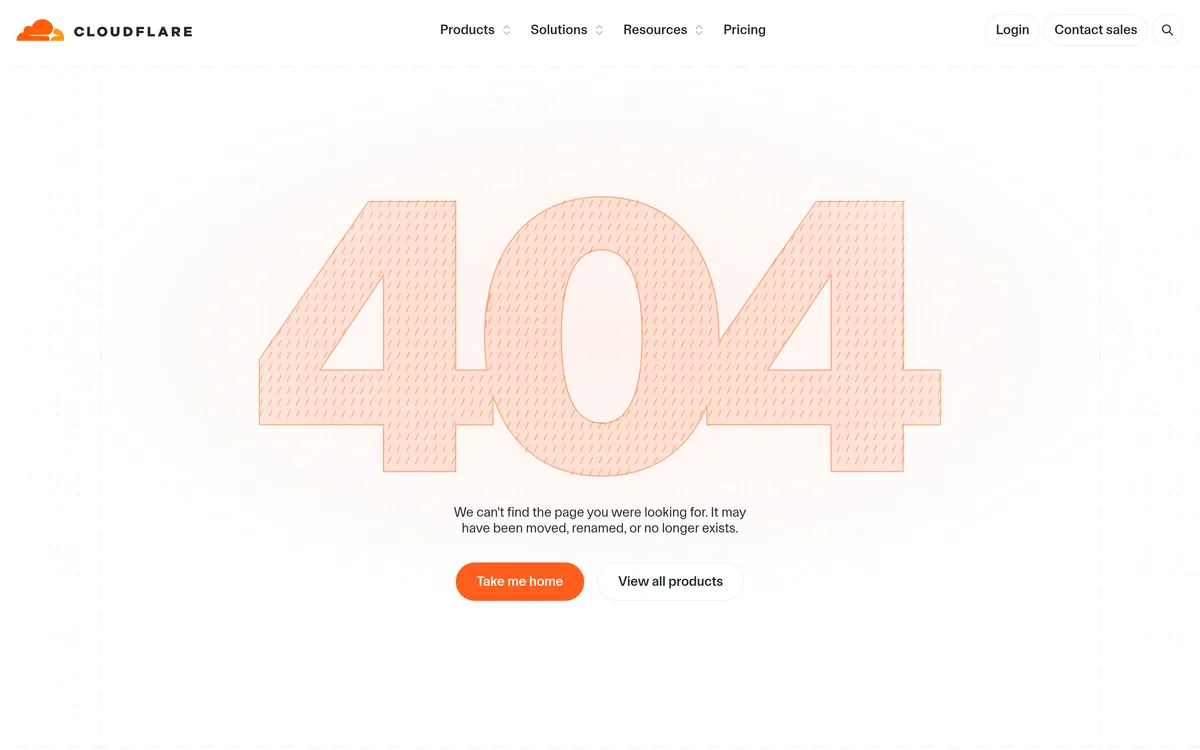
Cloudflare handles rule one better than almost anyone: "It may have been moved, renamed, or no longer exists." Three plausible causes, named. Most pages stop at "we can't find it", which leaves the user guessing whether they mistyped or the site is broken.
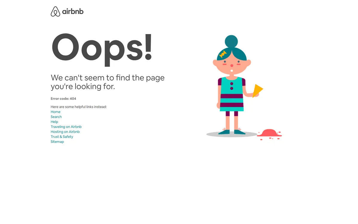
Airbnb is my go-to reference for rule four. Under "Oops!" sits a labelled list: Home, Search, Help, Traveling on Airbnb, Hosting on Airbnb, Trust & Safety, Sitemap. Those are the seven things a lost visitor was probably trying to do. It also prints "Error code: 404" as text, which support agents need and which most brands hide to protect the vibe.
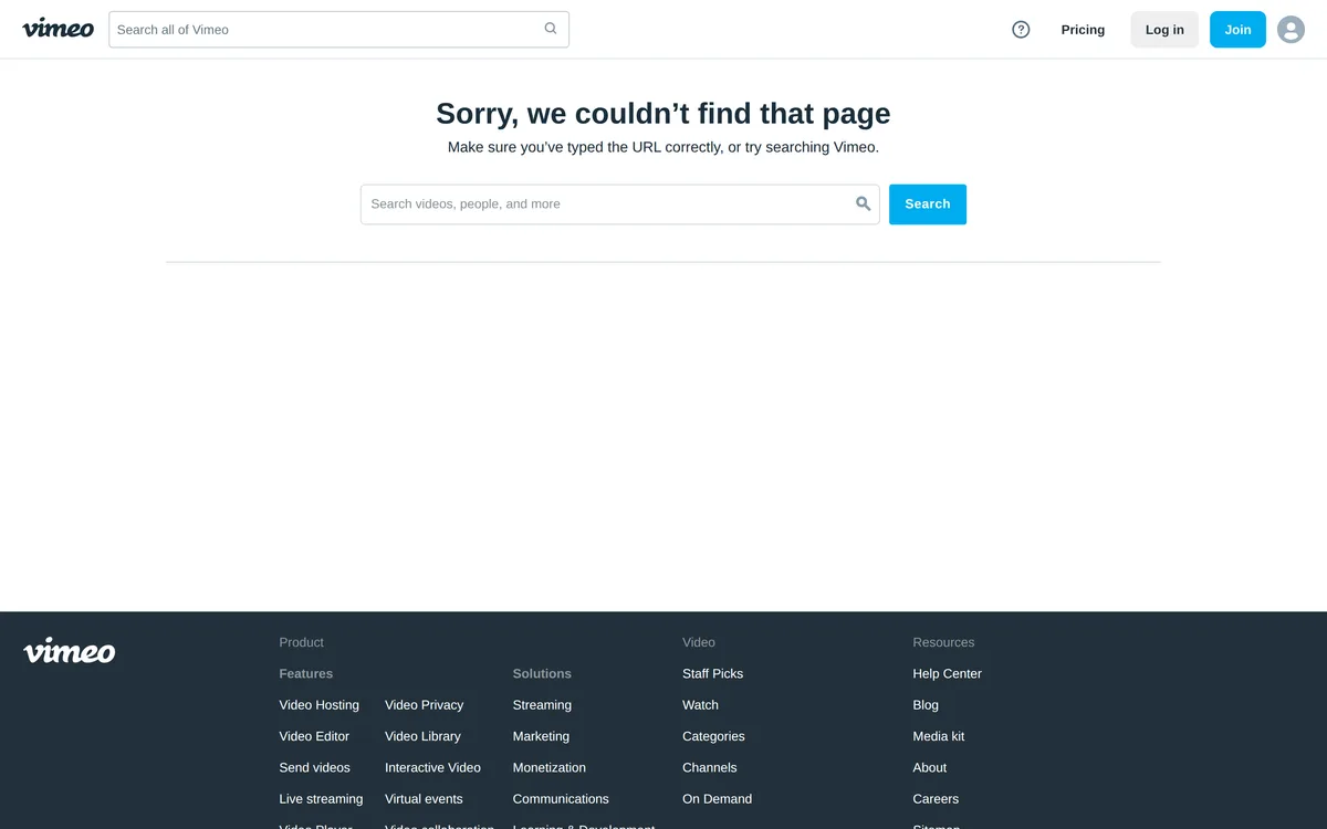
Vimeo covers the search rule twice: the header search stays put, and the error block adds a second, wider field right where your eyes already are. With millions of items, search is the only realistic recovery path, and putting it in the content column instead of the chrome is what gets it used.
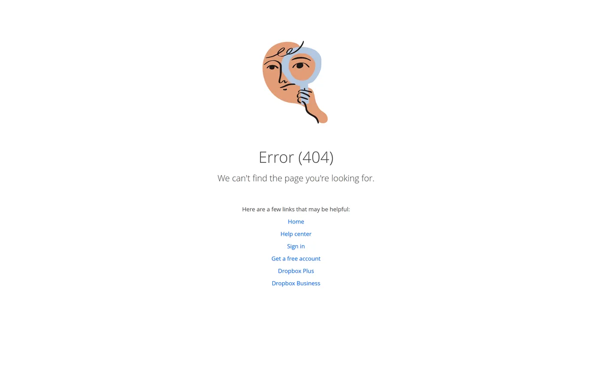
Dropbox is the cheapest version and it still works: six task-oriented links under one sentence, a small drawing, no clever copy. If your team has one afternoon, ship this one.
Which 404 Pages Get the Voice Right?
The four rules are the floor. What separates a 404 you remember from one you tolerate is tone, and tone is where teams either freeze up or overshoot.
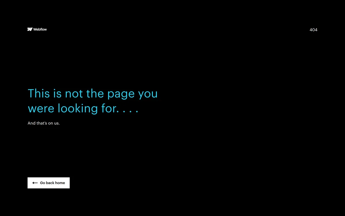
Webflow takes the blame in four words: "And that's on us." Nothing pinned on the user, one button back home, a single cyan headline on black. It reads as confident rather than apologetic, which is a hard trick in an error state.
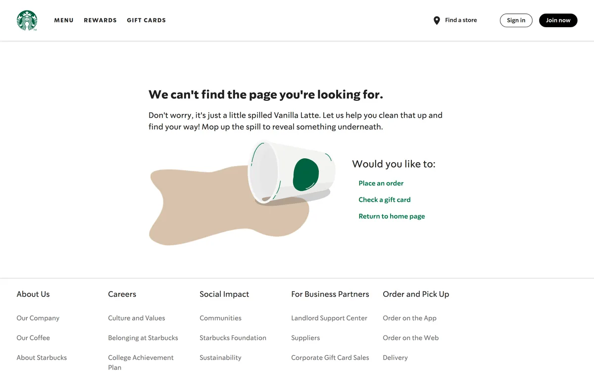
Starbucks builds the page around a spilled Vanilla Latte, then gets practical: place an order, check a gift card, return home. The metaphor carries the bad news so the copy doesn't have to, and those three links are what people actually come to starbucks.com for.
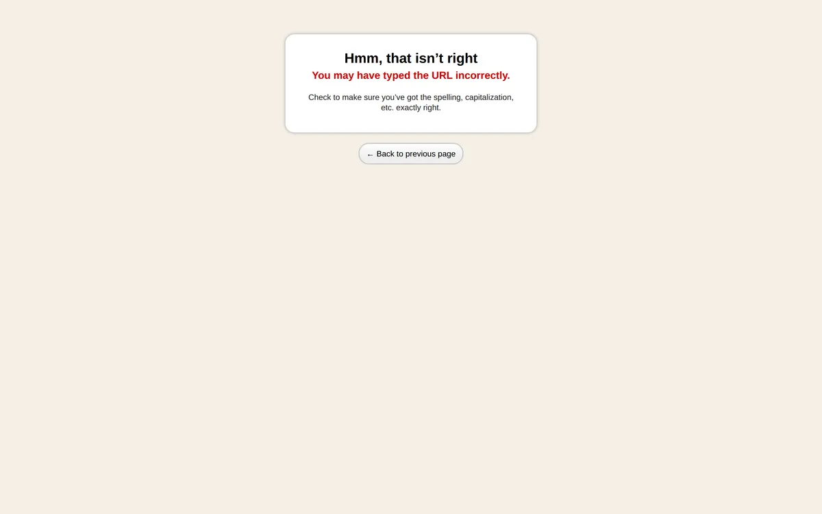
Basecamp goes the other way and I still like it. One card: "Hmm, that isn't right", then in red, "You may have typed the URL incorrectly", then advice specific enough to act on, check the spelling and capitalization. It's the only page here that treats the commonest cause of a 404 as something the user can fix in three seconds.
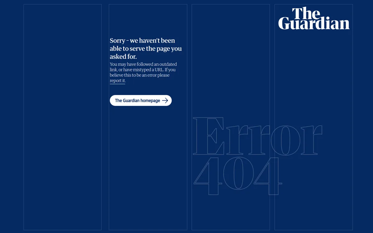
The Guardian is the only page in this set that offers a way to tell them about it: "If you believe this to be an error please report it." For a news site with decades of archive URLs loose on social media, that link is a free broken-link crawler staffed by readers. Why more publishers skip it, I genuinely don't know.
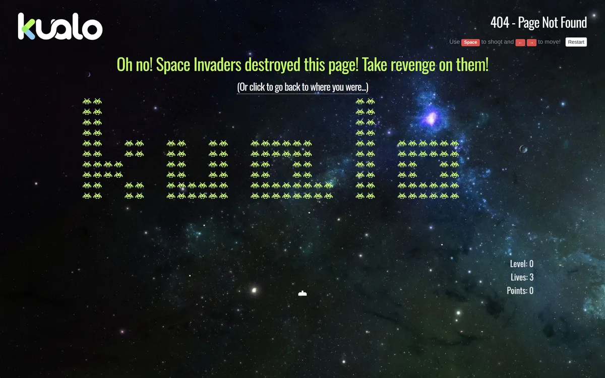
Kualo, a UK host, turned theirs into playable Space Invaders where the aliens spell the company name and beating a level unlocks a discount code. It's the most-copied joke 404 on the web. But look at what it keeps: the error code top-right, the controls, and a "click to go back to where you were" link under the headline. The game is additive, never a replacement for the exit.
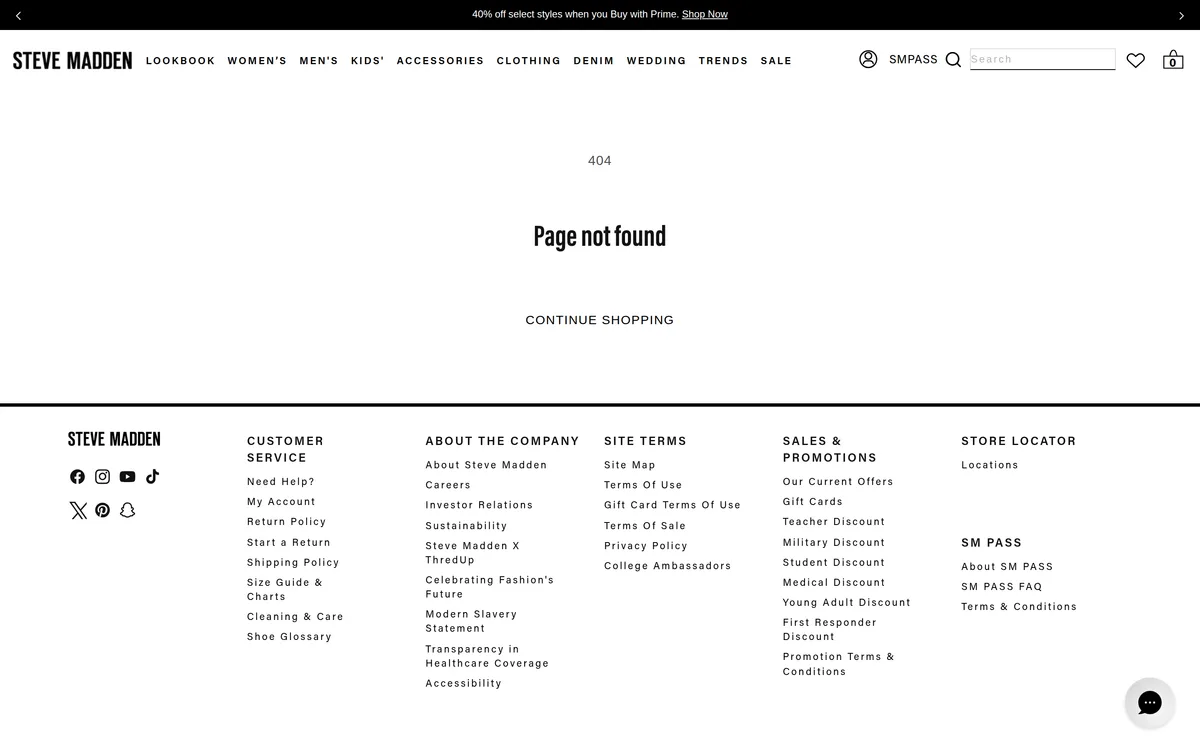
Steve Madden is the commerce pattern, and it's smarter than it looks. The error block is almost nothing: "404", "Page not found", "Continue shopping". But the page keeps the whole store around it, nav across nine categories, working search, cart count, six-column footer. On a shop, the furniture is the recovery path and the error block only has to stay out of the way.

How Should Zero-Data States Be Written?
Answer why, then answer what next. Those are the two jobs of an empty state's copy, and skipping either one is the most common mistake I see in reviews.
"No invoices yet" is fine as a headline, but it's incomplete. Pair it with "Create your first invoice to start tracking payments" and a button right there. That single sentence turns a dead-looking screen into an active prompt, and it costs you nothing beyond ten minutes of copywriting.
A few concrete patterns worth stealing:
- New account, no data: explain what this section is for, then offer the first action (a template, a quick-start wizard, a sample dataset toggle).
- Filtered search, zero matches: name the filters that are active, offer a one-click "clear filters" action right next to the message.
- Completed task list: celebrate it. "All caught up" with a small positive visual reads better than a blank list that looks broken.
- Permission-gated empty state: tell the user why they can't see data (role, plan tier) and who to ask, don't just show nothing.
Is a generic "No results found" ever acceptable? Only as a fallback, never as your primary design. It tells the user nothing about why or what to do about it.
| Empty state type | What to explain | Next action to offer |
|---|---|---|
| New account, no data | What this section is for | First action: template, quick-start wizard, sample dataset |
| Filtered search, zero matches | Which filters are active | One-click "clear filters" |
| Completed task list | Celebrate it | Small positive visual, not a blank list |
| Permission-gated | Why the user can't see data | Who to ask |
What Should Server Error Pages Actually Say?
Never show a raw stack trace or a generic "Something went wrong" that swallows the whole page. Scope the failure. If one API call fails on a dashboard with six widgets, only that widget should show an error state, the other five should keep working. I shipped a dashboard once where a single flaky endpoint took down the entire page behind a modal for 45 minutes before anyone noticed. Component-level error boundaries would have limited the damage to one card.
Error copy should tell the user three things: what happened in plain language, whether it's their fault or the system's, and what to do next (retry, contact support, wait). "Error 500" tells a user nothing useful. "We couldn't save your changes, try again in a moment" does.
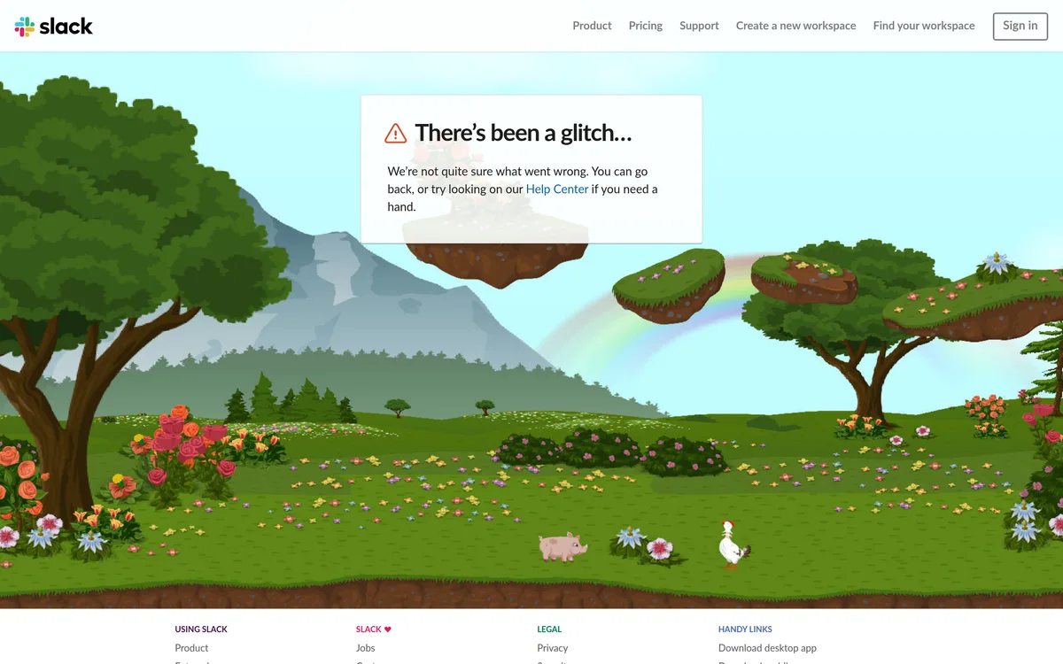
Slack's page is the cautionary one, and I say that as someone who admires the illustration. Ask for a URL that doesn't exist and you get "There's been a glitch..." followed by "We're not quite sure what went wrong." That's server-error copy on a navigation failure. The system knows exactly what happened, the page isn't there, and calling it a mystery invites the user to sit and refresh. Beautiful floating islands, vague sentence, and the only real exit buried mid-paragraph.
How Do You Test These Screens Before Launch?
Force them. Most teams never see their own empty states because they're testing with seeded demo data that always has content. Before you ship, manually trigger every zero-data path: a brand-new account, an aggressive filter combination, a deliberately broken URL, a timed-out API call.
I keep a checklist for this on every project now, and it takes maybe two hours to run through a typical app. It's the cheapest QA pass I do, and it catches things nobody would ever notice in a demo. Is your team actually testing these paths, or just assuming the framework default is fine? If you're not sure, that's your answer.
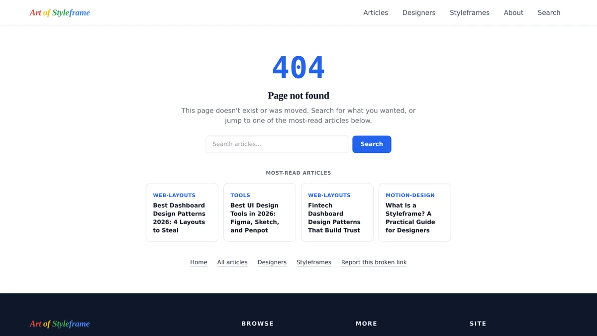
The image at the top of this article is our own 404 page, because writing the rules and then failing them would be embarrassing. Plain message, search field, navigation, four article cards, the error code as real text rather than a decorative graphic, and a report link that arrives prefilled with the URL that broke. Auditing our own page against this list turned up three things to fix, which tells you something about how easy the drift is.
The shortlist was the worst of them. It's now built from our Search Console export, ranked by impressions over the last 28 days, with every URL checked against the published collection first and a newest-first fallback so the grid never renders empty. Until this week it sorted by publish date and called itself "most read", which is exactly the intuition-over-analytics shortcut I'm warning about here.
The pages that get the least design attention are often the ones a meaningful slice of your users see first. Treat them with the same care you'd give the dashboard, and you'll fix a real drop-off point that most competitors never bother to touch.
Empty states are one small piece of a bigger discipline: our visual hierarchy in UI design principles guide covers the broader system these micro-states have to fit into, and our dashboard design patterns piece shows what the fully-populated version of these same screens should look like.