Search for styleframe examples and you get a wall of pretty pictures. Most of them aren't styleframes at all, they're posters, dressed up and going nowhere. A real styleframe carries a second layer under the surface: it tells you what's about to move. That's the trait worth studying, and it's the one every strong example shares.
A quick note on method. This guide is desk research, not a studio diary. We read the studios' own case studies, the interviews and credit pages on Art of the Title, and trade press, then looked hard at the frames in our own gallery. Every credit and number below is attributed to a named source, and where a source says nothing, we say nothing. Once an example stops being inspiration and becomes the frame you have to deliver, the style frame templates guide is the practical follow-on.
So what should you look for when you study an example? Not the color, though the color matters. Look for intent.
TL;DR: A strong styleframe example does two jobs at once: it looks finished, and its composition tells you what's about to move. Four public title sequences (Se7en, Catch Me If You Can, Game of Thrones, True Detective) each show one repeatable constraint that makes a frame readable. Two frames from our own gallery show the same traits in a still. Freeze a frame, then ask what it says about the motion.
What Trait Does Every Strong Example Share?
Take any styleframe that works and freeze on it. You can tell what will move and what will stay put, purely from the composition. The focal element sits where it will finally resolve. The supporting pieces sit where they'll arrive from, slightly off, slightly early, coiled. Nothing is animated yet, and still the frame implies the whole arc.
That's the test. A poster arranges elements to look good in stillness. A styleframe arranges them to look good and to pre-load motion. When a frame passes, an animator can build from it without inventing the timing, because the composition already decided it.
There's a quieter tell too. Strong examples leave room. Negative space isn't decoration in a styleframe; it's the runway a moving element needs. A frame packed edge to edge has nowhere for anything to travel, so it reads as static no matter how polished the render. When a frame feels dead despite gorgeous type, the usual fix is subtraction: pull something out and give the remaining elements somewhere to go.
A poster looks good standing still. A styleframe looks good and tells you what's about to move.
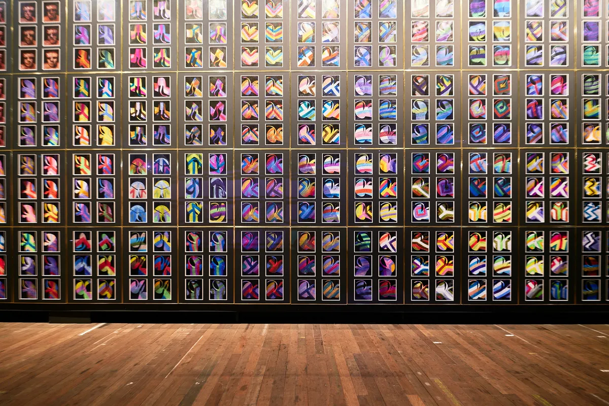
Which Public Title Sequences Are Worth Studying?
Title sequences repay this kind of study more than almost any other source. They're short, they're art-directed to the pixel, and the studios behind them often publish how they were made. Here are four, each chosen for one constraint you can steal.
| Sequence | Year | Credited to | Length, per a named source | The constraint to study |
|---|---|---|---|---|
| Se7en | 1995 | Kyle Cooper, with editor Angus Wall | Just over two minutes (The Fincher Analyst) | Type and imagery that look physically made |
| Catch Me If You Can | 2002 | Olivier Kuntzel and Florence Deygas, Nexus Productions | No source states one | A tiny vocabulary of flat shapes and color |
| Game of Thrones | 2011 | Elastic, Angus Wall as creative director | 90 seconds (Art of the Title interview) | One built world with a camera that has rules |
| True Detective | 2014 | Patrick Clair, Elastic and Antibody | No source states one | Two images fused in one composite |
A word on timestamps. None of the sources we found gives frame-accurate in and out points for these sequences, and we won't invent them. What we can report is the length when a source states one, and the pattern to look for. Pick your own pause point and defend it.
Se7en (1995): where does the type physically live?
Kyle Cooper's main title for David Fincher's film reads like the killer's own work, and that was the brief. According to Art of the Title, Cooper wanted the titles to feel as if the killer had made the film opticals himself, and Fincher wanted the type hand-drawn because it came from the killer's mind. Imaginary Forces, whose project page lists the sequence and says it helped launch the studio, describes the whole thing as appearing hand-made by John Doe.
The mechanics are specific. The notebooks were designed as props by Clive Piercy and John Sabel, then shot as tabletop close-ups, backlit so the pages throw shadows and ghosting. The type was hand-etched into black scratchboard, smeared and jittered during the film transfer, cut up and reassembled, and mixed with Helvetica. Film leader and other debris carry etched imagery and type. Angus Wall cut it in a staccato rhythm. And much of it was assembled by hand on an optical printer, with the team keeping accidents such as objects run through the machine.
The Fincher Analyst counts just over a hundred shots, many in close-up, running a little over two minutes, placed a few minutes into the film.
What does that teach a styleframe maker? Layers, in our reading. Backlighting gives the page, the writing and the shadow behind it three separate depths without a single 3D pass. The type isn't an overlay on the image; it's an object in the world with its own damage. Decide where your type physically lives, in the scene, on a surface, under a light, before you decide what it looks like. A frame from this sequence holds as a still because the grit is physical, not procedural.
Catch Me If You Can (2002): how small can your visual vocabulary be?
Steven Spielberg commissioned the Paris duo Olivier Kuntzel and Florence Deygas, and Nexus Productions in London assembled the work. The BFI's list of standout 21st-century openings calls it a homage to Saul Bass, built from bold blocks of colour and silhouettes, and ties the look to Bass's Vertigo, Anatomy of a Murder and Ocean's 11 titles. Art of the Title adds the technique: the characters were imagined as rubber stamps, carved by hand and animated by hand on paper, then placed over a precise digital set. Agnes Fauve is credited with 2D animation, Olivier Marquezy with layout and typography, and Pierre Yves Joseph with 2D composition.
Two details matter for frames. First, the palette does the storytelling. Art of the Title says color shifts mark changes of place and time, and the sequence slowly fades to a darker tone as the chase tightens. Second, the movement is routed. The page describes type and silhouettes snaking and sneaking across the screen, and Stopdesign's 2003 write-up notes letters curving into road-like shapes, with characters moving from one card to the next.
Here's the detail worth pausing on. Per the BFI, the pair hadn't seen the film. They worked only from Frank Abagnale's source book. That's a styleframe discipline in its purest form: a frame built from a written brief, with a constraint (silhouette plus flat color) strict enough that every card stays readable.
If you want the lineage, Art of the Title's Vertigo page credits John Whitney with the spirograph-like imagery Bass paired with close-ups of Kim Novak. Bass set the pattern: a hard vocabulary, repeated.
Game of Thrones (2011): what rules does your camera follow?
Elastic's sequence, led by creative director Angus Wall with Rob Feng as art director and Chris Sanchez as lead designer, runs about 90 seconds according to the interview on Art of the Title. The conceit is a map built as a physical machine: an astrolabe-like structure around a burning center, a map that comes into focus as if seen through a huge looking glass, and cities that rise from the terrain.
The layering is what makes it study material. Gears and cogs sit beneath the map's surface and drive the growth of the towns. The astrolabe's bands carry relief-sculpted history, with dragons and houses pledging allegiance to a stag. Locations are built from wood, metal, leather and fabric, with dust motes hanging in the air. The world sits inside a sphere with its light source at the center, which is why the camera can go anywhere.
And the camera has house rules. Art of the Title reports it moves constantly, in a motion-control style meant to feel like a physical object, and avoids tilting far upward because that would reveal what lies beyond the map. The team used previs instead of storyboards, and the locations follow George R. R. Martin's maps.
Is that a styleframe lesson or an animation lesson? Both, honestly. A frame from this sequence is legible because the light, the scale and the viewing angle were fixed before a single town was modelled. Lock those three in your own boards and every later frame inherits them for free.
True Detective (2014): what happens when two images share one frame?
Patrick Clair directed the season one titles at Elastic, with Antibody in Sydney handling design, animation and compositing, and Raoul Marks credited as senior designer. The idea, per Art of the Title, was inspired by photographic double exposures: portraits of the characters built from the terrain of the places they live, so each human figure acts as a window onto a partial scene. Clair told Stash he drew on the photographer Richard Misrach for a dark, intriguing mood, and Art of the Title ties the Gulf Coast imagery of pollution, industry and wildlife largely to Misrach's work.
Production notes on Art of the Title add the layers. The shots are 3D projected scenes with low-poly geometry for places like truck stops and refineries, with photographs projected over them and the portrait and terrain combined in one composite, plus focus effects and texture. Some footage was slowed to 10 or 20 percent of its original speed. The sequence moves from light to dark and ends with animated flames that burn the scene down, and SlashFilm notes that fire is a central motif.
The lesson for a frame is compositional. Two images can share one silhouette if one of them owns the shape and the other owns the fill. The figure supplies the contour, the world supplies the texture, and the eye reads both at once. It's a hard trick to fake with layer opacity alone, which is why the process notes matter more than the finished look.
What Do Two Frames From Our Own Gallery Show?
Reading about frames is one thing. So let's look at two from our styleframe gallery. The descriptions below come from the gallery entries and from the image files themselves; where we're reading intent into a still, we say so.
OFFF Barcelona 2018, frame by Heebok Lee
The OFFF Barcelona 2018 entry credits creative directors Jake Ferguson and Heebok Lee, produced at Giantstep, with Houdini as the listed tool. Lee's own page names Serjan Burlak as Houdini TD and describes the method as visual rhythm built by repeating imagery, in the manner of visual poetry.
What the still shows, from the file:
- Palette. Near-monochrome: charcoal, black and silver, with no hue to lean on.
- Layers. A back layer of faint, finely ruled arcs fills the corners. A mid layer holds the big structures: a heavy dark ring at upper left and a toothed outer ring that arcs around the whole frame. The front layer is a ribbed, disc-like object at right of center that catches the brightest highlights.
- Hierarchy. A small, thin-lined ring sits near the middle, and fine threads fan out from it in every direction. Everything points at that ring. The bright disc at right is the counterweight.
- Negative space. It's not empty but it's dark: pockets of near-black between the rings, strongest at the upper center and the left edge, give the threads room to read as light.
- Motion direction (our reading, not the studio's). Radiating lines imply either rotation around the central ring or a push in along its axis. The entry doesn't say which, and we can't see the finished sequence from here.
The takeaway is a frame with two focal points, one by convergence and one by brightness, and a clear winner. That tension is what keeps a monochrome frame from going flat.
Chimera, frame by Ash Thorp
The Chimera entry lists Photoshop, Cinema 4D and After Effects, and argues that depth of field is the hierarchy tool: the sharpest element is the anchor. It also says Thorp is known for finishing in Photoshop, painting over renders to control where the sharpness lives. That's the entry's claim, so treat it as one.
What the still shows, from the file:
- Depth stack. Front layer: a near-black mass formed by the window frame and a man in profile, merged into a single silhouette. Middle layer: three window openings of pale, warm sepia. Back layer: hazy ground and low hills, with two dark smoke columns, one in the left opening and one in the right.
- Focus. The silhouette's edge is the crispest contour in the frame, and the smoke and horizon are soft. That matches the entry's point.
- Empty space. The pale sky above his head and the open pane in front of his face. The head sits against the lightest part of the frame, which is exactly why the shape reads at thumbnail size.
- Direction. He faces left, toward the left window and its smoke. The empty pane on that side is where the eye wants to travel. As with the other frame, that's the still implying direction; we aren't claiming what the film does.
Notice what these two have in common despite looking nothing alike. Each frame has one element that wins, one place the eye is sent, and room left for something to happen there.
If you want more in the same vein, our gallery also carries title-sequence entries for RocknRolla, X-Men: Apocalypse and Zoolander 2, and the designer profiles collect each director's frames in one place.

Where Else Should You Look?
| Source | What You'll Find | Best For |
|---|---|---|
| Art of the Title | Credits, process notes and interviews for hundreds of sequences | Verifying who made what, and how |
| Designer profiles | Frames from directors like Ash Thorp, Andrea Braga, and Guillaume Combeaud | Seeing how one director's style holds across projects |
| Styleframe gallery | Individual frames, each linked back to the artist's original source sequence | Studying one frame, then following it to the full sequence |
| School of Motion teardowns | Famous title sequences broken down frame by frame | Learning to read implied motion in someone else's work |
Sites like School of Motion break down famous sequences frame by frame, and once you watch a few teardowns you start reading frames the same way. That handoff from a locked frame into production is exactly what the styleframe to working UI pipeline walks through.
Pick a sequence you love, scrub to the frame just before a major move, and pause. Ask three questions. What owns this frame? Where is the empty space, and what's going to fill it? If you had to animate the next two seconds from this still alone, could you? A frame that answers all three is a real styleframe. A frame that only answers the first is a nice picture with good taste behind it.
What Separates the Great From the Merely Nice?
A few things show up in every example above:
- Finished fidelity. Real type, real color, production quality. A rough frame reads as a mood board, not a commitment.
- Implied motion. Composition that pre-loads the arc, so the animator doesn't guess.
- A clear focal hierarchy. One element owns the frame; everything else supports. The same discipline covered in the visual hierarchy principles guide applies here.
- A rule that repeats. Scratchboard type, rubber-stamp silhouettes, a camera that never looks past the map, a double exposure. Each sequence picked one constraint and held it.
Miss the middle two and you've made a nice image. Nice images don't get approved twice, because the second time someone asks how it moves and the frame has no answer.
Fidelity versus motion is where the field splits. Over-rendering is the common failure: chase photoreal detail on every pixel and the frame gets so busy that no single element reads as the one about to move. The sequences above spend their fidelity where the eye lands and let the rest sit quiet. They look less impressive as wallpaper and work far better as styleframes, because they point. Restraint isn't the absence of skill. It's the skill.
How Do You Turn Examples Into Your Own Frames?
Studying examples is only half of it. The other half is briefing your own work so the frame you make actually carries intent. Before you open the design tool, get the direction, the beats, and the constraints on paper. Our free styleframe brief template gives you a one-page structure for exactly that, so your frame starts from a decision instead of a blank canvas. Borrow the constraint, not the look: pick one rule, like the four above, and write it at the top of the brief.
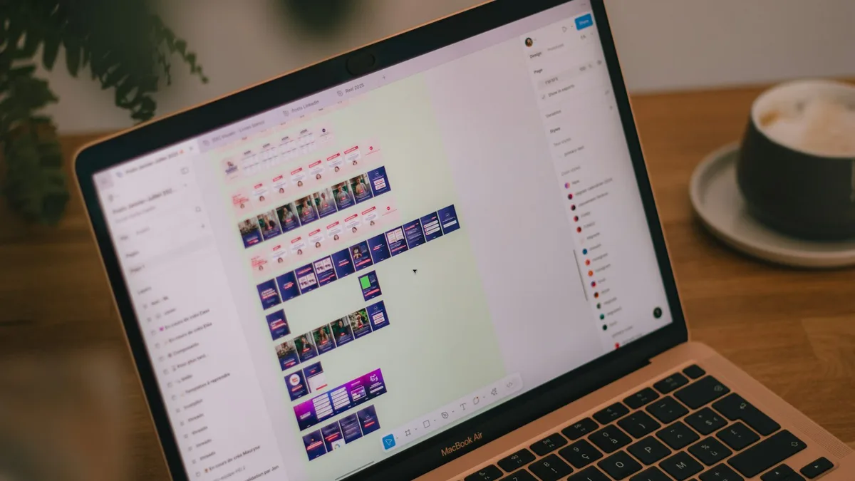
And once you've studied enough examples and briefed the work, the practical styleframe design guide covers actually building one.
Here's the opinionated bit: stop collecting screenshots and start pausing videos. A folder of admired frames teaches you taste. Freezing a single frame from a piece you love and asking what it's telling you about the motion teaches you the craft. That's the difference between liking styleframes and being able to make one. And if you're still deciding whether the brief calls for a single committed frame or a looser mood board, styleframe vs mood board breaks down when each one earns its place.