Malak's title and trailer graphics for the Paramount comedy sequel run on retro-styled typography and kinetic transitions, building a fashion-meets-film brand language. The tone brief is the interesting part. Comedy graphics have to be confident enough to feel glossy, like a real fashion house, while staying in on the joke. Play it too straight and it's boring. Push too hard and it turns cheap.
Built in After Effects with Cinema 4D support, the retro type choice does a lot of work. It nods to fashion editorial history without quoting any one era too literally, so it reads as stylish and slightly ridiculous at once. That's the whole Zoolander register. The kinetic transitions keep the energy high to match trailer pacing.
For anyone learning brand motion, this is a study in tone calibration. The typography has to sell a fake luxury world the audience knows is a gag. Watch how the polish and the punchline coexist without either canceling the other. Getting comedy graphics to look expensive and funny in the same frame is harder than it looks, and the balance is the entire craft here.
Production notes
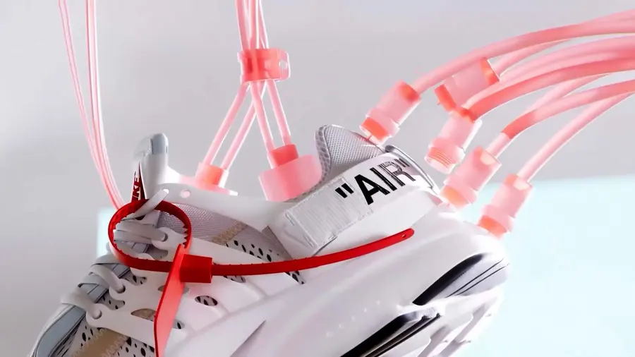
This frame comes from a brand-motion piece, where the styleframe locks the color language and spatial logic of the spot. Mhd Malak produced it in 2016, and the styleframe records the look decisions made before a single second of animation existed.
It was built using After Effects for compositing and animation timing and Cinema 4D for building the 3D scene. That toolset is what gives the motion design its specific weight, from how light falls to how the type settles into the frame.
Mhd appears 8 times across the Art of Styleframe library, so the related frames below trace the through-line in this designer's craft rather than showing one isolated piece.
Look at how a single restrained palette does more work here than any amount of added detail would.