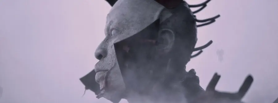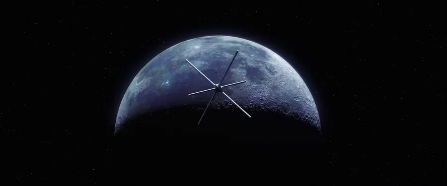
Thorp's concept work for Ant-Man compresses a macro-to-micro story into single frames, and scale plus atmospheric perspective do the heavy lifting. That's the puzzle this movie sets for a designer. How do you show something shrinking without a before-and-after? You build relative scale into one image so the eye reads size instantly.
The Photoshop and Cinema 4D pairing suits this. Cinema 4D establishes accurate perspective and depth, then Photoshop pushes the atmosphere, the haze and light that tell you how far things sit from the lens. When near objects loom and far ones dissolve into soft tone, the frame feels enormous even at a small subject.
For concept artists, this is a clean study in using perspective as narrative rather than decoration. The depth cues aren't there to look pretty. They're carrying the whole idea of scale, which is the movie's entire hook. Try composing a frame where a tiny element feels monumental purely through foreground contrast and atmospheric falloff. Get that right and you won't need a caption to explain what just got small.
Production notes
This frame comes from a commercial project, where a single frame has to sell the tone of the finished film. Ash Thorp produced it in 2015, and the styleframe records the look decisions made before a single second of animation existed.
It was built using Photoshop for matte painting and texture work and Cinema 4D for building the 3D scene. That toolset is what gives the motion design its specific weight, from how light falls to how the type settles into the frame.
Ash appears 8 times across the Art of Styleframe library, so the related frames below trace the through-line in this designer's craft rather than showing one isolated piece.
Look at how one frame compresses the whole tone of the spot into a still you can read in a second.