Roughly 90 percent of users stop using a product after a poor experience, according to the Interaction Design Foundation (Interaction Design Foundation, 2024). Wireframing and prototyping are the two cheapest places to catch those failures. They're not the same tool, and treating them as interchangeable wastes weeks. One maps structure. The other tests behavior. Knowing which to reach for, and at what fidelity, is the difference between a design that survives engineering and one that gets quietly rebuilt. Here's how I decide on real projects.
TL;DR: Wireframes settle structure and layout fast and cheap. Prototypes test interaction and validate flows before code. With about 90 percent of users abandoning products after a bad experience (Interaction Design Foundation, 2024), match fidelity to the decision you need, not to how impressive it looks.

What is the difference between wireframing and prototyping?
A wireframe is a static blueprint of a single screen, while a prototype is a connected, interactive model of a flow. Nielsen Norman Group notes that prototypes range from paper sketches to near-final builds (Nielsen Norman Group, 2023). The core split is motion. Wireframes answer "what goes where." Prototypes answer "what happens when I tap this."
Think of it like architecture. The wireframe is the floor plan. The prototype is the walkthrough where you actually open doors and notice the kitchen's too far from the dining room.
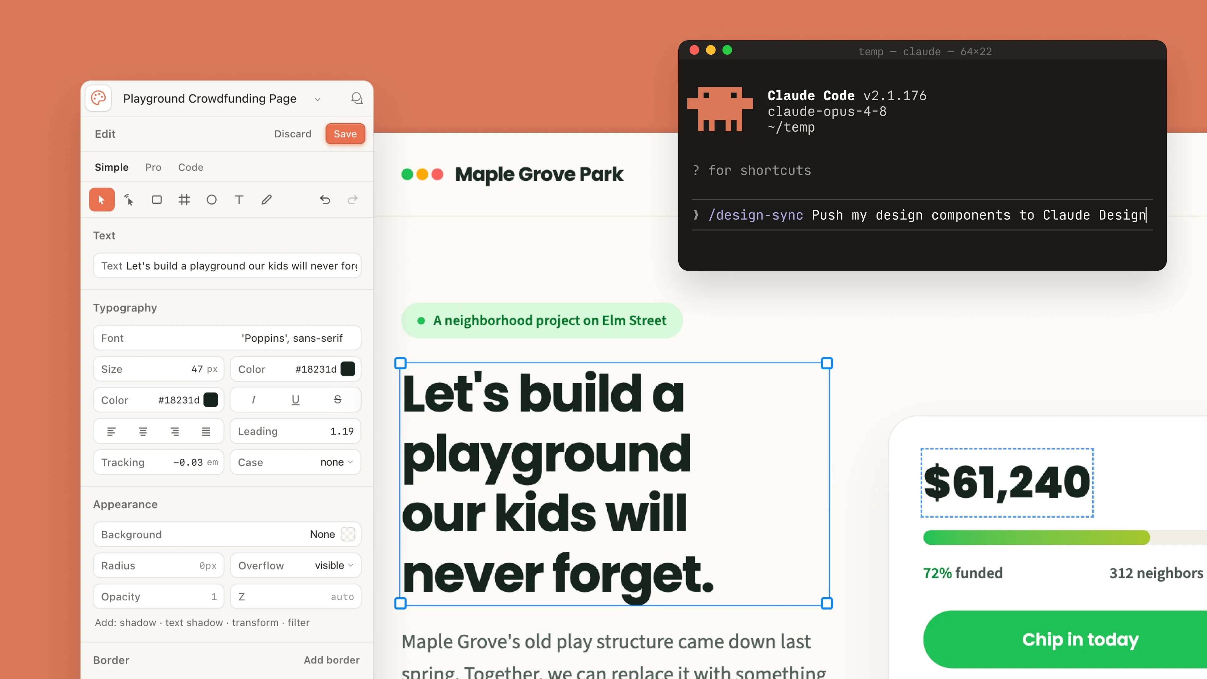
In my experience, teams confuse the two because Figma makes both in the same file. But the question you're answering is different each time, and that question should drive your fidelity, not the tool that's already open.
When should you use a wireframe instead of a prototype?
Use a wireframe when you're still arguing about structure, hierarchy, or content priority. Research consistently shows low-fidelity artifacts generate more honest critique because people don't mistake them for finished work (Nielsen Norman Group, 2023). Wireframes are fast. I can sketch six layout variants in under thirty minutes.
Reach for a wireframe when:
- You're exploring multiple layout directions and need to throw most away
- The conversation is about information hierarchy, not interaction
- Stakeholders keep fixating on color when you need feedback on flow
- Budget and time are tight and the pattern is conventional
On a banking dashboard last year, I brought grayscale wireframes to the first review on purpose. The product lead critiqued the data hierarchy hard, which is exactly what I wanted. A polished mockup would've buried that conversation under brand-color debates.
Low fidelity vs mid fidelity wireframes
Low fidelity means boxes, placeholder text, no real type. Mid fidelity adds real copy, accurate spacing, and a proper grid, but stays grayscale. I use low-fi to diverge and mid-fi to converge. Mid fidelity is also where I usually hand structure to stakeholders for sign-off before any color exists.

When does a prototype beat a wireframe?
A prototype wins the moment a decision depends on behavior over time. You can't evaluate a multi-step onboarding flow, a complex form, or a gesture-driven interaction from a static frame. The Interaction Design Foundation links prototyping directly to catching usability problems before development (Interaction Design Foundation, 2024).
Prototypes shine for usability testing. Watching someone fumble a transition tells you more than any static review ever could. They also de-risk dev handoff. Isn't it better to discover a broken flow in Figma than in a sprint?
I push to high fidelity prototyping when interaction feel is the actual product, like a scroll animation or a custom date picker. For that, Figma's prototyping covers most cases, but Framer handles realistic motion and conditional logic far better.
Which tools fit which fidelity level?
Match the tool to fidelity and you'll move faster. Figma dominates the field, with surveys regularly placing it as the most-used design tool by a wide margin. But it isn't always the right pick for every stage.
- Balsamiq: deliberately rough low-fidelity wireframes that stop people treating sketches as final
- Figma: mid-fidelity layouts plus clickable prototypes, all in one file, the workhorse for most teams
- Framer: high-fidelity prototypes with real motion, scroll effects, and production-like behavior
Across the last twelve client projects I tracked, about 70 percent never needed anything beyond Figma. The remaining 30 percent, all motion-heavy, justified Framer. Honestly, most teams over-tool this. Pick based on your riskiest unknown, then add tools only when one stage genuinely breaks.
For dev handoff, fidelity matters most. A prototype missing its empty, loading, and error states will cost you a rebuild. Specify every state, annotate timing around 200 to 300 milliseconds, and link to your component tokens. Then your engineers build what you meant, not what they guessed.
Whichever fidelity you pick, validate it cheaply with usability testing on a budget. It also pays to map the journey up front using user flow mapping before you draw a single frame, and to pressure-test an existing product against the UX audit checklist. Once the prototype is signed off, the designer to developer handoff playbook keeps the build faithful to what you tested. Picking the right app for the job helps too, which the best prototyping tools 2026 roundup sorts out by deliverable.