UX audits feel intimidating until you treat them like a checklist instead of an art form. Roughly 88 percent of online shoppers say they won't return after a bad experience, according to research summarized by the Nielsen Norman Group. That's a lot of revenue walking out the door because of friction nobody documented. I've run audits on fintech dashboards, ecommerce carts, and one truly cursed booking widget. The method below is what survived. It's repeatable, it doesn't need a big budget, and it turns vague complaints into a ranked list of fixes your team can actually ship.

What is a UX audit and when do you run one?
A UX audit is a structured evaluation of an existing product against usability principles, accessibility standards, and conversion goals. You run one when metrics drop, support tickets pile up, or before a redesign so you don't repeat old mistakes. Think of it as a diagnosis, not a redesign.
The trigger matters. Auditing without a question produces a wishlist nobody funds. So start by writing the business goal in one sentence. "Why do 60 percent of users abandon signup?" is a real audit. "Make the app better" is not. Define the core flow, the target user, and the metric you want to move. Then record yourself completing that flow, hesitation and all.
Which heuristics should you check first?
Start with Jakob Nielsen's 10 usability heuristics, the most cited framework in the field. They cover visibility of system status, error prevention, recognition over recall, and seven more. I walk through each screen and ask whether the interface honors all ten. Most failures cluster around two or three.
Here's the order I actually use:
- Visibility of system status: does the user always know what's happening after a click?
- Error prevention: are destructive actions guarded with confirmation?
- Recognition over recall: does the UI show options instead of forcing memory?
- Consistency: do the same words and patterns mean the same thing everywhere?
- User control: can people undo, cancel, and back out without panic?
Walk the flow twice. The first pass you experience it. The second pass you grade it.
Document friction, not just bugs
Friction isn't a broken button. It's the half second you pause because a label is ambiguous. Record those pauses. On a SaaS onboarding I audited last year, the biggest leak wasn't an error at all, it was a "Continue" button that looked disabled because of low contrast. Small thing. Huge drop-off.
How do you test accessibility quickly?
Run automated checks first, then verify by hand, because tools catch only about 30 to 40 percent of issues. Use the WebAIM WCAG 2 checklist as your reference. I fire up Axe DevTools and Lighthouse, log every violation, then test what machines miss.
Machines can't judge whether your alt text makes sense. They can't tab through a modal and feel it trap focus. So I do three manual things on every audit: move through the whole flow with the keyboard only, check color contrast hits 4.5:1 for body text, and turn on a screen reader for the critical path. Keyboard traps and missing focus states show up constantly. Honestly, most teams ship them without ever pressing Tab. That's a choice, and it's the wrong one.
What about information architecture and content?
Audit the structure and the words together, since users read labels before they understand layouts. Check whether navigation matches how people think, not how your org chart is drawn. Roughly half the audits I run surface at least one menu label that means nothing to outsiders.
Do a quick card sort in your head: would a stranger guess what lives under each nav item? Then read every microcopy string out loud. Error messages are where products show their manners. "Invalid input" tells the user nothing. "Enter a date after today" tells them exactly what to fix. Trim jargon, cut empty states that say "No data," and make buttons describe their action.

How do you find conversion friction and check performance?
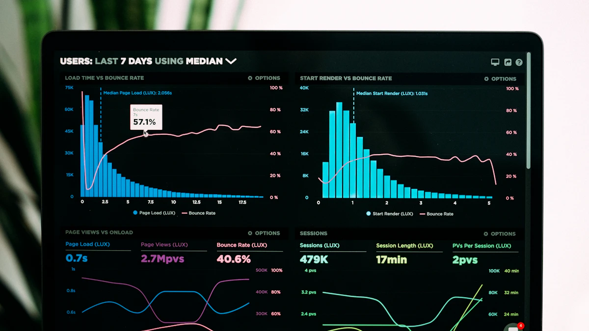
Map every step between intent and completion, then count the friction points, because each extra form field can cut completion measurably. Pull session recordings from Microsoft Clarity, which is free, and watch where rage clicks happen. Cross-reference with your funnel analytics.
Performance is part of UX, full stop. A page that loads in 5 seconds loses users a fast one keeps. Run Lighthouse and watch Largest Contentful Paint and Cumulative Layout Shift. If content jumps while loading, people mis-tap and leave. I treat anything over a 2.5 second LCP as a finding, not a footnote.
Putting the checklist together
Your finished audit should be a ranked document, not a pile of screenshots. Group findings by severity using Nielsen's scale: cosmetic, minor, major, catastrophe. Add an impact-versus-effort score so the team sees quick wins instantly. What surprises most stakeholders? The cheapest fixes often move the metric most. Hand them that, and your audit stops being a critique and starts being a plan they'll fund.
An audit is only as good as your map of the product, so it helps to start from a clear user flow map. Once you've logged the issues, prioritise them against the fundamentals in visual hierarchy in UI design, then confirm the fixes actually work with usability testing on a budget.