Visual Hierarchy in UI Design: 7 Principles That Work
Visual hierarchy techniques for UI designers, size, contrast, spacing, and color strategies...
Tag
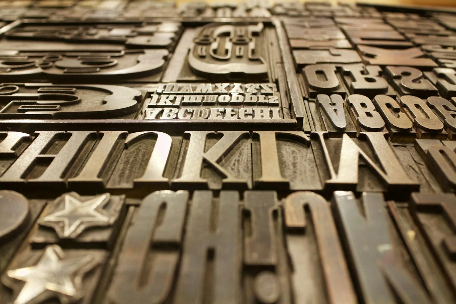
Type does most of the work on any screen, and most of the mistakes too. Line length past 75 characters, a body size that quietly sits at 14px, a scale with no rhythm. Under this tag we get into the decisions that make reading easy: measure, leading, modular scales, variable fonts, and pairing that doesn't feel accidental. We write for interface and editorial designers who want words to feel considered, not just placed. Expect specifics like why 1.5 line-height beats the default, and the occasional rant about justified text on the web.
Visual hierarchy techniques for UI designers, size, contrast, spacing, and color strategies...
Practical font pairing and web typography guide, variable fonts cut page load...