Adrienne Wollman
ESPN: 2018 SEC Network Rebrand Thumbnail
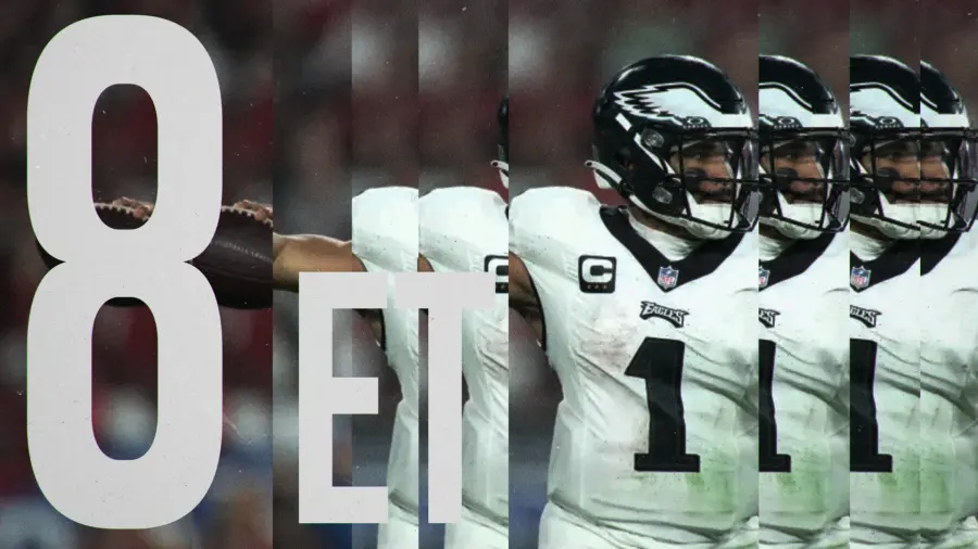
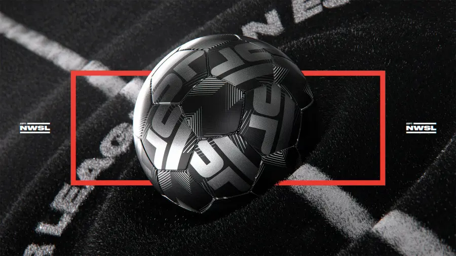
Network identity runs on constraints most product designers never meet: a five-second ident, a scoreboard legible over live action, and a type system that survives heavy compression. Filed here are channel packages, sports graphics, and on-air furniture from teams shipping to millions of screens nightly. What's the hardest object in the whole discipline? Probably the lower third. It carries data, brand, and hierarchy inside a strip about 90 pixels tall, and it can't obscure the thing you tuned in for. Broadcast solved dense data display decades before dashboard design was a job title. I'd argue most SaaS teams would learn more from picking apart an ESPN package than from another dashboard case study. Expect colour under broadcast-safe limits and typography built for glance-length viewing. The frames in this gallery skew toward live sport and news packages, because that's where the constraint bites hardest. A promo for a drama series can borrow film grammar; a ticker crawling under a penalty shoot-out cannot. Watch how the strongest packages reserve their loudest colour for the one number that changes.
19 works in this broadcast motion graphics library