Claude Design is Anthropic's beta tool for making actual designs, prototypes, wireframes, mockups, pitch decks, and it just learned to stay on your brand. The June 17, 2026 update lets it import your design system and build mockups from your real components, then fix its own drift before you see it (Claude). That's the update that made me stop treating it as a novelty.
I wrote recently about where Claude helps designers across the whole workflow. This is the narrower story: the product built specifically for the canvas, and whether it earns a slot next to Figma. Here's my honest read after pushing it at a real design system.
TL;DR: Claude Design is Anthropic's beta canvas at claude.ai/design. It imports your design system from a repo or file, checks its own output against it, and fixes drift automatically. Hand off to Claude Code through /design-sync and /design, and it's bundled free into Pro, Max, Team, and Enterprise. It won't replace Figma, but it's the fastest on-brand draft tool I've tested.
What is Claude Design, really?
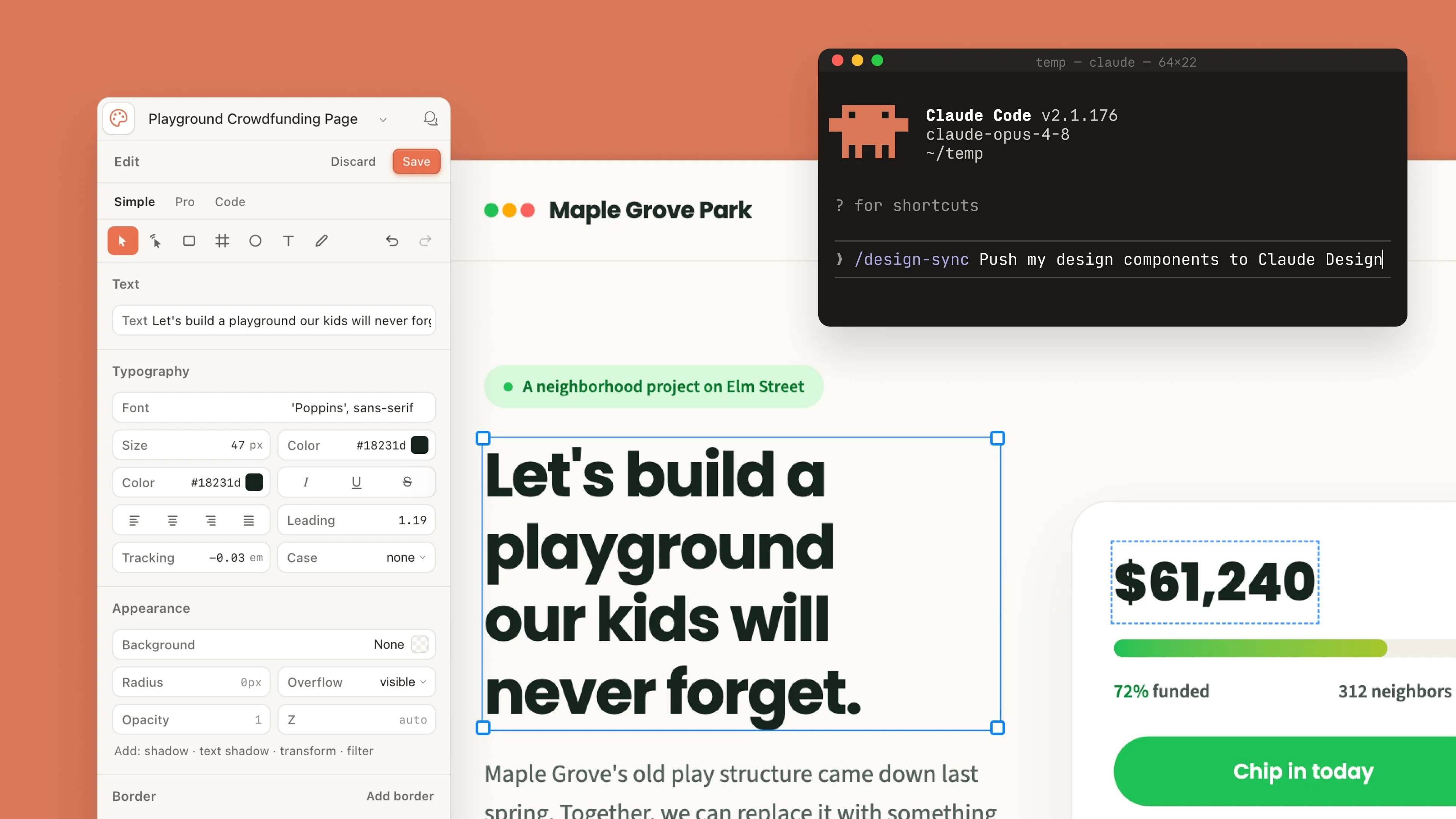
It's a canvas, not a chat box. You describe what you want at claude.ai/design, Claude drafts it, and you refine on the spot (Claude). The editing is what sets it apart from asking chat for HTML. You comment on an element, edit text in place, drag spacing sliders, and align objects by hand. It covers a wide spread: interactive prototypes you can actually click through, plus decks, flyers, and documents.
The reach surprised me. It imports DOCX, PPTX, and XLSX files, web captures, and whole codebases, then exports back out to PDF, PowerPoint, and HTML. So it slots between the messy input you already have and the polished output someone else needs. Is it a full design suite? No. But it closes the gap between "rough idea" and "shareable draft" faster than anything I keep open.
| Capability | What it does |
|---|---|
| Canvas surface | claude.ai/design, comment on elements, edit text in place, drag and align by hand |
| Import sources | GitHub repo, design file, or raw upload, plus DOCX, PPTX, XLSX, web captures, and whole codebases |
| Export formats | PDF, PowerPoint, HTML, and an org-scoped share link |
| On-brand check | Audits its own output against your design system and corrects drift before you see it |
| Claude Code handoff | /design-sync pulls the system in, /design creates, edits, and syncs projects from the terminal |
| Enterprise control | Off by default; an admin approves one standard system and locks the edits |
How does the "on brand" part actually work?
By reading your design system instead of inventing one. Point it at a GitHub repo, a design file, or an upload, and it builds with your components, not generic ones. Then it audits its own output against the system and quietly corrects the mismatches. For an org, an admin approves one standard system and locks the edits so nobody forks the brand by accident.
This is the difference between a demo and a tool. Generic AI mockups look convincing and use none of your tokens, which means every one is a rebuild. When the button is your button and the spacing is your spacing, the draft is a starting point instead of a decoy.
Generic AI mockups look convincing and use none of your tokens. That's the trap on-brand generation fixes.
Where does Claude Code fit in?
This is the strongest link in the chain. Two terminal commands run it: /design-sync pulls your design system into Claude Code, and /design lets you create, edit, and sync design projects without leaving the terminal. Hand off the design itself rather than a screenshot a developer has to reverse-engineer, and the generated build references your real components.
It pairs naturally with a clean designer to developer handoff, and if your tokens already live in a repo, the Figma-to-code tokens pipeline is the layer it reads from. Before you point any AI at a project, though, a tight brief saves you from ten polished-but-wrong drafts. Our styleframe brief template is the one-pager I fill in first so the generation starts aimed at the right target.

How should you structure the prompt so the output stays on brand?
Pointing the tool at your design system does half the job. The other half is the brief, and a vague brief is how you get ten polished drafts that are all subtly wrong.
The structure I use has four parts, in this order, and the order matters because the model weights early constraints more heavily than late ones.
- The constraint that must not break. One sentence, first. "Use only tokens from the repo; do not introduce new colors." Put it first and repeat it last if the brief runs long.
- The job the screen does. Not the layout, the job. "Let an ops manager spot a failing region in under five seconds" produces a different draft than "dashboard with charts", and only one of them is reviewable.
- The named components to use. Reference them by their real names.
MetricStrip,DataTable,EmptyState. Naming them turns a generation into an assembly, which is the whole point of on-brand output. - What you are not asking for. The negative space saves the most time. "No new iconography, no marketing copy, no hero section."
Two habits make a bigger difference than any wording trick. Write the brief once and keep it in the repo next to the system rather than retyping it per session, so every generation starts from the same constraints. And when a draft comes back wrong, fix the brief rather than arguing with the chat. A correction in conversation fixes one draft. A correction in the brief fixes every draft after it.
Can you use it to review work instead of generating it?
This is the use I'd actually defend, and it's the one people skip because generation is the flashier demo.
Hand it a screen somebody already built and ask a narrow question: which values here are not in the system? That reframing matters. "Review this design" invites an opinion, and its opinions are mediocre. "List every color, spacing and type value that does not resolve to a token" invites an inventory, and inventories are the thing software is good at.
What comes back is a diff between what shipped and what the system says. Off-scale spacing, a one-off hex somebody eyedropped, a font size between two steps of the scale. None of that is hard to find by hand. It's just that nobody does it by hand, on every screen, every sprint.
A caution worth stating plainly, because it's the failure mode here: this does not replace an accessibility check. It'll report a contrast ratio and it will sometimes be wrong about it, so contrast still belongs to a tool that measures rendered pixels rather than a model that reasons about hex values. Use this for system drift, which it's good at, and keep axe for contrast, which it isn't.
My take: as a generator it's a fast junior. As a drift detector it's genuinely better than the humans it's helping, because it doesn't get bored on screen forty.
What still trips it up?
It's beta, and it acts like it. The June update shipped "hundreds of stability fixes," which tells you how rough the earlier builds were. Usage limits are shared with chat, Claude Code, and Cowork, so a long design session can quietly drain the pool you needed for other work. On Enterprise it's off until an admin enables it, which trips up plenty of first-time users hunting for a feature that's simply switched off.
My bigger caution is the same one from every AI tool: it produces a confident first draft, and confidence isn't correctness. It'll ship a contrast ratio it calls fine and a layout that ignores your edge cases. So treat the output the way you'd treat a fast junior's work. Useful, quick, and never the last word.
One more practical note from my own testing. The on-brand generation is only as good as the design system you point it at. Feed it a repo with messy, half-named components and it will faithfully reproduce that mess in every mockup. Feed it a tidy, well-tokenized system and the drafts come back genuinely usable. So the prep work you thought you could skip, naming components properly and keeping your tokens honest, is exactly what decides whether this tool earns its place. That's not a knock on Claude Design. It's the same rule that governs every design system: garbage in, garbage out, just faster now.
Does it replace Figma?
Not yet, and it isn't trying to. Claude Design is fastest at the front of the process: exploration, first drafts, and getting a rough concept in front of people. Figma still owns the deep, collaborative production work, the thousand-component libraries and the plugin depth. If you're weighing the wider toolkit, our best prototyping and handoff tools roundup maps the specialists, and the Penpot review covers the open-source angle if owning your files matters more than raw AI speed.
Here's my honest verdict. Claude Design won't retire your design tool, but it's the fastest path I've found from a described idea to an on-brand, clickable draft, and the repo-aware generation is the part that finally makes it trustworthy for daily work. Point it at your system, keep your judgment on the output, and let it own the tedious first 60%. That's the whole trick with any AI in design work: fast drafts in, careful review out.